
Pearl White
Meet Pearl White (#E9EBDF), a soft off-white distinguished by its subtle green undertone. This quiet complexity sets it apart from stark whites, offering a gentle warmth and organic character—a sophisticated foundation for clean, modern interfaces without the usual harshness of pure white.
What color is Pearl White?
Pearl White is a soft, warm off-white with subtle green and yellow undertones. This gives the color a natural, almost creamy appearance that distinguishes it from cooler, more sterile whites.
Its low saturation creates a muted and sophisticated feel, reminiscent of the gentle luster of a real pearl. The color has a quiet warmth that is gentle and easy on the eyes.
What is the meaning of the color Pearl White in design?
Pearl White carries the symbolism of purity and innocence associated with white, but with an added layer of elegance, wisdom, and value drawn from the gemstone itself.
It evokes a sense of calm and sophistication, creating a timeless foundation that feels both gentle and luxurious—a softer, more classic alternative to stark white.
How can I effectively use Pearl White in my UI design?
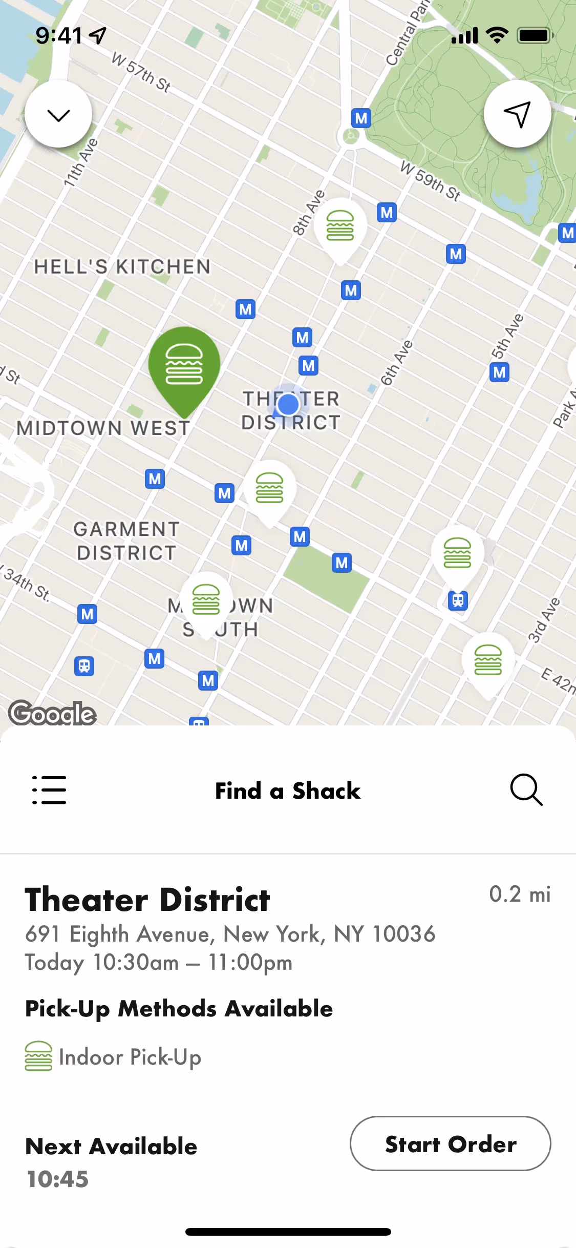
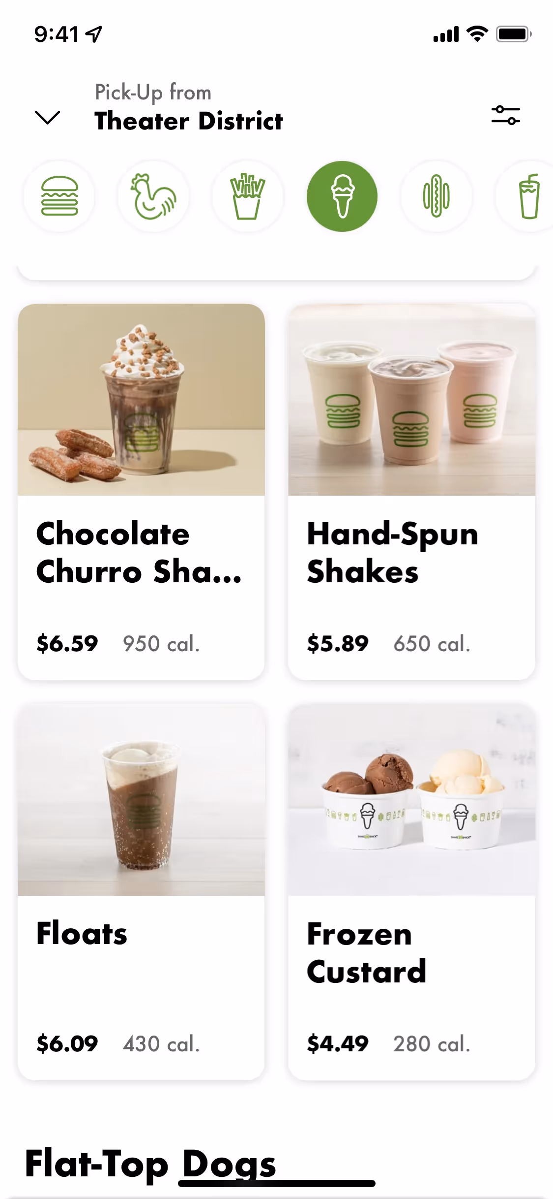
In UI design, Pearl White (#E9EBDF) is an excellent choice for a primary background, offering a softer, more organic alternative to pure white that can reduce eye strain. It provides a sophisticated canvas that makes vibrant accent colors pop without feeling harsh. For a more reserved and elegant palette, pair it with deep charcoals, earthy tones, or muted greens to build a high-contrast interface that feels both warm and readable.
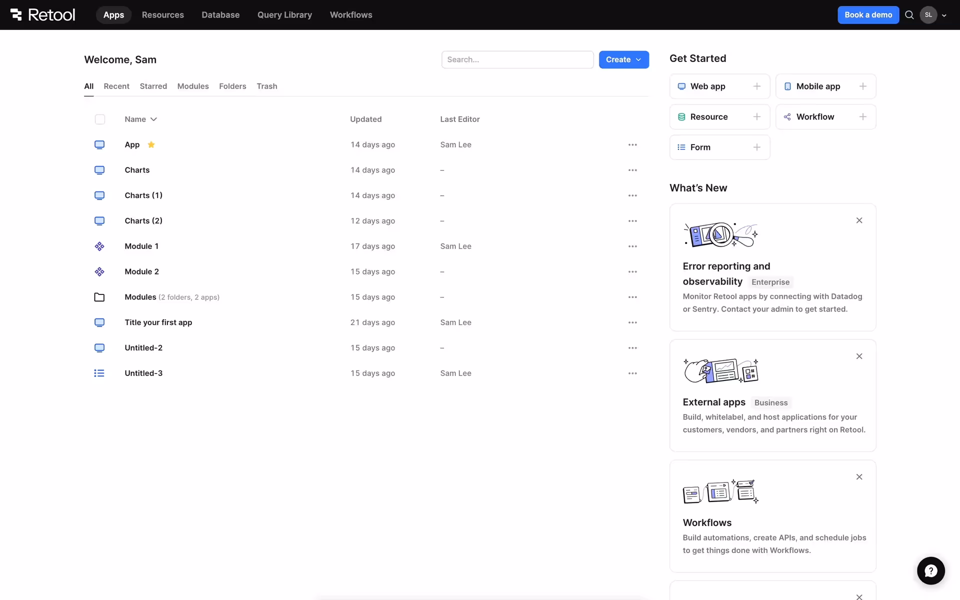
While not a widely used primary color for major brands, its rarity can make a design feel distinctive. Companies like Open and Retool employ similar off-whites to cultivate a refined and focused user experience. Using Pearl White can signal a quiet confidence and a premium quality, sidestepping the clinical feel of a standard white background.
Use the tools below to explore curated palettes, test color contrast for accessibility, and preview Pearl White in real UI components from top brands.
Using Pearl White color codes
Applying Pearl White in your work starts with its HEX code, #E9EBDF. This is the most direct way to specify the color for web-based projects, ensuring digital accuracy from the get-go.
Different design tools and mediums require different color models. For digital screens, you'll often use RGB (Red, Green, Blue) values. For physical print work, you'll need the CMYK (Cyan, Magenta, Yellow, Key/Black) equivalent. Converting #E9EBDF into these formats ensures color consistency across your projects.
To make things easier, we've converted Pearl White's #E9EBDF code into a range of popular formats. You can find and copy the exact values you need right below.
Analogous
By selecting colors adjacent to Pearl White on the color wheel, you create an analogous scheme. This approach results in a cohesive and tranquil composition.
Complementary
Complementary colors sit opposite each other on the color wheel. Paired with Pearl White, they produce a high-contrast, visually striking effect.
Split Complementary
Split complementary colors offer a more nuanced palette. For Pearl White, this means pairing it with the two colors adjacent to its direct opposite.
Triadic
A triadic palette uses three colors evenly spaced on the color wheel, creating a vibrant, high-contrast combination that remains balanced with Pearl White.
Tetradic
Tetradic schemes build a four-color palette around Pearl White using two pairs of complementary hues from opposite sides of the color wheel.
Square
A square color scheme pairs Pearl White with three other colors, all evenly spaced on the color wheel for a vibrant, high-contrast effect.
Text Color
Background Color
Your Catchy Large Text Goes Here
Shades
Shades of Pearl White are created by adding black, giving the color more depth and weight.
Tints
By mixing white into Pearl White, you create tints—lighter variations that add a soft quality.
Tones
Adding gray to Pearl White creates its tones—softer, less saturated versions of the original color.
Hues
Hues are variations of Pearl White, differing in intensity or temperature to create distinct moods.


Never run out of inspiration again.
Use Mobbin for free as long as you like or get full access with any of our paid plans.


