#1db954
Copy
Copied

Waze is a community-based navigation app providing real-time traffic and road information. Its branding and interface designs feature a palette of Black, Merino, and Azure Radiance. On this page, you can easily copy these colors in Hex, CMYK, RGB, and other formats.
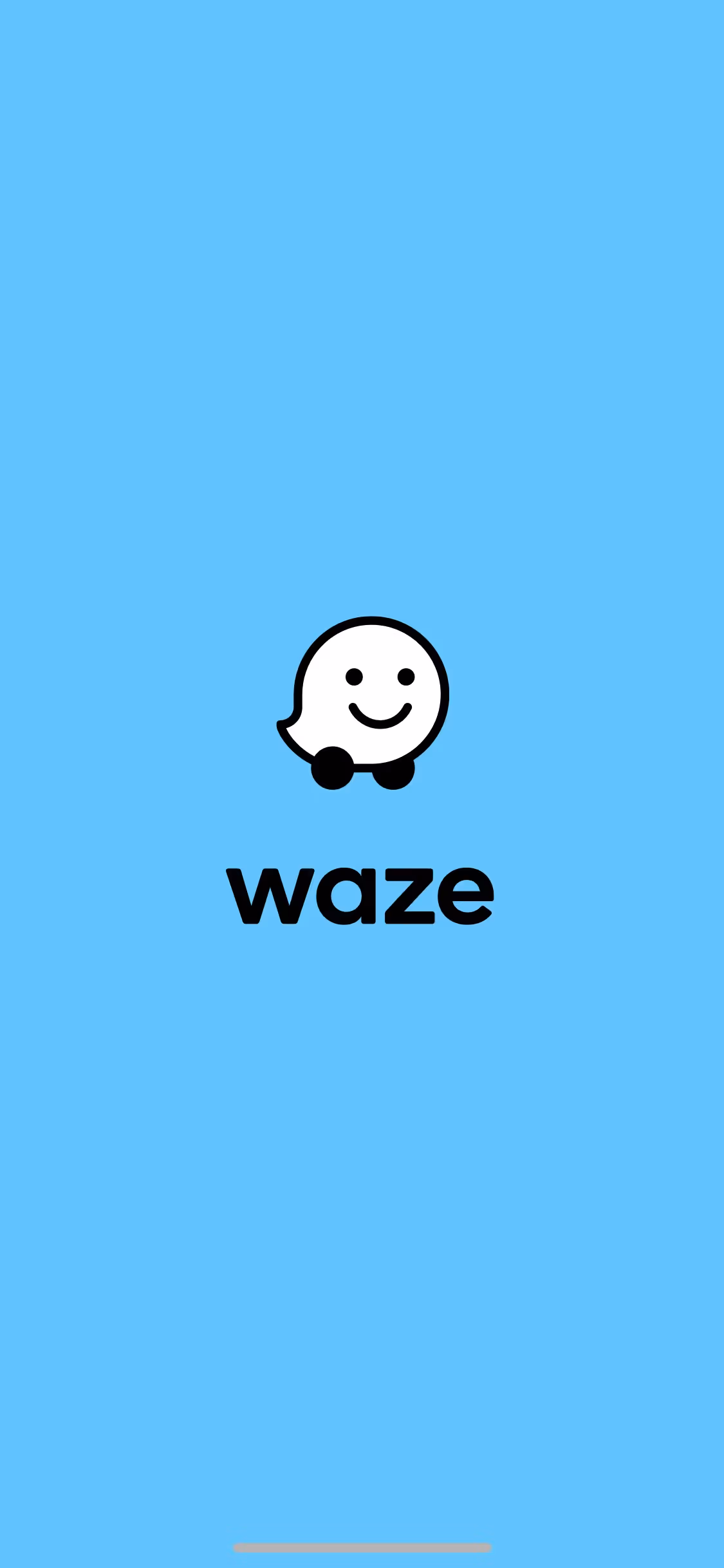
Waze's core color palette features a classic Black (#000000), a gentle off-white called Merino (#F9F6ED), and a vibrant Azure Radiance blue (#0099FF). This trio is key to their clear and approachable UI, offering a great starting point for your own design explorations.
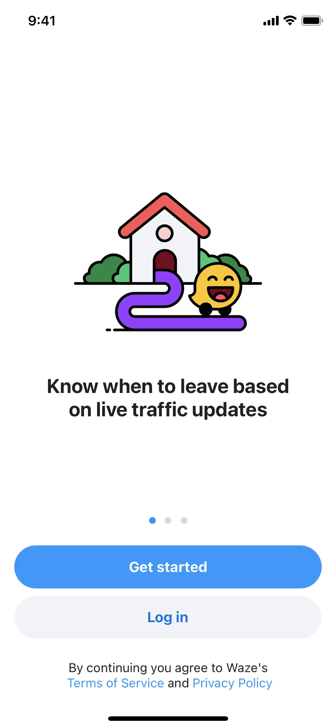
Waze's primary use of black conveys a sense of modern authority and clarity, creating a focused backdrop for your navigation. This is softened by a warm off-white and punctuated by a vibrant blue, which together create a user-friendly and trustworthy experience, guiding you reliably on your journey.
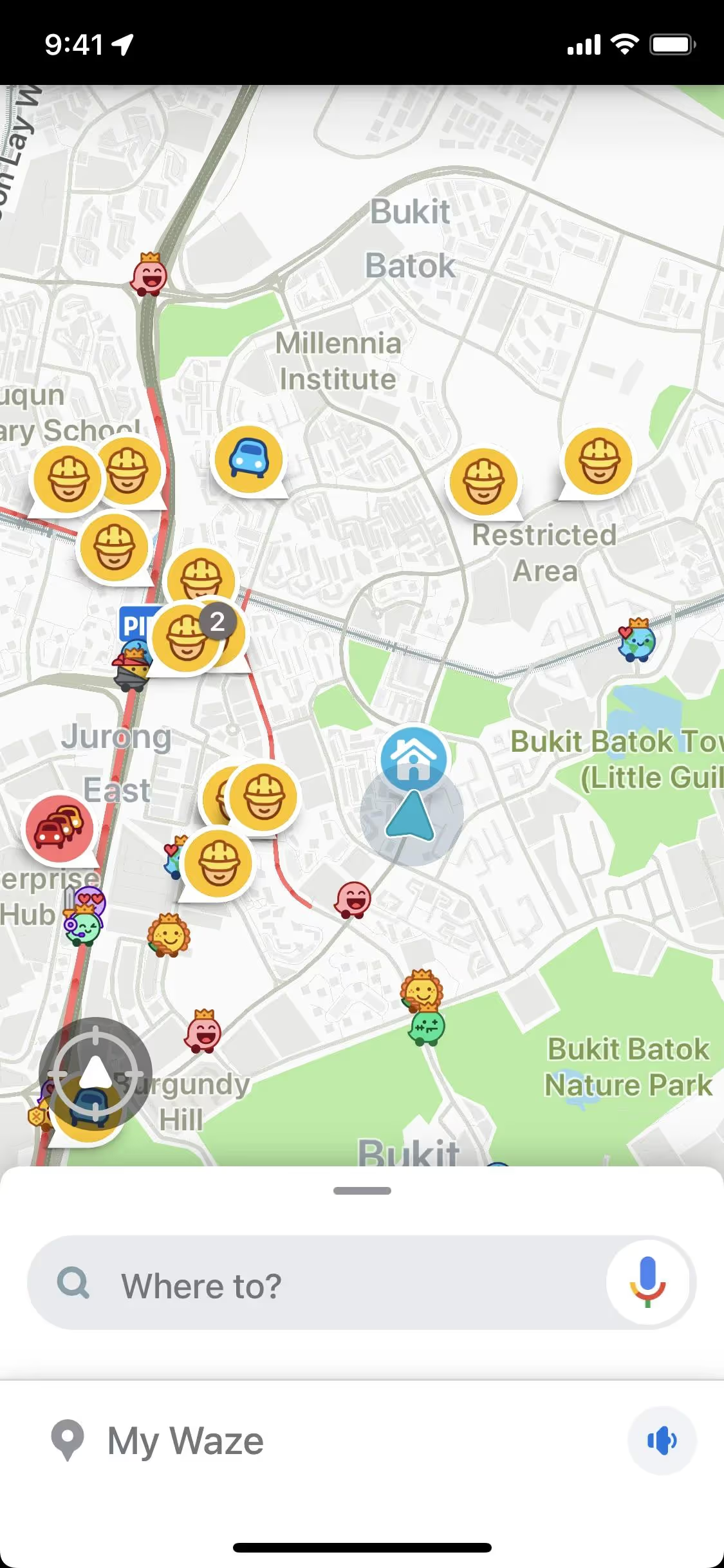
We see Waze's vibrant palette as a strategic move to capture the joy and energy of its community-driven platform. The choice of colors aims to evoke a sense of fun and personality, shifting the brand from purely functional to delightfully human.
Waze masterfully uses Azure Radiance to draw your eye to the navigation path and critical calls-to-action. This vibrant blue, set against a clean Merino and Black backdrop, simplifies decision-making and creates an intuitive, focused driving experience.
To build on Waze's core colors, you could explore a vibrant yellow for a pop of energy or a deep, earthy green to create a more grounded feel. We find these create a striking contrast against the primary black, offering you fresh creative directions.
On our brand colors page, you can explore curated color palettes from top companies. We also offer access to thousands of UI designs from various brands, providing endless inspiration for your next color combination from real-world examples.
Mobbin keeps you at the forefront of design with our extensive, constantly updated library of mobile and web UI/UX patterns. By exploring real-world examples, from innovative color palettes to seamless user flows, you can easily spot emerging trends and keep your work fresh and relevant.
You can try Mobbin today for free for as long as you like, or get full access with any of our paid plans.
Use Mobbin for free as long as you like or get full access with any of our paid plans.


