#1db954
Copy
Copied


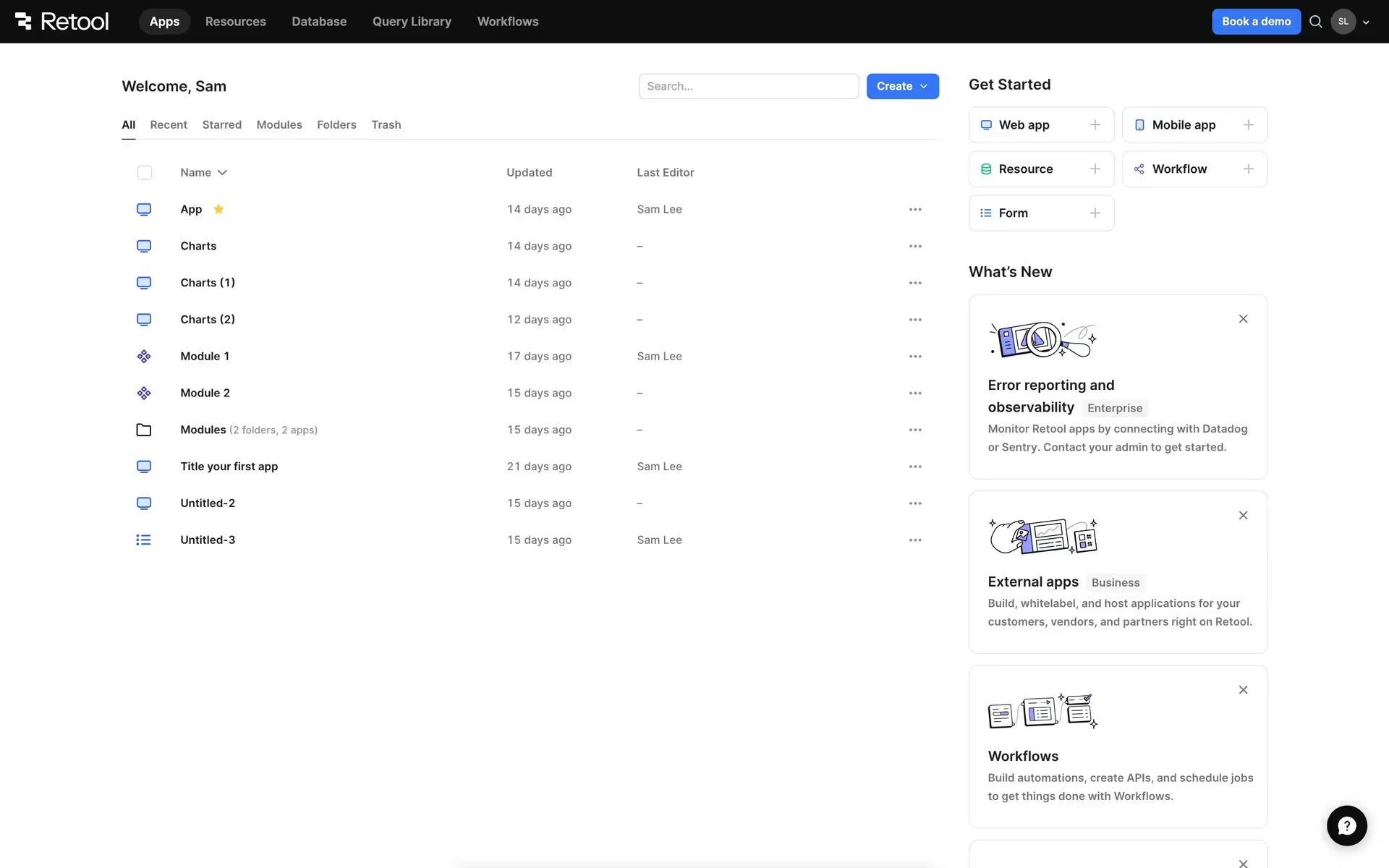
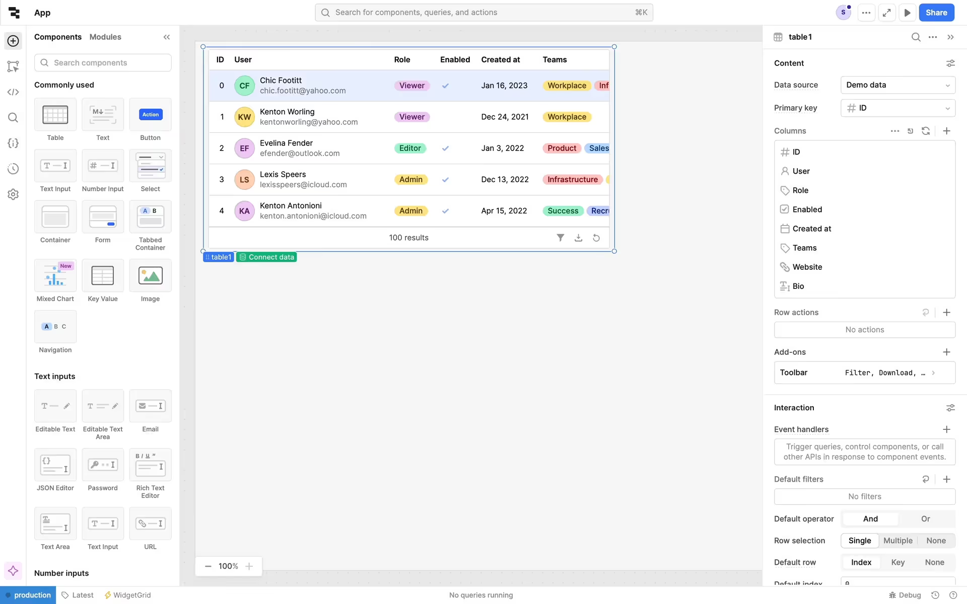
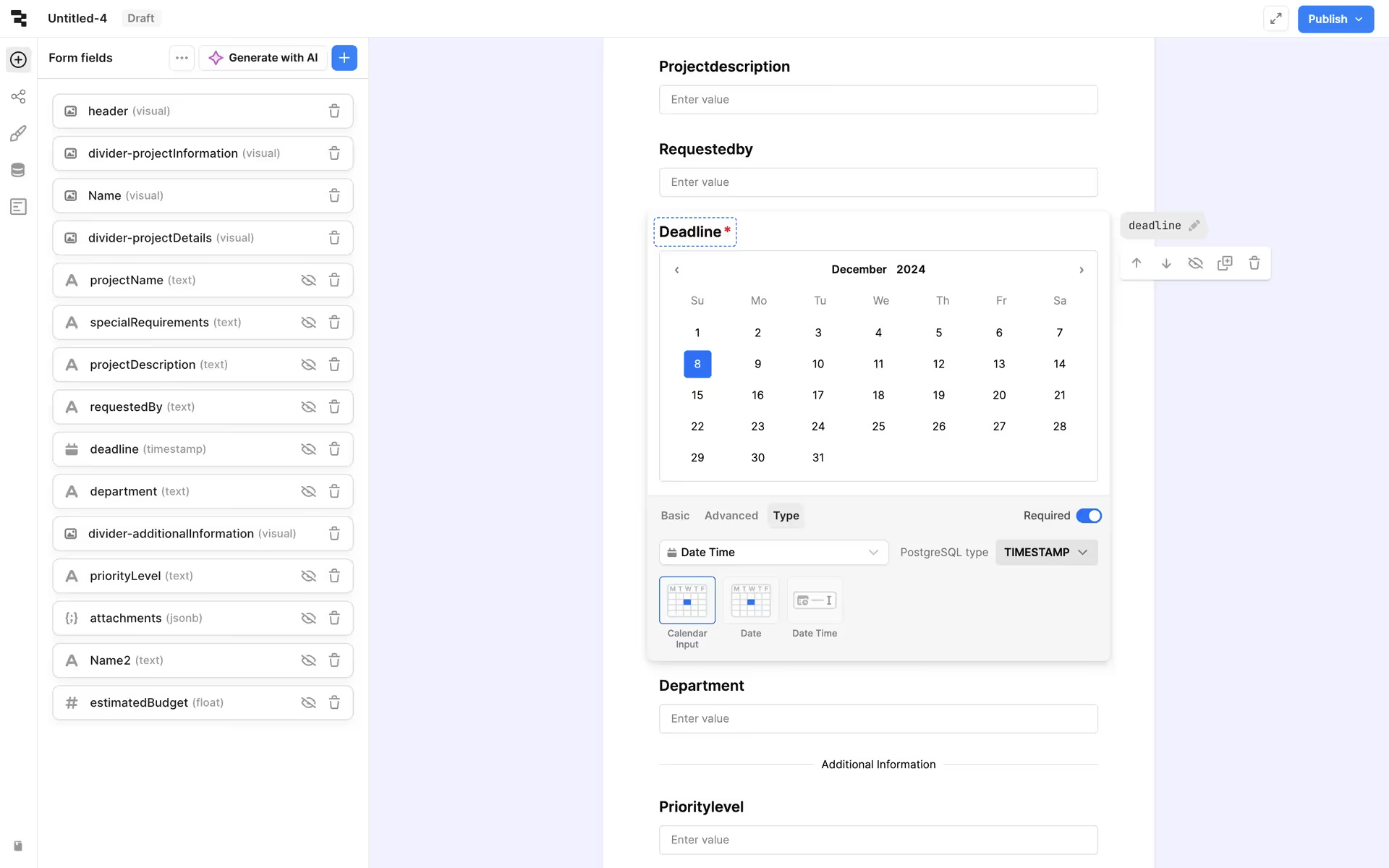
Retool is a platform for building internal business software quickly and efficiently. Its branding features Green White, Cod Gray, Smalt Blue, Burnt Sienna, Cornflower, and White. We've made it easy for you to copy these colors in Hex, CMYK, RGB, and other popular formats on this page.
To help you build with confidence, we've broken down Retool's palette for you. It's built on a foundation of neutrals like White, Green White, and Cod Gray, brought to life with pops of Smalt Blue, Burnt Sienna, and Cornflower.
Retool's primary Green White (#E9EBDF) establishes a calm, clean canvas, reflecting the platform's role as a foundation for your custom tools. This is supported by a palette of functional accents that guide your workflow, creating an environment that feels both powerful and approachable.
Retool's color scheme is a masterclass in balancing the vibrant energy of a modern innovator with the grounded stability essential for enterprise-grade software.
We see Retool use its neutral palette to create a focused workspace for you, while strategic accents like Smalt Blue guide primary actions and Burnt Sienna highlights key information, ensuring a clear and efficient building experience.
To build on Retool's earthy primary, we suggest exploring a warm terracotta for a grounded feel or a rich plum to introduce sophisticated contrast. A muted mustard yellow could also serve as an excellent accent, helping you guide user attention without overpowering the core palette.
On our brand colors page, you can explore curated color palettes from top companies. We also offer access to thousands of other UI designs and interfaces, making it a great resource for discovering new color combinations and getting inspiration from real-world examples.
Our extensive, constantly updated collection of mobile and web design patterns shows you the latest trends in UI/UX, from color usage to entire user flows. By using Mobbin, you can easily explore current design practices and stay ahead of the curve in the industry.
Try Mobbin today for free for as long as you like, or get full access with any of our paid plans.

Use Mobbin for free as long as you like or get full access with any of our paid plans.


