#1db954
Copy
Copied

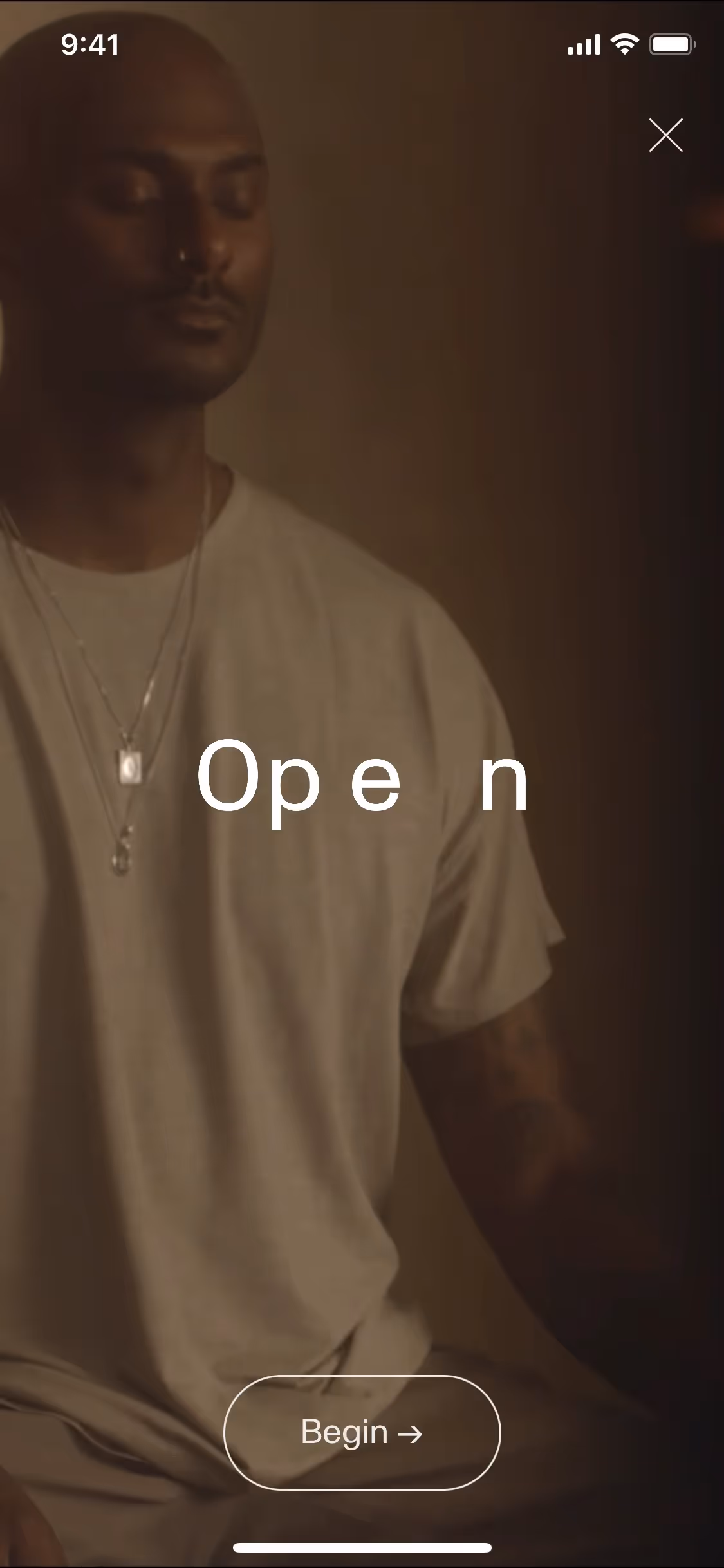
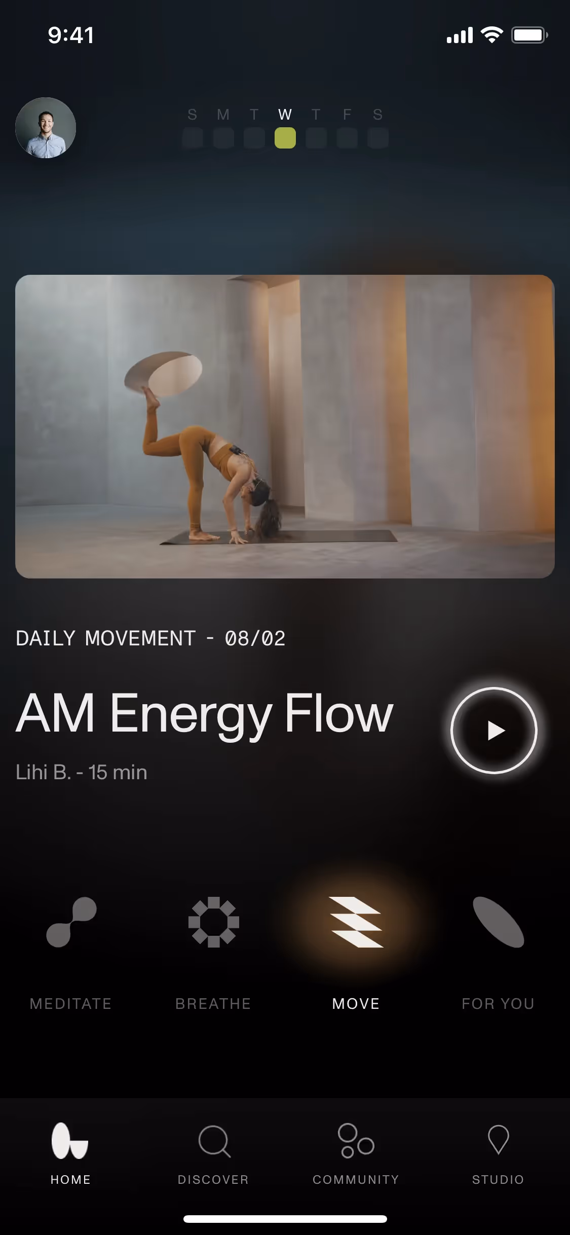
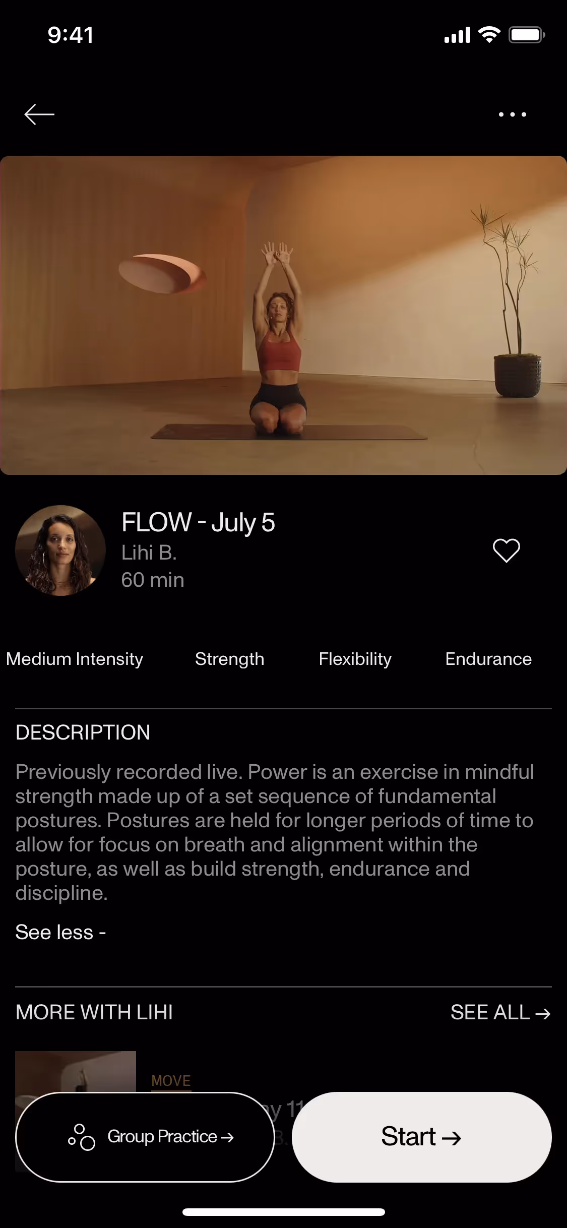
Open is a mindfulness studio with digital and in-person experiences. Its branding and interface designs feature a serene Cararra and a grounding, classic Black. On this page, you can easily copy these colors in Hex, CMYK, RGB, and other popular formats.
You'll find that Open's primary color palette is elegantly simple, focusing on two main colors: Cararra (#EDECE7) and Black (#000000).
When we analyze Open's palette, we see how the primary off-white, Carrara, establishes a serene and clear foundation that mirrors the brand's focus on mindfulness. This calming base is then grounded by black, which provides the necessary contrast and focus to guide you through the experience with purpose.
While there isn't publicly detailed information on the history, Open's minimalist color palette appears intentionally chosen to support its core mission: creating a serene, focused environment for mindfulness practices.
Open’s high-contrast palette of warm, off-white Cararra and stark Black creates a focused, tranquil digital space that mirrors their mindfulness ethos. This minimalist approach strips away distractions, naturally guiding your attention to core content and calls-to-action.
To complement Open's signature off-white, we recommend exploring earthy tones like deep forest greens or rich terracottas for warmth and contrast. Alternatively, muted blues or other warm neutrals can create a more subtle, sophisticated balance for your designs.
On our brand colors page, you can explore a curated list of color palettes from top companies. We also offer access to thousands of UI designs from various brands, providing endless inspiration for your next color combination from real-world examples.
Mobbin keeps you on the cutting edge with our extensive, constantly updated library of mobile and web design patterns, showcasing the latest trends from color usage to user flows. By exploring our collection, you can easily see current design practices in action and stay ahead of industry trends.
You can try Mobbin today for free for as long as you like, or get full access with any of our paid plans.

Use Mobbin for free as long as you like or get full access with any of our paid plans.


