
Steel Blue
Introducing Steel Blue (#4682B4), a hue defined by its remarkable balance. This color masterfully blends a cool blue base with subtle gray undertones, resulting in a shade that is both grounded and visually interesting, commanding attention through its refined and steady presence.
What color is Steel Blue?
Steel Blue is a cool, medium-to-dark shade of blue with prominent gray undertones. Its appearance is inspired by the bluish tint of steel that has been treated to improve its corrosion resistance, giving it a sophisticated, industrial quality.
As a desaturated color, it sits on the cooler end of the spectrum. Its character comes from this blend of blue and gray, which can sometimes present a subtle green undertone depending on the surrounding light and colors.
What is the meaning of the color Steel Blue (#4682B4)?
Steel Blue carries a sense of authority and stability, blending the tranquility of blue with the impartiality of gray. This combination evokes feelings of calm, logic, and serious professionalism, making it a symbol of strength and reliability.
Psychologically, the color suggests structure and dependability. It is a modern, sophisticated hue that builds trust without being overtly emotional, often associated with industrial precision and corporate integrity.
How can I best use Steel Blue in my UI design?
Steel Blue (#4682B4) is remarkably versatile, working well as a dependable primary color or a subtle accent. For a clean, professional interface, pair it with soft neutrals like off-white, light gray, or beige. To create a more dynamic composition, introduce a pop of a warmer, complementary color such as a muted orange or a deep gold. Applying the 60-30-10 rule can help balance these combinations effectively.
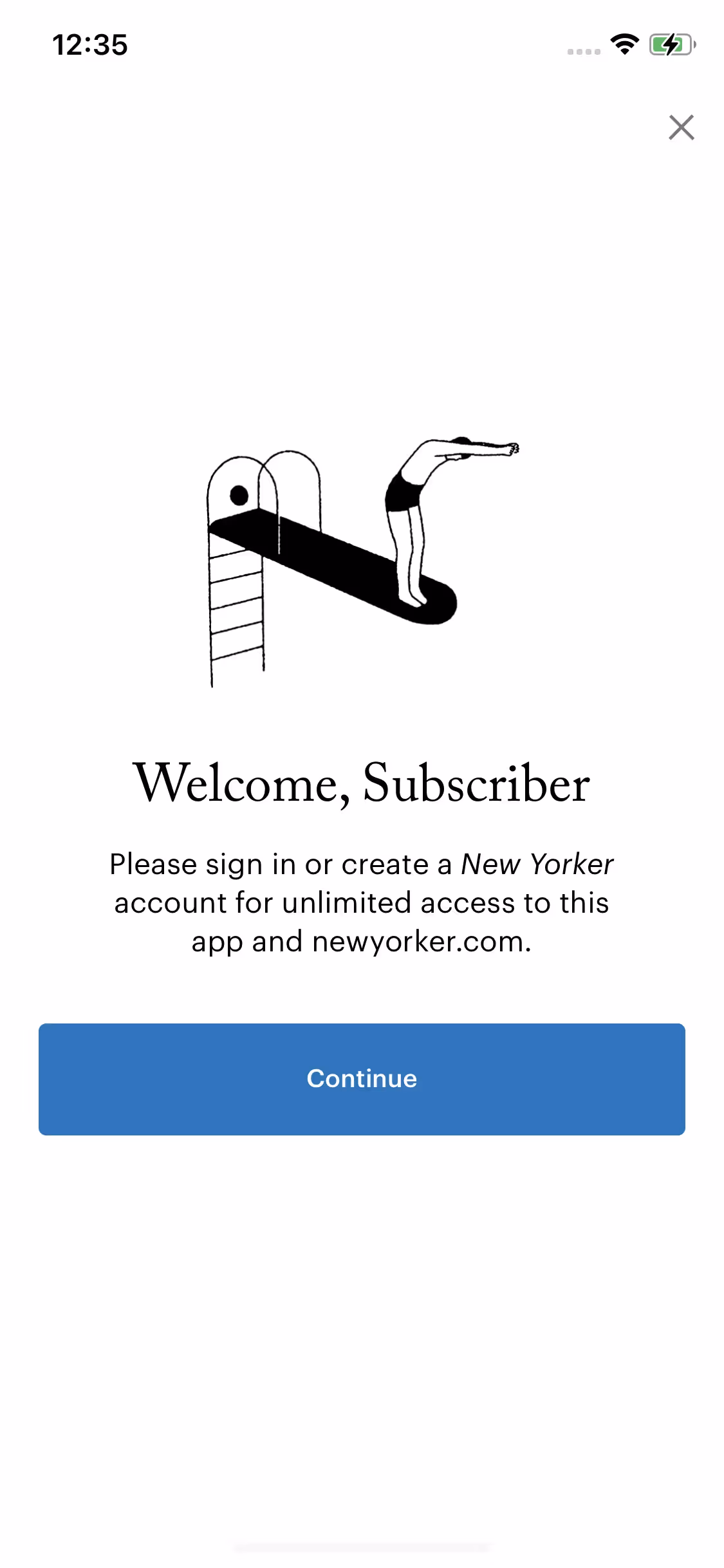
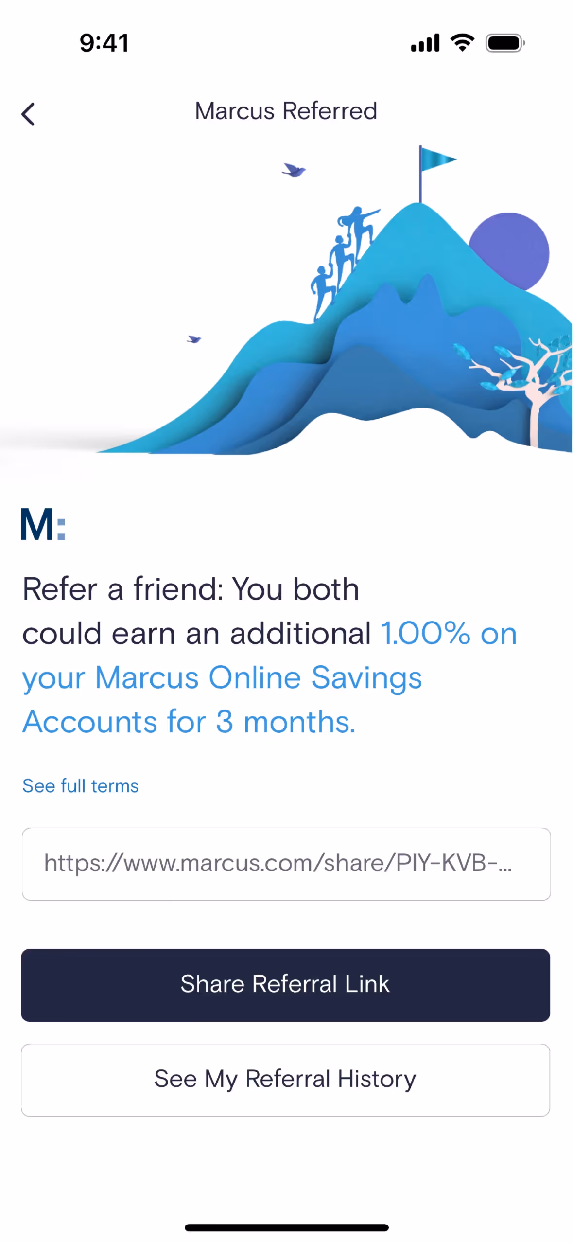
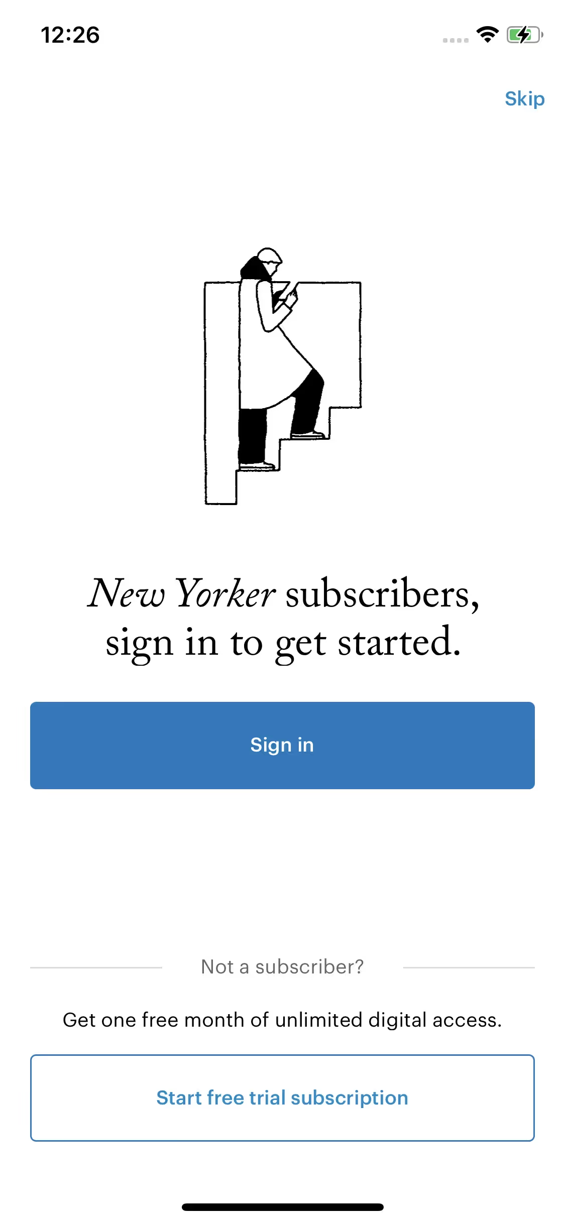
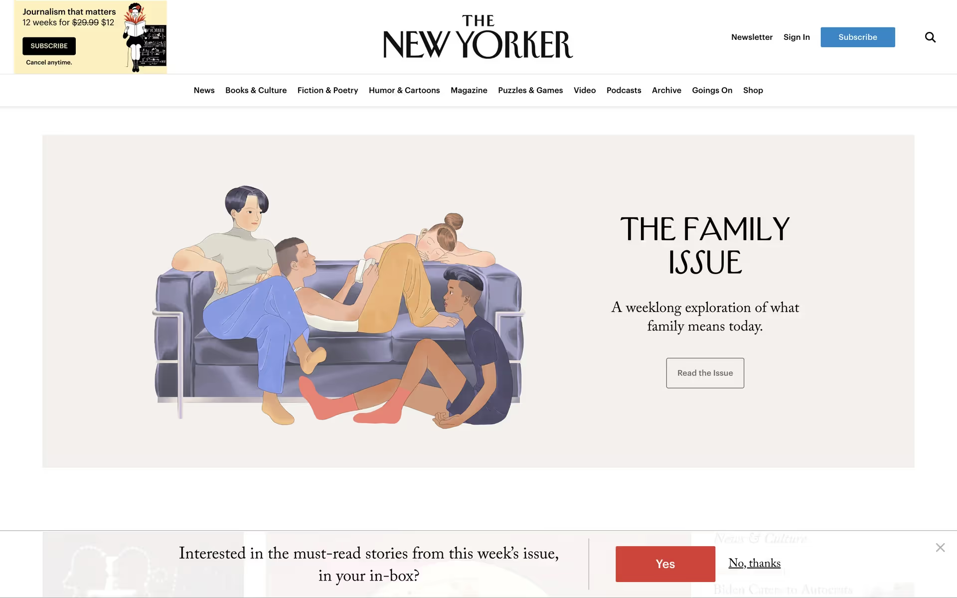
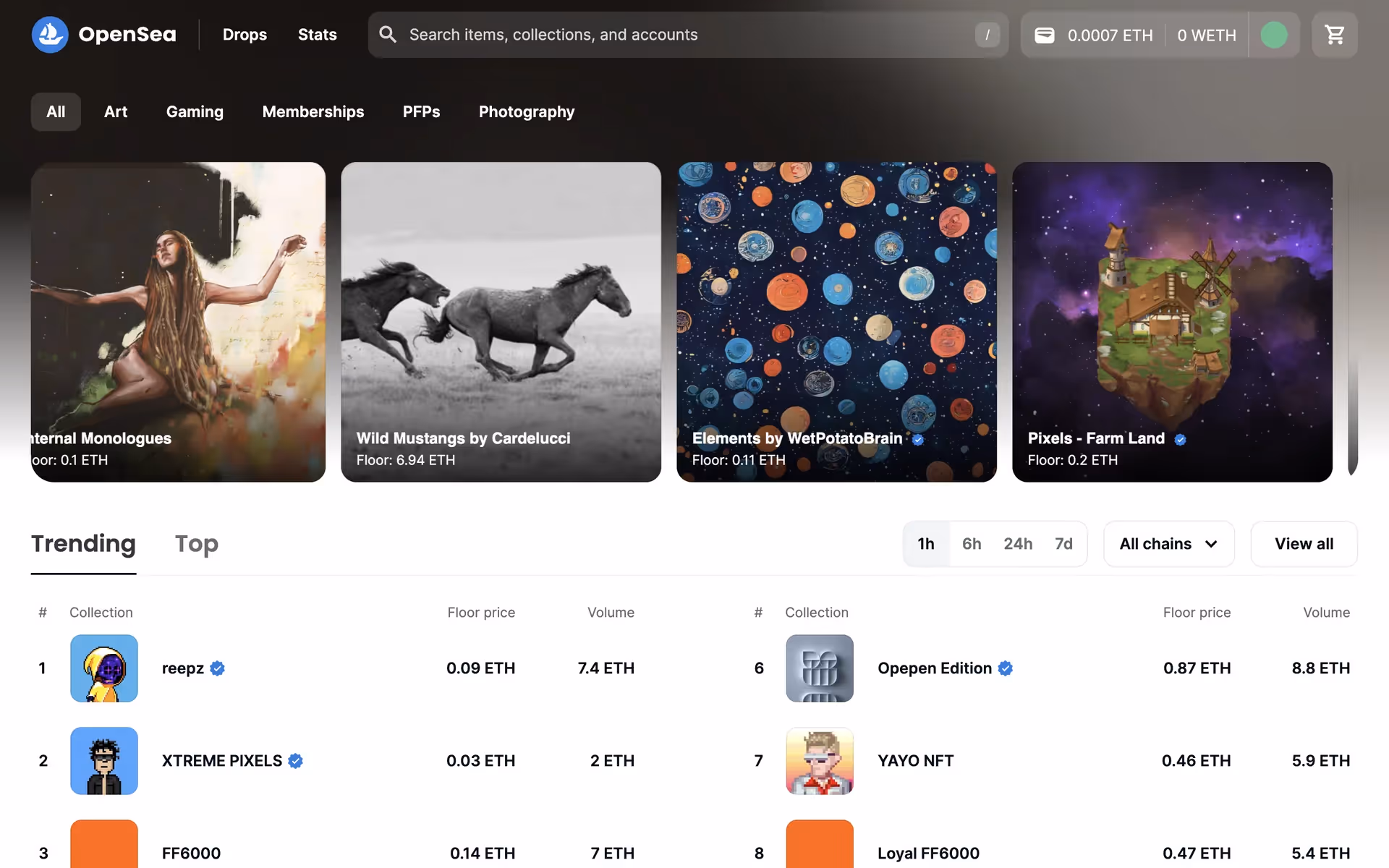
While not as ubiquitous as primary blue, Steel Blue is a choice for established brands seeking a refined image. Companies like PayPal, Telegram, and Marcus by Goldman Sachs use similar shades to project stability and trust. In other spaces, brands like The New Yorker and OpenSea employ it to convey a sense of authority and modern sophistication.
To see how Steel Blue works in practice, use the tools below. You can explore curated palettes, test color contrast for accessibility, and preview the color applied to UI components from well-known applications.
How do I use the Steel Blue color codes?
Using Steel Blue (#4682B4) effectively often comes down to its application. Its muted quality makes it a strong supporting color, but it can also stand on its own without overwhelming a composition. Consider its saturation and brightness when placing it alongside other hues to maintain visual harmony.
A hex code is just one way to define a color. For digital work, you'll often use its RGB values, which specify the intensity of red, green, and blue light on a screen. For print projects, the CMYK values are critical, dictating the mix of cyan, magenta, yellow, and black inks. Other formats like HSL or LAB offer different ways to describe color based on properties like hue, saturation, and lightness.
To simplify your workflow, we have converted #4682B4 into a range of popular formats. You can find the corresponding values below, ready to copy and paste directly into your design tools.
Analogous
Sitting next to Steel Blue on the color wheel, analogous colors create a unified and tranquil palette, producing a pleasing and cohesive visual experience.
Complementary
Complementary colors sit opposite each other on the color wheel. When paired with Steel Blue, they create a striking, high-contrast visual effect.
Split Complementary
A split complementary scheme for Steel Blue uses the two colors adjacent to its direct complement, offering a vibrant yet balanced color harmony.
Triadic
Triadic color schemes use three hues equally spaced on the color wheel. For Steel Blue, this creates a vibrant, high-contrast, and balanced palette.
Tetradic
Tetradic palettes pair Steel Blue with three other hues, creating a rich combination of two complementary color pairs for dynamic and versatile designs.
Square
A square color scheme pairs Steel Blue with three other colors, all equidistant on the color wheel, creating a vibrant and high-contrast palette.
Text Color
Background Color
Your Catchy Large Text Goes Here
Shades
Adding black to Steel Blue produces darker shades, which introduce a sense of depth and substance.
Tints
Tints of Steel Blue are created by adding white, which produces lighter, softer variations.
Tones
Tones of Steel Blue are created by adding gray, resulting in softer, more subdued variations.
Hues
Hues are variations of Steel Blue that differ in intensity and temperature, creating distinct moods.


Never run out of inspiration again.
Use Mobbin for free as long as you like or get full access with any of our paid plans.


