#1db954
Copy
Copied

PayPal is a leading online payment platform offering a suite of financial services. PayPal's branding prominently features the colors Pay Blue (#00457C) and Pal Blue (#0079C1). You can easily copy PayPal's colors in Hex, CMYK, RGB, and other popular formats on this page.
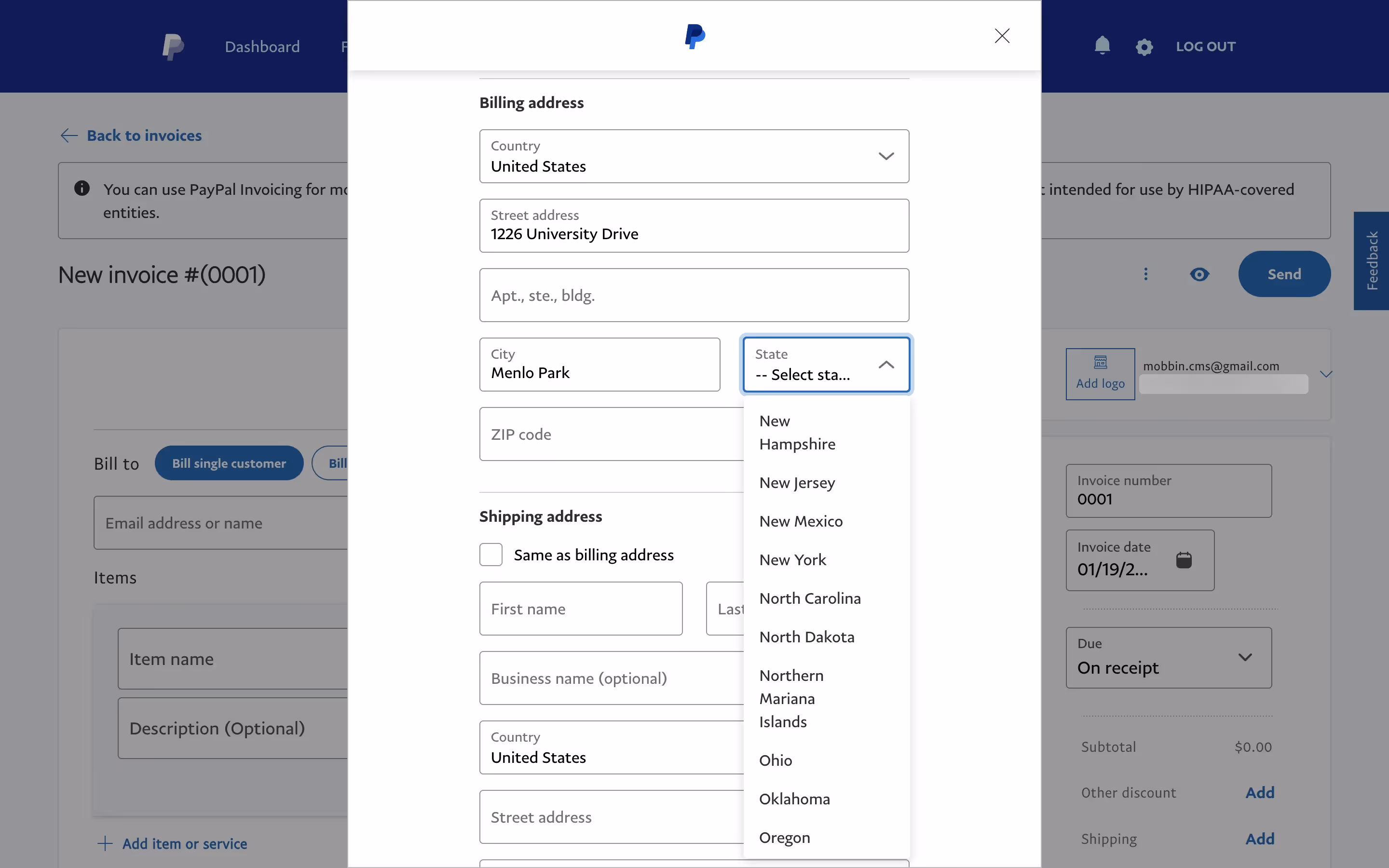
The main colors in PayPal's color palette are Pay Blue (#00457C) and Pal Blue (#0079C1). These shades of blue are integral to PayPal's brand identity, providing a sense of trust and reliability.
PayPal's primary color, Pay Blue (#00457C), conveys a sense of trust, reliability, and professionalism, aligning perfectly with the brand's identity as a secure and dependable financial service. This deep blue hue instills confidence and stability, essential qualities for a platform handling your financial transactions. Complementing this, Pal Blue (#0079C1) adds a touch of vibrancy and modernity, enhancing the overall message of innovation and user-friendliness.
PayPal's color scheme, primarily featuring blue tones, was chosen to evoke trust, security, and professionalism. While the specific historical context and influences behind these choices aren't explicitly documented, the consistent use of blue aligns with the brand's emphasis on reliability and financial security.
PayPal's use of 'Pay Blue' and 'Pal Blue' strategically guides your actions and influences decisions by creating a sense of trust and reliability. These colors are designed to enhance your user experience, making interactions feel secure and intuitive.
To complement PayPal's primary color (#00457C), consider using shades like coral (#FF6F61) for a vibrant contrast, or mint green (#98FF98) for a refreshing balance. These colors can enhance your design by adding warmth and a touch of modernity.
On Mobbin’s brand colors page, you can explore a curated list of brand color palettes from top companies. We also offer access to thousands of other UI designs and interfaces from various brands, making it a great resource for finding new color combinations and getting inspiration from real-world examples.
Mobbin helps you stay up-to-date with the latest UI/UX trends by offering an extensive, constantly updated collection of mobile and web design patterns. From color usage to user flows, you can easily explore current design practices and stay ahead of trends in the industry.
Don't miss out—try Mobbin today for free as long as you like, or get full access with any of our paid plans.

Use Mobbin for free as long as you like or get full access with any of our paid plans.


