#1db954
Copy
Copied

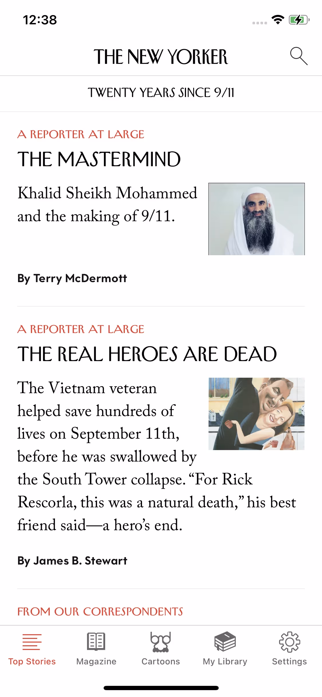
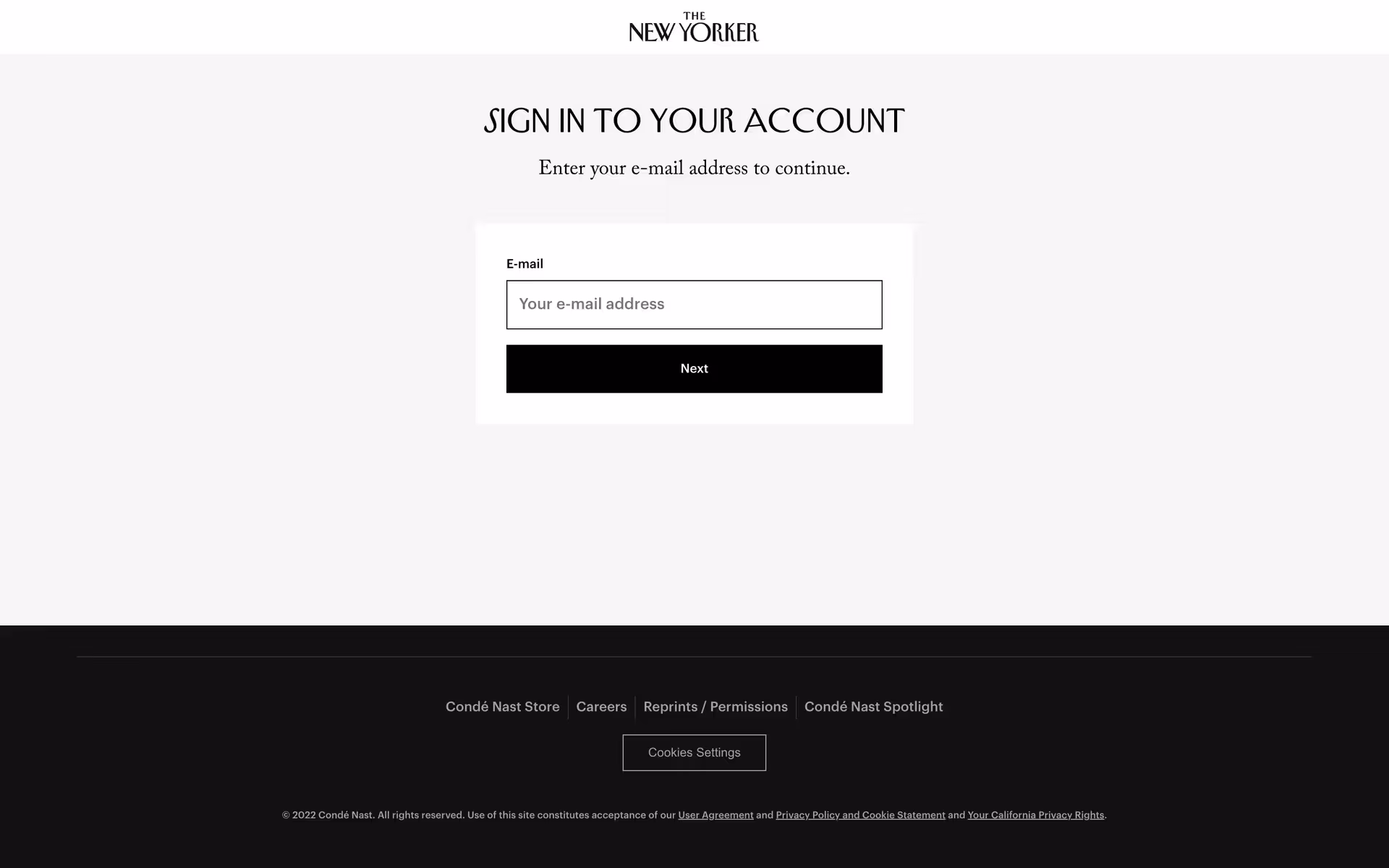
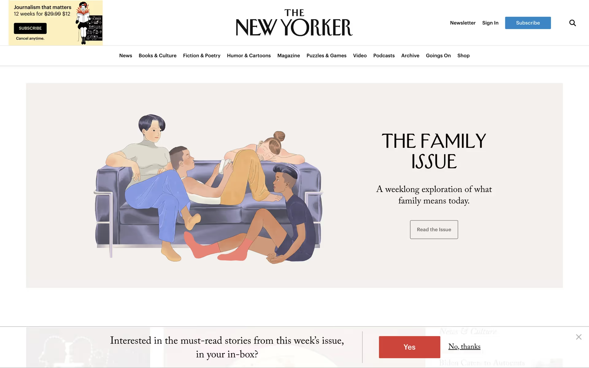
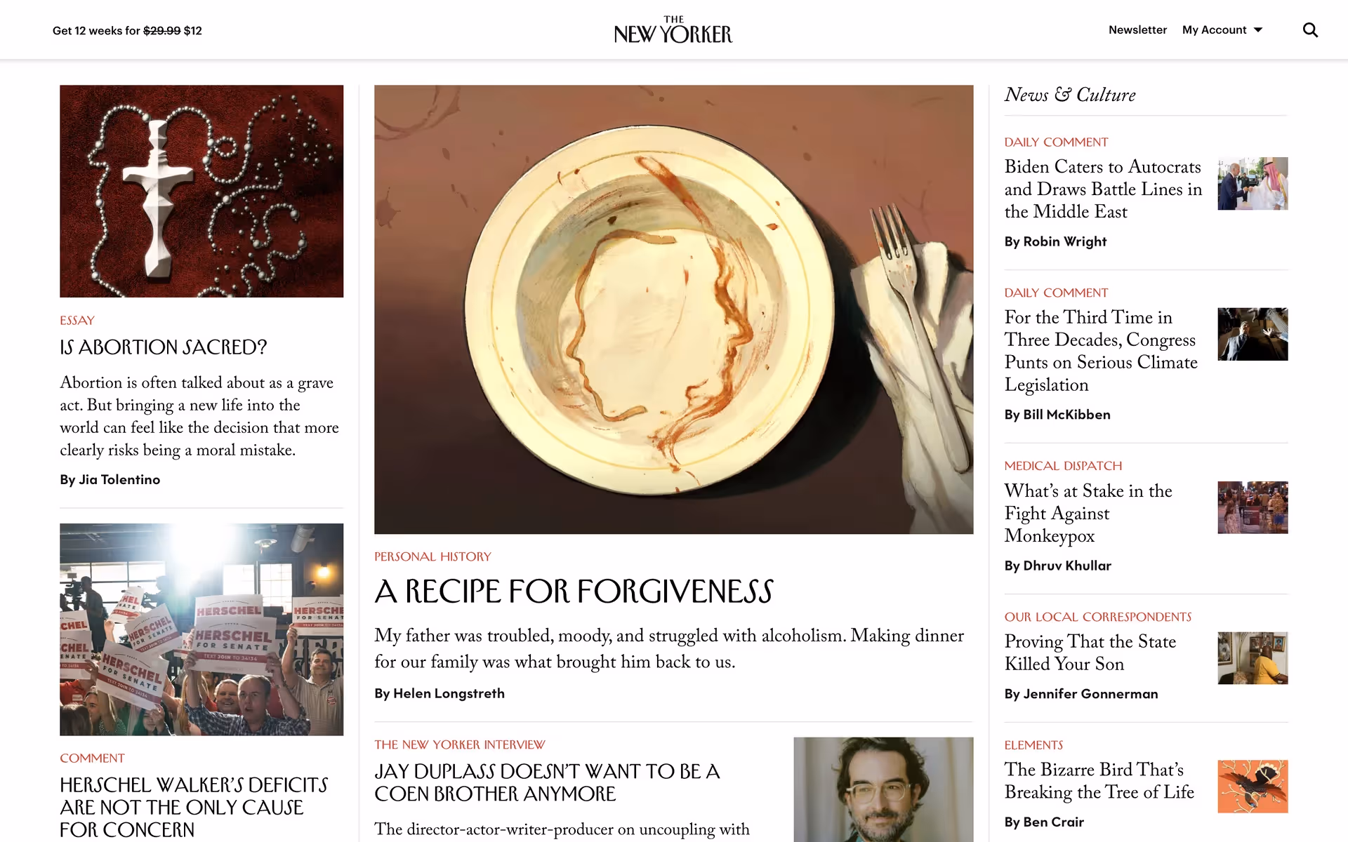
Condé Nast's The New Yorker app delivers its iconic magazine content to mobile devices. Its branding and interface feature a classic palette of blue, beige, and striking crimson. On this page, you can easily copy these colors in Hex, CMYK, RGB, and more.
The New Yorker's main color palette is a timeless combination of Lochmara blue (#0786C9), New Orleans beige (#F3D4A8), and Crimson red (#ED1C24), creating a foundation for their sophisticated and instantly recognizable brand identity.
The New Yorker's signature blue conveys intellectual depth and trustworthiness, grounding its authoritative voice. We find the complementary newsprint-inspired beige and bold crimson accent create a palette that feels both timeless and dynamically modern, offering you a masterclass in balancing brand legacy with contemporary digital design.
The New Yorker's iconic color scheme stems from its original 1925 art direction, which favored a timeless, high-contrast palette that has elegantly endured. For us, it's a masterclass in how foundational design choices can create a lasting and sophisticated brand identity.
We see how The New Yorker uses its palette to create a focused reading environment for you. The calming New Orleans background reduces strain, while strategic Lochmara and Crimson accents guide your navigation and highlight key actions, making the experience feel both classic and intuitive.
To build on The New Yorker's classic blue, we suggest exploring a deep forest green for a touch of earthy sophistication, or a warm taupe to create a modern, clean canvas that lets the primary colors shine.
On our brand colors page, you can explore curated color palettes from top companies. We also offer access to thousands of UI designs from various brands, providing endless inspiration for your next color combination from real-world examples.
Mobbin keeps you at the forefront of design with our extensive, constantly updated library of mobile and web UI/UX patterns. By exploring the latest trends in everything from color palettes to intricate user flows, you can easily see what's current and stay ahead of the curve in the ever-evolving design industry.
Try Mobbin today—you can use it for free for as long as you like, or get full access with any of our paid plans.
Use Mobbin for free as long as you like or get full access with any of our paid plans.


