
Crimson Red
Meet Crimson Red (#B20710), a color that commands attention. Its deep, saturated nature gives it a powerful visual weight, making it a standout choice for creating impactful designs. This isn't your standard red; its specific hue offers a unique intensity.
What color is Crimson Red?
Crimson Red is a deep, saturated red with a noticeable blue undertone. This hint of blue pulls it away from a pure, primary red, giving it a cooler temperature and a touch of purplish depth.
Visually, it sits on the cooler side of the red spectrum, appearing more sophisticated and less aggressive than warmer, orange-tinted reds. Its richness comes from high saturation without being overly bright, creating a strong yet composed presence.
What is the meaning of Crimson Red (#B20710) in design?
Crimson Red evokes a spectrum of intense emotions, from passion and love to power and warning. It's a color that commands attention, signifying both courage and a sense of urgency.
Historically, its deep, rich tones were associated with royalty and religious authority, symbolizing status and sacrifice. This connection gives Crimson Red a timeless quality of significance and ceremony.
How can I effectively use Crimson Red in my UI design?
Given its intensity, Crimson Red (#B20710) works exceptionally well as an accent color to guide user attention. Apply it to critical UI elements like call-to-action buttons, error messages, or notifications to create a clear visual hierarchy. For pairings, it contrasts sharply against light neutrals like off-white and soft grays for a clean, modern feel. For a more daring combination, consider a muted, deep teal as a complementary color to produce a vibrant and memorable interface.
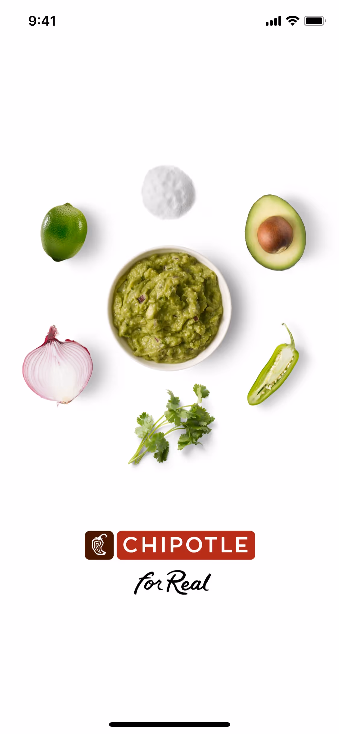
While not as widespread as other primary colors in branding, a similar bold red is famously used by companies like Netflix, Chipotle, and The Athletic. These brands use it to project a sense of energy, passion, and confidence. Choosing a distinct color like Crimson Red can help a product stand out and establish a strong, recognizable identity in a crowded market.
You can use the tools below to explore curated palettes, test color contrast for accessibility, and preview Crimson Red in real UI components from top-tier apps.
How do I use Crimson Red color codes?
Using Crimson Red in your designs starts with its hex code, #B20710. Its intensity makes it a powerful accent, perfect for drawing focus to key elements without overwhelming the composition.
While hex codes are standard for the web, you will need other formats for different applications. Digital displays rely on RGB (Red, Green, Blue) values to mix light, whereas print production requires CMYK (Cyan, Magenta, Yellow, Key) values for mixing inks.
To make things easier, we've converted #B20710 into a full range of popular formats. You can find and copy the exact codes you need for your project below.
Analogous
Analogous colors sit next to Crimson Red on the color wheel. This grouping produces a harmonious and tranquil palette for any design project.
Complementary
Complementary colors sit directly opposite each other on the color wheel. For Crimson Red, its complement creates a striking, high-contrast visual pairing.
Split Complementary
For Crimson Red, a split complementary palette uses the two colors next to its opposite on the color wheel, offering high contrast with less tension.
Triadic
Triadic color schemes use three hues equally spaced on the color wheel. For Crimson Red, this creates a vibrant, high-contrast, and balanced palette.
Tetradic
A tetradic scheme is built from two pairs of complementary colors. With Crimson Red, this creates a balanced and dynamic four-color palette.
Square
A square scheme pairs Crimson Red with three other colors, all equidistant on the color wheel, for a bold and balanced high-contrast combination.
Text Color
Background Color
Your Catchy Large Text Goes Here
Shades
Shades of Crimson Red are made by adding black, giving the color a heavier, deeper feel.
Tints
Tints of Crimson Red are lighter values made by adding white for a softer effect.
Tones
Tones of Crimson Red are created by adding gray, which softens the color's saturation.
Hues
Hues of Crimson Red vary in intensity and temperature, affecting a design's overall feel.


Never run out of inspiration again.
Use Mobbin for free as long as you like or get full access with any of our paid plans.


