#1db954
Copy
Copied

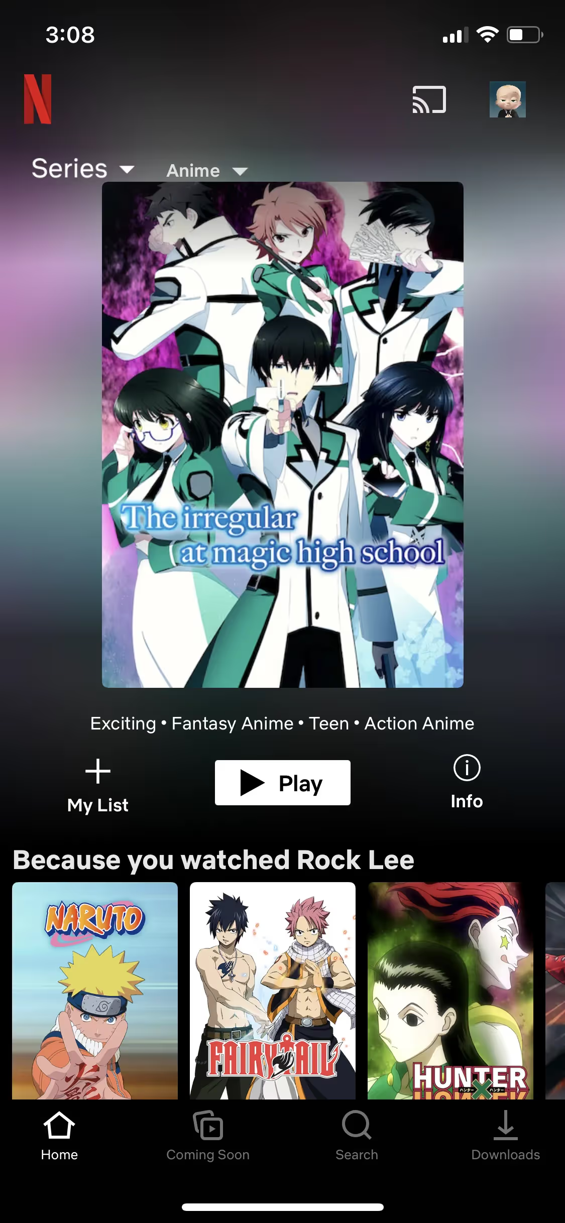
Netflix is a leading streaming service offering unlimited movies, TV shows, and more. The platform's branding prominently features Netflix Red (#E50914) and Symbol Dark Red (#B20710). You can easily copy these colors in Hex, CMYK, RGB, and other popular formats from this page.
The main colors in Netflix's color palette are Netflix Red (#E50914) and Symbol Dark Red (#B20710). These vibrant hues are integral to the brand's identity, providing a striking visual appeal that captures attention.
Netflix's primary color, #E50914, known as "Netflix Red," is a bold and vibrant hue that conveys excitement, passion, and energy. This striking red is central to Netflix's brand identity, symbolizing the dynamic and engaging nature of its content. Complementing this, the "Symbol Dark Red" (#B20710) adds depth and intensity, reinforcing the brand's commitment to delivering a rich and immersive viewing experience. Together, these colors create a powerful visual impact that resonates with Netflix's innovative and entertainment-driven ethos.
Netflix's color scheme, particularly the iconic 'Netflix Red,' was chosen to ensure instant recognition and universal identification. The emphasis on this vibrant red color helps the brand stand out and be easily identifiable, especially in the context of the 'N' Symbol.
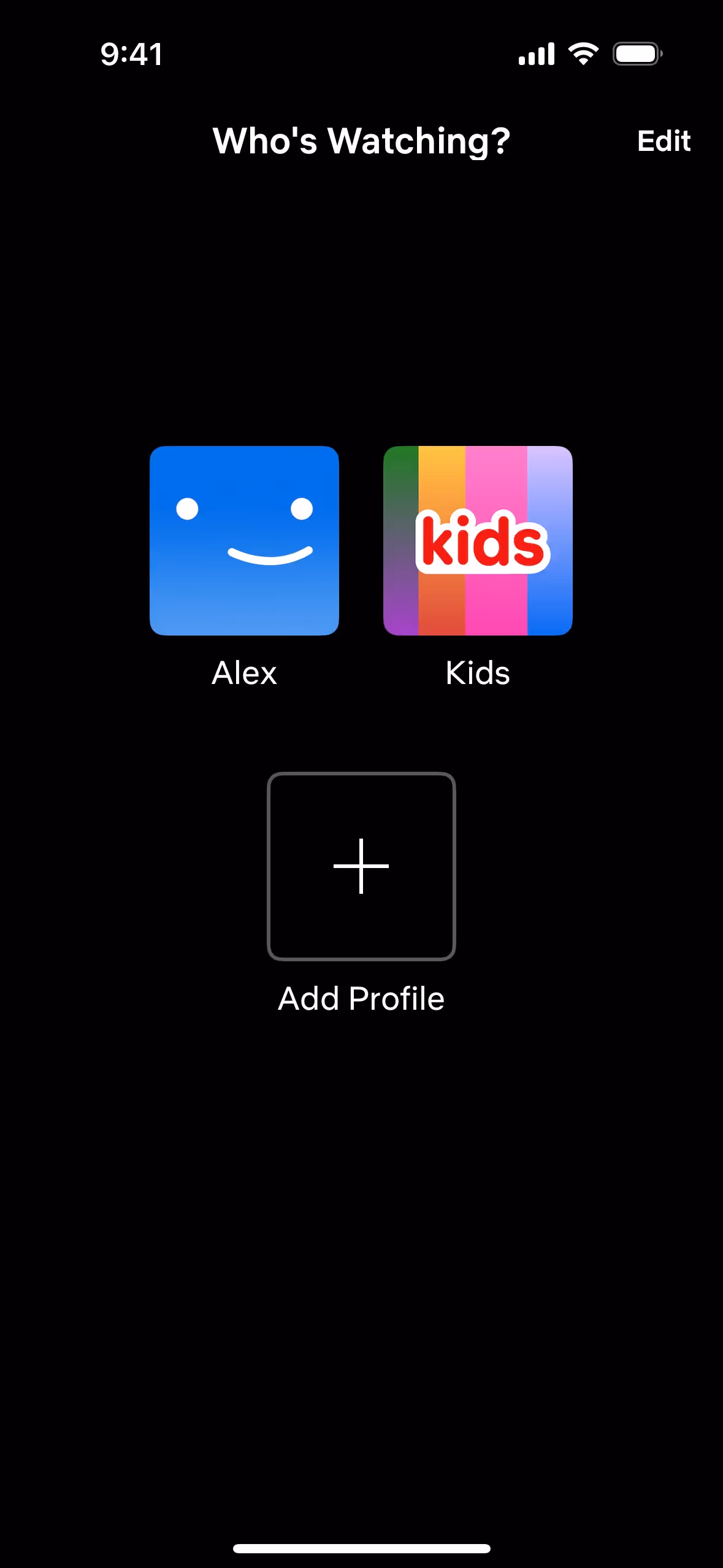
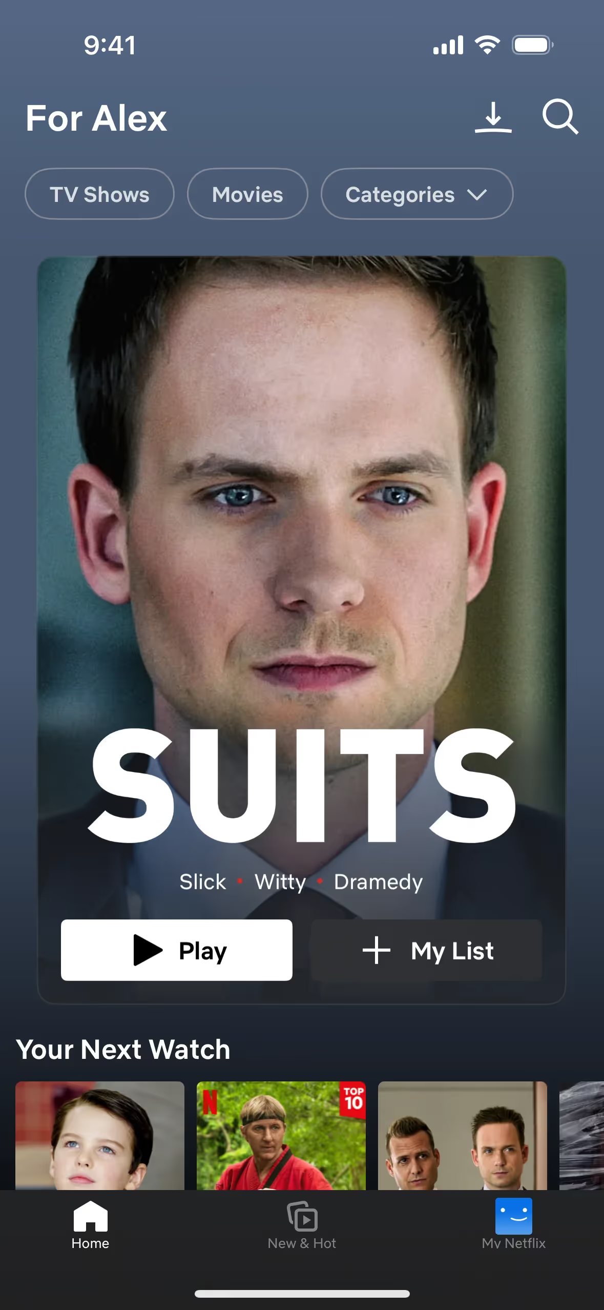
Netflix strategically uses its signature colors, Netflix Red and Symbol Dark Red, to ensure brand recognition and consistency. These vibrant reds are not only visually striking but also help guide your actions and decisions by making key elements like logos and call-to-action buttons stand out, thereby creating a cohesive and engaging user experience.
To complement Netflix's primary color (#E50914), consider using shades like charcoal gray (#333333) for a sophisticated contrast, or a vibrant teal (#008080) to create a striking balance. Additionally, a soft gold (#FFD700) can add a touch of elegance and warmth to your design palette.
On Mobbin’s brand colors page, you can explore a curated list of brand color palettes from top companies. We also offer access to thousands of other UI designs and interfaces from various brands, making it a great resource for finding new color combinations and getting inspiration from real-world examples.
Mobbin helps you stay up-to-date with the latest UI/UX trends by offering an extensive, constantly updated collection of mobile and web design patterns. From color usage to user flows, you can easily explore current design practices and stay ahead of trends in the industry.
Ready to elevate your design game? Try Mobbin today for free as long as you like, or get full access with any of our paid plans.


Use Mobbin for free as long as you like or get full access with any of our paid plans.


