
Carmine Red
Meet Carmine Red (#FF0038), a pure and intensely saturated hue that sits at the edge of the visible spectrum. Its striking character comes from its sheer vibrancy, offering a clean, powerful red that feels both modern and foundational for any designer's palette.
What color is Carmine Red?
Carmine Red is a brilliant and saturated shade of red, bordering on neon. It's an intense color that commands attention with its pure, high-chroma appearance.
With its cool, bluish undertones, Carmine Red sits closer to magenta than a fiery, orange-red. This gives it a sharp, contemporary feel, distinct from more traditional, warmer reds.
What is the meaning of Carmine Red (#FF0038)?
Historically signifying power and status, Carmine Red is a color of intense emotion. It communicates everything from passionate love to urgent danger, immediately capturing the viewer's focus.
The shade #FF0038 carries a dual meaning of romance and risk, making it a potent choice in visual language for highlighting both heartfelt connection and critical information.
What are some good examples of using Carmine Red (#FF0038) in UI design?
To make Carmine Red work in your design, use it sparingly as an accent. Its intensity is perfect for drawing attention to critical actions like buttons, notifications, or active states. For a balanced composition, pair its vibrancy with a foundation of muted neutrals—think deep grays, soft creams, or even a sophisticated navy. This contrast allows the #FF0038 to stand out without creating visual fatigue.
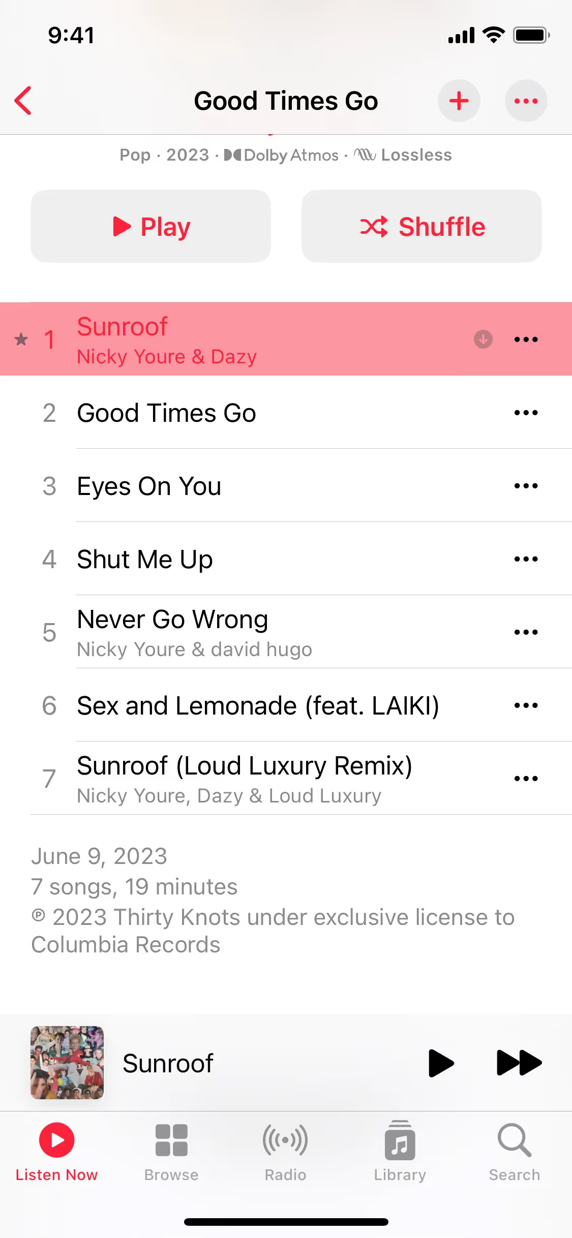
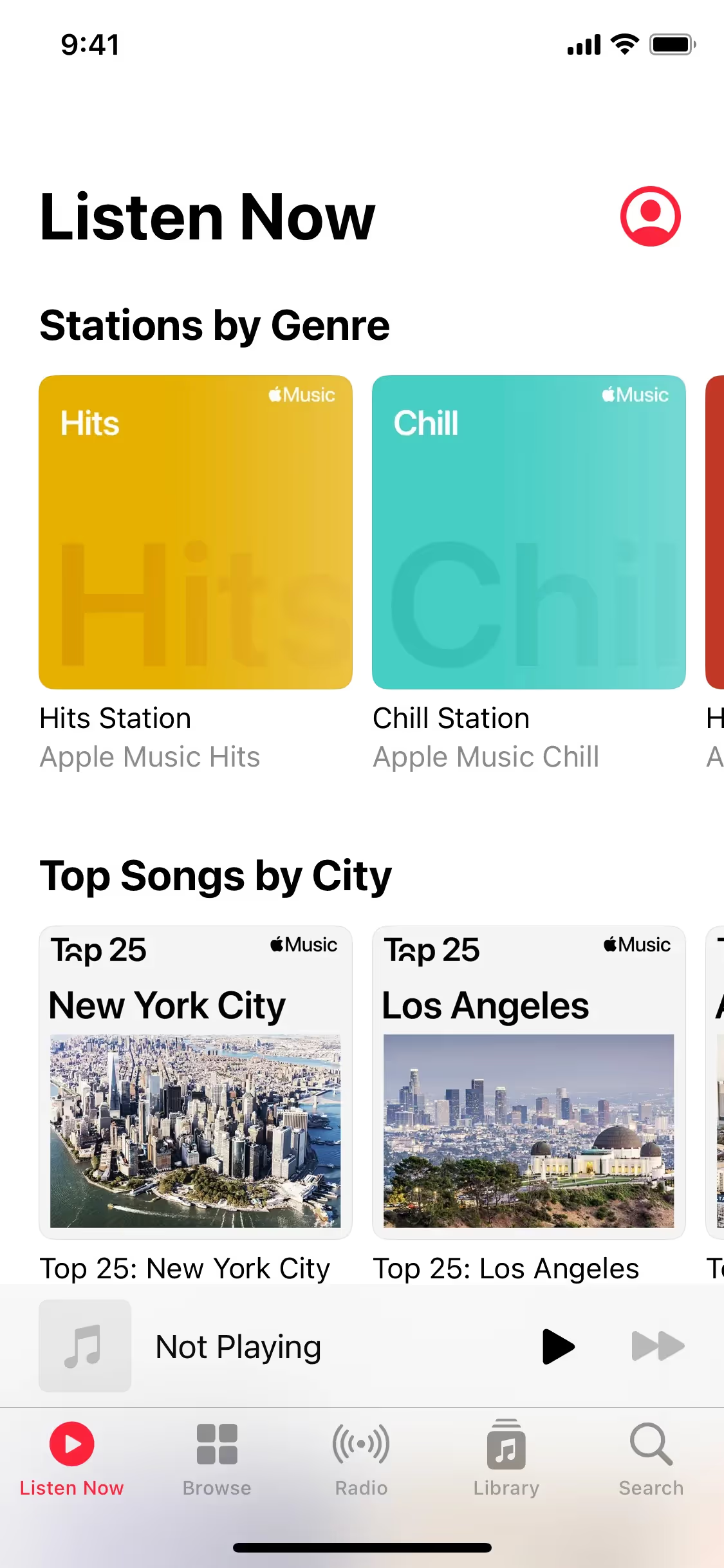
While not every brand goes for such a potent shade, several prominent apps use a similar red to their advantage. You can see it in the branding of Grubhub and Meetup, or as a key interactive color in products like Apple Music and Discord. This choice often signals energy and action, helping these brands create memorable and effective user experiences.
Ready to try it yourself? Use the tools below to browse curated palettes, test the contrast of Carmine Red for accessibility standards, and preview how #FF0038 looks within the UI components of leading apps.
How do I use Carmine Red color codes?
Using Carmine Red (#FF0038) effectively means applying it with intent. Because of its high saturation, it naturally draws the eye, making it an excellent choice for accents and critical calls-to-action where you want to direct a user’s focus.
While #FF0038 is the standard hexadecimal code for web design, you will need different codes for other applications. For digital displays, RGB values specify the exact amounts of red, green, and blue light required. For print work, CMYK values determine the precise ink mixture. Models like HSL (Hue, Saturation, Lightness) also provide a more intuitive way for designers to make adjustments.
To simplify your workflow, we have converted #FF0038 into a range of popular formats. You can copy the exact codes you need from the tables directly below.
Analogous
Analogous colors sit next to Carmine Red on the color wheel. Using them together results in a cohesive and tranquil design scheme.
Complementary
Complementary colors sit on opposite sides of the color wheel. Paired with Carmine Red, its complement offers the highest possible visual contrast.
Split Complementary
A split complementary scheme pairs Carmine Red with the two colors adjacent to its direct complement, creating strong visual contrast with more nuance.
Triadic
A triadic scheme pairs Carmine Red with two other colors from equidistant points on the color wheel, producing a bold and balanced effect.
Tetradic
A tetradic color scheme for Carmine Red uses two pairs of complementary colors, forming a rectangle on the color wheel for a vibrant palette.
Square
A square color scheme uses four colors evenly spaced on the color wheel, creating a vibrant and balanced palette with very high contrast.
Text Color
Background Color
Your Catchy Large Text Goes Here
Shades
Shades of Carmine Red are made by adding black, giving the color more depth and gravity.
Tints
Tints are lighter versions of Carmine Red, created by adding white for a softer feel.
Tones
Tones of Carmine Red are created by adding gray, resulting in softer, less saturated variations.
Hues
Hues are variations of Carmine Red, differing in temperature and intensity to evoke different feelings.


Never run out of inspiration again.
Use Mobbin for free as long as you like or get full access with any of our paid plans.


