#1db954
Copy
Copied


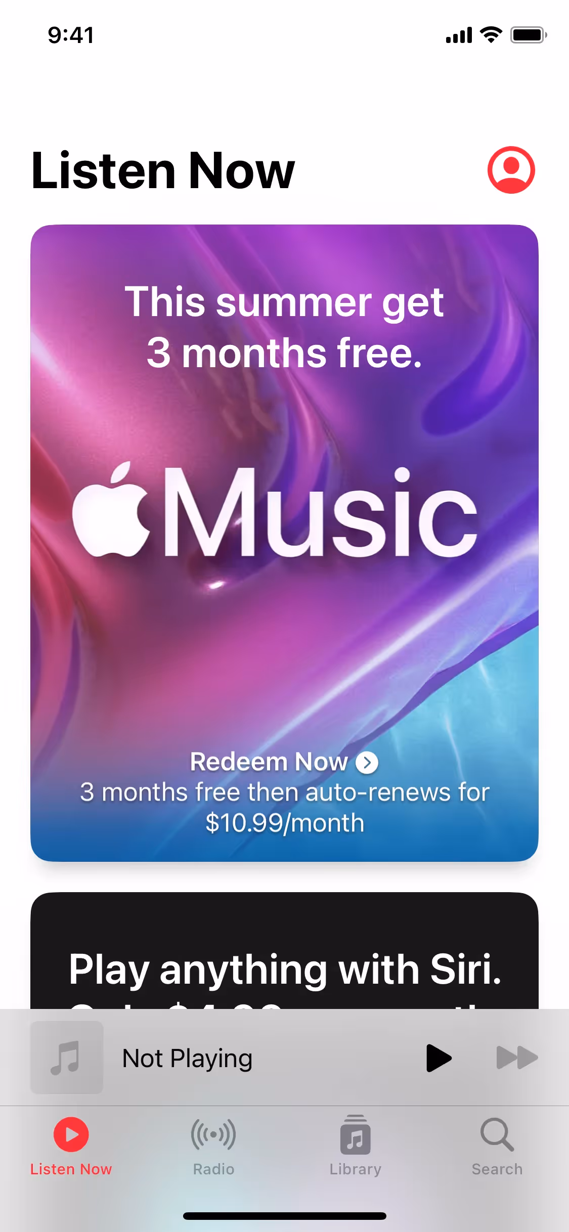
Apple Music is a leading music streaming service offering over 100 million songs ad-free. The general colors used in Apple Music's branding and interface designs include Pink (#FF4E6B), Red (#FF0436), and White (#FFFFFF). You can easily copy Apple Music's colors in Hex, CMYK, RGB, and other popular formats on this page.
The main colors in Apple Music's color palette are vibrant pink (#FF4E6B), striking red (#FF0436), and clean white (#FFFFFF). These colors create a dynamic and engaging visual experience for users.
The primary color in Apple Music's app, #FF4E6B, conveys a sense of energy and passion, aligning with the brand's vibrant and dynamic identity. This pink hue, along with the prominent red (#FF0436) and white (#FFFFFF) colors, creates a visually striking and emotionally engaging experience, enhancing the overall message of creativity and enjoyment in music.
Apple Music's color scheme has remained consistent with Apple's minimalist and sleek design philosophy, focusing on clean, modern aesthetics. While the specific influences behind the choice of colors aren't publicly detailed, the brand's visual identity aligns with Apple's broader design ethos, emphasizing simplicity and elegance to enhance user experience.
Apple Music uses color psychology in its interface designs to create a vibrant and engaging user experience. The strategic use of Pink, Red, and White guides your actions, influences your decisions, and enhances your overall interaction with the app. Pink and Red evoke excitement and passion, drawing your attention to key features and actions, while White provides a clean, balanced backdrop that ensures clarity and focus.
To complement Apple Music's primary color (#FF4E6B), consider using shades like teal (#008080) for a striking contrast, or soft lavender (#E6E6FA) for a balanced, harmonious effect. These colors can enhance your design by adding depth and visual interest.
On Mobbin’s brand colors page, you can explore a curated list of brand color palettes from top companies. We also offer access to thousands of other UI designs and interfaces from various brands, making it a great resource for finding new color combinations and getting inspiration from real-world examples.
Mobbin offers an extensive, constantly updated collection of mobile and web design patterns, showcasing the latest trends in UI/UX design, from color usage to user flows. By using Mobbin, you can easily explore current design practices and stay ahead of trends in the industry.
Ready to elevate your design game? Try Mobbin today for free as long as you like, or get full access with any of our paid plans.
Use Mobbin for free as long as you like or get full access with any of our paid plans.


