
Beige
Beige (#F5F5DC) is a study in understated elegance. Its defining quality is a soft, creamy warmth that creates a stable and sophisticated canvas. This particular shade offers a gentle luminosity, making it a compelling neutral for interfaces that require a touch of organic character.
What color is Beige?
Beige is a pale, sandy neutral, often described as a grayish-tan or a light, yellowish-brown. It's a color that suggests a natural warmth, reminiscent of unbleached wool or desert sands.
Its character is defined by its undertones, which can range from pink and yellow to cooler hints of green or gray, giving each variation of Beige a distinct temperature and feel.
What is the meaning of the color Beige in design?
Beige, or #F5F5DC, is often associated with feelings of calm, comfort, and dependability. It offers a sense of quiet relaxation and understated sophistication, providing a neutral and stable psychological foundation.
Symbolically, Beige represents simplicity, authenticity, and the raw potential of a clean slate. Its history as the color of natural, undyed fibers gives it a timeless quality, suggesting reliability and a return to fundamentals.
How to use Beige in UI design?
To make Beige (#F5F5DC) work in your design, think in terms of balance and contrast. It excels as a primary background, offering a warmer alternative to stark white. For text and key interactive elements, pair it with deep, saturated colors like charcoal, navy blue, or even a rich terracotta to ensure strong visual hierarchy and accessibility. For a more monochromatic or analogous scheme, layer it with creams, soft grays, and taupes to build a sophisticated, textured interface.
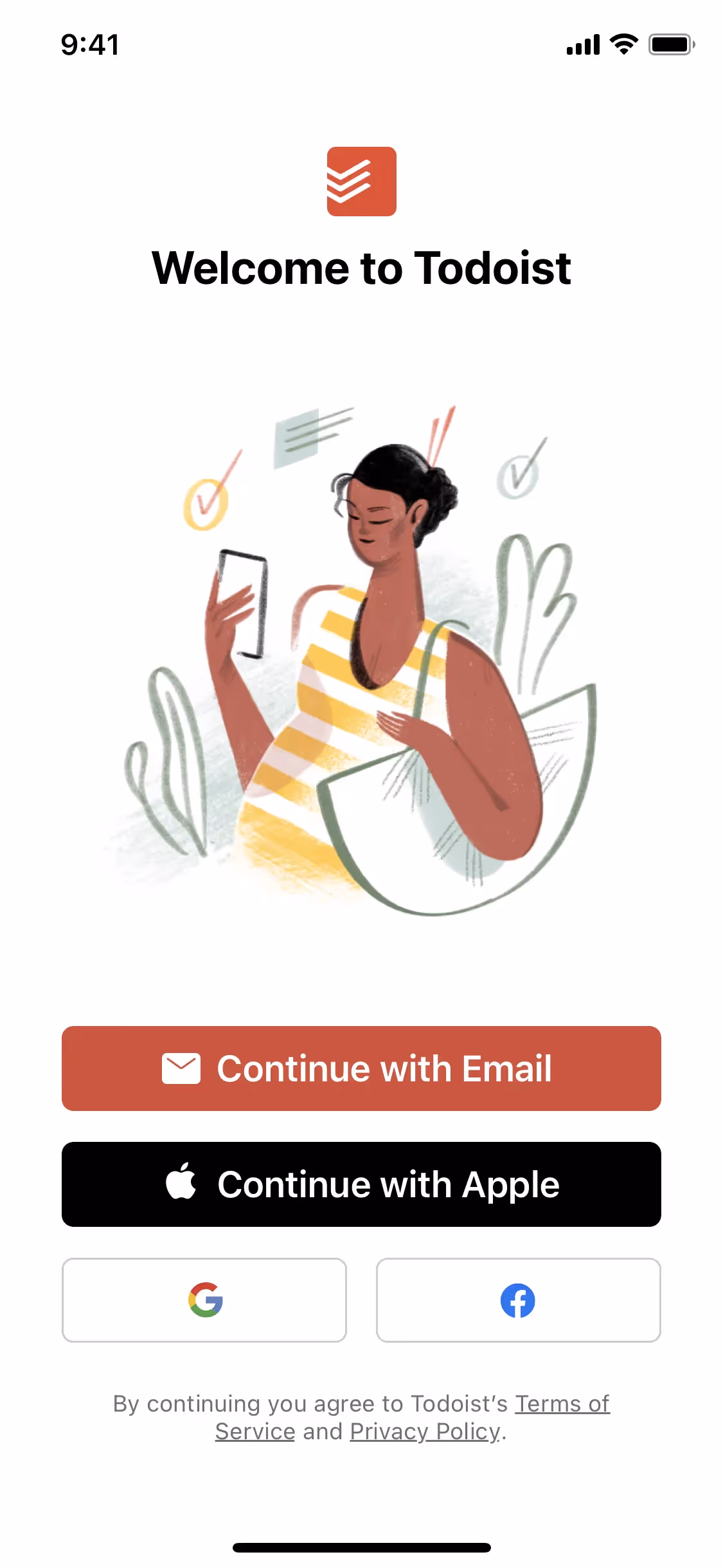
While not as ubiquitous as blue or gray, Beige is a confident choice for brands aiming for a refined and approachable aesthetic. Companies like Todoist and ExpressVPN use similar warm neutrals to create focused, uncluttered user experiences. The relative infrequency of Beige in the digital space presents an opportunity for a product to appear distinct and memorable.
Put these ideas into practice with the tools below. You can explore curated palettes, check the contrast ratios for your chosen color combinations, and see how Beige looks within the actual components of well-known apps.
Using Beige color codes
When applying Beige, with its hex code #F5F5DC, consider it a foundational neutral. It provides a warm, soft base that can ground a composition, allowing more vibrant accent colors to stand out without the harshness of a pure white background.
While #F5F5DC is standard for web development, you'll need other codes for different media. RGB (Red, Green, Blue) values define the color for digital displays by mixing light, whereas CMYK (Cyan, Magenta, Yellow, Key/Black) values are critical for physical printing, dictating ink proportions. Models like HSL (Hue, Saturation, Lightness) give you a more intuitive way to make adjustments.
To simplify your workflow, we have translated #F5F5DC into a variety of common formats. You can find and copy the exact codes you need for your project in the section below.
Analogous
Created from adjacent hues on the color wheel, analogous schemes for Beige result in a naturally harmonious and serene composition for any design.
Complementary
Complementary colors are direct opposites on the color wheel. Pairing Beige with its counterpart creates a high-contrast combination that makes designs stand out.
Split Complementary
For a more nuanced high-contrast palette, Beige's split complementary scheme pairs it with the two colors adjacent to its direct complement on the wheel.
Triadic
A triadic color scheme uses three colors equidistant on the color wheel. With Beige (#F5F5DC) as a base, this creates a vibrant, high-contrast palette.
Tetradic
A tetradic scheme for Beige involves two pairs of complementary colors, resulting in a dynamic four-color palette that offers considerable design flexibility.
Square
A square color scheme pairs Beige with three other colors, all equidistant on the color wheel, creating a vibrant and high-contrast palette.
Text Color
Background Color
Your Catchy Large Text Goes Here
Shades
Adding black to Beige creates darker shades that give a design more substance and weight.
Tints
Adding white to Beige produces tints—lighter variations that introduce a softer, more delicate feel.
Tones
Adding gray to Beige creates its tones, which offer a muted and sophisticated palette.
Hues
Beige hues are variations in temperature and intensity, subtly altering a design's mood.


Never run out of inspiration again.
Use Mobbin for free as long as you like or get full access with any of our paid plans.


