#1db954
Copy
Copied


Todoist is a versatile task management and productivity tool designed to streamline your workflow. Its branding and interface designs prominently feature the colors Zeus (#25221E), Fantasy (#FEFDFC), and Frost (#F0F6DF). You can easily copy Todoist's colors in Hex, CMYK, RGB, and other popular formats on this page.
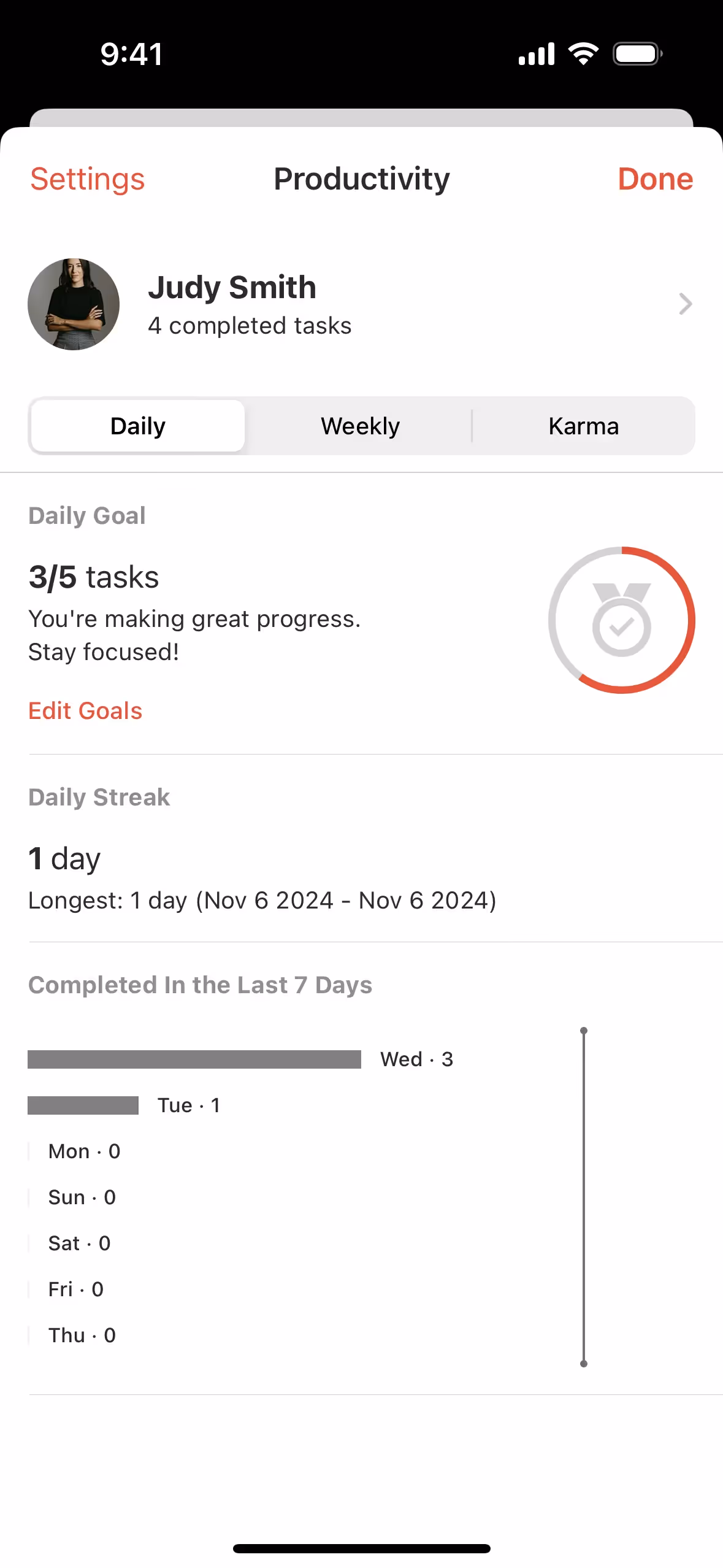
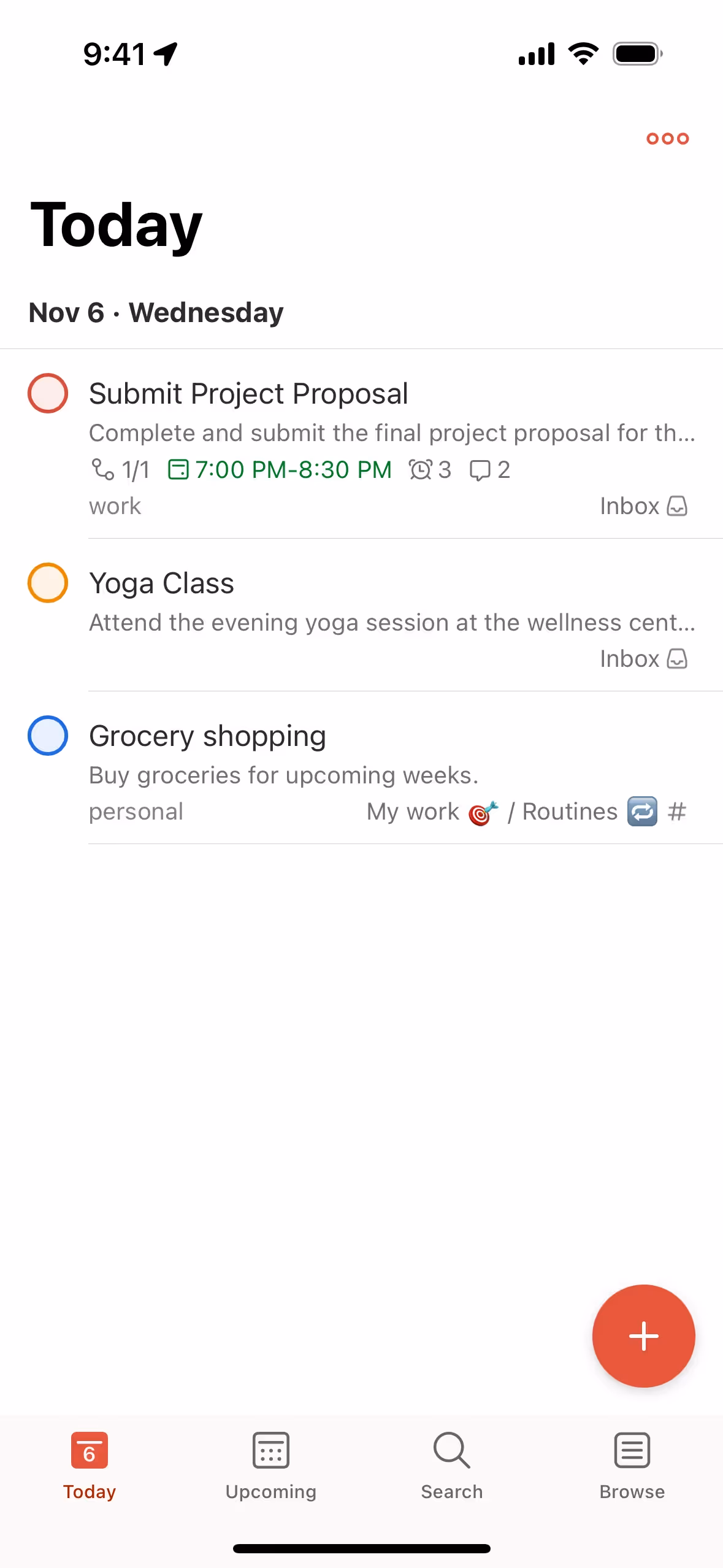
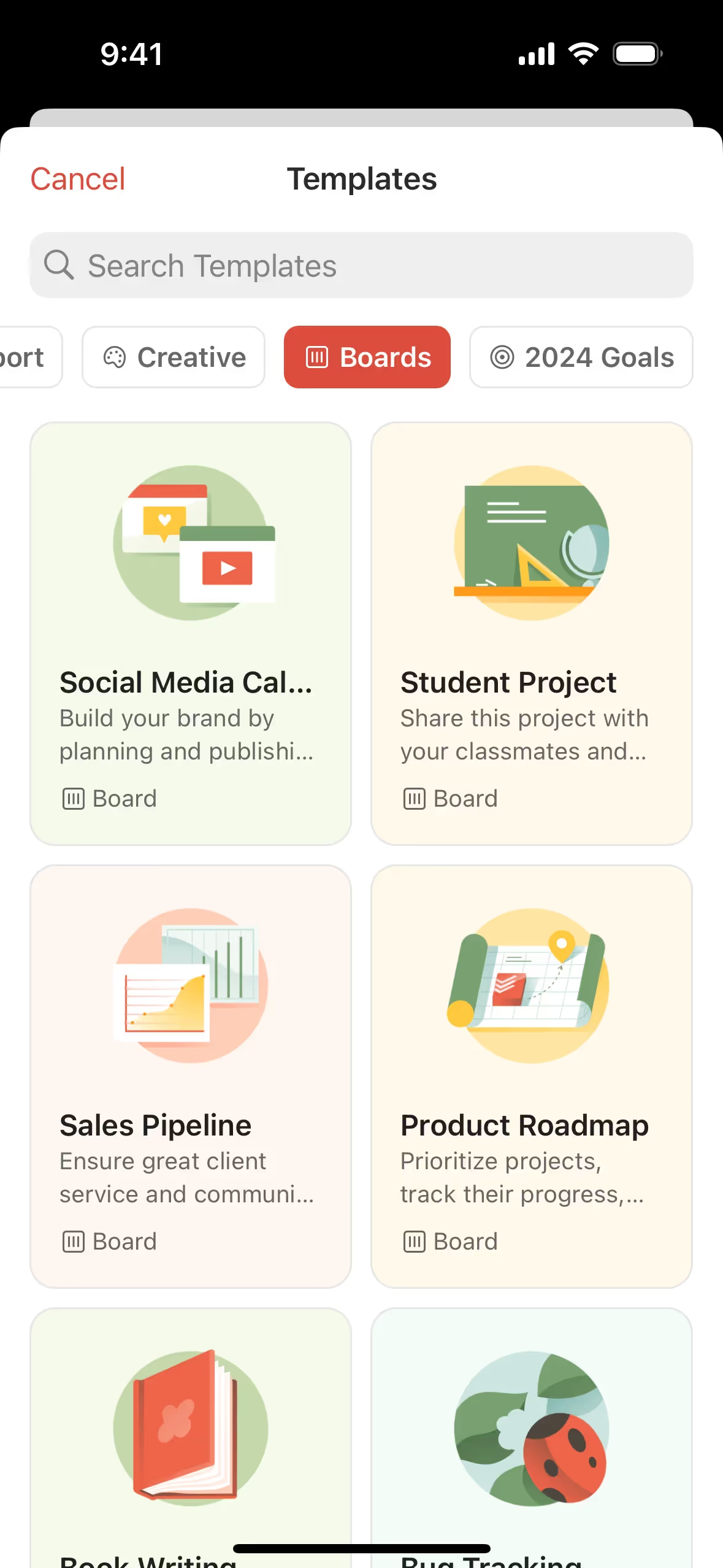
The main colors in Todoist's color palette are Zeus (#25221E), Fantasy (#FEFDFC), and Frost (#F0F6DF). These colors create a balanced and visually appealing interface, perfect for enhancing your design projects.
In Todoist's app, the primary color, Zeus (#25221E), conveys a sense of reliability and sophistication, aligning with the brand's identity of being a dependable and professional productivity tool. Complementary colors like Fantasy (#FEFDFC) and Frost (#F0F6DF) enhance this message by adding a touch of clarity and calmness, making the user experience both intuitive and visually appealing.
Todoist's color scheme, featuring a primary vibrant red, was chosen to evoke energy and urgency, aligning with the app's focus on productivity and task management. The minimalist design, complemented by white backgrounds and dark gray text, ensures clarity and ease of use across all platforms.
Todoist uses color psychology to create a balanced and intuitive interface. The dark hue of Zeus (#25221E) is employed for text and headers, ensuring readability and focus. Fantasy (#FEFDFC) serves as a warm, neutral background, reducing eye strain and providing a clean canvas. Frost (#F0F6DF) is used for subtle highlights and inactive states, fostering a calm and organized user experience. These strategic color choices guide your actions, influence decisions, and enhance overall productivity.
To complement Todoist's primary color (#25221E), consider using shades like #FF6F61 (Coral) for a vibrant contrast, #A9A9A9 (Dark Gray) for a balanced neutral, or #FFD700 (Gold) to add a touch of warmth and sophistication. These colors can enhance the brand's visual appeal and create a more dynamic user experience.
On Mobbin’s brand colors page, you can explore a curated list of brand color palettes from top companies. We also offer access to thousands of other UI designs and interfaces from various brands, making it a great resource for finding new color combinations and getting inspiration from real-world examples.
Mobbin helps you stay up-to-date with the latest UI/UX trends by offering an extensive, constantly updated collection of mobile and web design patterns. From color usage to user flows, you can easily explore current design practices and stay ahead of industry trends.
Ready to elevate your design game? Try Mobbin today for free as long as you like, or get full access with any of our paid plans.


Use Mobbin for free as long as you like or get full access with any of our paid plans.


