
Very Peri
Meet Very Peri, #796EFF. This captivating periwinkle blue possesses a distinct violet-red undertone, creating a novel perspective on the blue family. Its unique fusion of warmth and coolness gives it a striking presence that immediately draws the eye, offering fresh possibilities for your design palette.
What color is Very Peri?
Very Peri is a dynamic periwinkle blue with a noticeable violet-red undertone.
This gives the typically cool blue a surprising warmth, creating a complex and novel shade that straddles the line between blue and purple.
What is the meaning behind the color Very Peri (#796EFF)?
Very Peri embodies a spritely, joyous attitude and a creative spirit. It encourages personal inventiveness and imagination by blending the tranquility of blue with the vibrant energy of red.
Symbolizing the transformative times we live in, this color represents the merging of our physical and digital lives and a courageous look toward the future.
How can I use Very Peri in my UI design?
Very Peri works well as an accent color to draw attention to key elements like buttons or icons. For a balanced interface, consider the 60-30-10 rule, pairing it with neutral grays and whites. For a more striking combination, try contrasting it with warm yellows or soft corals.
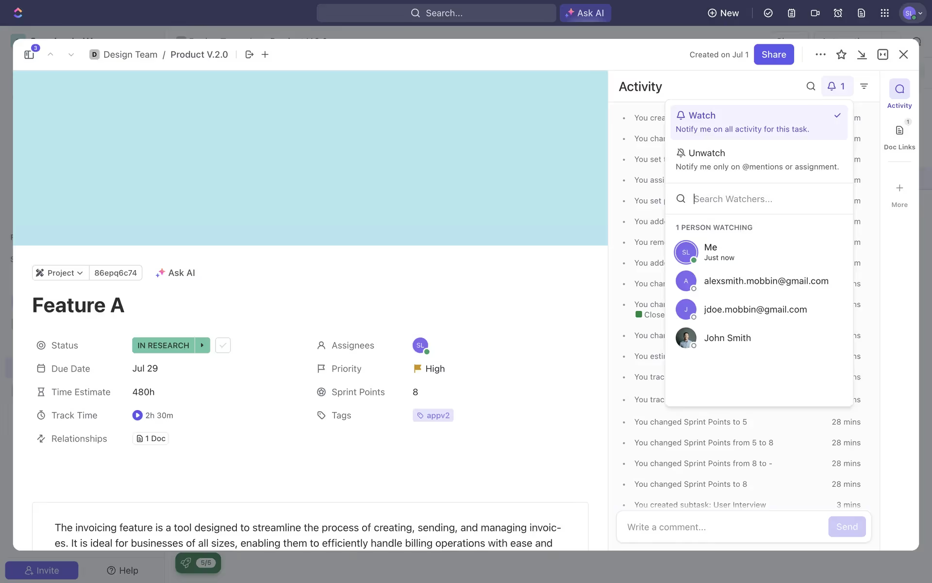
While not a dominant color in branding, shades similar to Very Peri are used by productivity apps like ClickUp, June, and Asana. This suggests its potential to make a product feel fresh and creative, helping it stand out in a crowded market.
Use the tools below to explore curated palettes, test the accessibility of your color combinations, and preview Very Peri in the UI components of top brands.
Using Very Peri color codes
To apply Very Peri in your designs, you can start with its hex code, #796EFF. This six-digit code is a web-standard representation of the color, perfect for quick application in CSS or design software.
Different projects require different color models. For digital screens, you'll need the RGB (Red, Green, Blue) values, which define color through light. For printed materials, the CMYK (Cyan, Magenta, Yellow, Key/Black) values are necessary as they correspond to ink colors. Each format communicates color information for a specific medium.
To help you get started, we've converted #796EFF into a range of popular formats. You can find and copy the exact codes you need for your project below.
Analogous
Analogous colors are neighbors on the color wheel. For Very Peri, these adjacent hues create a harmonious and tranquil palette, perfect for serene designs.
Complementary
Complementary colors are opposites on the color wheel. When paired with Very Peri, they create a dynamic tension that makes both colors pop.
Split Complementary
For a high-contrast yet balanced palette, Very Peri's split complementary scheme pairs it with the two colors adjacent to its direct opposite.
Triadic
To create a triadic palette, select two other colors equally distant from Very Peri on the color wheel for a vibrant, yet harmonious, combination.
Tetradic
Tetradic schemes pair Very Peri with three other colors, forming two complementary pairs on the color wheel for a rich, balanced palette.
Square
A square scheme pairs Very Peri with three other colors, all equidistant on the color wheel, creating a balanced yet highly contrasting palette.
Text Color
Background Color
Your Catchy Large Text Goes Here
Shades
Adding black to Very Peri creates its shades, which introduce a sense of depth and weight.
Tints
Tints are created by adding white to Very Peri, resulting in softer, lighter variations.
Tones
Tones are created by adding gray to Very Peri, resulting in a softer, more muted appearance.
Hues
Hues are variations of Very Peri, differing in intensity or temperature to create distinct moods.


Never run out of inspiration again.
Use Mobbin for free as long as you like or get full access with any of our paid plans.


