#1db954
Copy
Copied


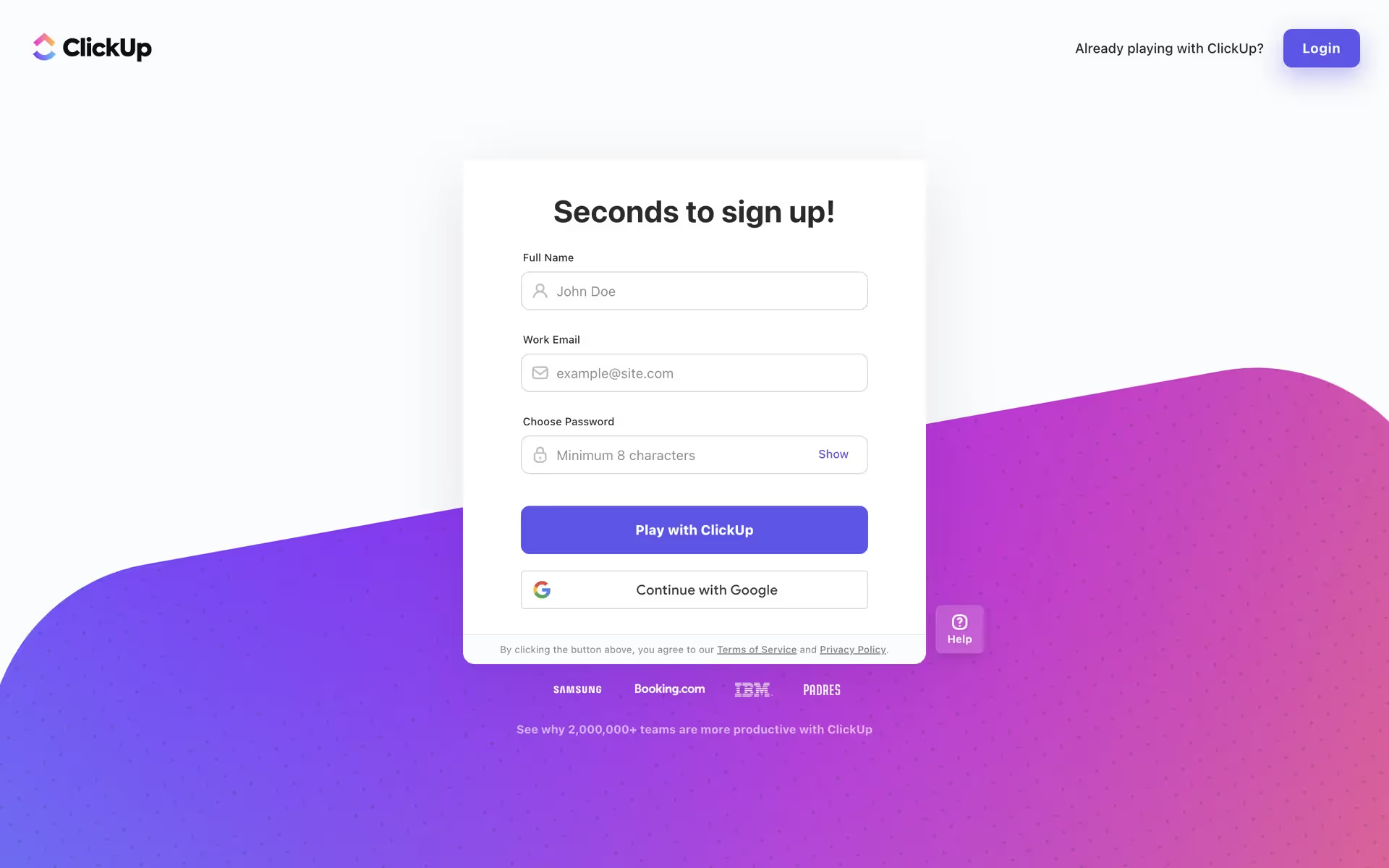
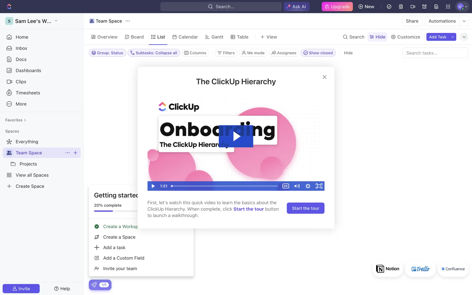
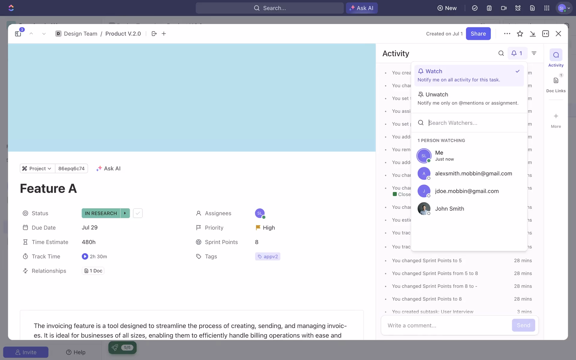
ClickUp is a popular all-in-one productivity app for managing tasks and projects. Its branding and interface feature a vibrant mix of purples, pinks, blues, and yellows. You can easily copy these colors in Hex, CMYK, RGB, and other popular formats here.
ClickUp's main color palette gives you a versatile range to work with, combining core colors like Shark (#292D34), White (#FFFFFF), and Cornflower Blue (#7B68EE) with vibrant accents such as Hot Pink (#FD71AF), Malibu (#49CCF9), and Supernova (#FFC800).
The deep charcoal, or Shark, grounds your experience in professionalism and stability, creating a reliable foundation for productivity. We see the vibrant pops of color—from Cornflower Blue to Hot Pink—as reflections of the creative energy and versatility ClickUp brings to managing every unique workflow you can imagine.
ClickUp's dynamic color system is deeply tied to its identity as a flexible, all-in-one platform, designed to help you organize a complex world of work with clarity and energy.
In our analysis, we see ClickUp masterfully uses its vibrant palette to create clarity; Cornflower Blue guides you toward primary actions, while the brighter accents help you instantly differentiate statuses and priorities against the clean, neutral backdrops.
To build on ClickUp's dark charcoal base, we suggest exploring a deep emerald green for a touch of sophisticated energy, or a warm terracotta to introduce an earthy, grounding element to the palette. These choices can help you create a more nuanced and versatile visual identity beyond the existing vibrant accents.
On our brand colors page, you can explore curated color palettes from top companies. We also offer access to thousands of UI designs from various brands, providing endless inspiration for your next color combination.
Our platform offers an extensive, constantly updated library of mobile and web design patterns, so you can see exactly how the best apps are handling everything from color usage to user flows. By exploring Mobbin, you can easily keep up with current design practices and stay ahead of the latest industry trends.
Try Mobbin today for free for as long as you like, or get full access with any of our paid plans.
Use Mobbin for free as long as you like or get full access with any of our paid plans.


