
Terrace White
Meet Terrace White (#D7DAD8), a soft off-white that stands out with its subtle gray and green undertones. This unique complexity gives it a quiet strength, making it a versatile yet distinctive choice for any design palette and a fresh alternative to stark whites.
What color is Terrace White?
Terrace White is a delicate off-white with a distinct grayish cast, presenting as a soft, light gray that feels both airy and grounded.
Its cool temperature comes from subtle green and blue undertones, giving #D7DAD8 a crisp, almost silvery quality that sets it apart from warmer, creamier whites.
What is the meaning of the color Terrace White (#D7DAD8) in design?
Terrace White evokes a sense of calm and stability, much like a quiet stone patio. In color psychology, this gentle off-white suggests tranquility and balance, offering a softer, more approachable alternative to stark white.
It symbolizes a clean slate and clarity of thought, providing a solid foundation for creative expression. The color represents a sophisticated neutrality, blending natural elegance with structured order.
How can I use Terrace White in my UI design?
In UI design, Terrace White (#D7DAD8) serves as a sophisticated alternative to pure white for backgrounds, creating a softer, more calming interface. Pair it with dark, rich colors for crisp contrast and readability, or combine it with other muted tones for a subtle, harmonious palette. It's particularly effective for spacious layouts that need a touch of warmth.
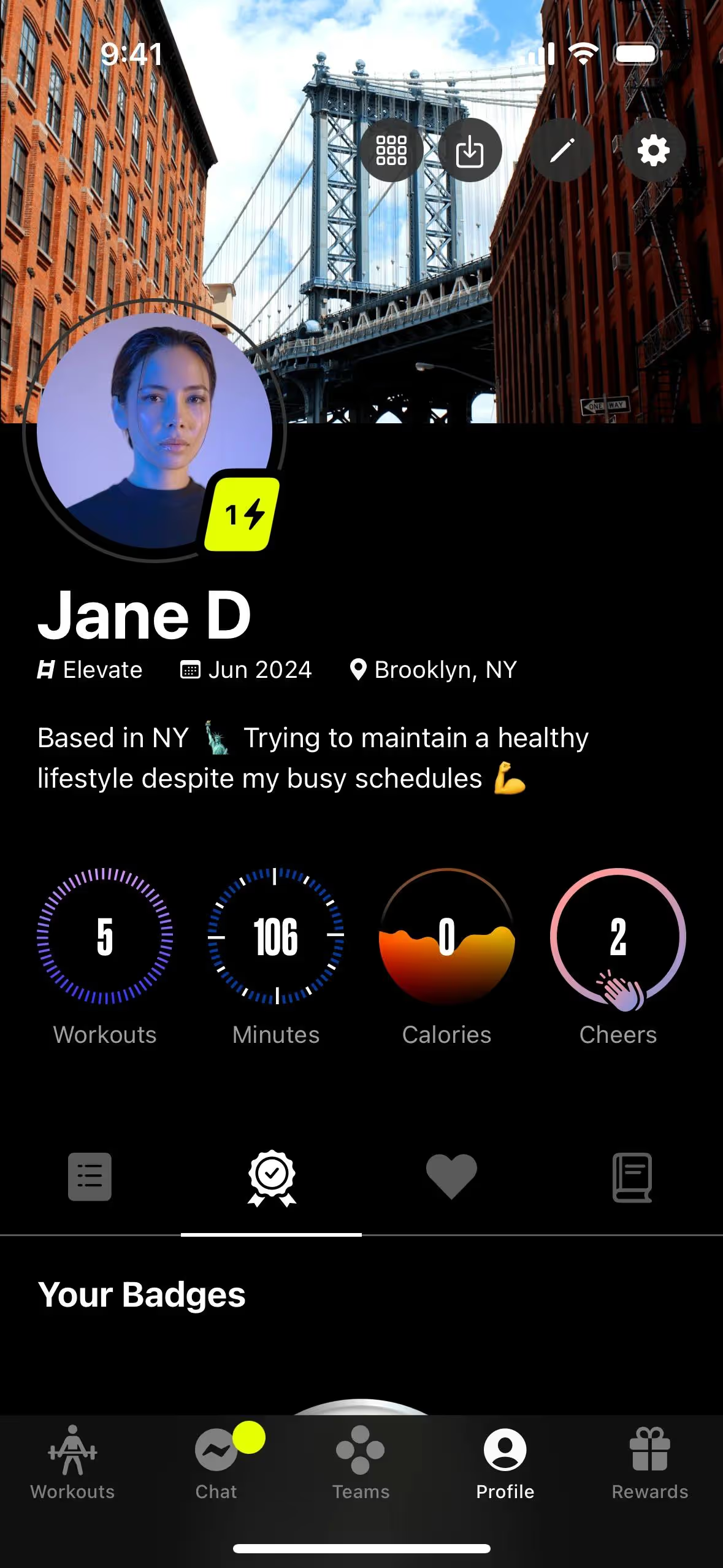
This approach is seen in apps from brands like Nike, Ladder, Fitbit, and Peloton, which use similar light grays to achieve a clean, focused, and premium feel. The color helps their content and photography stand out without the harshness of a #FFFFFF background.
Explore how Terrace White can fit into your own work with the tools below. You can find curated palettes, test color contrast for accessibility, and preview #D7DAD8 in real UI components from leading brands.
Using Terrace White color codes
When working with Terrace White, the hex code #D7DAD8 is your starting point for any digital application. However, translating this color for different mediums or software requires converting it into other formats.
Each color code serves a specific purpose. RGB values, for instance, are fundamental for digital displays that mix red, green, and blue light. For print work, you'll need the CMYK values, which correspond to the ink colors used in printing. Other models like HSL (Hue, Saturation, Lightness) offer a more intuitive way to adjust and perceive color.
To help you apply Terrace White across your projects, we've converted #D7DAD8 into a range of popular color models. You can find and copy the exact codes you need below.
Analogous
Analogous colors sit side-by-side on the color wheel. With Terrace White as a base, this combination produces a calm and cohesive visual experience.
Complementary
Complementary colors are found opposite each other on the color wheel. Paired with Terrace White, they make for a vibrant, high-contrast combination.
Split Complementary
A split complementary palette for Terrace White uses the two colors adjacent to its direct complement, creating a vibrant yet balanced combination.
Triadic
Triadic palettes combine three colors from equidistant points on the color wheel. With Terrace White, this approach yields a vibrant and balanced composition.
Tetradic
A tetradic scheme pairs Terrace White with three other colors, forming two complementary pairs in a rectangular shape on the color wheel.
Square
A variation of the tetradic scheme, a square color palette uses four evenly spaced colors for a vibrant, high-contrast combination with Terrace White.
Text Color
Background Color
Your Catchy Large Text Goes Here
Shades
Adding black to Terrace White creates its shades, which introduce more depth and visual weight.
Tints
Tints of Terrace White are lighter variations made by adding white for a softer quality.
Tones
Tones of Terrace White are created by adding gray, which softens the color’s saturation.
Hues
Hues are variations of Terrace White, differing in intensity or temperature to create distinct moods.


Never run out of inspiration again.
Use Mobbin for free as long as you like or get full access with any of our paid plans.


