#1db954
Copy
Copied

Ladder Technologies, Inc. offers the Ladder app for structured, coach-led strength training. Its branding uses Cod Gray, Mercury, and a vibrant Chartreuse Yellow in its interface designs. Here on our platform, you can easily copy these colors in Hex, CMYK, and RGB formats.
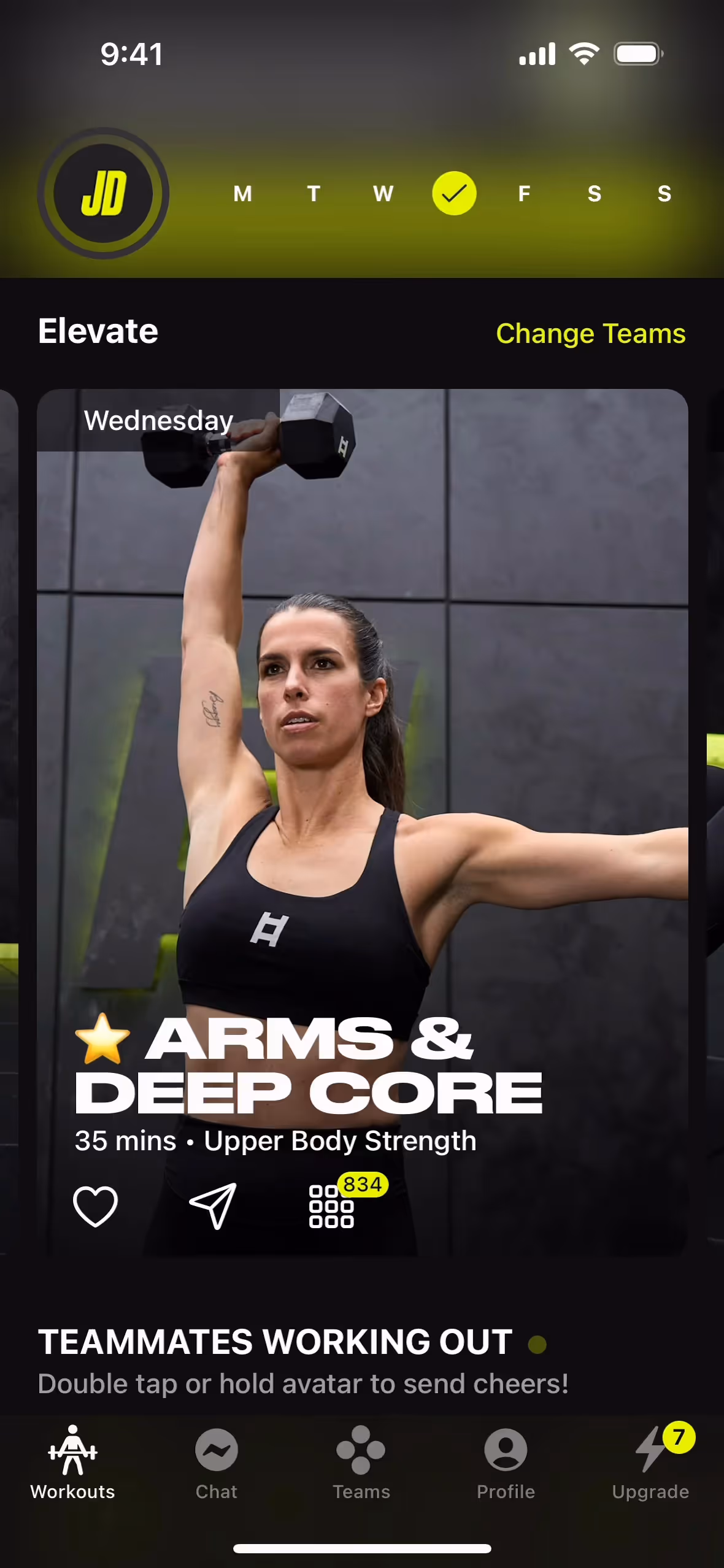
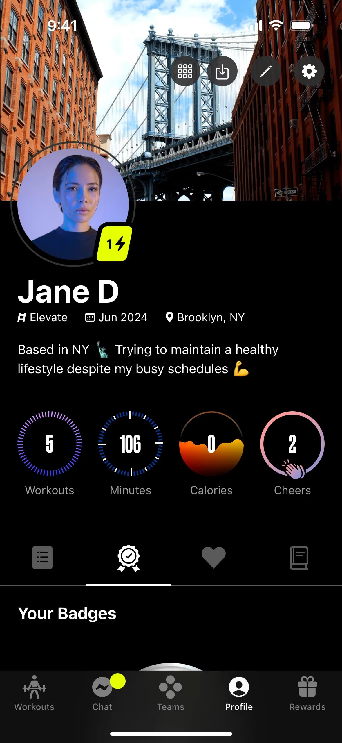
We've found that Ladder's core color palette revolves around three key colors: Cod Gray (#0E0E0E), Mercury (#E1E1E1), and a vibrant Chartreuse Yellow (#E5FF00).
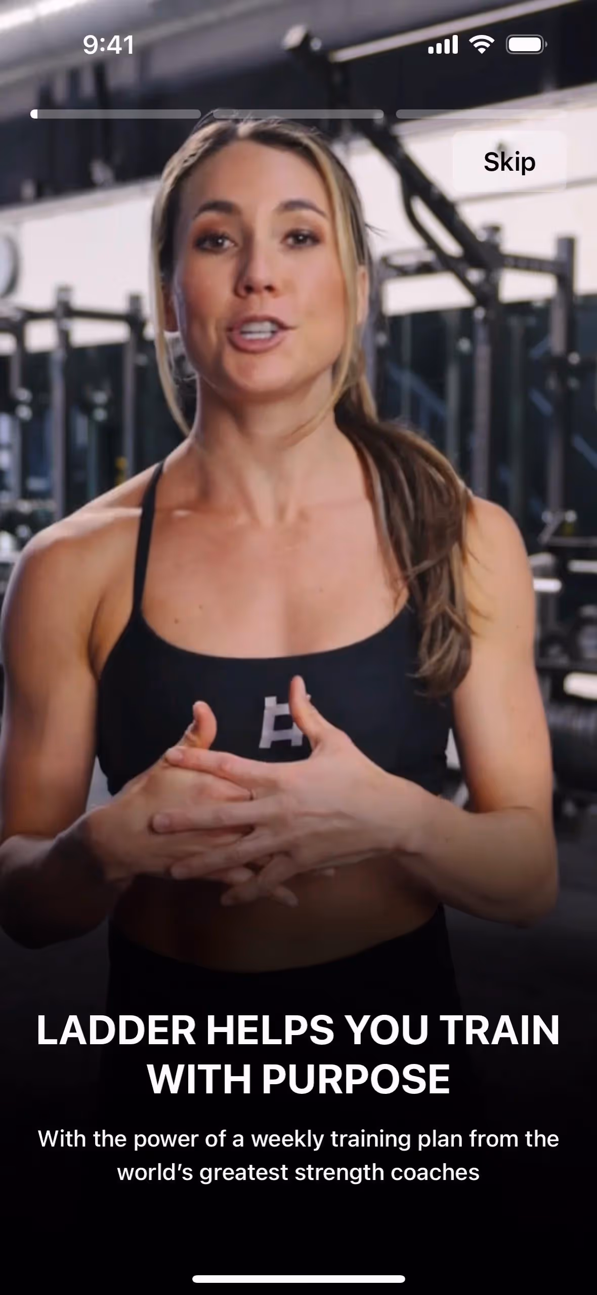
Ladder's foundational dark gray (#0E0E0E) evokes a sense of strength and focus, creating a serious yet motivating canvas for your fitness goals. The vibrant Chartreuse Yellow (#E5FF00) then acts as a powerful accent, representing the energy, action, and achievement you'll find within the app.
Ladder's color palette is a direct reflection of its brand ethos, combining modern energy with a sharp focus on strength. The scheme is crafted to provide a motivational, distraction-free environment for your workouts.
While Ladder hasn't publicly detailed the specific psychology behind its color choices, we observe that the high-contrast palette is used to create a focused, energetic user experience. The vibrant Chartreuse Yellow acts as a powerful accent against the neutral Cod Gray and Mercury, effectively drawing your eye to key actions and motivating progress.
We suggest pairing Ladder's primary black with rich jewel tones like sapphire blue for a sophisticated feel, or with earthy terracottas to introduce warmth and striking contrast.
On our brand colors page, you can explore curated color palettes from top companies. We also offer thousands of UI designs from various brands, providing endless inspiration for new color combinations from real-world examples.
Our extensive library of mobile and web design patterns is constantly updated, giving you a real-time look at the latest UI/UX trends—from innovative color palettes to seamless user flows. By exploring our curated collection, you can easily see what leading apps are doing and stay ahead of the curve in the ever-evolving design industry.
Why not try Mobbin today? You can use it for free for as long as you like, or get full access with any of our paid plans.

Use Mobbin for free as long as you like or get full access with any of our paid plans.


