
Sap Green
Meet Sap Green (#418A2F), a color balancing vibrancy with a natural, earthy feel. Its rich, leafy quality offers a distinct character, making it a compelling choice for interfaces that need a touch of organic yet modern energy.
What color is Sap Green?
Sap Green is a warm, earthy green with distinct yellow undertones. It brings to mind the fresh, vibrant color of new leaves in spring, sitting comfortably between a true green and a chartreuse.
This tertiary color has a moderate saturation and brightness, giving it a natural and grounded appearance without being dull. Its inherent warmth makes it feel organic and lively.
What is the meaning of the color Sap Green (#418A2F)?
Sap Green embodies the essence of growth, renewal, and vitality. Its connection to the natural world evokes feelings of balance and harmony, making it a symbol of fresh starts and environmental consciousness.
Historically derived from unripe buckthorn berries, the color carries an organic, earthy legacy, suggesting authenticity and a connection to traditional craftsmanship.
How can I use Sap Green (#418A2F) in my UI design?
To make Sap Green (#418A2F) stand out, pair it with soft neutrals like cream, beige, or light gray. This creates a balanced, organic look perfect for accents like buttons or icons. For a more dynamic palette, introduce a complementary muted orange or a deep navy to establish strong visual contrast and guide the user's eye.
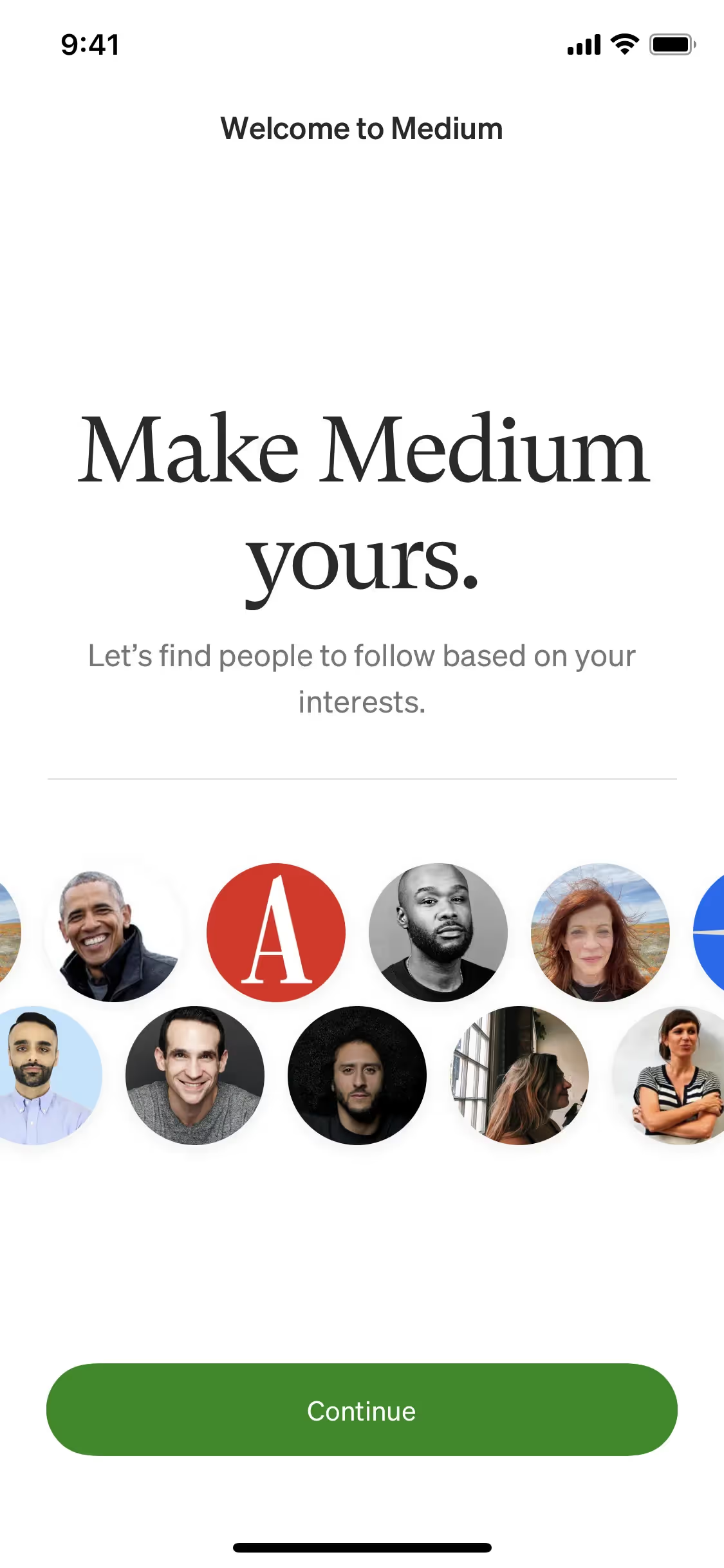
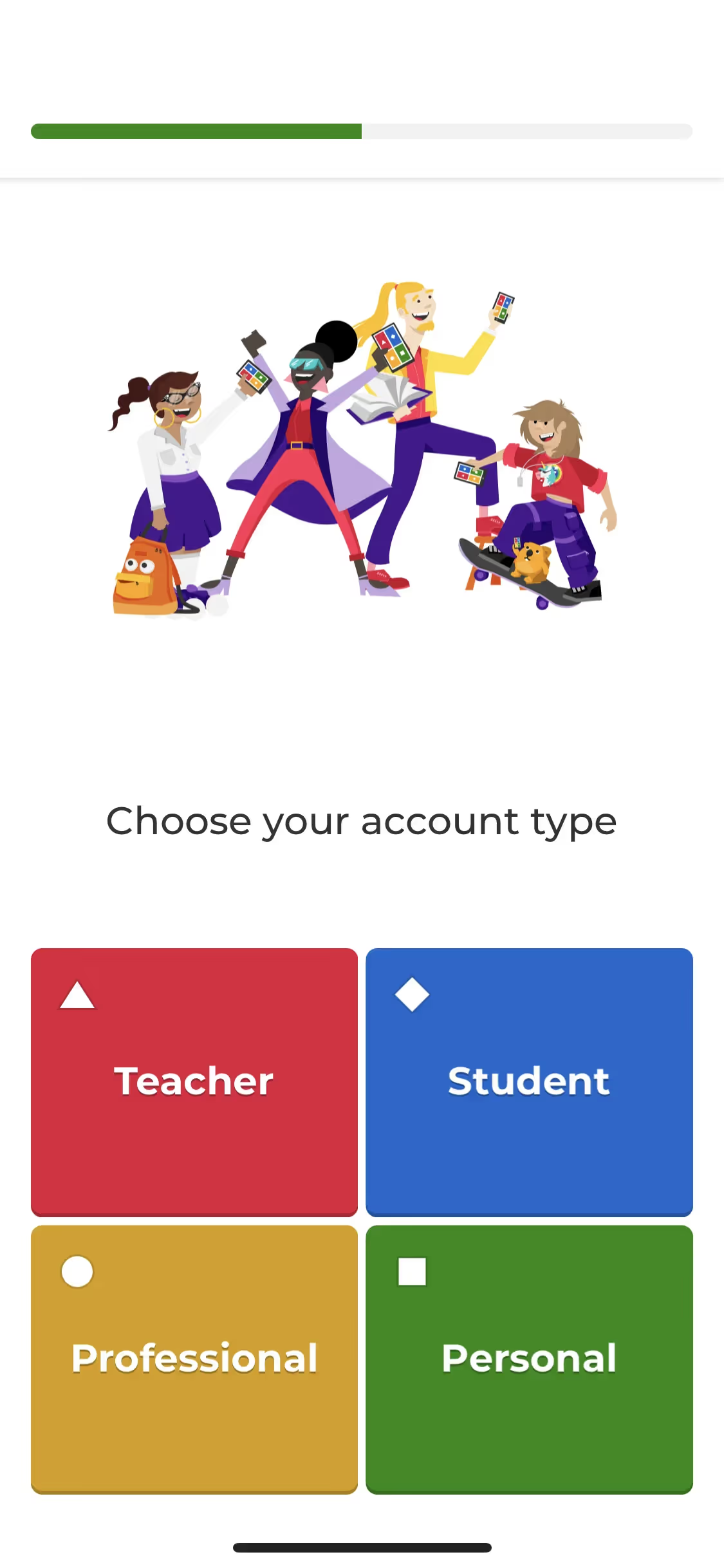
While you won't find Sap Green splashed across every major app, its rarity is its strength. It offers a chance to build a distinct visual identity. Brands like Medium, Kahoot!, and Pi have successfully used similar greens to appear fresh and engaging, but the earthy quality of Sap Green provides a more mature and trustworthy feel.
Get a feel for Sap Green in a practical setting. Use the tools below to browse curated color palettes, check your combinations for accessibility contrast, and see how #418A2F looks in real UI components from well-known apps.
How do I use the Sap Green color codes?
To use Sap Green in your projects, start with its hex code, #418A2F. This six-digit code is the standard for color on the web, ensuring consistency across different browsers and devices.
Depending on your medium, you may need to translate #418A2F into other formats. RGB (Red, Green, Blue) is essential for any on-screen application, as it dictates how pixels are lit. For print materials, you'll convert to CMYK (Cyan, Magenta, Yellow, Key/Black) to specify ink mixtures. Other models like HSL (Hue, Saturation, Lightness) offer a more intuitive way to make adjustments.
We've converted #418A2F into a full spectrum of color codes for your convenience. Feel free to copy the exact values you need from the list below.
Analogous
Analogous colors are neighbors on the color wheel. For Sap Green, these adjacent hues create a harmonious and naturally serene visual palette.
Complementary
Complementary colors are opposites on the color wheel. When paired with Sap Green, they create a high-contrast, vibrant visual effect.
Split Complementary
For a nuanced palette, Sap Green's split complementary scheme uses the two colors neighboring its direct complement, creating high contrast with less tension.
Triadic
Triadic palettes pair Sap Green with two additional hues from equidistant points on the color wheel, creating a balanced yet visually striking combination.
Tetradic
A tetradic palette for Sap Green is built from two pairs of complementary colors, creating a rich, four-color combination with plenty of visual tension.
Square
A square color scheme uses four colors evenly spaced on the color wheel. With Sap Green, this creates a vibrant, high-contrast palette.
Text Color
Background Color
Your Catchy Large Text Goes Here
Shades
By adding black to Sap Green, you create shades that add depth and substance.
Tints
Tints of Sap Green are created by mixing in white, resulting in lighter, softer variations.
Tones
Tones of Sap Green are created by adding gray, resulting in softer, less saturated versions.
Hues
Hues are variations of Sap Green that differ in intensity or temperature, influencing visual mood.


Never run out of inspiration again.
Use Mobbin for free as long as you like or get full access with any of our paid plans.


