#1db954
Copy
Copied

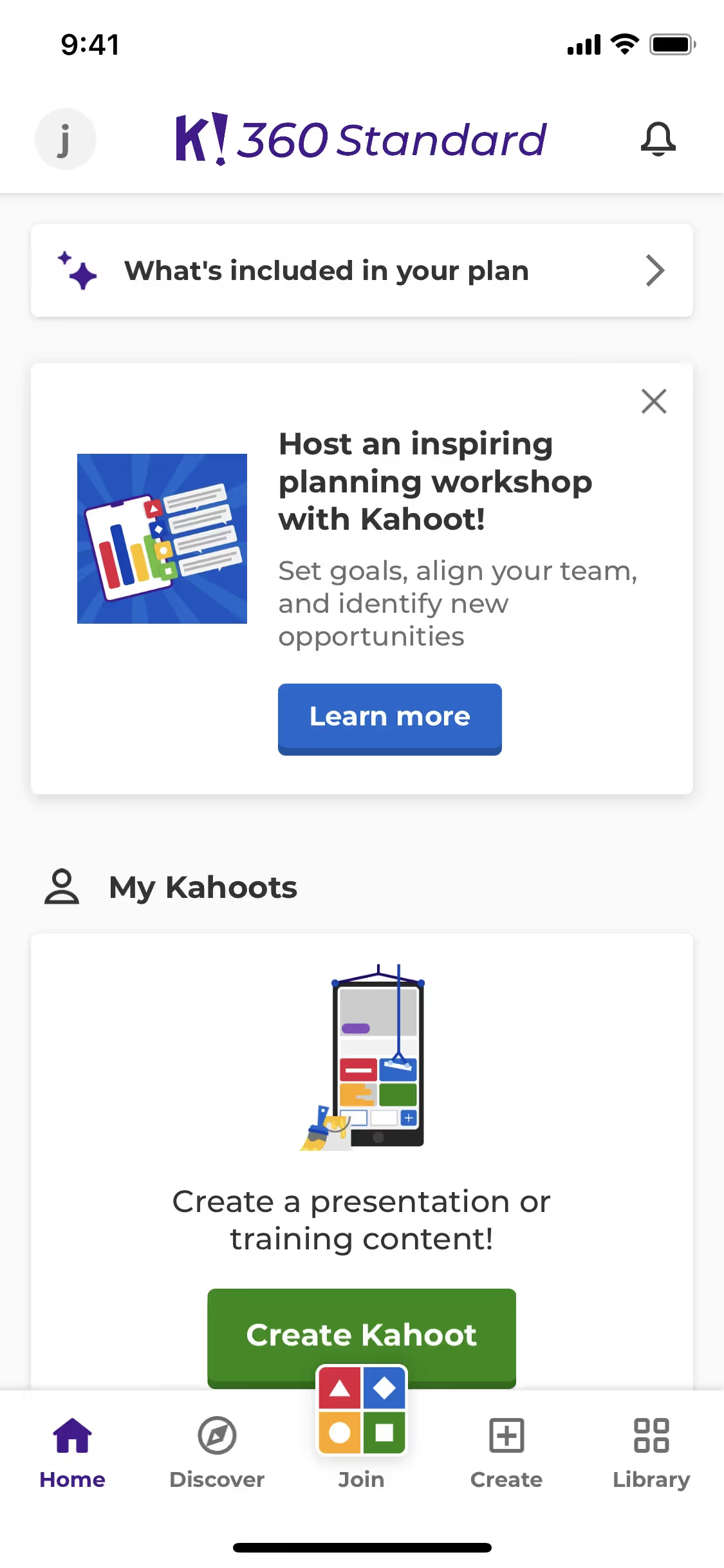
Kahoot! is an interactive learning platform that offers engaging quizzes and games. The platform's branding and interface designs prominently feature colors like Black (#000000), White (#FFFFFF), Bilbao (#26890C), and Denim (#1368CE). You can easily copy Kahoot!'s colors in Hex, CMYK, RGB, and other popular formats on this page.
The main colors in Kahoot!'s color palette are Black (#000000), White (#FFFFFF), Bilbao (#26890C), and Denim (#1368CE). These colors create a vibrant and engaging visual experience for users.
The primary color in Kahoot!'s app and website, black (#000000), conveys a sense of sophistication and authority, aligning with the brand's identity as a leader in educational technology. Complementary colors like white (#FFFFFF), Bilbao green (#26890C), and Denim blue (#1368CE) enhance this message by adding clarity, energy, and trustworthiness, respectively, creating a balanced and engaging user experience.
The history and key influences behind Kahoot!'s color scheme are not explicitly detailed in the available resources. However, the vibrant and playful colors are likely chosen to reflect the brand's mission of making learning fun and engaging for all users. The energetic palette aligns with Kahoot!'s dynamic and interactive platform, designed to captivate and inspire both educators and learners.
Kahoot! uses color psychology to create an engaging and intuitive user experience. By leveraging vibrant greens (Bilbao) for primary actions, blues (Denim) for navigation, and maintaining high contrast with black and white, Kahoot! guides your actions, influences decisions, and fosters a playful yet professional atmosphere.
To complement Kahoot!'s primary color (#000000), consider using vibrant hues like coral (#FF6F61) for a striking contrast, or soft pastels like mint green (#98FF98) to create a balanced and refreshing look. These choices can enhance your design's visual appeal and maintain brand coherence.
On Mobbin’s brand colors page, you can explore a curated list of brand color palettes from top companies. We also offer access to thousands of other UI designs and interfaces from various brands, making it a great resource for finding new color combinations and getting inspiration from real-world examples.
Mobbin helps you stay up-to-date with the latest UI/UX trends by offering an extensive, constantly updated collection of mobile and web design patterns. From color usage to user flows, you can easily explore current design practices and stay ahead of industry trends.
Ready to elevate your design game? Try Mobbin today for free as long as you like, or get full access with any of our paid plans.
Use Mobbin for free as long as you like or get full access with any of our paid plans.


