
Powder Blue
Meet Powder Blue (#B0E0E6), a color that balances subtlety with a distinct presence. Its soft, airy quality gives it a gentle character, while a slight gray undertone provides a sophisticated foundation for any design palette, making it a versatile choice for modern interfaces.
What color is Powder Blue?
Powder Blue is a pale, soft shade of cyan-blue, characterized by its high value and low saturation. It sits on the cooler side of the color spectrum, often carrying subtle gray undertones that give it a muted, almost dusty quality.
The name can refer to a family of light blues that share this gentle, airy appearance, differing slightly in their cyan-to-gray balance.
What is the meaning of the color Powder Blue (#B0E0E6)?
Powder Blue evokes feelings of calmness, peace, and reliability. In color psychology, this gentle shade, #B0E0E6, is often associated with sincerity and tranquility, communicating a sense of quiet confidence.
Symbolically, the color represents youthfulness and nostalgia. Its name hints at a delicate, powdered pigment, suggesting softness and subtlety without being overly sentimental.
How can I use Powder Blue in UI design?
Powder Blue works beautifully as a background color to create a sense of space and calm, or as a striking accent for calls-to-action when paired with a darker counterpart. For a high-contrast, professional look, set it against deep charcoal or navy. For a warmer, more inviting feel, try pairing it with soft peach, coral, or creamy off-whites to avoid a look that feels overly cold or clinical.
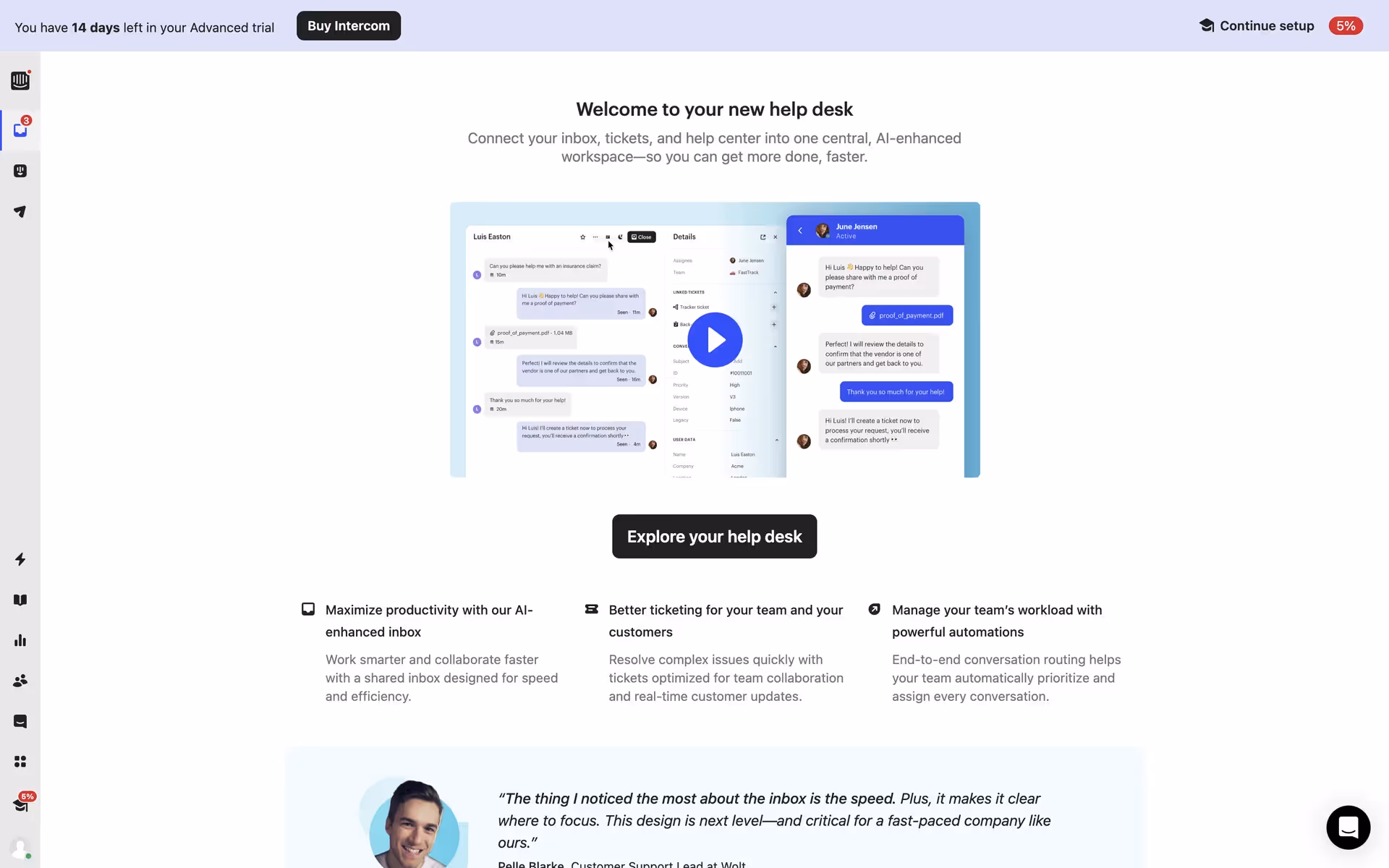
While not a common primary color in the branding of major tech companies, shades similar to Powder Blue have appeared in the user interfaces of brands like Intercom and Birchbox. Its relative rarity presents an opportunity for a product to stand out with a distinct, serene, and trustworthy visual identity.
To see these principles in action, use the tools below. You can explore curated palettes, test the accessibility of your color combinations, and preview how Powder Blue looks in real UI components from leading apps.
Using Powder Blue color codes
Using Powder Blue in your work starts with its hex code, #B0E0E6. This specific value ensures digital accuracy across different screens and platforms, making it the go-to for web-based projects.
For projects beyond the screen, you'll need to translate that hex code. Color models like RGB (Red, Green, Blue) are additive and built for digital displays, while CMYK (Cyan, Magenta, Yellow, Key/Black) is a subtractive model required for physical printing. Each system represents #B0E0E6 differently to achieve a consistent appearance across various media.
We have converted #B0E0E6 into a range of popular formats below. Simply find the color model you need and copy the corresponding values for your project.
Analogous
Found next to Powder Blue on the color wheel, analogous colors create a serene and unified palette, perfect for calm user interfaces.
Complementary
Complementary colors sit directly opposite each other on the color wheel. For Powder Blue, this pairing creates a striking, high-contrast visual effect.
Split Complementary
The split complementary palette for Powder Blue offers a nuanced high-contrast look by using the two colors adjacent to its direct complement.
Triadic
Triadic color schemes use three hues equally spaced on the color wheel. With Powder Blue, this method creates a vibrant, high-contrast palette.
Tetradic
A tetradic color scheme for Powder Blue uses two pairs of complementary colors, forming a rectangle on the color wheel for a vibrant palette.
Square
A square color scheme pairs four colors in a square formation on the color wheel, giving Powder Blue a bold, highly contrasting combination.
Text Color
Background Color
Your Catchy Large Text Goes Here
Shades
Adding black to Powder Blue creates its shades, which give the color more depth and weight.
Tints
Tints of Powder Blue are created by adding white, which results in softer, airier variations.
Tones
Tones are subtle variations of Powder Blue, created by adding gray for a muted effect.
Hues
Hues are variations of Powder Blue, differing in intensity and temperature to create distinct moods.


Never run out of inspiration again.
Use Mobbin for free as long as you like or get full access with any of our paid plans.


