#1db954
Copy
Copied


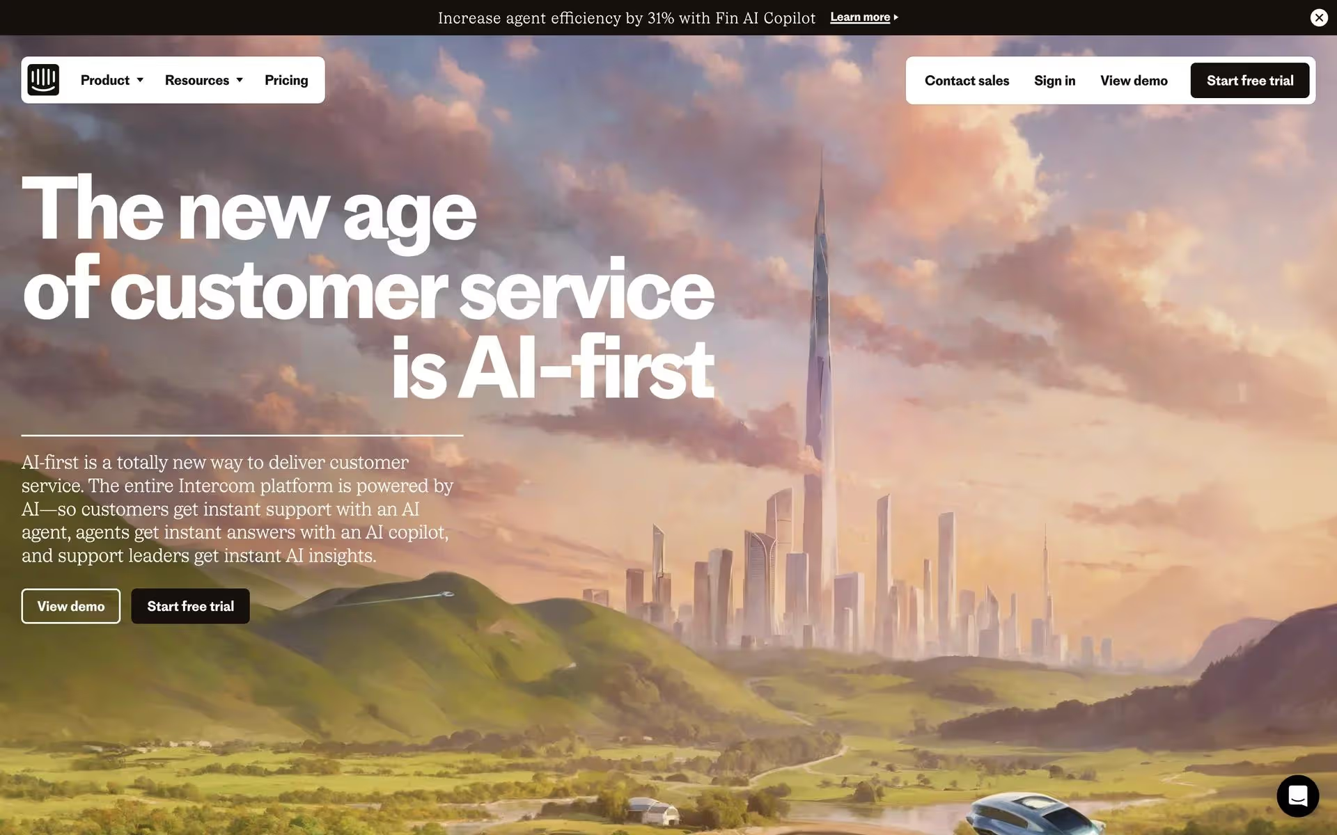
Intercom is a leading AI-powered customer service company. Its branding and interface designs feature a palette of blues, black, white, and neutral tones. On this page, you can easily copy its official colors in various formats like Hex and RGB.
Intercom's palette is built around a core of vibrant blues, like Blue Ribbon (#0057FF) and Picton Blue (#47C7F0), balanced by a versatile range of neutrals. This creates a look that's both trustworthy and modern, offering a great reference for your own designs.
Intercom's primary use of white creates a clean, open canvas, emphasizing clarity and focus in your customer conversations. This foundation is supported by confident blues that build trust, reflecting a brand identity centered on clear, human-centric communication.
Intercom's color evolution offers a masterclass in how branding can mirror a company's growth. We see their shift to a more focused palette as a direct reflection of their journey from a simple chat tool to a mature, comprehensive platform.
We see Intercom use its signature Blue Ribbon to create clear calls-to-action, guiding your eye and encouraging interaction, while the surrounding neutral tones foster a sense of calm and focus.
To introduce warmth and create a focal point, we recommend exploring a vibrant coral or a sophisticated mustard yellow. These colors can add a friendly energy that beautifully balances Intercom's cool blue and neutral tones.
On our brand colors page, you can explore a curated list of color palettes from top companies. We also offer access to thousands of UI designs from various brands, providing endless inspiration for your next color combination.
We offer an extensive, constantly updated collection of mobile and web design patterns, showcasing the latest trends in everything from color usage to user flows, so you can easily explore current practices and stay ahead in the industry.
Try Mobbin today for free for as long as you like, or get full access with any of our paid plans.

Use Mobbin for free as long as you like or get full access with any of our paid plans.


