
Pantone 1585 C
Meet Pantone 1585 C (#FF7E1D), a vibrant, unapologetic orange that commands attention. Its pure, zesty character radiates energy, sitting confidently at the intersection of fiery red and sunny yellow, making it a standout choice for any palette.
What color is Pantone 1585 C?
Pantone 1585 C is a bright, saturated orange that radiates warmth and energy, sitting squarely between a fiery red-orange and a sunny yellow-orange.
It carries distinct yellow undertones, giving it a zesty, almost citrus-like quality without losing the classic richness of a true orange.
What is the meaning of the color Pantone 1585 C?
Pantone 1585 C is a burst of creative energy and enthusiasm. It communicates warmth and excitement, making it a go-to for brands that want to appear friendly and full of life.
Symbolically, this vibrant orange represents optimism and spontaneity. It's a confident color that encourages social interaction and radiates positivity.
How to use Pantone 1585 C (#FF7E1D) in UI design?
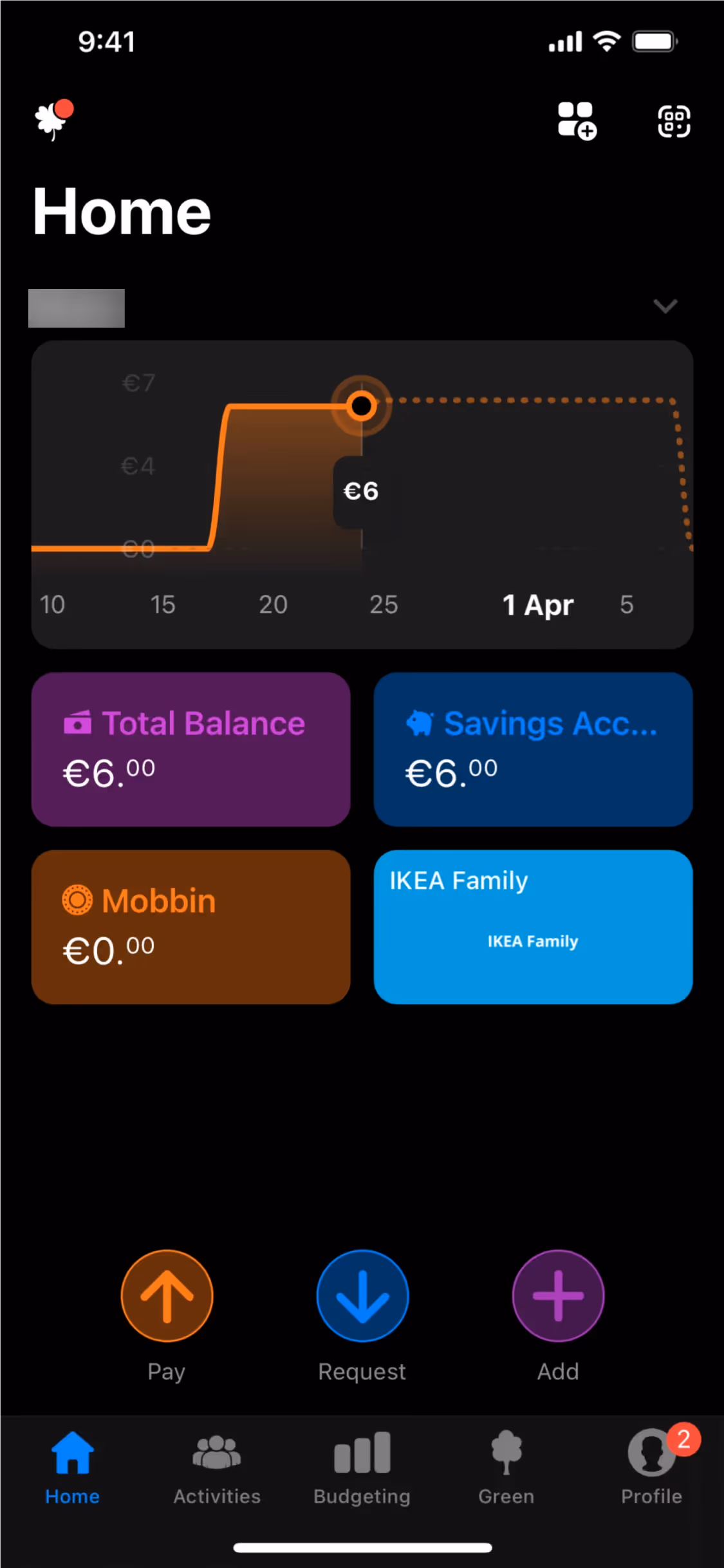
Pantone 1585 C is a powerful accent color, ideal for drawing attention to key elements like buttons, icons, and interactive states. It creates a striking contrast against dark backgrounds, such as deep blues or charcoals, for a contemporary feel. For a more subdued and warm composition, pair it with earthy tones, creams, and light grays. Applying the 60-30-10 principle, this vibrant orange often works best as the 10% highlight that makes an interface pop.
While not a dominant color across the web, similar shades are effectively used by brands like Headspace, Burger King, bunq, and Instacart. This demonstrates its applicability in diverse sectors, from wellness to food delivery. Its moderate use presents an opportunity for new products to build a distinct and energetic visual identity.
To see how Pantone 1585 C performs in practice, use the tools below. You can explore curated palettes, check contrast ratios for accessibility, and preview the color in UI components from well-known apps.
How do I use Pantone 1585 C color codes?
Using Pantone 1585 C in your digital work often starts with its hex code, #FF7E1D. However, depending on your project's medium—whether it's a screen or a printed piece—you'll need to translate this value into a different color model to maintain consistency.
Each color code system serves a specific purpose. For instance, RGB (Red, Green, Blue) values define color for digital displays through additive light, while CMYK (Cyan, Magenta, Yellow, Key/Black) is the standard for four-color process printing. Converting #FF7E1D to the correct format is critical for accurate color reproduction across different media.
To help you get started, we've converted #FF7E1D into a range of popular color code formats. You can find and copy these values for your own projects right below.
Analogous
Analogous colors sit side-by-side on the color wheel. When paired with Pantone 1585 C, they produce a unified and calming visual effect.
Complementary
Complementary colors sit directly opposite each other on the color wheel. For Pantone 1585 C, its complement creates a striking, high-contrast pairing.
Split Complementary
A split complementary scheme for Pantone 1585 C uses the two colors adjacent to its direct complement, offering high contrast with more nuance.
Triadic
A triadic palette is built from three colors equidistant on the color wheel. With Pantone 1585 C, this results in a bold and balanced combination.
Tetradic
A tetradic color scheme for Pantone 1585 C uses two pairs of complementary colors, forming a rectangle on the color wheel for a vibrant palette.
Square
Square color schemes pair Pantone 1585 C with three other hues, all equidistant on the color wheel for a balanced, high-contrast effect.
Text Color
Background Color
Your Catchy Large Text Goes Here
Shades
Shades of Pantone 1585 C are created by adding black, resulting in darker, weightier tones.
Tints
Tints of Pantone 1585 C are lighter values made by adding white, creating a softer effect.
Tones
Adding gray to Pantone 1585 C creates tones, which are softer, less saturated variations.
Hues
Hues are variations of Pantone 1585 C, differing in intensity and temperature to create unique moods.


Never run out of inspiration again.
Use Mobbin for free as long as you like or get full access with any of our paid plans.


