#1db954
Copy
Copied


Headspace Inc offers mental health and wellbeing solutions via its popular meditation app. Its branding and interface designs use a vibrant palette including Pumpkin, Supernova, and Azure Radiance. We've made it easy for you to copy these colors in popular formats like Hex, CMYK, and RGB.
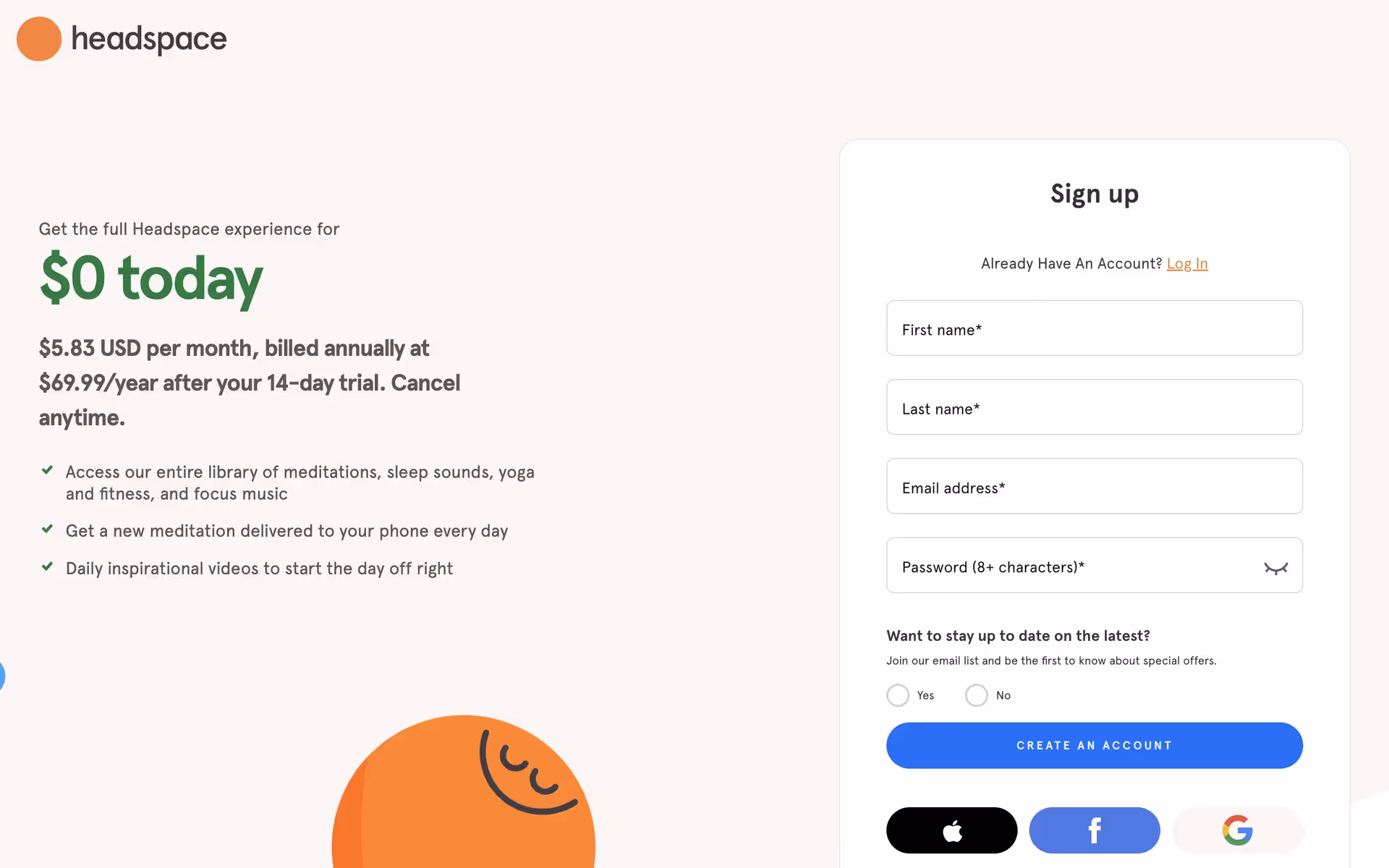
To achieve Headspace's signature look, you'll need their main colors: a vibrant mix of Blue Ribbon (#0C6FF9), Ship Gray (#413D45), Green Haze (#01A652), Azure Radiance (#00A4FF), Pumpkin (#FF7E1D), Supernova (#FFCE00), and White (#FFFFFF).
In our view, Headspace's primary blue evokes a sense of calm and trust, creating a serene foundation for your mindfulness journey. This is thoughtfully balanced with vibrant oranges and yellows that inject moments of joy and energy, guiding you through the experience with a friendly, optimistic touch.
The evolution of Headspace's color palette is a masterclass in supporting a brand's mission. Their vibrant yet soothing tones feel intentionally chosen to evoke calm and optimism, directly reflecting their focus on mental well-being.
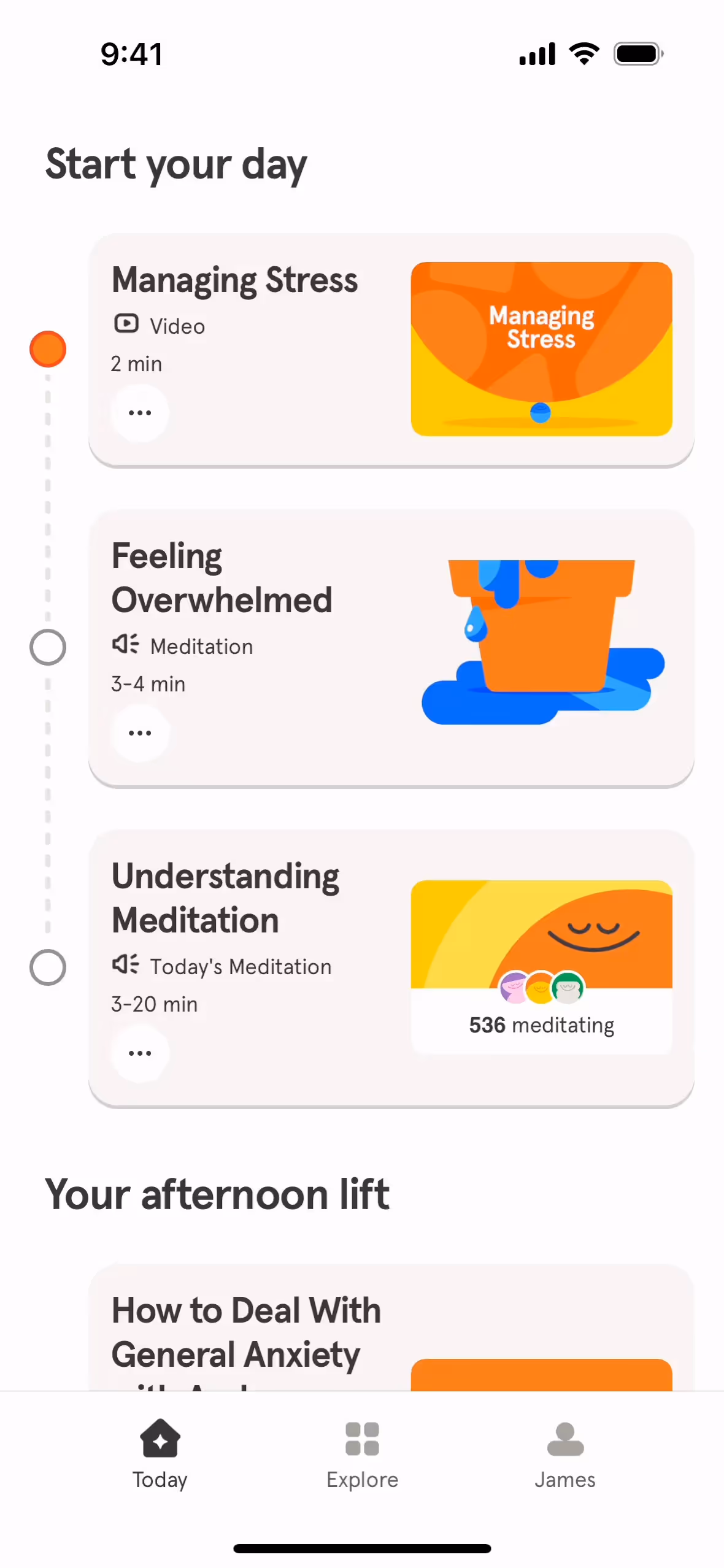
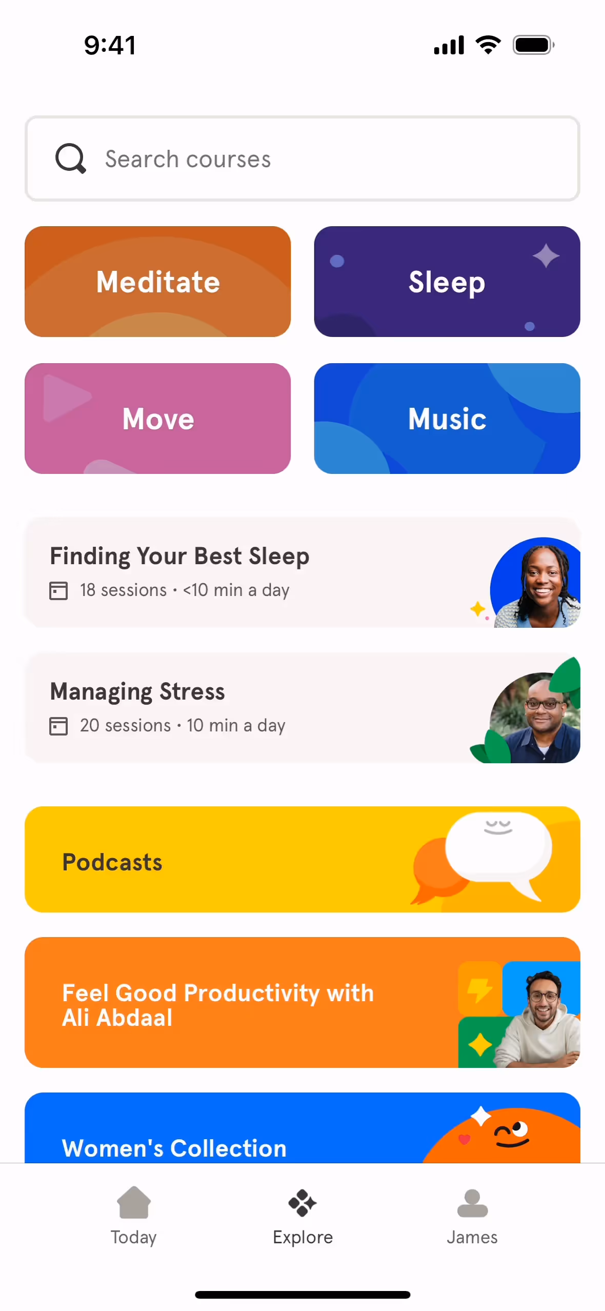
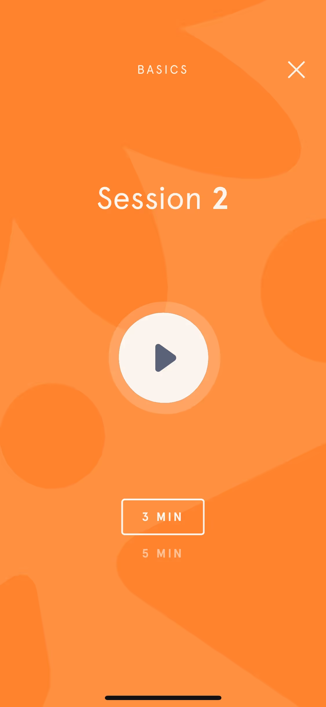
We've observed how Headspace's palette masterfully guides your experience; vibrant oranges and yellows highlight key actions, while calming blues and clean whites create a serene, focused environment that makes mindfulness feel accessible.
To build on Headspace's vibrant blue, we suggest exploring a soft coral to introduce warmth and energy, or a calming lavender to evoke a more serene and sophisticated feel in your designs.
On our brand colors page, you can explore curated color palettes from top companies. We also offer thousands of UI designs from various brands, providing endless inspiration for your next color combination from real-world examples.
With our extensive and constantly updated collection of mobile and web design patterns, you can see precisely how top apps are applying the latest UI/UX trends, from color usage to complete user flows. Exploring these real-world examples allows you to effortlessly absorb current design practices and stay ahead of the curve in the industry.
You can try Mobbin today for free for as long as you like, or get full access with any of our paid plans.


Use Mobbin for free as long as you like or get full access with any of our paid plans.


