
Light Carmine Pink
Meet Light Carmine Pink (#E66771), a vibrant hue that sits at the intersection of red's energy and pink's softness. Its striking quality comes from this unique balance, offering a warm, saturated tone that commands attention without feeling overwhelming, making it a compelling choice for modern interfaces.
What color is Light Carmine Pink?
Light Carmine Pink is a warm, rosy hue that sits comfortably between a soft red and a vibrant pink.
Its prominent red undertones give it a distinct warmth, while a touch of dustiness keeps it from feeling overly saturated.
What is the meaning of the color Light Carmine Pink?
Light Carmine Pink (#E66771) carries a sophisticated duality, blending gentle affection with a muted, confident passion. It evokes feelings of warmth and compassion, suggesting a mature and heartfelt connection.
Symbolically, this color moves beyond simple sweetness to represent a more nuanced femininity and modern romance. It speaks to a creative, approachable energy that is both soft and self-assured.
How can I effectively use Light Carmine Pink (#E66771) in my UI design?
In UI design, Light Carmine Pink (#E66771) works exceptionally well as an accent color. Use it for key interactive elements like buttons, toggles, or notification badges to guide user attention. It pairs effectively with deep charcoals and clean off-whites for a sharp, modern look. For a more dynamic palette, consider pairing it with muted teals or soft blues to create a sophisticated split-complementary scheme.
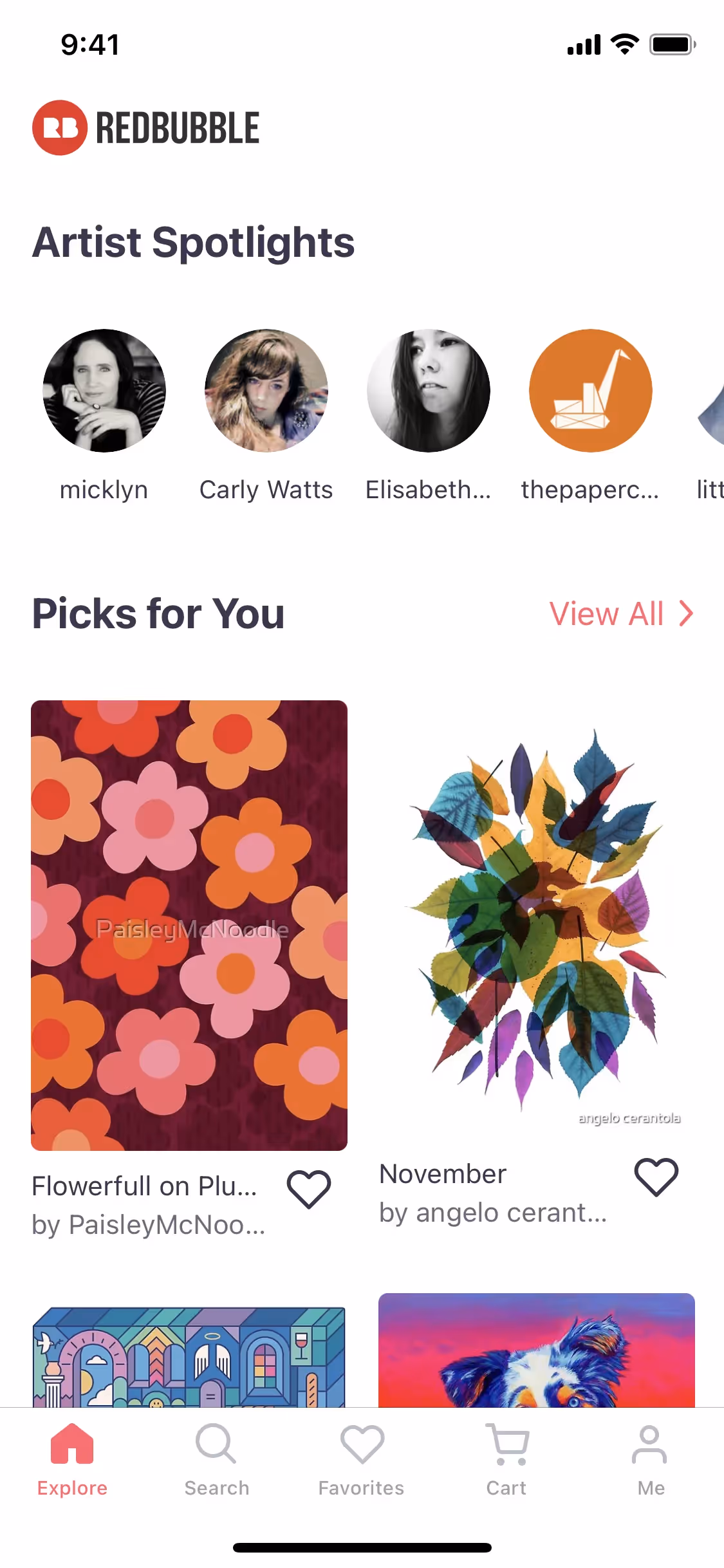
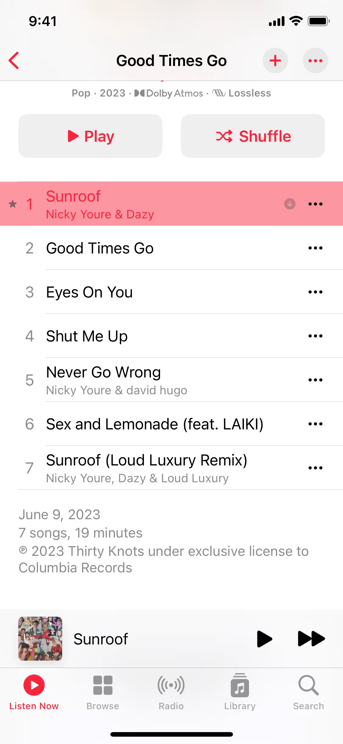
While not a widespread primary brand color, shades similar to Light Carmine Pink are used by companies like Meetup, Redbubble, and Apple Music to inject energy and highlight key features. Its relative scarcity in branding presents an opportunity for a product to stand out with a memorable and confident visual identity.
To see how this color performs, use the tools below. You can explore curated palettes, check the accessibility of your color combinations, and even preview Light Carmine Pink applied to UI components from leading apps.
Using Light Carmine Pink color codes
To use Light Carmine Pink in your work, you'll need the right color code for your medium. The hex code #E66771 is standard for web design, but for print or other digital applications, you might need a different format.
Color codes are different ways to represent a color. RGB (Red, Green, Blue) and HSL (Hue, Saturation, Lightness) are common for digital screens, defining colors with light. For printing, CMYK (Cyan, Magenta, Yellow, Key/Black) is used, which describes colors based on ink mixtures. Each system offers a specific way to define and adjust colors for different design needs.
To make things easier, we've converted Light Carmine Pink's hex code #E66771 into its corresponding RGB, HSL, CMYK, and other values. You can find these below, ready to copy for your design tools.
Analogous
Analogous colors are found next to Light Carmine Pink on the color wheel, creating a harmonious and serene palette for your designs.
Complementary
Complementary colors are opposites on the color wheel. When paired with Light Carmine Pink, its complement offers the highest possible visual contrast and energy.
Split Complementary
A split complementary scheme for Light Carmine Pink uses the two colors neighboring its direct complement, creating a vibrant yet balanced and harmonious palette.
Triadic
Triadic colors are three hues spaced evenly on the color wheel. For Light Carmine Pink, this creates a vibrant, high-contrast palette.
Tetradic
For Light Carmine Pink, a tetradic combination involves two pairs of complementary colors, forming a rectangle on the color wheel for a vibrant four-color palette.
Square
A square color scheme uses four colors equidistant on the color wheel. With Light Carmine Pink, this creates a vibrant, high-contrast palette.
Text Color
Background Color
Your Catchy Large Text Goes Here
Shades
Shades of Light Carmine Pink are created by adding black, resulting in a deeper, weightier color.
Tints
Tints are lighter versions of Light Carmine Pink, created by adding white for a softer feel.
Tones
Tones of Light Carmine Pink are created by adding gray, resulting in softer, desaturated variations.
Hues
Hues are Light Carmine Pink variations that alter in warmth and intensity, shaping a design's atmosphere.


Never run out of inspiration again.
Use Mobbin for free as long as you like or get full access with any of our paid plans.


