
Ivory
Ivory (#FFFFF0) is a refined off-white with a whisper of yellow. This subtle warmth distinguishes it from pure white, lending it a natural luminosity. For designers, it offers a sophisticated foundation that feels both clean and approachable, ideal for creating nuanced user interfaces.
What color is Ivory?
Ivory is a warm, off-white color characterized by a subtle yellow or cream undertone.
This gives it a softer, more calming appearance than pure white, with a richness that can range from a pale tint to a deeper, creamy hue.
What is the meaning of the color Ivory in design?
Ivory offers a softer, warmer alternative to stark white, suggesting comfort and understated elegance.
It carries connotations of history and quality, evoking a sense of calm and timeless sophistication.
How do I use Ivory in UI design?
Ivory works beautifully as a primary background color, offering a softer, more inviting alternative to stark white. For strong visual hierarchy, pair it with deep, saturated colors like navy, charcoal, or forest green to make text and interactive elements pop. For a more subtle, layered effect, combine Ivory with other warm neutrals and earthy tones.
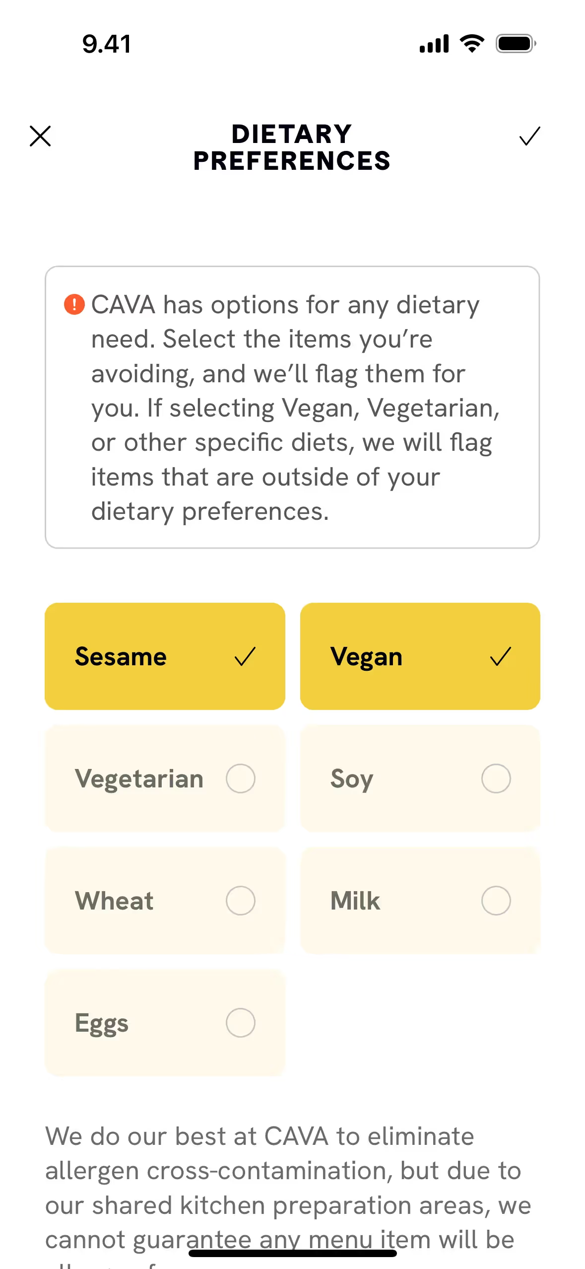
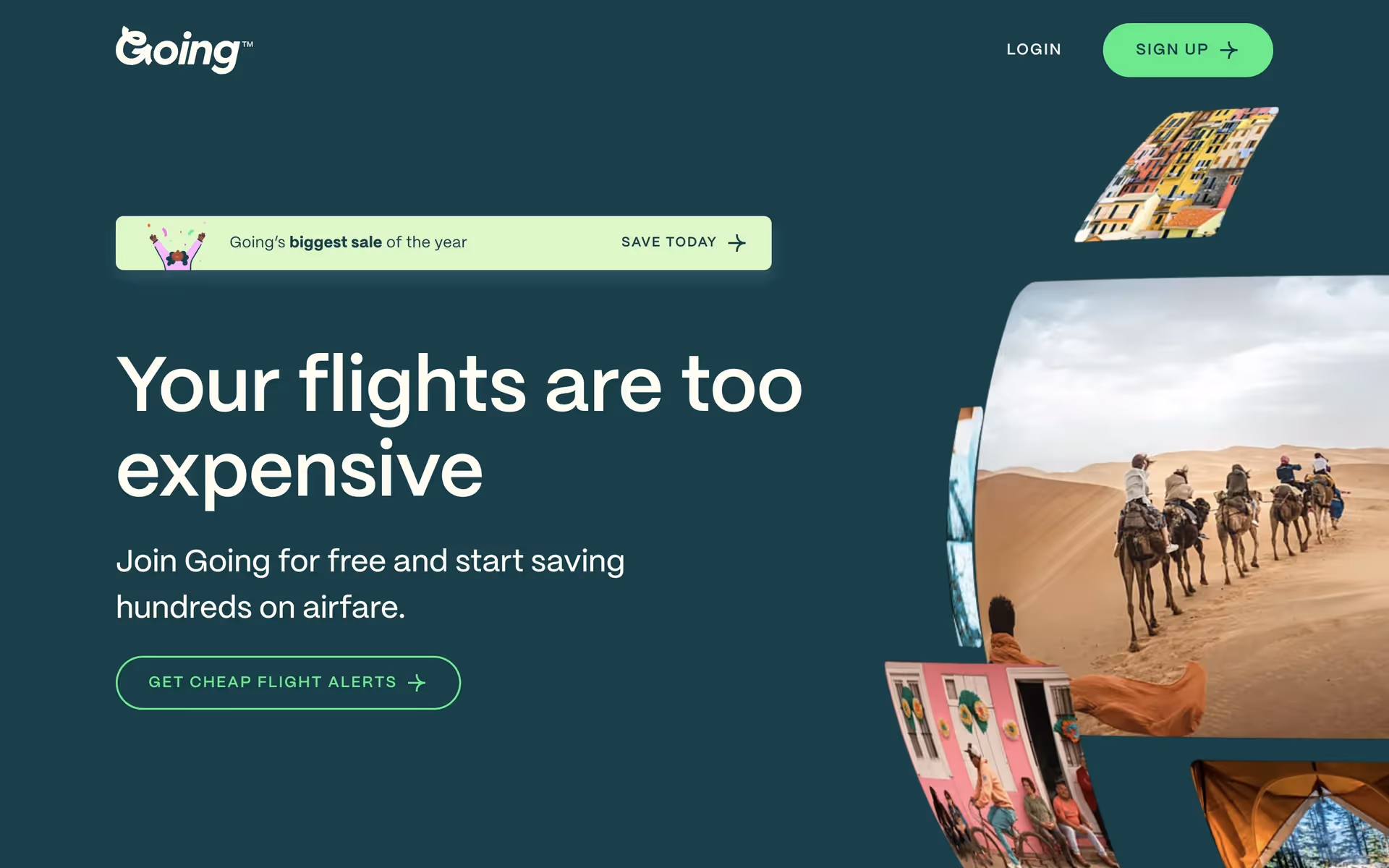
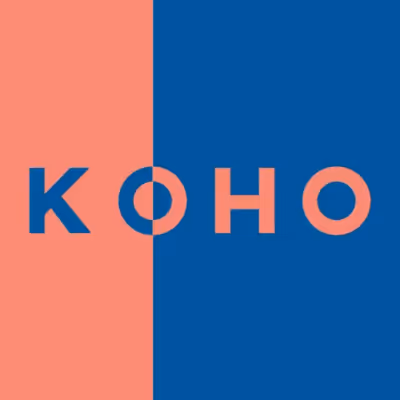
While pure #FFFFF0 is less common in branding than optic white, companies like CAVA and KOHO use similar off-white shades to build a sophisticated and approachable identity. Choosing Ivory can set a design apart, giving it a tangible warmth that feels more considered and less clinical.
Put theory into practice with the tools on this page. Explore curated palettes built around Ivory, test your color pairings for accessibility contrast, and preview the color in real UI components from leading applications.
How do I use Ivory color codes?
The hex code for Ivory is #FFFFF0. This value is the starting point for using the color in any digital project, defining its specific shade for web browsers and design software.
Different projects require different color models. The hex code can be converted to RGB (Red, Green, Blue) for screen-based work, CMYK (Cyan, Magenta, Yellow, Key) for print materials, or HSL (Hue, Saturation, Lightness) for more intuitive color manipulation. Each model represents the same color, just defined for a specific medium.
To make things simple, we've converted #FFFFF0 into a variety of popular formats below. Simply find the code you need and copy it for your project.
Analogous
Analogous colors are adjacent to Ivory on the color wheel. This combination produces a cohesive and tranquil palette, ideal for calm interfaces.
Complementary
Complementary colors sit directly opposite each other on the color wheel. Paired with a soft neutral like Ivory, they create a striking, high-contrast effect.
Split Complementary
For a vibrant yet balanced palette, Ivory's split complementary scheme pairs it with the two colors adjacent to its direct opposite on the color wheel.
Triadic
A triadic scheme for Ivory involves two other colors equally spaced on the color wheel, creating a vibrant and balanced high-contrast palette.
Tetradic
A tetradic palette combines Ivory with three other hues, forming two complementary pairs in a rectangle across the color wheel for rich, versatile designs.
Square
Using Ivory as a base, a square scheme adds three equidistant colors from the wheel for a lively, high-contrast combination.
Text Color
Background Color
Your Catchy Large Text Goes Here
Shades
Adding black to Ivory produces darker shades, which give the color more depth and weight.
Tints
Tints of Ivory are created by adding white, resulting in softer, lighter variations.
Tones
Tones are muted versions of Ivory, made by adding gray to soften its saturation.
Hues
Ivory's hues are variations in temperature and intensity, subtly altering the overall design feel.


Never run out of inspiration again.
Use Mobbin for free as long as you like or get full access with any of our paid plans.


