
Crimson
Meet Crimson (#DC143C), a powerful red that commands attention. Its deep, saturated character gives it a distinct visual weight, sitting confidently between a pure red and a rich magenta. This intensity makes it a memorable choice for any design palette.
What color is Crimson?
Crimson is a deep, rich red characterized by a subtle shift towards purple.
Its cool, blue undertones give it a distinct character, setting it apart from warmer, orange-based reds.
What is the meaning of Crimson (#DC143C)?
Historically, the high cost of producing Crimson dye meant it was reserved for the powerful and wealthy, symbolizing nobility, religion, and status.
Psychologically, this intense shade of red, #DC143C, evokes strong feelings of passion, courage, and love, but can also signify danger or anger.
How can I use Crimson in my UI design?
In UI design, Crimson works best as a powerful accent. Use its intensity for critical elements like primary buttons, notifications, or active states to guide user attention. To balance its strength, pair it with deep charcoals, soft off-whites, or a sophisticated navy. Applying the 60-30-10 rule—with Crimson as the impactful 10%—creates a visually stable yet energetic interface.
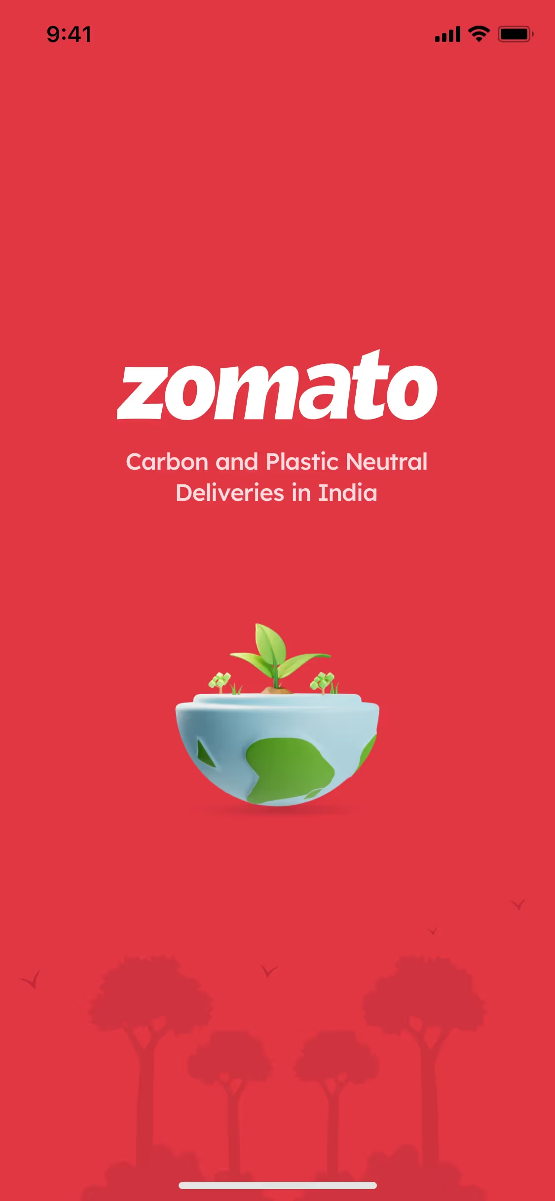
While not as widespread as other colors, a shade like Crimson (#DC143C) gives brands such as Zomato, ExpressVPN, and Meetup a distinct and confident identity. Its calculated use helps them appear bold and memorable in a crowded field.
You can explore curated palettes, test your color combinations for accessibility, and preview how Crimson performs in real UI components from top brands using the tools below.
Using Crimson color codes?
The most direct way to specify Crimson in digital design is with its hex code, #DC143C. This six-digit code is a web-standard format that provides a consistent color display across different browsers and devices.
While the hex code is standard for web development, your project might require different color models. For instance, RGB (Red, Green, Blue) values are used for digital displays, defining colors by the intensity of light. For print work, you'll need the CMYK (Cyan, Magenta, Yellow, Key/Black) values, which describe the ink mixture on a physical surface.
To make things easy, we've converted Crimson's #DC143C hex code into a range of popular formats. You can find and copy the exact values you need for your project below.
Analogous
Analogous colors sit next to each other on the color wheel. When paired with Crimson, they form a rich, yet tranquil, color scheme.
Complementary
Complementary colors sit opposite each other on the color wheel. When paired with Crimson, its complement creates a striking, high-contrast visual effect.
Split Complementary
A split complementary scheme pairs Crimson with the two colors adjacent to its direct complement, creating a high-contrast palette with more nuance.
Triadic
A triadic color scheme for Crimson involves selecting two other colors equally spaced on the color wheel, creating a vibrant and balanced high-contrast palette.
Tetradic
A tetradic color scheme for Crimson involves two pairs of complementary colors, forming a rectangle on the color wheel for a vibrant, balanced palette.
Square
A square color scheme pairs Crimson with three other colors, all equidistant on the color wheel, creating a vibrant and high-contrast palette.
Text Color
Background Color
Your Catchy Large Text Goes Here
Shades
Shades of Crimson are created by adding black, resulting in darker, weightier tones.
Tints
Mixing white with Crimson creates tints, which are lighter variations that soften the original hue.
Tones
Adding gray to Crimson creates tones, resulting in a softer, more muted appearance.
Hues
Hues are variations of Crimson, with changes in intensity or temperature affecting visual tone.


Never run out of inspiration again.
Use Mobbin for free as long as you like or get full access with any of our paid plans.


