#1db954
Copy
Copied

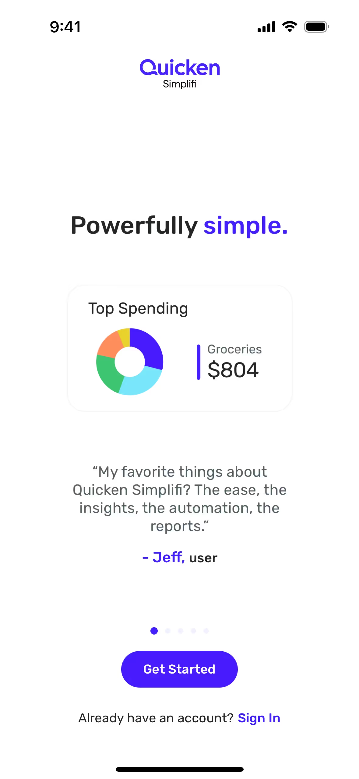
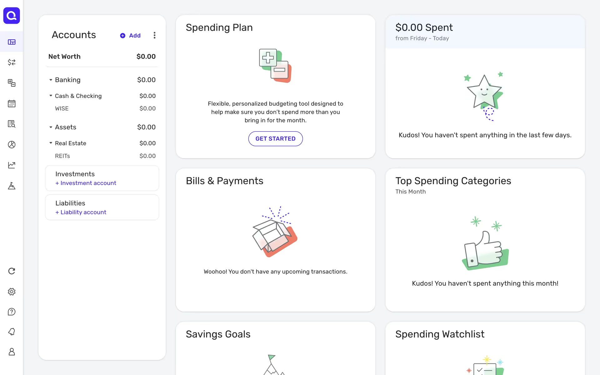
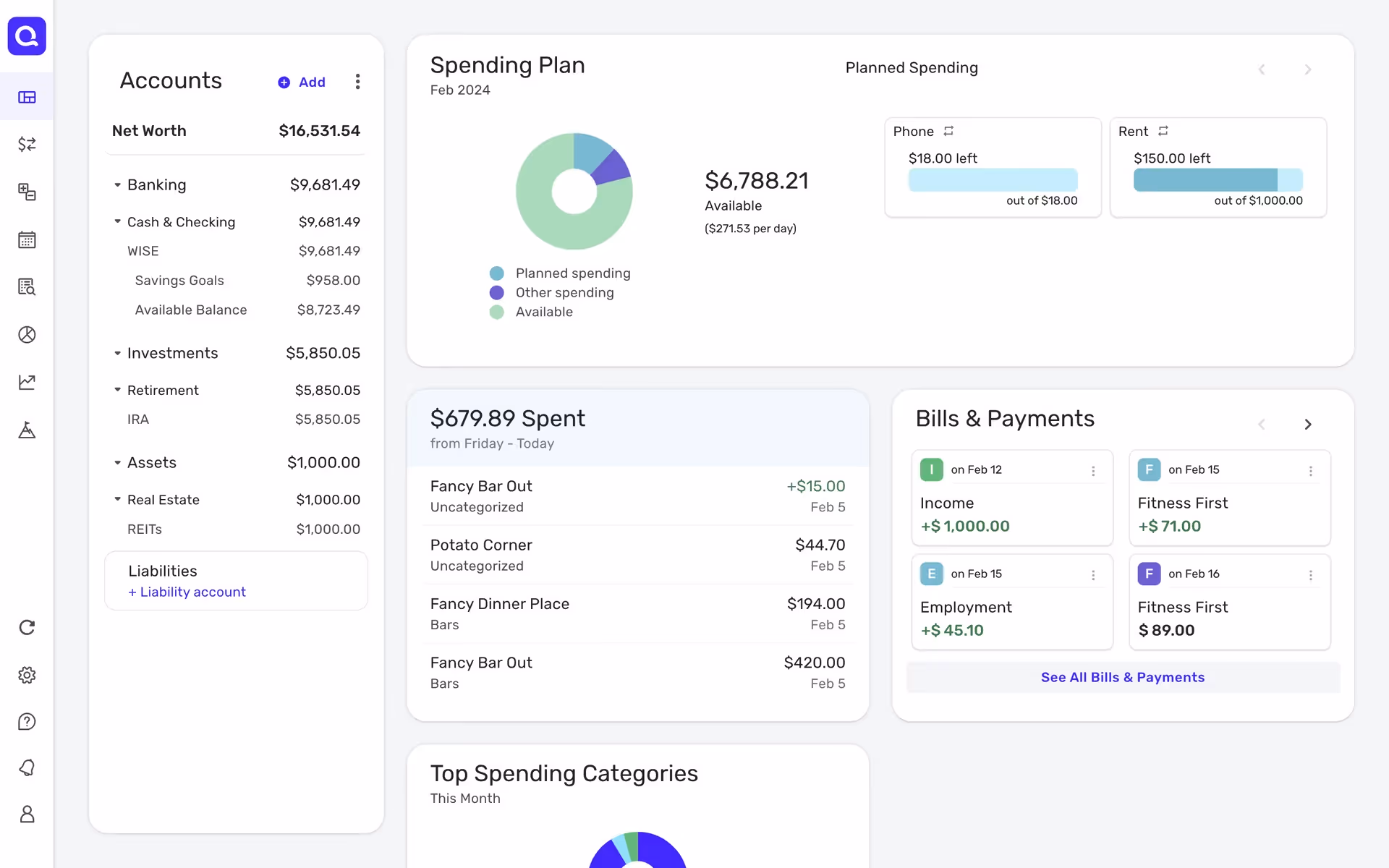
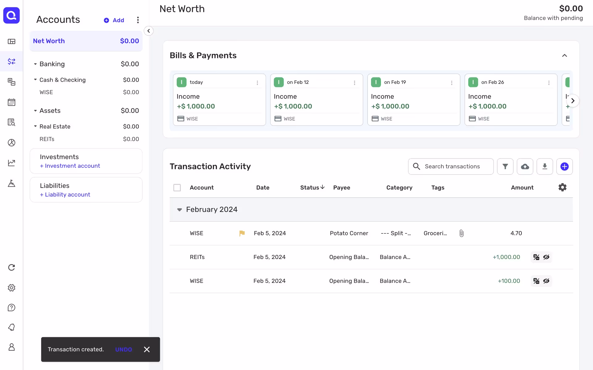
Quicken is a personal finance management tool that helps you manage your money. Its branding and interface feature a palette of deep blue, vibrant purple, and classic red. On this page, you can easily copy these colors in Hex, CMYK, RGB, and more.
When you look at Quicken's design, you'll see a core palette of Cloud Burst (#22324F) and White (#FFFFFF). We love how they use Carnation (#471CFF) and Classic Red (#EB0130) as powerful accents to guide user attention.
Quicken's primary deep blue (#22324F) grounds the user experience in trust and stability, essential for a financial product. We see how the strategic pops of vibrant purple and red then cut through the interface, providing clarity and a modern energy that helps guide your actions with confidence.
Quicken's color palette is a strategic choice rooted in financial psychology, designed to communicate the trust, security, and clarity that you need when managing your money.
While Quicken doesn't offer explicit guidelines, our analysis shows their color strategy aims to build trust and clarity with foundational Cloud Burst and White, using vibrant Carnation and Classic Red as key accents to guide you toward important actions.
To create a sophisticated contrast with the deep blue, we suggest exploring warm, earthy tones like a soft ochre or a muted terracotta. For a more modern and energetic accent, you could also consider a vibrant mint green to add a refreshing and clean pop of color to your designs.
On our brand colors page, you can explore curated color palettes from top companies, and browse thousands of other UI designs for endless inspiration from real-world examples.
Mobbin keeps you at the forefront of design with our extensive, constantly updated library of mobile and web UI/UX patterns. By exploring the latest trends in everything from color usage to intricate user flows from top apps, you can easily stay ahead of the curve and see what's current in the industry.
Why not try Mobbin today? You can use it for free for as long as you like, or get full access with any of our paid plans.
Use Mobbin for free as long as you like or get full access with any of our paid plans.