
Camp Fire
Meet Camp Fire (#F47238), an orange with undeniable presence. Its radiant, near-luminous quality offers a potent dose of energy that immediately draws the eye without overwhelming it, making it a powerful asset for any designer's palette.
What color is Camp Fire?
Camp Fire is a vibrant, warm orange with a strong presence.
It carries distinct red and yellow undertones, giving it a glowing quality reminiscent of its namesake.
What is the meaning of Camp Fire (#F47238)?
The color Camp Fire, #F47238, embodies the warmth and connection of gathering around a glowing hearth. It speaks to a sense of community, shared stories, and the comfort found in togetherness.
For designers, this energetic orange can ignite feelings of enthusiasm, creativity, and adventure. It carries a primal symbolism of transformation and the spark of a new idea.
How can I use Camp Fire (#F47238) in UI design?
In UI design, Camp Fire (#F47238) shines as an accent. Think buttons, toggles, or notification badges where you need to draw the eye. For pairings, consider setting it against deep charcoals or navy blues to make it pop, or with off-whites for a clean, energetic interface. Applying the 60-30-10 principle, where this color acts as your 10% accent, can create a balanced and focused composition.
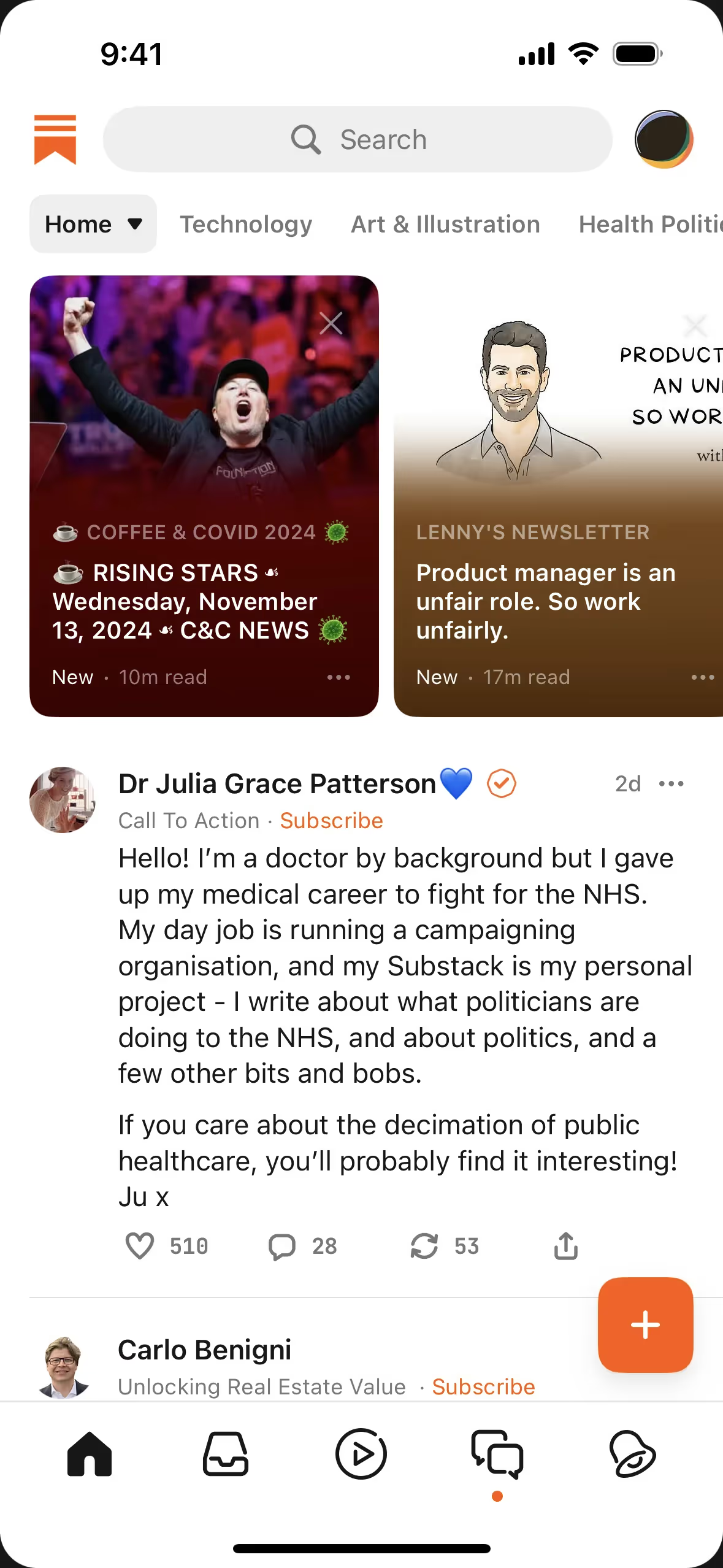
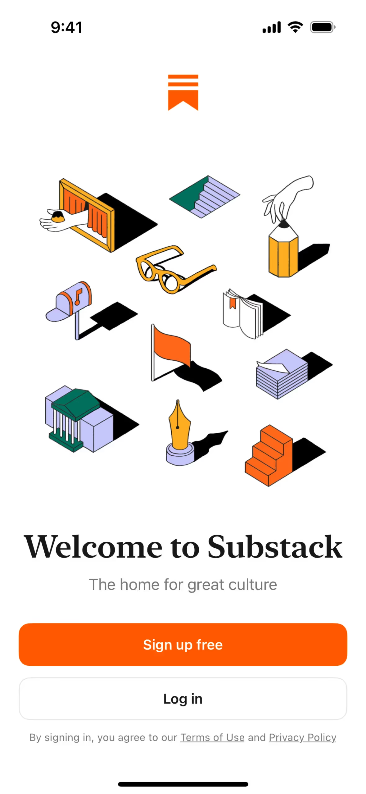
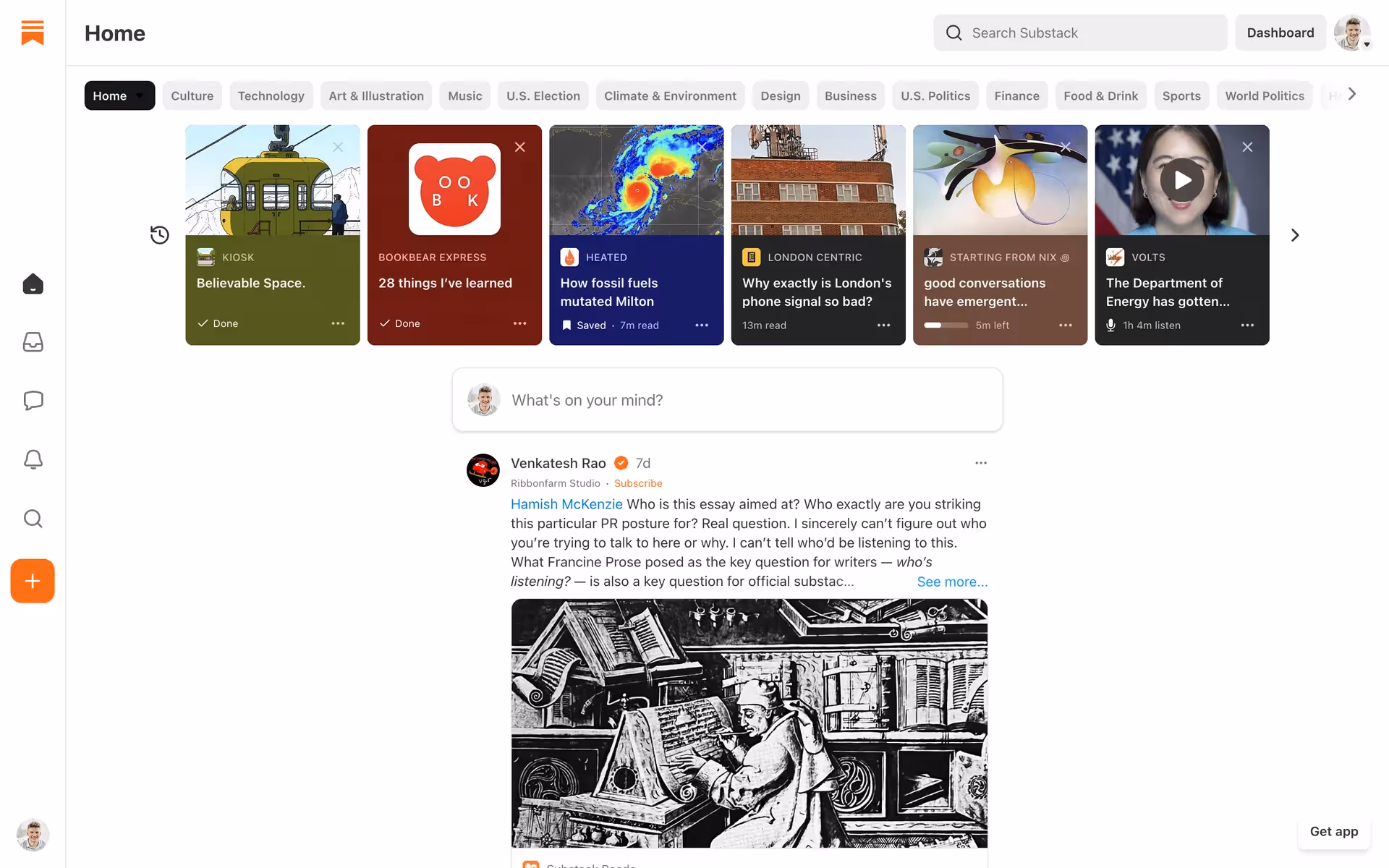
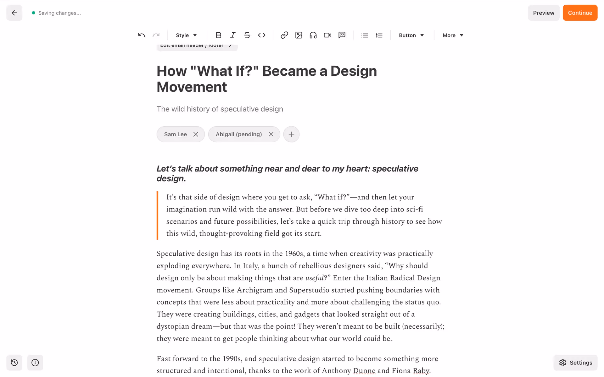
This energetic orange is a familiar sight in the tech world, used by brands like Substack, Zeplin, and Instagram to convey creativity and action. Its presence in apps such as How We Feel and Clay shows its versatility, from wellness to professional tooling.
You can use the tools below to explore curated palettes, test color contrast for accessibility, and preview Camp Fire in real UI components of top brands.
Using Camp Fire color codes
Using the Camp Fire color starts with its hex code, #F47238. This is your go-to for web and app design, but different projects require different color models.
For instance, you'll need the RGB values for any digital screen work, while CMYK is essential for print. Other models like HSL offer a more intuitive way to manipulate color attributes like saturation and lightness.
To make things easier, we've converted #F47238 into a variety of popular formats. You can find and copy the exact codes you need for your project below.
Analogous
Analogous color schemes use colors next to Camp Fire on the color wheel, creating a harmonious and serene visual experience for users.
Complementary
Colors from opposite sides of the color wheel are complementary. Paired together, Camp Fire and its opposite create a vibrant, high-contrast look.
Split Complementary
For a vibrant yet balanced palette, split complementary schemes pair Camp Fire with the two colors adjacent to its direct complement.
Triadic
A triadic scheme is built from three colors equidistant on the color wheel. The result is a vibrant, high-contrast palette with a balanced feel.
Tetradic
Using Camp Fire as a base, a tetradic scheme adds three more colors, forming two complementary pairs for a vibrant and versatile palette.
Square
A square color scheme uses four colors equidistant on the color wheel. This creates a lively palette with strong, balanced contrast for your designs.
Text Color
Background Color
Your Catchy Large Text Goes Here
Shades
Shades are darker versions of Camp Fire, created by adding black to give it more depth and weight.
Tints
Tints are lighter variations of Camp Fire, created by adding white to soften the hue.
Tones
Tones are created by adding gray to Camp Fire, resulting in softer, less saturated versions.
Hues
Hues are variations of Camp Fire that alter its intensity and temperature for different moods.

Never run out of inspiration again.
Use Mobbin for free as long as you like or get full access with any of our paid plans.


