#1db954
Copy
Copied

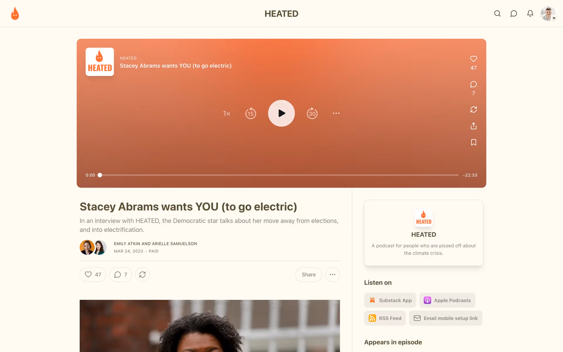
Substack is a platform that empowers independent writers and publishers. Its branding and interface designs feature a distinct palette of Dune, White, and vibrant Orange. On this page, you can easily copy these colors in Hex, CMYK, RGB, and more.
You'll find Substack's core color palette is built on a simple yet powerful trio: their signature Orange (#FF6719), a clean White (#FFFFFF), and a deep, grounding shade called Dune (#2B2823).
When we analyze Substack's palette, we see how its deep, ink-like primary color (#2B2823) grounds the experience in authority and focus, letting your words take center stage. The brilliant orange accent then cuts through, adding a necessary spark of creativity and encouraging action, creating a perfect balance for a platform built on passionate writing.
Substack's color scheme is a direct reflection of its product-first ethos, a bold and minimalist palette that keeps your focus squarely on the writers and their work.
In our analysis, we see Substack masterfully uses its palette to direct your focus. By pairing a high-contrast, readable Dune-on-White base with a vibrant Orange for key actions, they create a clear path that turns passive reading into active engagement.
To expand on Substack's foundational colors, we suggest exploring a muted sage green for a natural, harmonious feel, or a dusty slate blue to introduce a sophisticated, cool contrast to your designs.
On our brand colors page, you can explore curated color palettes from top companies. We also offer access to thousands of UI designs from various brands, providing endless inspiration for your next color combination from real-world examples.
Our platform offers an extensive, constantly updated library of mobile and web design patterns, giving you a real-time look at the latest UI/UX trends—from evolving color palettes to innovative user flows. By exploring our collection, you can easily see what leading apps are doing and stay ahead of the curve in the design industry.
You can try Mobbin today for free for as long as you like, or get full access with any of our paid plans.
Use Mobbin for free as long as you like or get full access with any of our paid plans.


