
Bright Sky Blue
Bright Sky Blue, #409FFF, is a hue defined by its striking clarity and saturation. It’s a pure, vibrant blue that feels perfectly at home on digital interfaces, providing a sharp and modern look without any visual noise.
What color is Bright Sky Blue?
Bright Sky Blue is a crisp, vibrant shade of cyan-blue.
It carries a cool temperature with distinct cyan undertones, giving it a clean and refreshing appearance reminiscent of a clear afternoon sky.
What is the meaning of the color Bright Sky Blue (#409FFF)?
Bright Sky Blue, or #409FFF, is psychologically linked to feelings of calm and serenity. It inspires a sense of openness and optimism, suggesting clarity of thought and a peaceful state of mind.
Symbolically, this hue represents trust, stability, and clear communication. It carries connotations of freedom and boundless possibility, making it a color of inspiration.
How can I use Bright Sky Blue in my UI design?
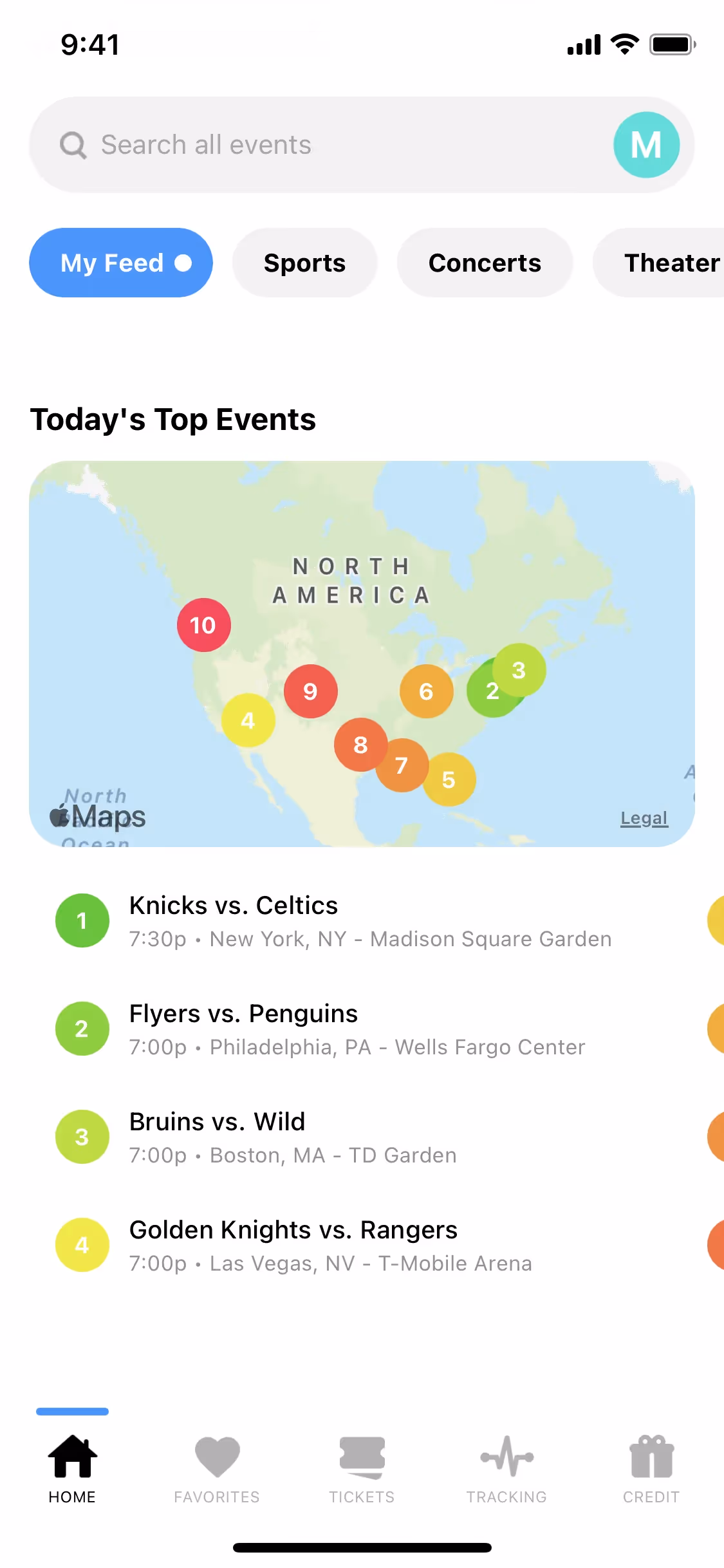
To make Bright Sky Blue effective in your designs, apply it as an accent for key elements like buttons, links, or notification badges. It creates a striking contrast against dark or neutral backgrounds, such as charcoal or off-white. For a balanced palette, consider pairing #409FFF with analogous greens or a complementary orange to draw attention without overwhelming the user.
This shade of blue is favored by several forward-thinking brands. Companies like Figma, Framer, and Flighty use similar blues to convey innovation and clarity in their interfaces, making it a strong choice for products that want to appear modern and user-friendly.
Use the tools below to explore curated palettes, test color contrast for accessibility, and preview Bright Sky Blue in real UI components from top brands.
Using Bright Sky Blue color codes
While the hex code #409FFF is standard for web development, different projects require different color models. For instance, RGB is fundamental for consistency across digital screens, whereas CMYK is necessary for any print work to maintain color accuracy on paper.
To support your workflow, we have converted #409FFF into a range of popular formats below. Just find the code you need and copy it directly into your design tool.
Analogous
Analogous colors sit next to Bright Sky Blue on the color wheel. Grouping them together produces a cohesive and calming palette.
Complementary
Complementary colors are direct opposites on the color wheel, creating a vibrant effect. With Bright Sky Blue, this pairing offers maximum visual contrast.
Split Complementary
A split complementary palette for Bright Sky Blue uses the two colors adjacent to its direct opposite, creating a high-contrast look with less tension.
Triadic
A triadic scheme pairs Bright Sky Blue with two other colors equidistant on the color wheel, resulting in a bold, multicolored palette.
Tetradic
Tetradic schemes pair Bright Sky Blue with three other colors, creating a rich palette from two sets of complementary colors on the color wheel.
Square
A square scheme builds on Bright Sky Blue with three other equidistant colors on the color wheel, creating a rich and highly contrasting palette.
Text Color
Background Color
Your Catchy Large Text Goes Here
Shades
Shades of Bright Sky Blue are made by adding black, which introduces depth and weight.
Tints
Tints of Bright Sky Blue are created by adding white, resulting in lighter, softer variations.
Tones
Tones of Bright Sky Blue are created by adding gray, resulting in softer, more muted variations.
Hues
Hues are variations of Bright Sky Blue, differing in intensity or temperature to create distinct moods.


Never run out of inspiration again.
Use Mobbin for free as long as you like or get full access with any of our paid plans.


