#1db954
Copy
Copied

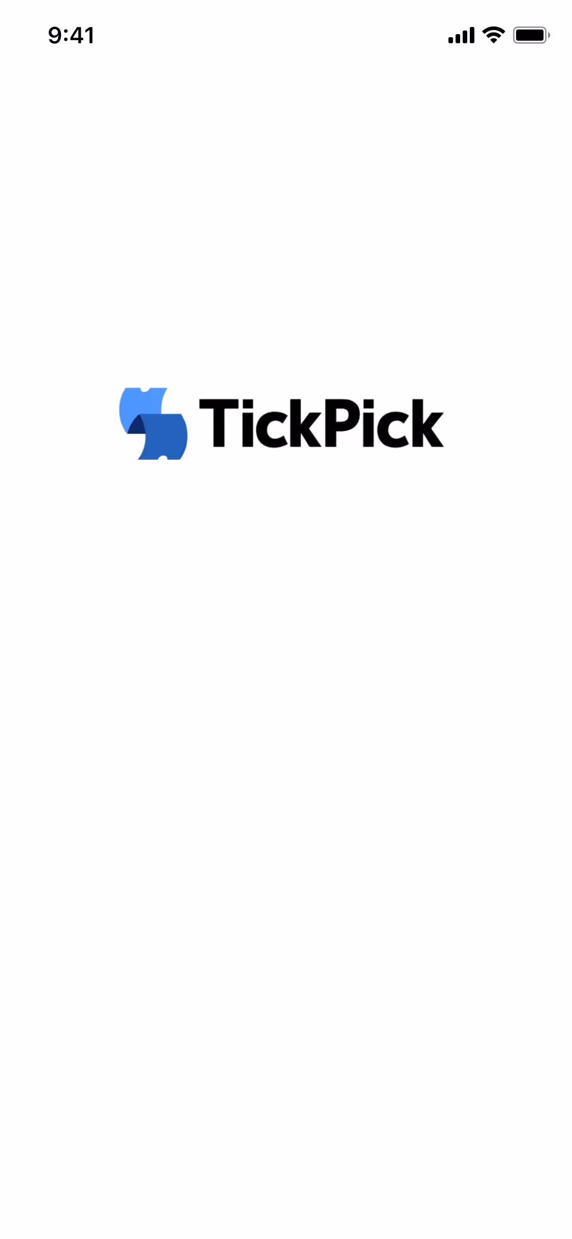
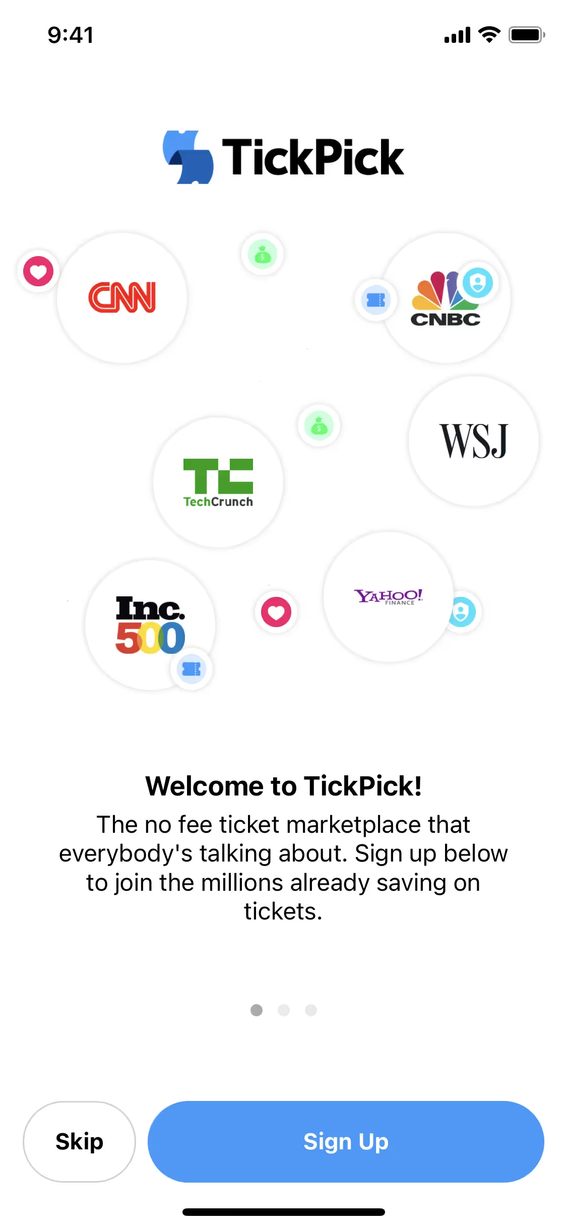
TickPick is an online marketplace for tickets to all your favorite live events. Its branding and interface designs feature a clean palette of Bunker, White, and Dodger Blue. We've made it easy for you to copy these colors in Hex, CMYK, RGB, and more.
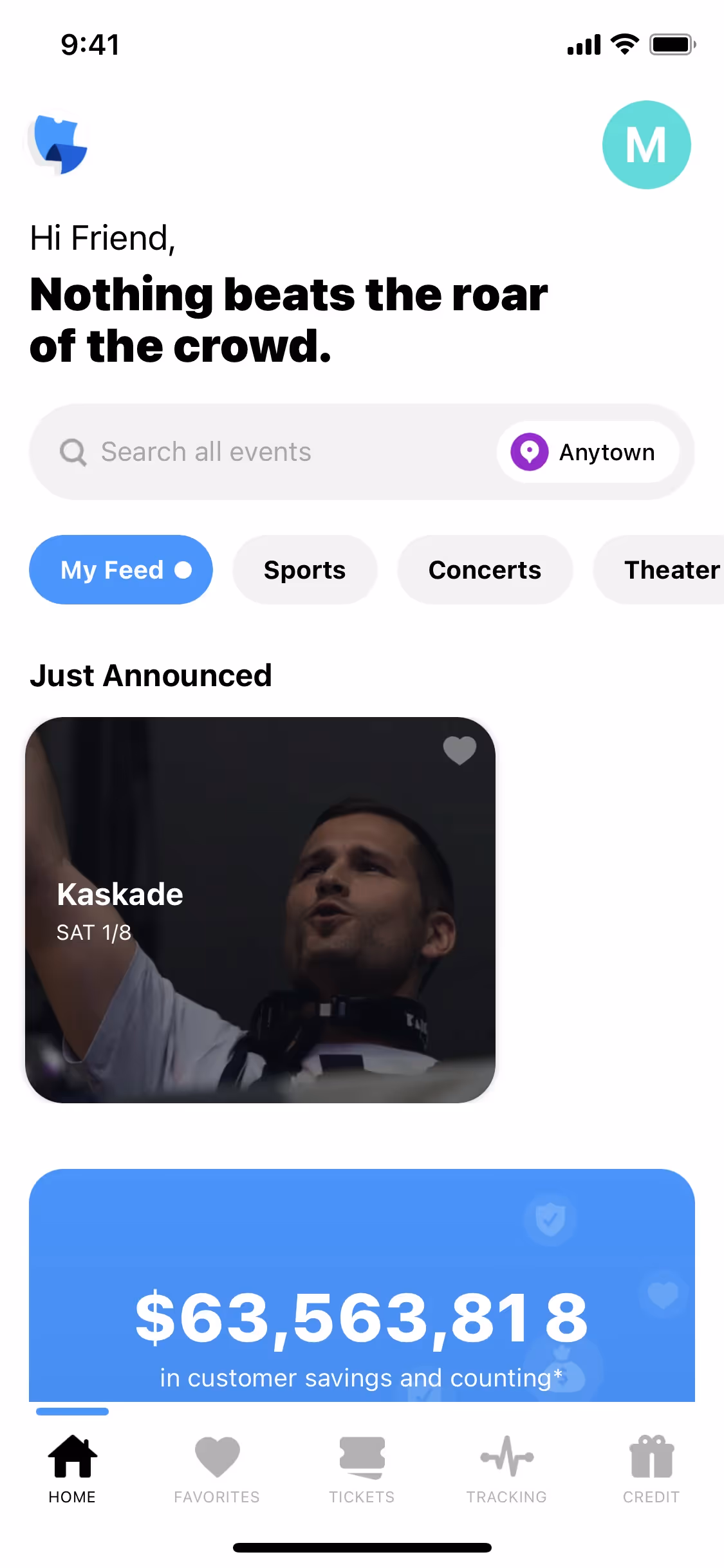
TickPick's primary color palette is a straightforward trio of Bunker (#0F161E), White (#FFFFFF), and Dodger Blue (#3399FF). We've found this combination gives you a versatile foundation for creating clean and user-friendly interfaces.
We find TickPick's deep, near-black primary color (#0F161E) grounds the experience in trust and sophistication, which is essential when you're buying tickets. This solid foundation is then energized by a vibrant Dodger Blue that guides you to action, supported by crisp white for ultimate clarity.
In our library, we see TickPick's palette as a strategic choice to build trust and signal savings, directly supporting their 'no hidden fees' model to create a seamless experience for you.
We've observed that TickPick uses its high-contrast palette to build trust and guide your actions. The deep Bunker and clean White establish a clear foundation, while the vibrant Dodger Blue is strategically placed on CTAs to draw your attention and simplify the path to purchase.
We find that warm, earthy tones like a rich ochre or a soft terracotta can beautifully complement TickPick's dark primary, adding a layer of sophisticated warmth and visual interest to your designs.
On our brand colors page, you can explore curated color palettes from top companies. You'll also find thousands of other UI designs and interfaces from various brands, perfect for discovering new color combinations and drawing inspiration from real-world examples.
Our extensive, constantly updated collection of mobile and web design patterns shows you the latest trends in UI/UX, from color usage to entire user flows. By using Mobbin, you can easily explore current design practices and stay ahead of the curve in the industry.
Try Mobbin today for free for as long as you like, or get full access with any of our paid plans.
Use Mobbin for free as long as you like or get full access with any of our paid plans.