
Bittersweet
Meet Bittersweet (#FE6F5E), a vibrant coral-red that immediately draws the eye. Its striking quality lies in a potent balance of energetic orange and warm red. This fusion produces a hue with a distinct visual punch, stopping short of neon yet full of life.
What color is Bittersweet?
Bittersweet is a vibrant, warm shade that sits comfortably between red and orange. It has a distinct reddish undertone that gives it depth, while its orange notes provide a bright, energetic quality.
This creates a compelling color that feels both sophisticated and lively, reminiscent of a tropical sunset or the flesh of a ripe papaya.
What is the meaning of the color Bittersweet in design?
Bittersweet, #FE6F5E, embodies a vibrant energy and passion. It channels the warmth and enthusiasm of orange, sparking feelings of creativity and excitement.
True to its name, the color also suggests a deeper complexity, evoking a sense of nostalgia or poignant memories—a beautiful feeling tinged with a touch of longing.
How can I effectively use Bittersweet (#FE6F5E) in my UI design?
In UI design, Bittersweet (#FE6F5E) works best as an accent color. Use it for primary buttons, notifications, or to draw attention to interactive elements. To ground its intensity, pair it with a foundation of deep charcoals, clean off-whites, or muted blues. This creates a sophisticated balance, allowing Bittersweet to guide the user's eye without causing visual fatigue. Applying the 60-30-10 principle, where it serves as the 10% accent, is a reliable approach.
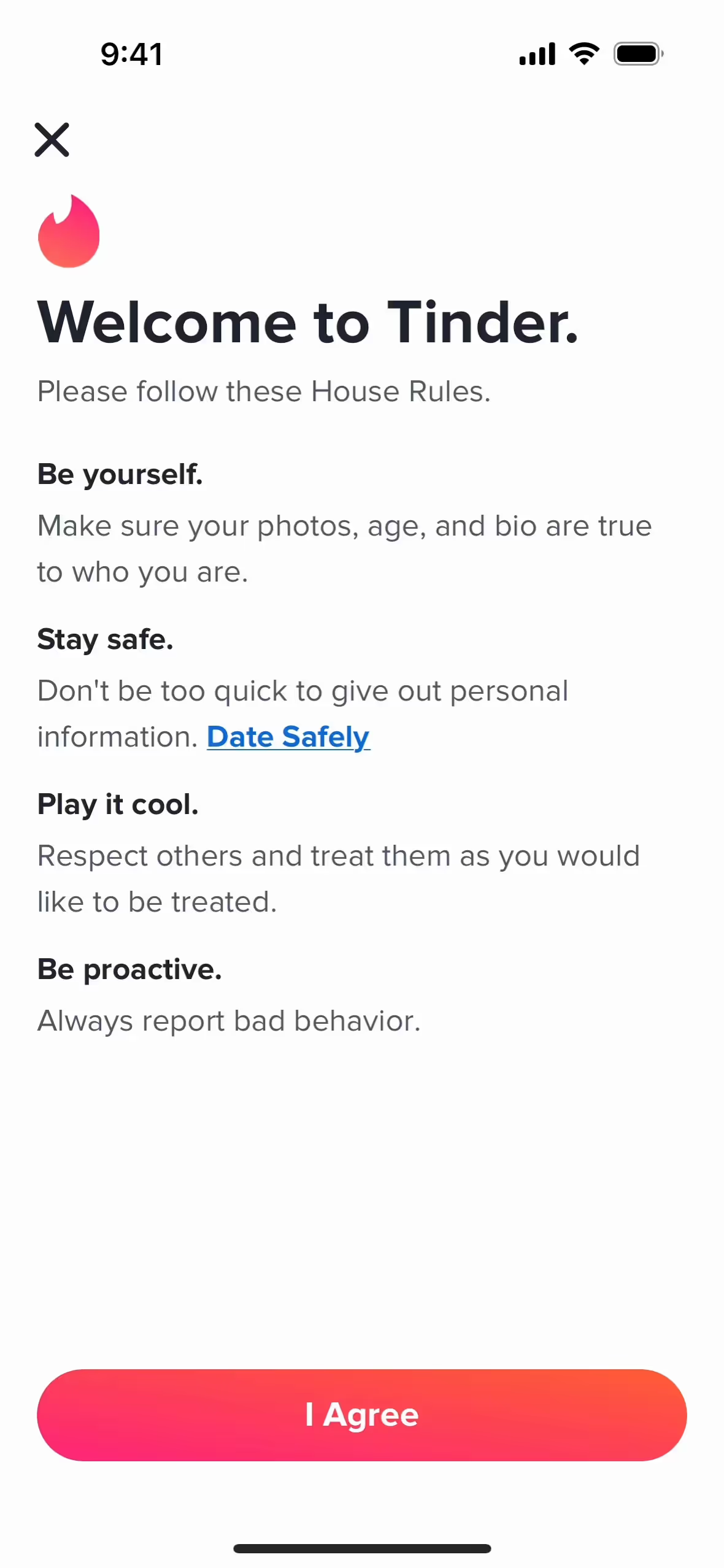
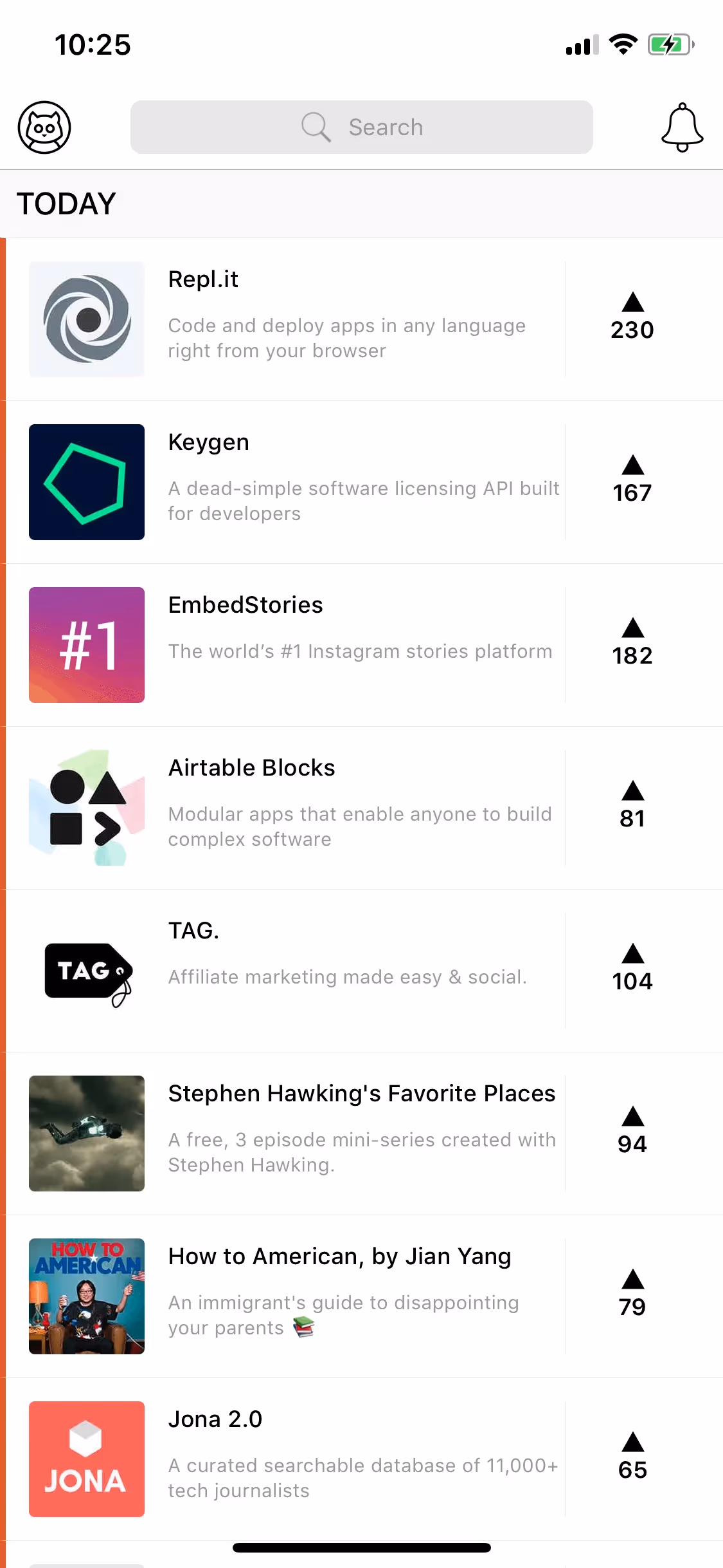
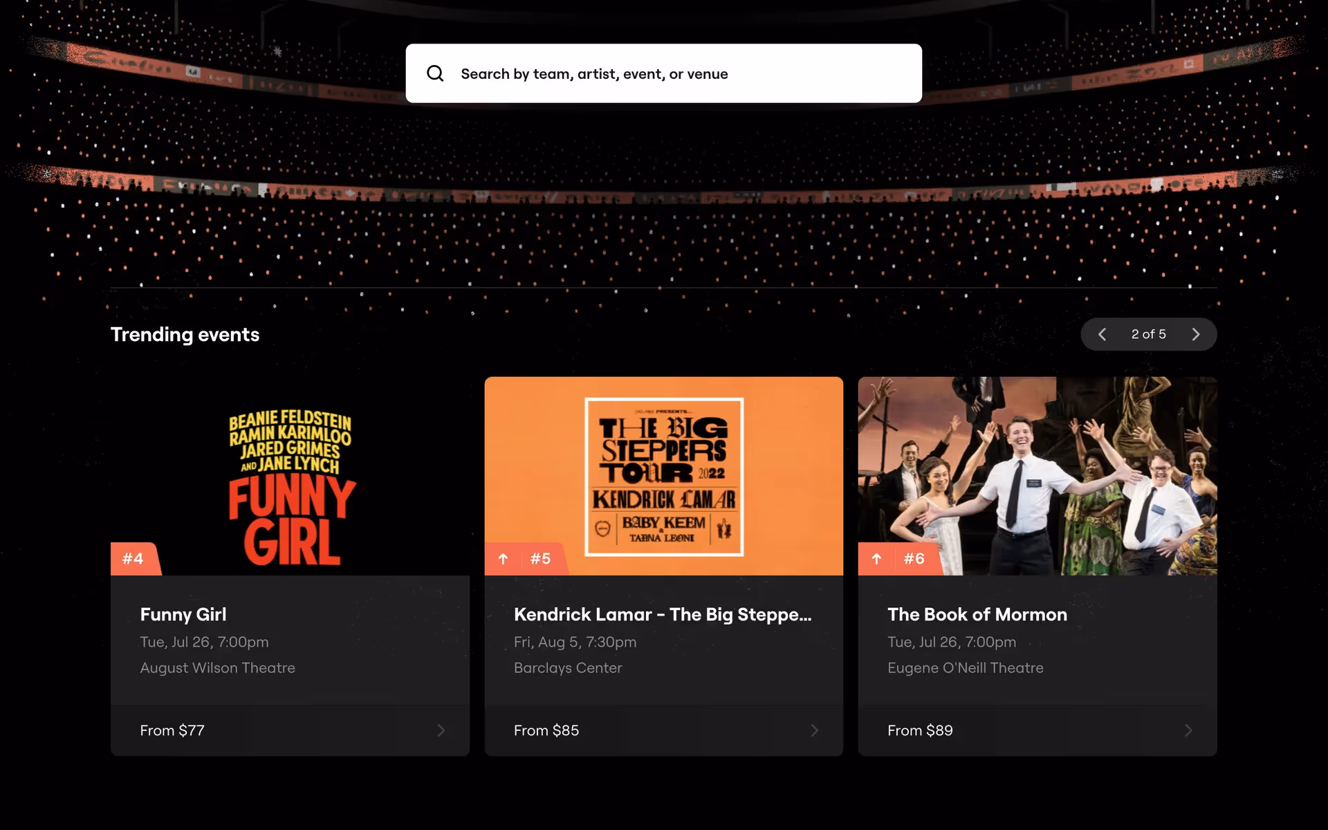
Several prominent brands, including Tinder, Product Hunt, and SeatGeek, incorporate a similar energetic coral in their branding. They use it to create a memorable and action-oriented identity. This choice helps them stand out and communicates a sense of vitality and forward momentum, which is fitting for their product offerings.
To see how Bittersweet works in practice, use the tools below. You can explore curated palettes, test color contrast for accessibility, and preview #FE6F5E in UI components from top-tier applications.
Using Bittersweet color codes
When working with the color Bittersweet, using its hex code #FE6F5E is the most direct way to specify the color in digital projects like websites or apps. This six-digit code is a web-safe standard that ensures precise color reproduction across different browsers and devices.
However, you'll often need to translate #FE6F5E into other color models for different mediums. For instance, RGB (Red, Green, Blue) is essential for on-screen design as it dictates the intensity of light on a display. For print materials, you'll need the CMYK (Cyan, Magenta, Yellow, Key/Black) values, which correspond to ink combinations on paper. Other formats like HSL (Hue, Saturation, Lightness) provide a more intuitive way to make color adjustments.
To simplify your workflow, we have converted #FE6F5E into a range of popular formats. You can find the exact values below, ready to copy and paste directly into your design tools.
Analogous
Built around Bittersweet, analogous colors are neighbors on the color wheel. They work together to produce a serene and cohesive visual experience for users.
Complementary
Complementary colors sit opposite each other on the color wheel. Paired with Bittersweet, they create a striking visual effect with high contrast.
Split Complementary
A split complementary scheme for Bittersweet uses the two colors adjacent to its direct complement, creating a vibrant yet balanced color harmony.
Triadic
A triadic scheme uses three colors equidistant on the color wheel. Starting with Bittersweet produces a balanced yet bold palette with strong visual contrast.
Tetradic
A tetradic scheme forms a rich palette with two pairs of complementary colors. See how Bittersweet anchors these balanced, four-color combinations.
Square
A square color scheme uses four colors equidistant on the color wheel. With Bittersweet as the base, this creates a lively, high-contrast palette.
Text Color
Background Color
Your Catchy Large Text Goes Here
Shades
Shades are created by mixing black with Bittersweet, resulting in a deeper, weightier color.
Tints
Tints are created by adding white to Bittersweet, resulting in softer, lighter values.
Tones
Tones of Bittersweet are created by adding gray, resulting in softer, less saturated variations.
Hues
Hues are variations of Bittersweet, creating different effects by altering the color's intensity or temperature.


Never run out of inspiration again.
Use Mobbin for free as long as you like or get full access with any of our paid plans.


