#1db954
Copy
Copied

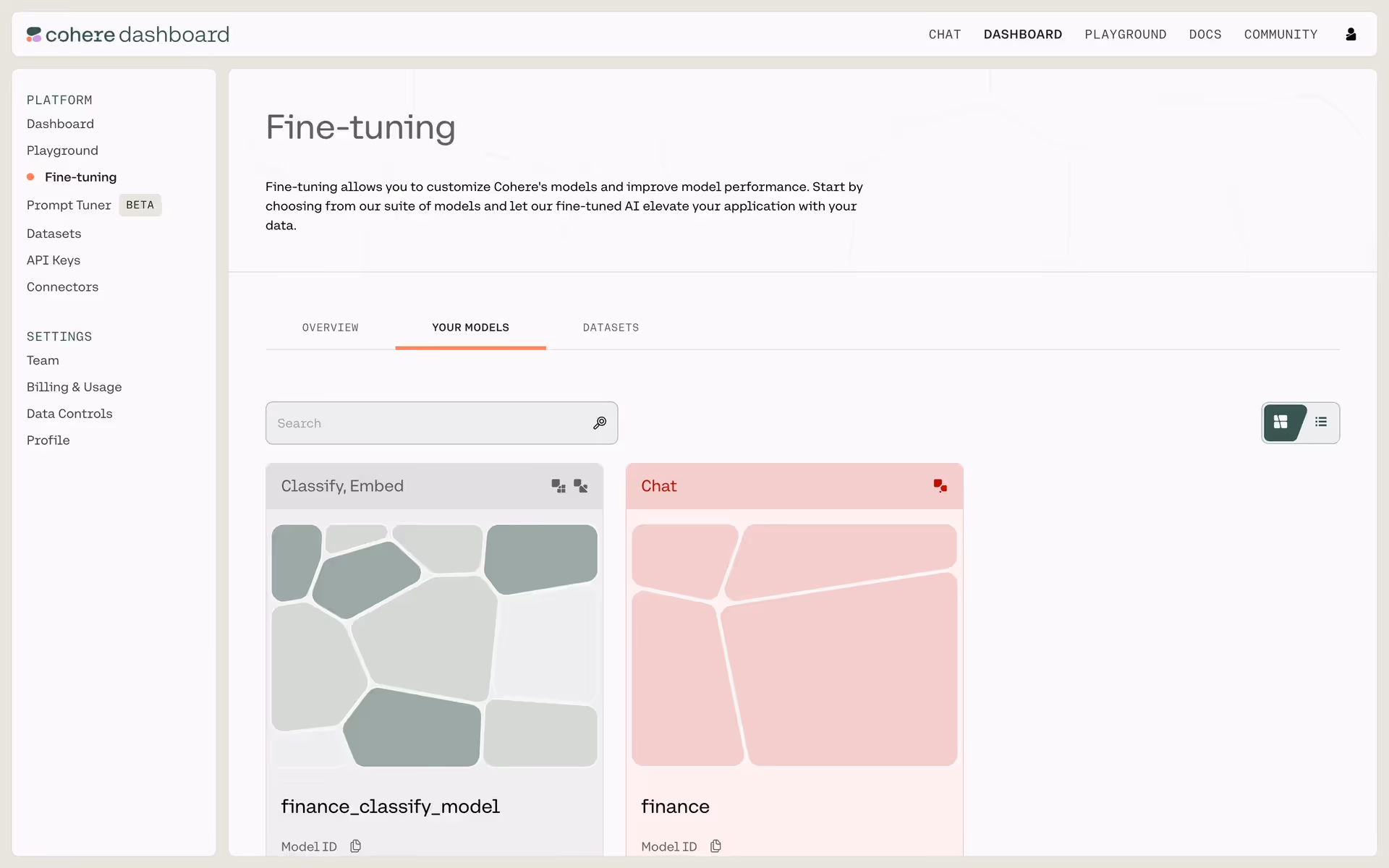
Cohere Inc. is an enterprise AI platform for building large language models. Their branding features a striking mix of Mine Shaft, Alabaster, and the vibrant Bittersweet. On our platform, you can easily copy these colors in Hex, CMYK, RGB, and other popular formats.
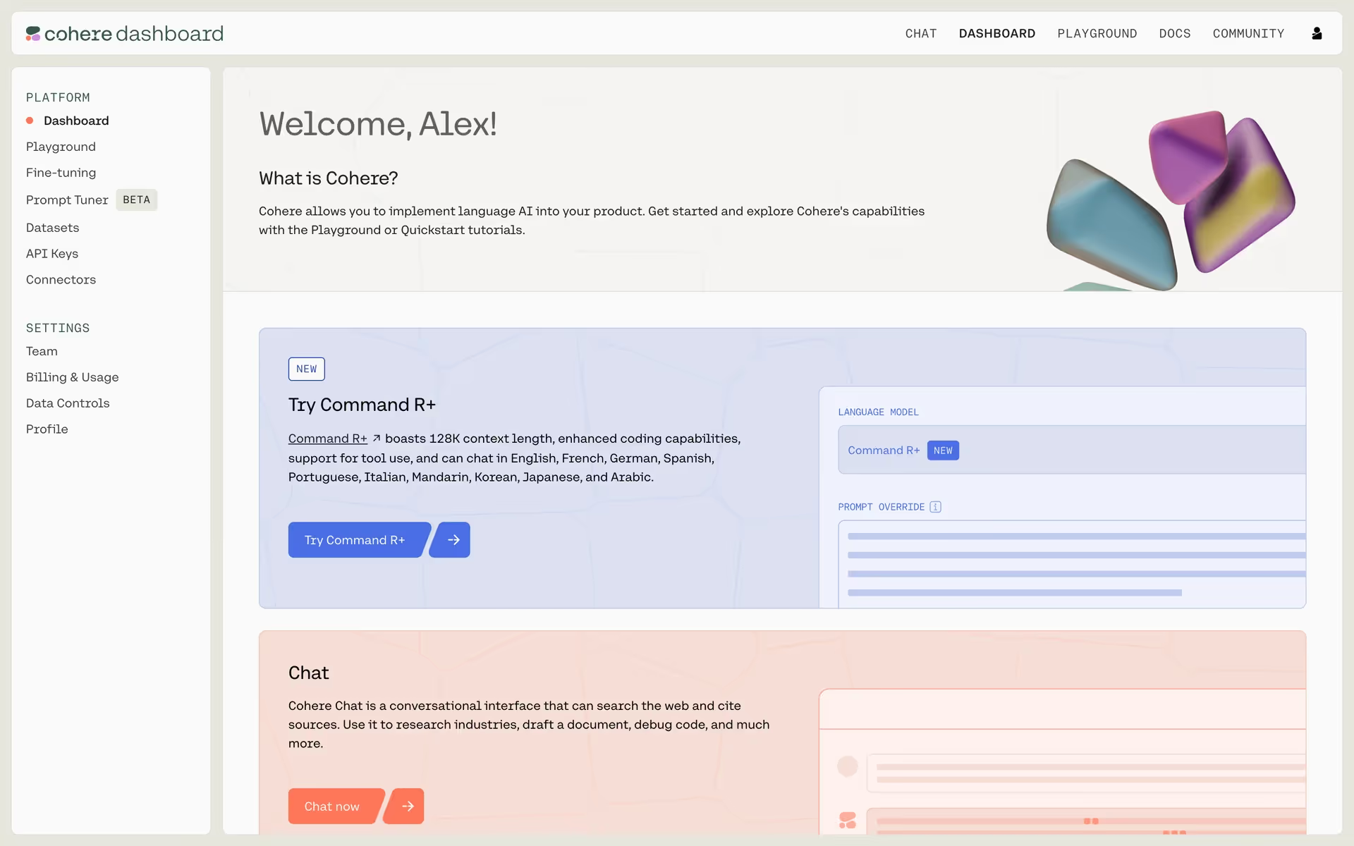
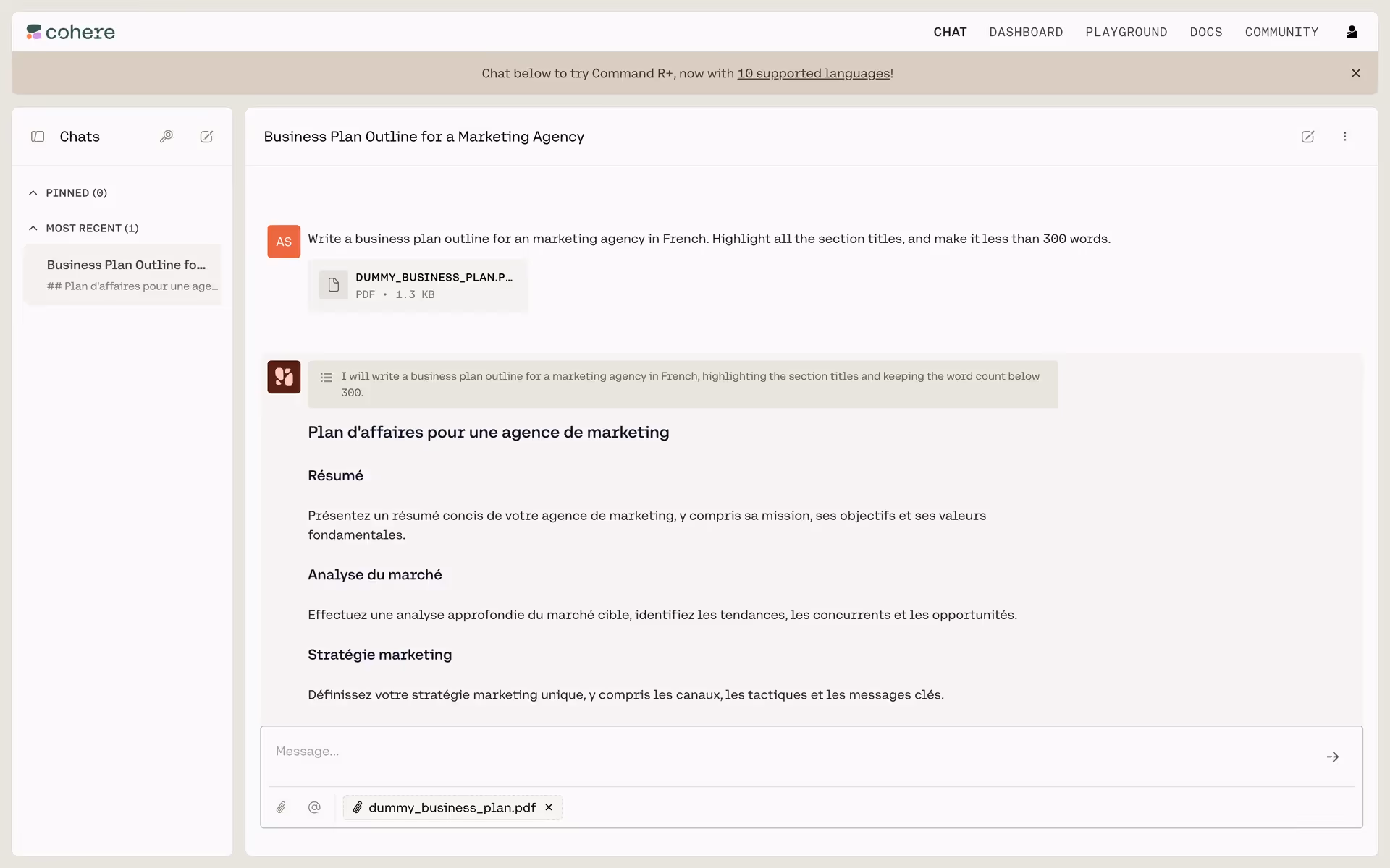
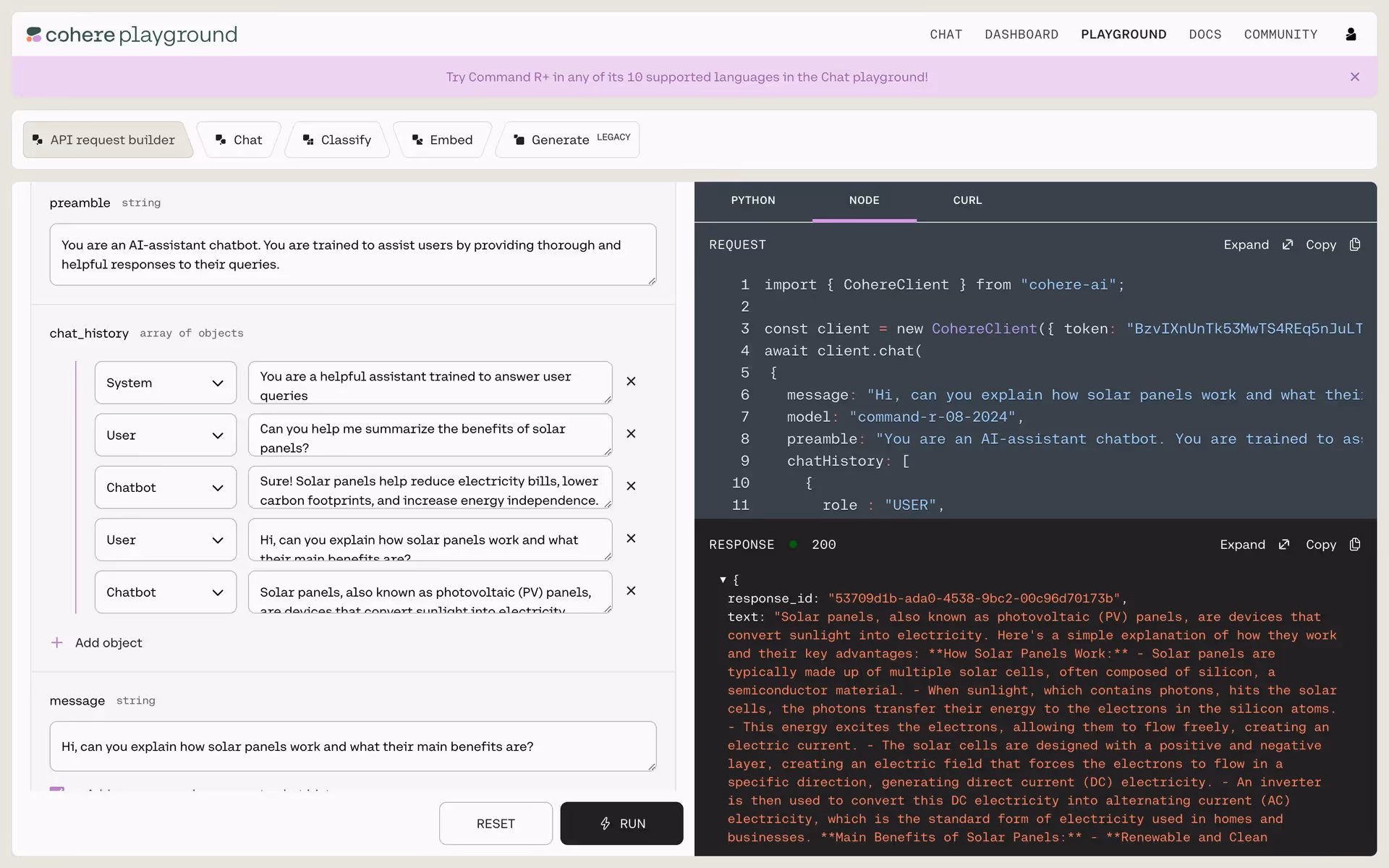
Cohere's main color palette pairs a deep Mine Shaft (#212121) and a clean Alabaster (#FAFAFA) with a vibrant pop of Bittersweet (#FF7759) for accents.
Cohere's foundational dark gray conveys a sense of powerful intelligence and stability, while the pop of bittersweet orange adds a layer of human creativity and warmth, making their advanced tools feel both authoritative and approachable for you.
Cohere's color scheme appears to be a deliberate choice to balance technological sophistication with a vibrant, human-centric feel, making advanced AI feel more approachable and inspiring for creators.
Cohere masterfully employs a high-contrast palette; the neutral foundation of Mine Shaft and Alabaster creates a focused, clean workspace, allowing the energetic Bittersweet to strategically draw your eye to calls-to-action and critical interactive elements.
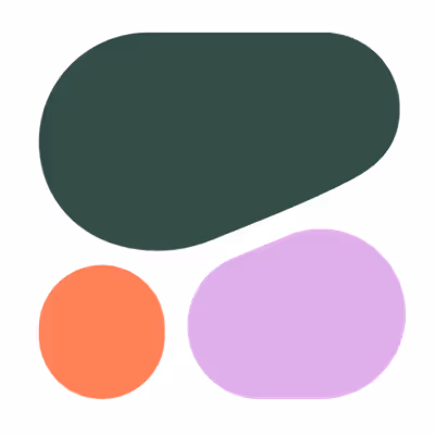
To build on Cohere's strong foundation, we suggest exploring a deep forest green for a touch of sophistication, or a vibrant electric blue to create striking contrast and guide your user's attention.
On our brand colors page, you can explore a curated list of color palettes from top companies. We also offer access to thousands of UI designs from various brands, providing endless inspiration for your next color combination from real-world examples.
Mobbin keeps you at the forefront of design with our extensive, constantly updated library of mobile and web UI/UX patterns. By exploring the latest trends in everything from color usage to intricate user flows, you can easily see what leading apps are doing and stay ahead of the curve in the ever-evolving design industry.
Why not try Mobbin today? You can use it for free for as long as you like, or get full access with any of our paid plans.
Use Mobbin for free as long as you like or get full access with any of our paid plans.