
Tomato
Meet Tomato (#FF6347), a vibrant and energetic hue that commands attention. Its unique position between red and orange gives it a striking warmth and approachability, making it a compelling choice for any designer's palette. This color pops with a distinct personality.
What color is Tomato?
Tomato is a vibrant reddish-orange, a hue that captures the point where red's intensity meets orange's friendliness.
It carries noticeable yellow undertones, which contribute to its warm temperature and give it a lively, approachable quality.
What is the meaning of the color Tomato (#FF6347) in design?
The color Tomato radiates energy and excitement, a hue that naturally grabs attention and can even stir the appetite. It communicates a feeling of warmth and vitality without the full intensity of a true red.
Symbolically, #FF6347 suggests freshness and a certain zest for life. It strikes a balance between passion and friendliness, projecting a confidence that is both bold and approachable.
What are the best practices for using the color Tomato in UI design?
In UI design, Tomato works best as a high-impact accent color. Use its vibrancy for key elements like buttons, alerts, or icons to guide user attention. The color #FF6347 pairs effectively with neutral backgrounds—think soft grays, whites, or dark charcoal—which allows its warmth to stand out without overwhelming the interface. For a bolder look, consider pairing it with deep teals or blues for a striking complementary contrast.
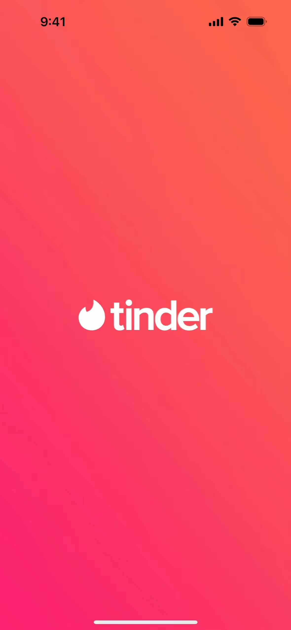
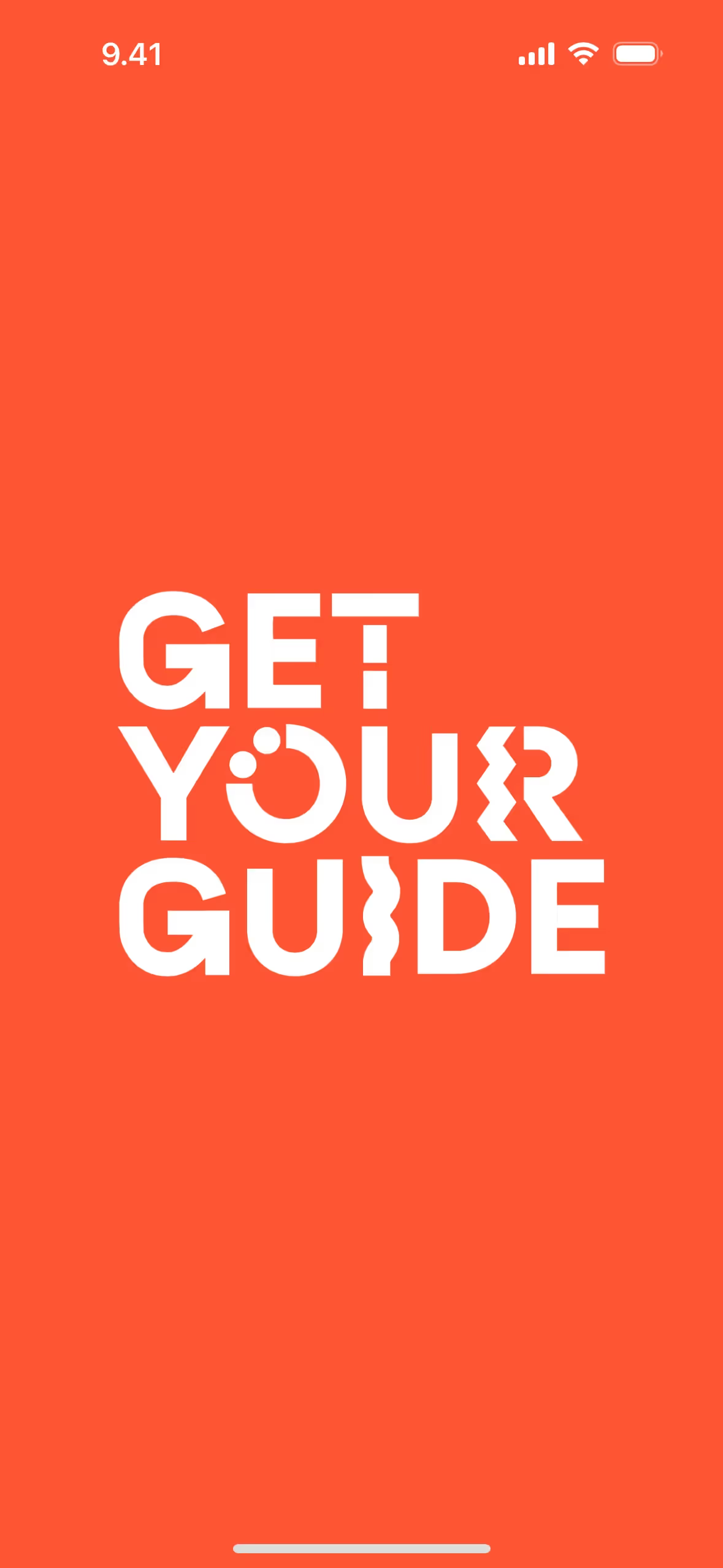
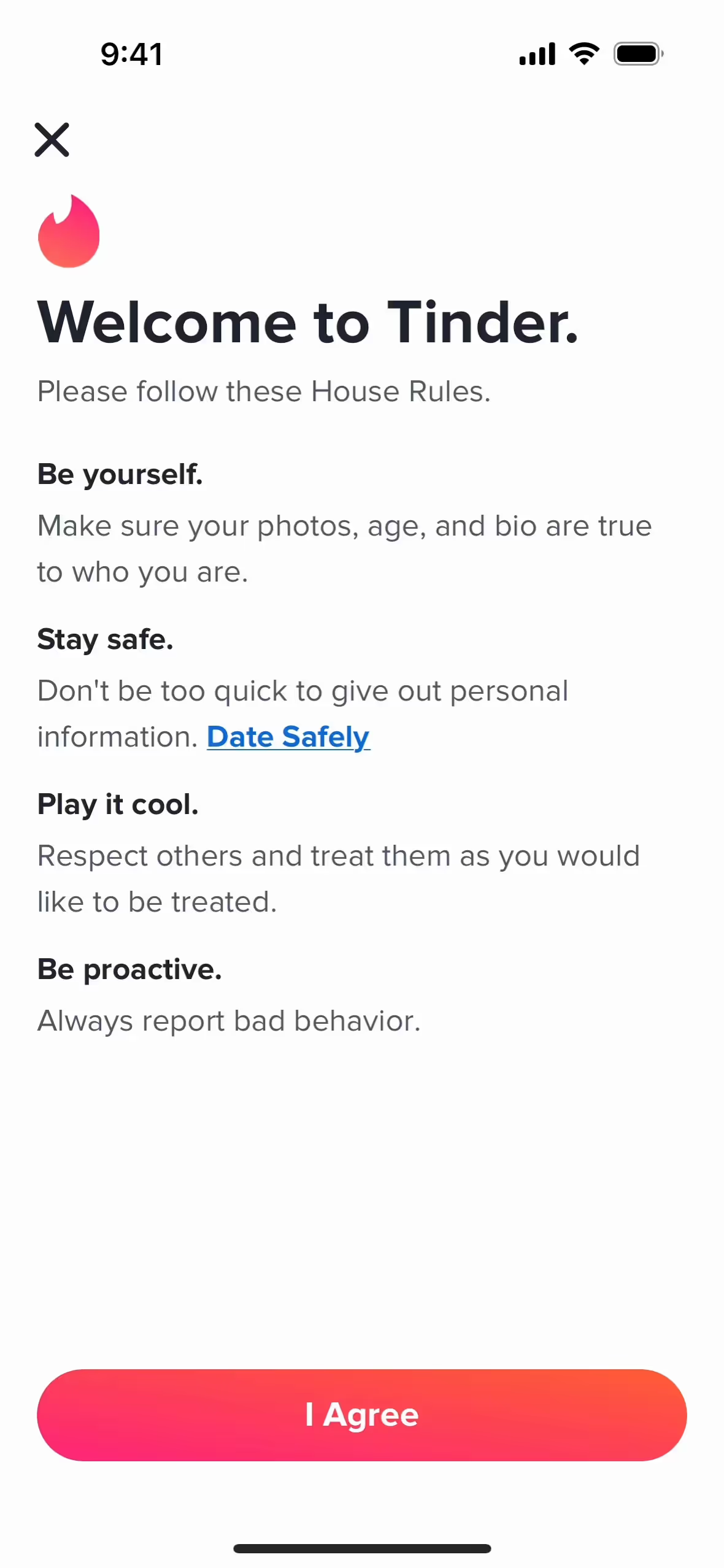
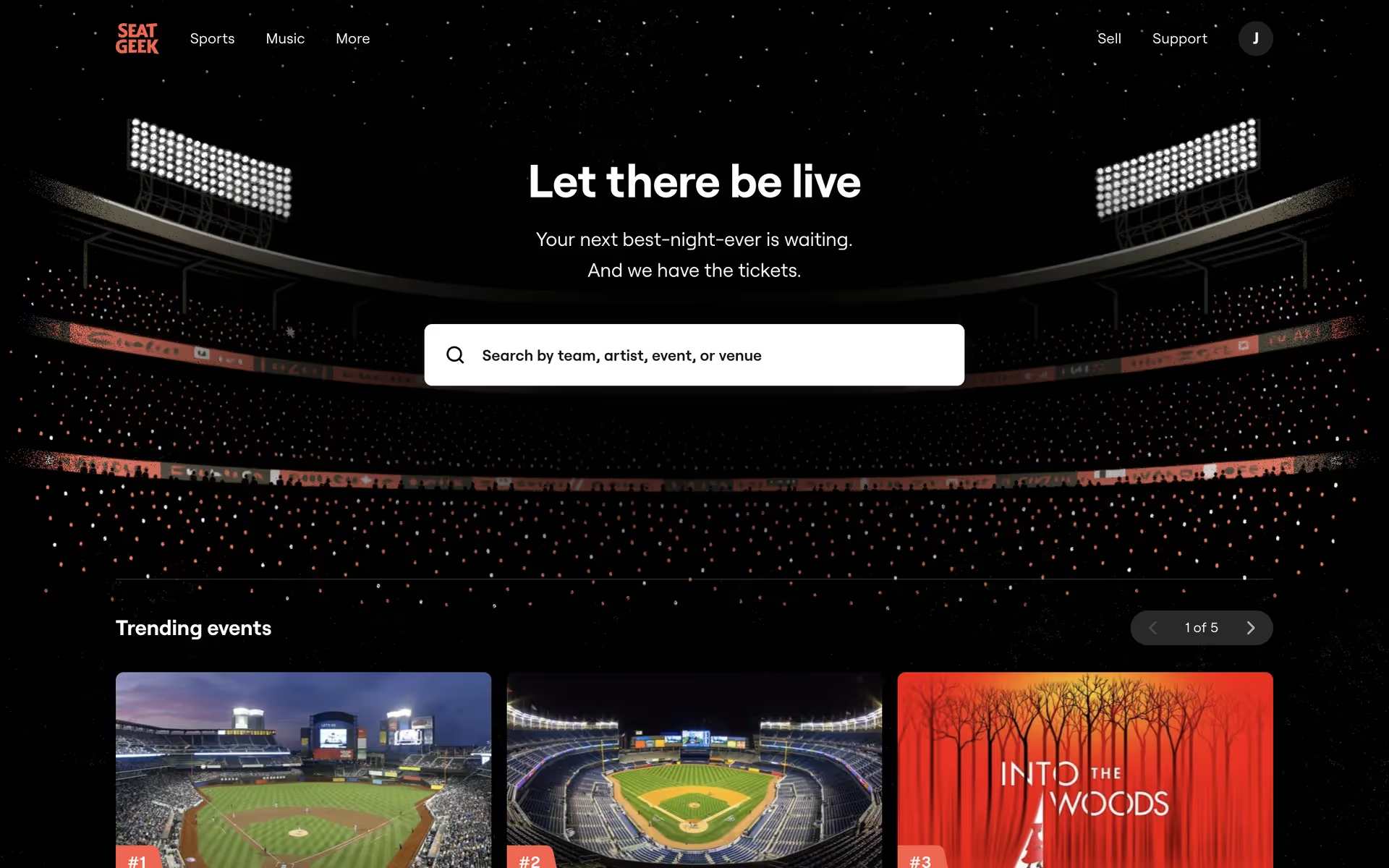
Several major brands have built recognizable identities around similar energetic hues. Companies like Instagram, Tinder, SeatGeek, GetYourGuide, and Noom use these reddish-oranges to create a friendly and action-oriented feel in their products, showing its effectiveness in creating memorable user experiences.
To see how Tomato works in practice, use the tools below. You can explore curated palettes, test the color's contrast ratios for accessibility compliance, and see how #FF6347 looks within real UI components from top applications.
Using Tomato color codes
The most direct way to specify the color Tomato is with its hex code, #FF6347. Its inherent vibrancy makes it a strong choice for an accent color that draws attention without overwhelming a composition.
While hex codes are standard for web design, you may need to convert #FF6347 for other applications. RGB (Red, Green, Blue) values are also for digital screens, while CMYK (Cyan, Magenta, Yellow, Key) is the go-to for print materials. Other models like HSL (Hue, Saturation, Lightness) offer a more intuitive way to make color adjustments.
To make things easy, we've converted #FF6347 into a range of popular formats. You can find and copy the exact values you need for your project right below.
Analogous
Analogous colors are neighbors on the color wheel. When paired with Tomato, they create a harmonious and serene palette, offering a visually pleasing composition.
Complementary
Complementary colors are opposites on the color wheel. When paired with Tomato, its complement creates a high-contrast, vibrant effect, making both colors pop.
Split Complementary
This scheme pairs Tomato with the two colors neighboring its complement, offering the same high contrast but with less tension and more creative freedom.
Triadic
A triadic scheme pairs Tomato with two other colors equally spaced on the color wheel, creating a vibrant and balanced high-contrast palette.
Tetradic
Tetradic palettes pair Tomato with three other hues, forming two complementary pairs for a rich, four-color combination on the color wheel.
Square
A square color scheme uses four colors evenly spaced on the color wheel, creating a vibrant and high-contrast palette with a base like Tomato.
Text Color
Background Color
Your Catchy Large Text Goes Here
Shades
By mixing in black, you get darker shades of Tomato that add visual weight.
Tints
Tints of Tomato are created by mixing in white, resulting in softer, lighter variations.
Tones
Tones of Tomato are created by adding gray, resulting in a softer, desaturated hue.
Hues
Hues are variations of Tomato, sharing its base color but differing in intensity or temperature.


Never run out of inspiration again.
Use Mobbin for free as long as you like or get full access with any of our paid plans.


