
Sonnet
Meet Sonnet (#F7F1E9), a warm off-white with a distinctively creamy character. Its subtle departure from pure white gives it a soft, organic quality, making it a sophisticated foundation for any design palette without the starkness of a clinical white.
What color is Sonnet?
Sonnet is a warm off-white, a soft cream color with subtle yellow and peachy undertones.
Its high value and low saturation give it a quiet, near-neutral character that is gentle and harmonious.
What is the meaning of the color Sonnet (#F7F1E9)?
The color Sonnet (#F7F1E9) carries the quiet elegance of its poetic namesake, suggesting warmth, tranquility, and the timeless appeal of aged parchment.
It offers a sense of sophisticated calm and understated luxury, providing a gentle, organic foundation that feels both classic and clean.
How can I use Sonnet in my UI design?
In UI and web design, Sonnet (#F7F1E9) is an excellent choice for a primary background, offering a softer, more organic feel than pure white. To maintain readability, pair it with high-contrast text, such as a dark charcoal or near-black. This warm neutral works well with earthy palettes, deep jewel tones, or a single, vibrant accent color for a focused pop.
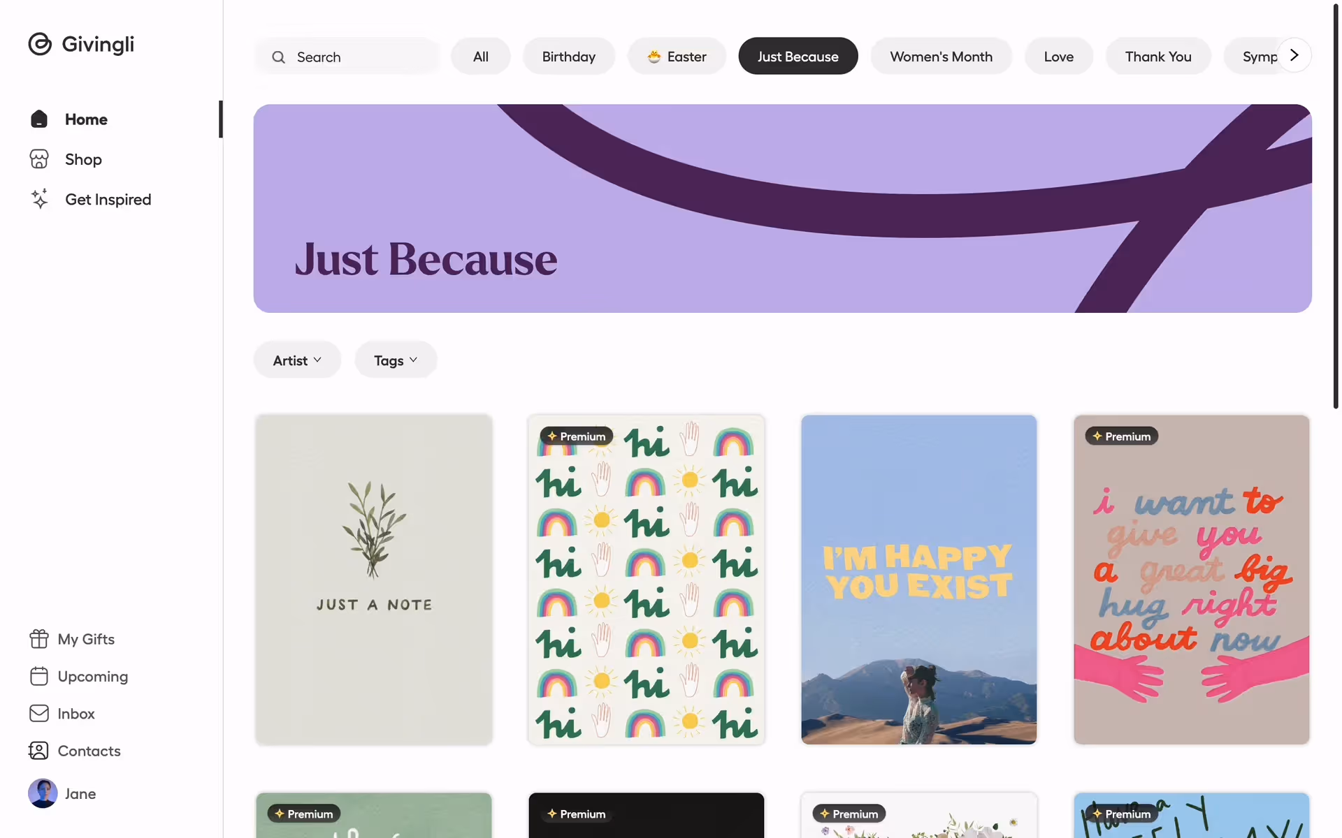
Brands like Givingli, Coda, Perplexity, and Warby Parker use similar off-whites to create a sophisticated and approachable feel. This choice can make a digital product feel more tangible and less clinical, suggesting a premium, considered user experience.
Put Sonnet to the test with the tools below. You can explore curated palettes, check color contrast for accessibility, and preview the color in real UI components from top brands.
Using Sonnet color codes
While #F7F1E9 is the go-to for web development, working across different media requires translating this value. Whether you're preparing assets for print or adjusting colors in a design tool, you'll need the right code for the job.
Each color model serves a specific purpose. RGB is fundamental for digital displays, defining colors by mixing red, green, and blue light, while CMYK values are essential for print projects. Other models like HSL (Hue, Saturation, Lightness) offer a more intuitive way to manipulate color properties directly within your design software.
To help you get started, we've converted Sonnet's #F7F1E9 hex code into several popular formats. Simply copy the values you need from the list below.
Analogous
Analogous colors are three hues sitting next to each other on the color wheel. With Sonnet as the base, they create a harmonious and serene palette.
Complementary
Complementary colors sit on opposite ends of the color wheel. Pairing them with Sonnet results in a vibrant, high-contrast combination that commands attention.
Split Complementary
For Sonnet, a split complementary scheme provides high contrast with less tension, using the two colors neighboring its direct opposite on the color wheel.
Triadic
A triadic scheme pairs Sonnet with two other colors, equally spaced on the color wheel, for a vibrant and balanced high-contrast look.
Tetradic
Tetradic schemes pair Sonnet with three other colors, forming two complementary pairs. This creates a rich, four-color palette for vibrant design work.
Square
A square color scheme uses four colors evenly spaced on the color wheel. With Sonnet as the base, this creates a vibrant, high-contrast palette.
Text Color
Background Color
Your Catchy Large Text Goes Here
Shades
Shades are darker versions of Sonnet, created by adding black to give designs more depth.
Tints
Tints are lighter versions of Sonnet, created by mixing in white for a softer feel.
Tones
Adding gray to Sonnet creates its tones, resulting in softer, more muted variations.
Hues
Hues are variations of Sonnet, sharing its base color but with different intensities and temperatures.


Never run out of inspiration again.
Use Mobbin for free as long as you like or get full access with any of our paid plans.


