
Pearl
Meet Pearl (#EAE0C8), a soft, off-white hue that offers more than meets the eye. Its striking quality comes from a delicate balance of warm, creamy undertones with a touch of muted beige, giving it a sophisticated depth that sets it apart from simple whites or creams.
What color is Pearl?
Pearl is a soft, warm off-white with subtle creamy undertones.
Its gentle hue gives it a classic and sophisticated appearance, distinct from stark, cool whites.
What is the meaning of the color Pearl?
The color Pearl, much like the gemstone it's named after, represents wisdom, purity, and serenity, conveying a sense of quiet elegance and timeless sophistication.
Historically associated with luxury and royalty, its warm off-white character creates a comforting and gentle atmosphere, making digital interfaces feel more approachable and calm.
How can I use the color Pearl in my UI design?
In design, Pearl (#EAE0C8) serves as a sophisticated background, offering a warmer alternative to stark white. For accessible, high-contrast text, pair it with deep browns or charcoals. It works well with muted earth tones for a natural aesthetic or with rich jewel tones for a more luxurious feel.
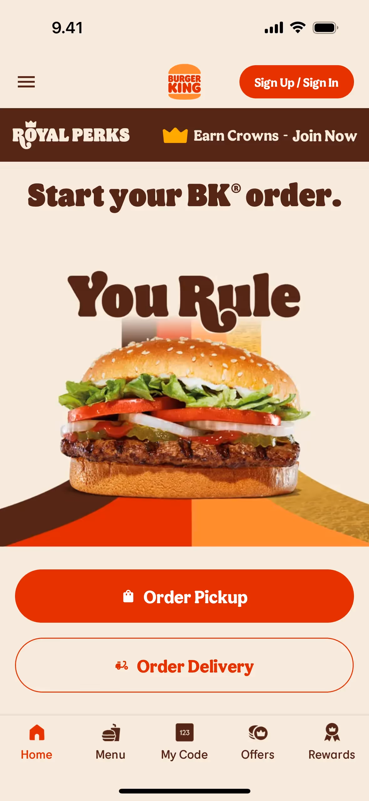
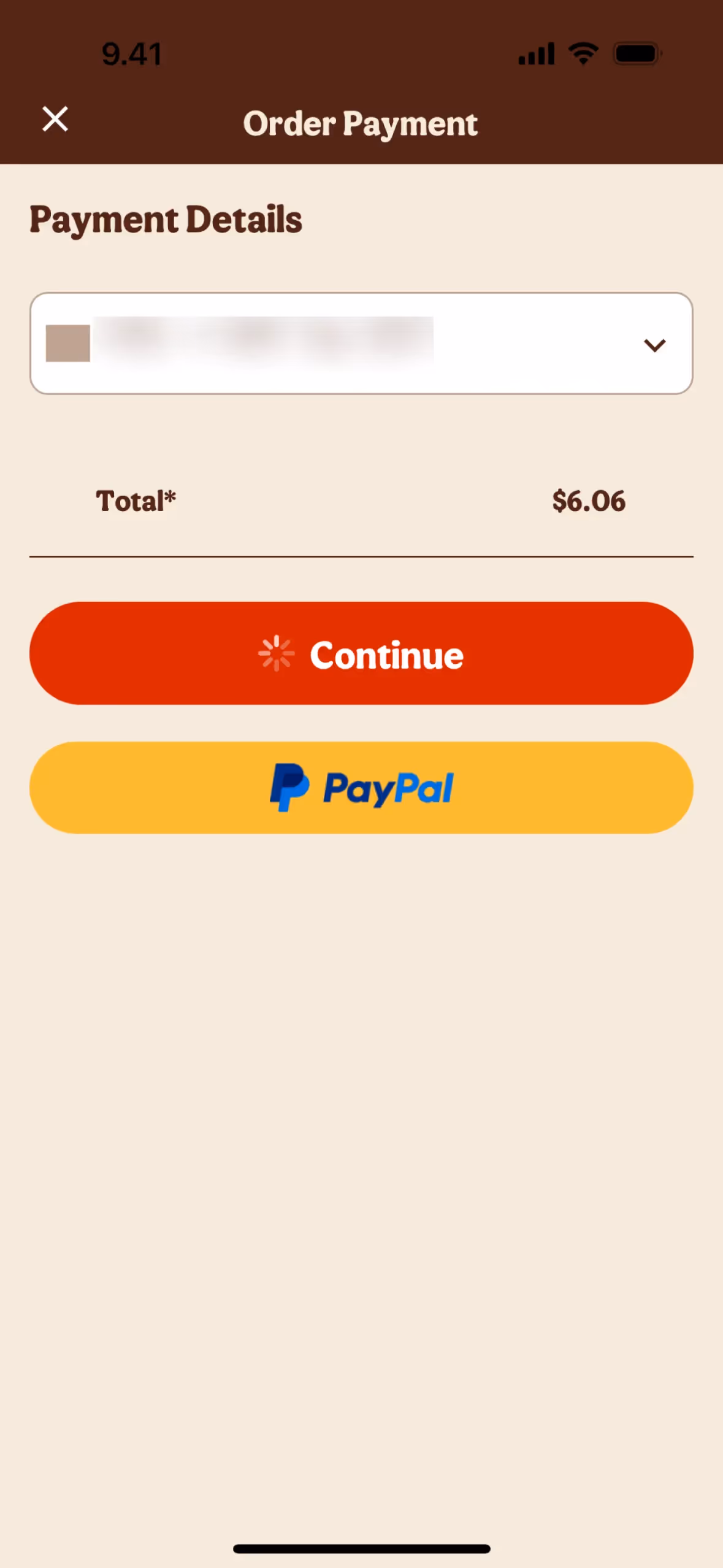
While some brands like Burger King use similar creamy hues, Pearl as a primary brand color is uncommon. This rarity can be an advantage, giving a product a unique visual identity that feels both classic and fresh.
You can explore curated palettes, test color contrast for accessibility, and preview Pearl in real UI components from top brands using the tools below.
Using Pearl color codes
While the hex code #EAE0C8 is standard for web development, working with the color Pearl across different projects requires translating it into other formats. Each color model serves a specific purpose, from digital displays to physical print.
For instance, RGB values define colors for screens using light, whereas CMYK is the go-to for printing inks. Other models like HSL or LAB provide different ways to manipulate color, offering more intuitive adjustments for saturation and brightness.
To help you apply Pearl consistently in your work, we've converted #EAE0C8 into a variety of popular color codes. You can find and copy them directly from the list below.
Analogous
Built from colors adjacent to Pearl on the color wheel, analogous schemes produce a cohesive and serene palette, ideal for calm interfaces.
Complementary
Complementary colors are opposites on the color wheel. Pairing Pearl with its complement creates a striking, high-contrast combination perfect for grabbing attention.
Split Complementary
This scheme pairs Pearl with the two colors adjacent to its complement, creating a high-contrast look with less tension than a direct pairing.
Triadic
A triadic scheme pairs Pearl with two other colors equally spaced on the color wheel, creating a vibrant and high-contrast palette.
Tetradic
Tetradic schemes pair Pearl with three other colors, forming two complementary pairs in a rectangle on the color wheel for a vibrant palette.
Square
A square color scheme uses four colors evenly spaced on the color wheel. With Pearl as the base, this creates a vibrant, high-contrast palette.
Text Color
Background Color
Your Catchy Large Text Goes Here
Shades
Shades are darker versions of Pearl, made by mixing in black for added visual weight.
Tints
Tints of Pearl are created by adding white, resulting in lighter, softer variations of the color.
Tones
Tones of Pearl are created by adding gray, which desaturates the color for a softer appearance.
Hues
Hues are variations of Pearl, altering its intensity and temperature to create different moods.


Never run out of inspiration again.
Use Mobbin for free as long as you like or get full access with any of our paid plans.


