
Pear
Meet Pear (#D1E231), a vibrant chartreuse that commands attention. This electric hue straddles the line between zesty yellow and fresh green, creating a visual pop that is both energetic and distinctly modern. Its high-visibility nature makes it an unforgettable choice for any design palette.
What color is Pear?
Pear (#D1E231) is a vibrant, acidic yellow-green that sits squarely between chartreuse and lime. It’s a high-saturation hue that radiates with an almost electric quality.
With strong yellow undertones, Pear has a distinctly warm temperature, giving it an energetic and fresh character that avoids the cooler nature of traditional greens.
What is the meaning of the color Pear?
The color Pear, a vibrant yellow-green, often brings to mind feelings of freshness, nature, and vitality. It's associated with new growth and the zest of spring, suggesting a sense of renewal and organic energy.
Symbolically, the bright hue of #D1E231 communicates optimism and creativity. Its electric quality can represent forward-thinking ideas and a playful, confident spirit that stands out from the crowd.
How can I use Pear in my UI design?
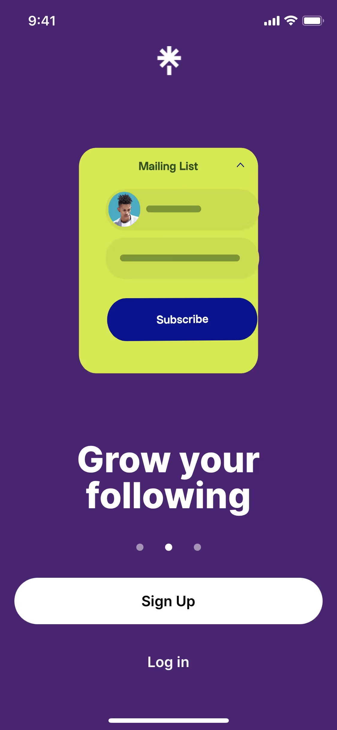
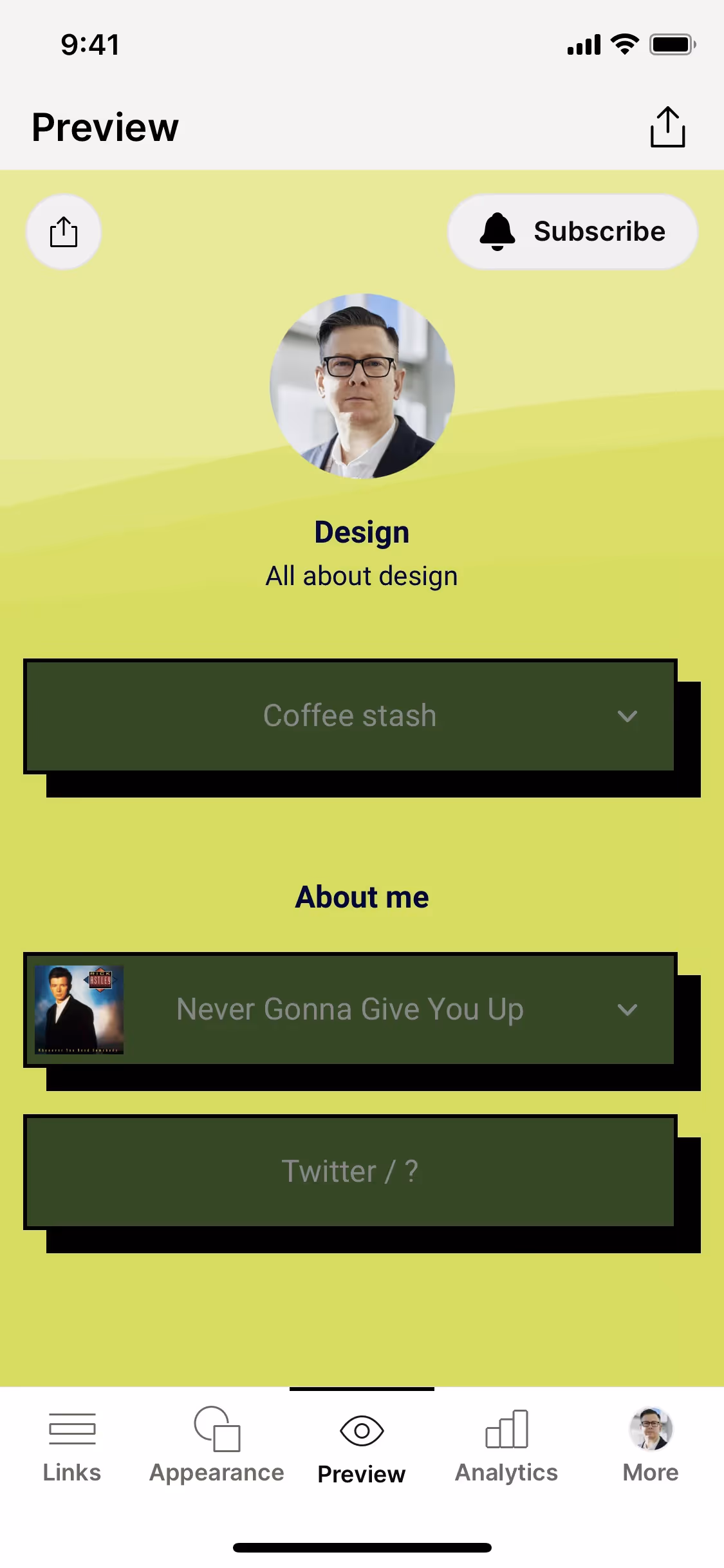
The vibrant nature of Pear (#D1E231) makes it a powerful accent color for grabbing attention on key elements like buttons or notification badges. For maximum legibility, pair it with deep charcoals or dark navy blues. For a more organic feel, combine it with earthy tones and off-whites to ground its intensity.
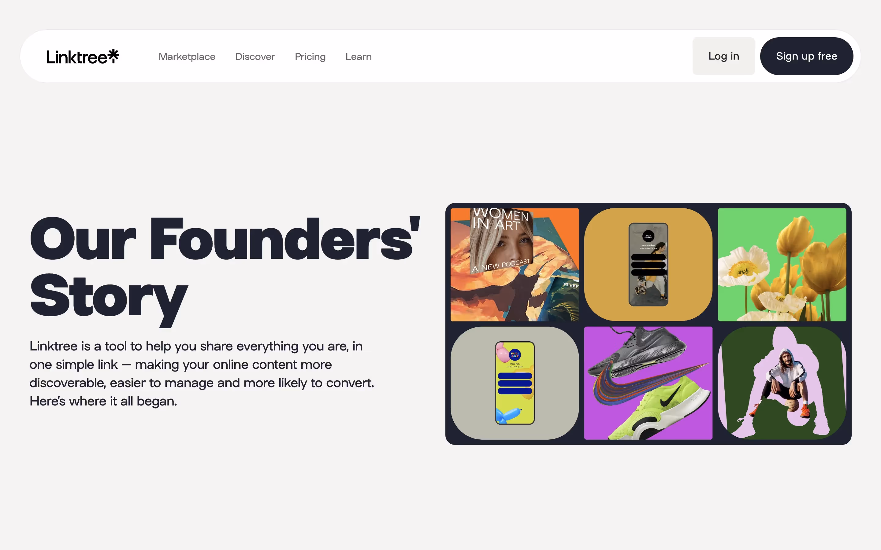
While not a dominant color across the web, Pear's distinctive yellow-green hue is used by brands like Linktree Drops, KOHO, and Udemy. These companies use similar shades to project a modern and fresh identity, showing how the color can help a product stand out.
Use the tools below to explore curated palettes, test color contrast for accessibility, and preview Pear in real UI components from top brands.
Using Pear color codes
Using the color Pear in your projects starts with its digital identifier, the hex code #D1E231. This code is the standard for web design, but to apply Pear consistently across different media, you'll need to translate it into other color models.
Each color model serves a specific purpose. For instance, RGB (Red, Green, Blue) values define colors for digital screens, while CMYK (Cyan, Magenta, Yellow, Key/Black) is essential for print materials. Other models like HSL (Hue, Saturation, Lightness) offer a more intuitive way to make color adjustments in software. This conversion process is critical for maintaining color fidelity across different outputs, from digital displays to physical prints.
To help you get started, we've converted the Pear hex code #D1E231 into a variety of popular formats. You can find and copy the exact values you need for your project below.
Analogous
An analogous color scheme uses colors found next to each other on the color wheel. With Pear, this creates a cohesive and calming palette.
Complementary
Complementary colors sit opposite each other on the color wheel. When paired with Pear, they create a striking, high-contrast visual effect.
Split Complementary
For a high-contrast yet balanced palette, Pear's split complementary scheme pairs it with the two colors adjacent to its direct complement.
Triadic
A triadic scheme pairs Pear with two other colors, all equidistant on the color wheel, creating a high-contrast and harmonious combination.
Tetradic
Tetradic palettes for Pear use two pairs of complementary colors, forming a rectangle on the color wheel for a vibrant, balanced combination.
Square
A square scheme selects four colors equidistant on the color wheel. With Pear as a base, this creates a vibrant, high-contrast, and balanced palette.
Text Color
Background Color
Your Catchy Large Text Goes Here
Shades
By mixing Pear with black, you create shades that add visual depth and gravity.
Tints
Tints are lighter versions of Pear, created by adding white to produce a softer feel.
Tones
Adding gray to Pear creates its tones, resulting in softer, more muted variations.
Hues
Hues are variations of Pear that alter its intensity and temperature, creating different visual moods.


Never run out of inspiration again.
Use Mobbin for free as long as you like or get full access with any of our paid plans.


