
Pastel Yellow
Meet Pastel Yellow (#FDFD96), a soft hue that brings a gentle brightness to any design palette. Its subtle luminosity offers a fresh alternative to more saturated yellows, providing a quiet confidence without overwhelming the visual space. It's a versatile and modern choice for designers.
What color is Pastel Yellow?
Pastel Yellow is a soft, pale shade of yellow, characterized by its high value and low saturation. It has a gentle warmth that feels light and airy, reminiscent of lemon chiffon or early spring sunlight.
This hue often presents with creamy or buttery undertones, giving it a softer appearance than brighter, more saturated yellows. Its muted quality makes it a subtle, approachable color without the sharp intensity of its primary counterpart.
What meaning does the color Pastel Yellow carry in design?
Pastel Yellow carries the optimism and happiness of its primary counterpart, but in a much gentler, more subdued manner. It evokes a sense of soft warmth and calm cheerfulness, symbolizing freshness and new beginnings.
For designers, the color suggests clarity and creativity, helping to build interfaces that feel friendly and approachable without being overwhelmingly bright.
How can I effectively use Pastel Yellow in my UI design?
To make Pastel Yellow work in your designs, focus on contrast. Because of its lightness, #FDFD96 serves well as a background or an accent, but requires a dark counterpart like deep charcoal or black for text to be legible. For a vibrant palette, pair it with rich blues or purples. For a softer, more organic feel, consider pairing it with muted greens or earthy oranges.
While some brands like Tubi incorporate a bright, energetic yellow, Pastel Yellow itself is not a common choice for a primary brand color. This rarity presents a chance for a product to stand out. Using it can give a design a fresh, gentle, and distinctive personality in a market saturated with blues and grays.
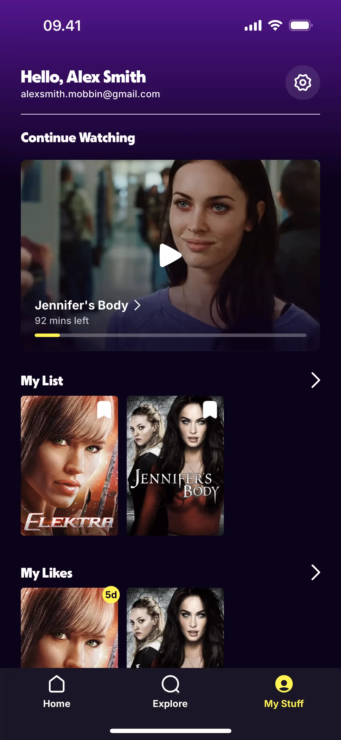
To see these principles in action, use the tools below. You can explore curated palettes, check the accessibility of your color combinations, and see how Pastel Yellow looks within real interface components from leading apps.
Using Pastel Yellow color codes
To apply Pastel Yellow in your work, you’ll typically start with its hex code, #FDFD96. While this is the standard for web design, different projects and platforms often require different color code formats.
For digital screens, you'll use its RGB (Red, Green, Blue) values, which dictate light emission. For print, you'll need the CMYK (Cyan, Magenta, Yellow, Key/Black) equivalent for ink formulation. Other models like HSL (Hue, Saturation, Lightness) provide a more intuitive way for designers to make color adjustments.
We've converted #FDFD96 into a range of popular formats below. Simply find the one you need and copy it for your project.
Analogous
Colors adjacent to Pastel Yellow on the color wheel form an analogous scheme. These palettes are known for their low contrast and cohesive, calming effect.
Complementary
Complementary colors sit opposite each other on the color wheel. For Pastel Yellow, its complement creates a striking, high-contrast visual pairing.
Split Complementary
A split complementary scheme pairs Pastel Yellow with the two colors adjacent to its direct complement, creating a vibrant yet balanced palette.
Triadic
A triadic harmony uses three colors equidistant on the color wheel. For Pastel Yellow, this approach produces a vibrant, high-contrast, and balanced palette.
Tetradic
Tetradic schemes for Pastel Yellow use two pairs of complementary colors, forming a rectangle on the color wheel for a rich, balanced palette.
Square
The square color scheme pairs Pastel Yellow with three other colors, all equidistant on the color wheel, for a balanced yet striking effect.
Text Color
Background Color
Your Catchy Large Text Goes Here
Shades
Adding black to Pastel Yellow creates its shades, giving the color more depth and weight.
Tints
Tints of Pastel Yellow are created by adding white, resulting in softer, more delicate variations.
Tones
Adding gray to Pastel Yellow creates tones, which produce a softer, more muted effect.
Hues
Hues are variations of Pastel Yellow, differing in intensity and temperature to create distinct moods.

Never run out of inspiration again.
Use Mobbin for free as long as you like or get full access with any of our paid plans.


