
Pale Gold
Introducing Pale Gold (#E6BE8A), a warm, sandy hue with a quiet metallic character. Its striking quality lies in its ability to suggest luxury in a restrained fashion, offering a soft glow that feels both modern and approachable for interface design.
What color is Pale Gold?
Pale Gold is a soft, warm color with earthy undertones. It sits between a muted yellow and a light brown, carrying a subtle warmth that avoids the brilliance of traditional gold.
Its low saturation gives it a sophisticated, sandy appearance, reminiscent of aged parchment or sun-bleached desert landscapes. This gives the hue a gentle, approachable quality.
What is the meaning of the color Pale Gold?
Pale Gold carries the prestige of traditional gold, symbolizing success and quality, but with a softer, more sophisticated touch. It suggests understated luxury and timeless value rather than overt wealth.
Psychologically, the color #E6BE8A imparts warmth and optimism. It creates a feeling of comfort and classic elegance, making it a choice for brands that want to appear both premium and approachable.
How can I effectively use Pale Gold in my UI design?
In UI design, Pale Gold (#E6BE8A) works beautifully as an accent color. Apply it to highlights, buttons, or icons to introduce warmth and elegance without overwhelming the user. For a striking effect, pair it with deep blues, dark grays, or rich emeralds to create high contrast. Alternatively, combine it with creams and beiges for a gentle, layered aesthetic.
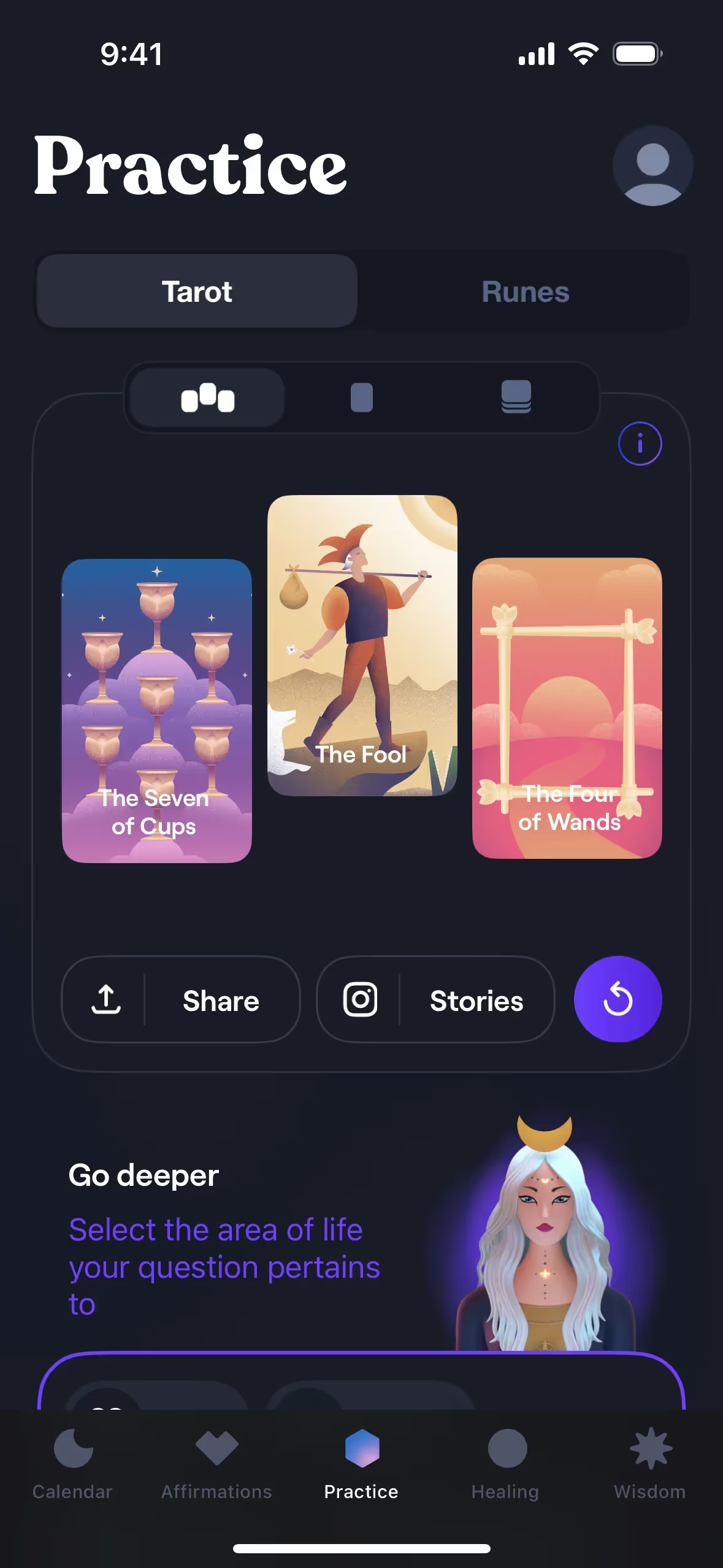
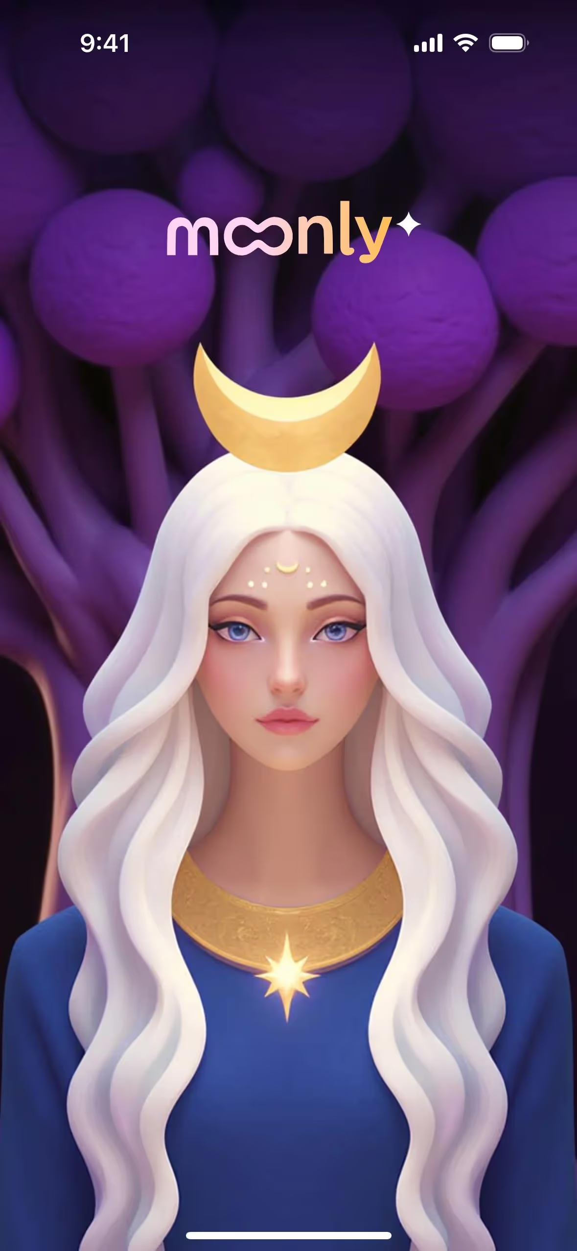
Few brands adopt Pale Gold as a primary color, making it a distinctive choice for those looking to build a memorable identity. Its rarity suggests sophistication and exclusivity. The app Moonly, for instance, uses a similar golden palette to cultivate a calm and premium atmosphere, showing how this color family can define a product's character.
To see how Pale Gold works in practice, use the tools below. You can explore curated palettes, test color contrast for accessibility, and preview #E6BE8A on UI components from top brands.
Using Pale Gold color codes
Using Pale Gold in your work starts with its hex code, #E6BE8A. This is the standard for web and digital applications, but ensuring color consistency across different media requires using the correct color model for each job.
Different design projects call for different color codes. For digital screens, you'll work with RGB (Red, Green, Blue) or its shorthand, HEX codes. For anything destined for print, you'll need the CMYK (Cyan, Magenta, Yellow, Key) values to get accurate color reproduction on paper. Other models like HSL (Hue, Saturation, Lightness) offer more intuitive ways to adjust color properties.
We've converted #E6BE8A to a range of popular formats below. Simply copy the code you need for your project.
Analogous
Analogous colors are found next to Pale Gold on the color wheel. This combination creates a harmonious and serene palette, ideal for calm designs.
Complementary
Complementary colors sit opposite each other on the color wheel. For Pale Gold, its complement creates a striking, high-contrast visual pairing.
Split Complementary
A split complementary scheme for Pale Gold uses the two colors adjacent to its direct opposite, offering high contrast with more nuance.
Triadic
Triadic palettes are built from three colors equidistant on the color wheel. This approach gives Pale Gold a lively, high-contrast, yet harmonious combination.
Tetradic
Tetradic palettes pair Pale Gold with three other hues, forming two complementary sets for a vibrant and balanced four-color combination.
Square
A square color scheme uses four colors equidistant on the color wheel. With Pale Gold as a base, this creates a vibrant, high-contrast palette.
Text Color
Background Color
Your Catchy Large Text Goes Here
Shades
Adding black to Pale Gold creates darker shades, which introduce depth and weight.
Tints
Tints are lighter variations of Pale Gold, achieved by adding white for a softer effect.
Tones
Tones of Pale Gold are created by adding gray, resulting in softer, more subdued variations.
Hues
Hues are variations of Pale Gold, differing in temperature or intensity to shift visual tone.

Never run out of inspiration again.
Use Mobbin for free as long as you like or get full access with any of our paid plans.


