
Medium Purple
Meet Medium Purple, #7E4BDE, a highly saturated shade that commands attention. Sitting perfectly between cool blue and energetic red, its digital-native vibrancy gives it a uniquely modern and assertive character, making it a compelling choice for contemporary interfaces.
What color is Medium Purple?
Medium Purple is a vibrant, balanced shade that sits comfortably between the deep richness of royal purple and the gentle softness of lavender. It offers a clear, distinct purple hue without leaning too heavily towards red or blue.
Characterized by its noticeable blue undertones, Medium Purple carries a cool temperature. This gives the color a modern and composed quality, setting it apart from warmer, reddish purples.
What meaning does Medium Purple (#7E4BDE) convey in design?
Historically, purple shades were linked to royalty and nobility due to the rarity of the dye. Medium Purple carries this sense of sophistication and ambition, suggesting a certain prestige.
Psychologically, #7E4BDE inspires creativity and imagination. It strikes a balance between the calm of blue and the energy of red, often associated with wisdom, dignity, and a touch of magic.
How can I effectively use Medium Purple in my UI design?
To apply Medium Purple in your designs, consider its versatility. The color #7E4BDE creates a sharp, clean look when contrasted with off-whites or dark grays. For a more dynamic palette, pair it with a complementary mustard yellow or an analogous cool blue. A practical approach is the 60-30-10 rule, where Medium Purple can serve as the 10% accent color for key interface elements like buttons and icons.
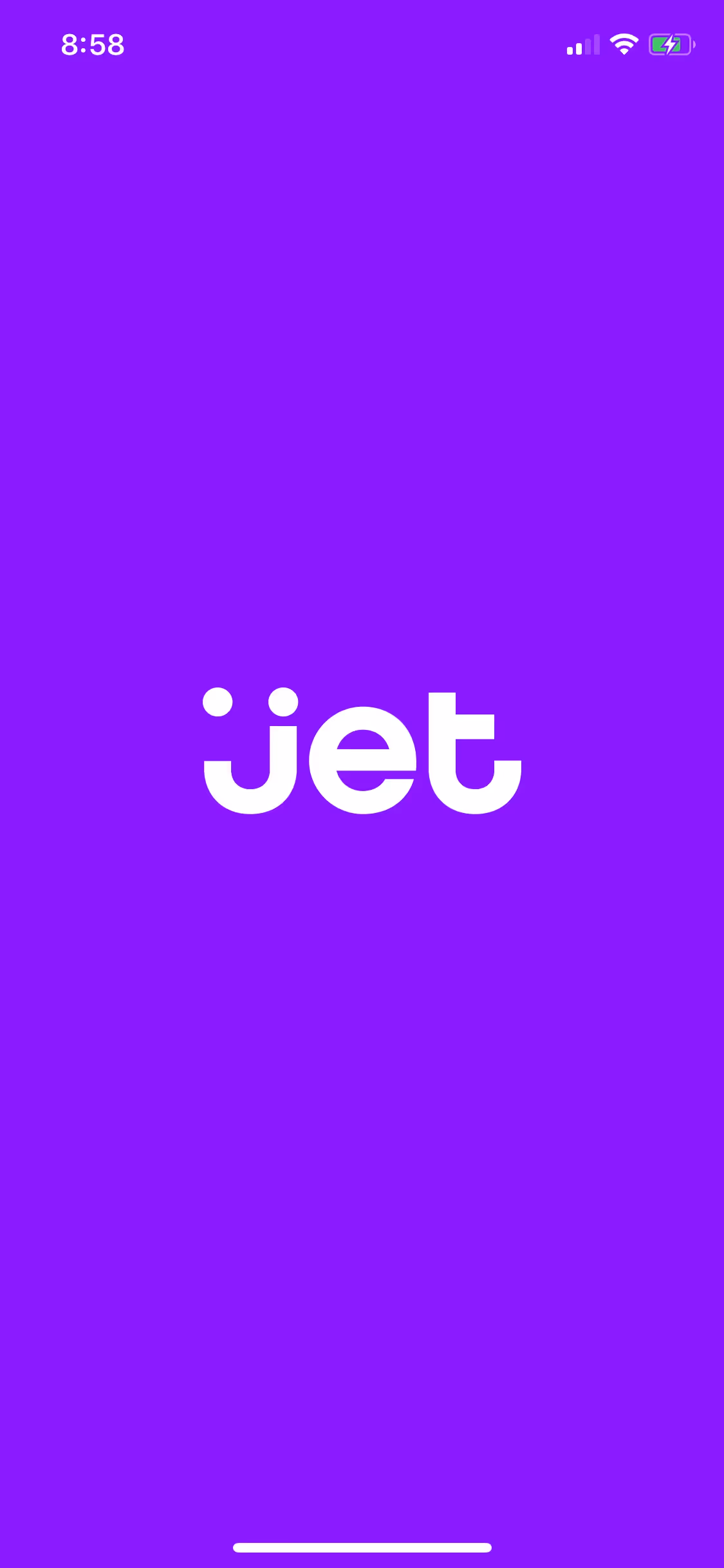
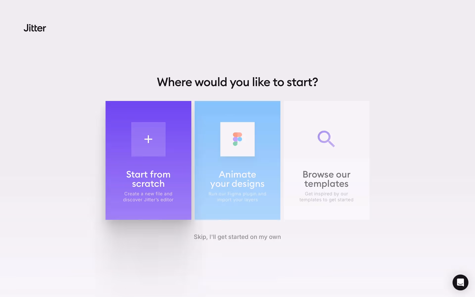
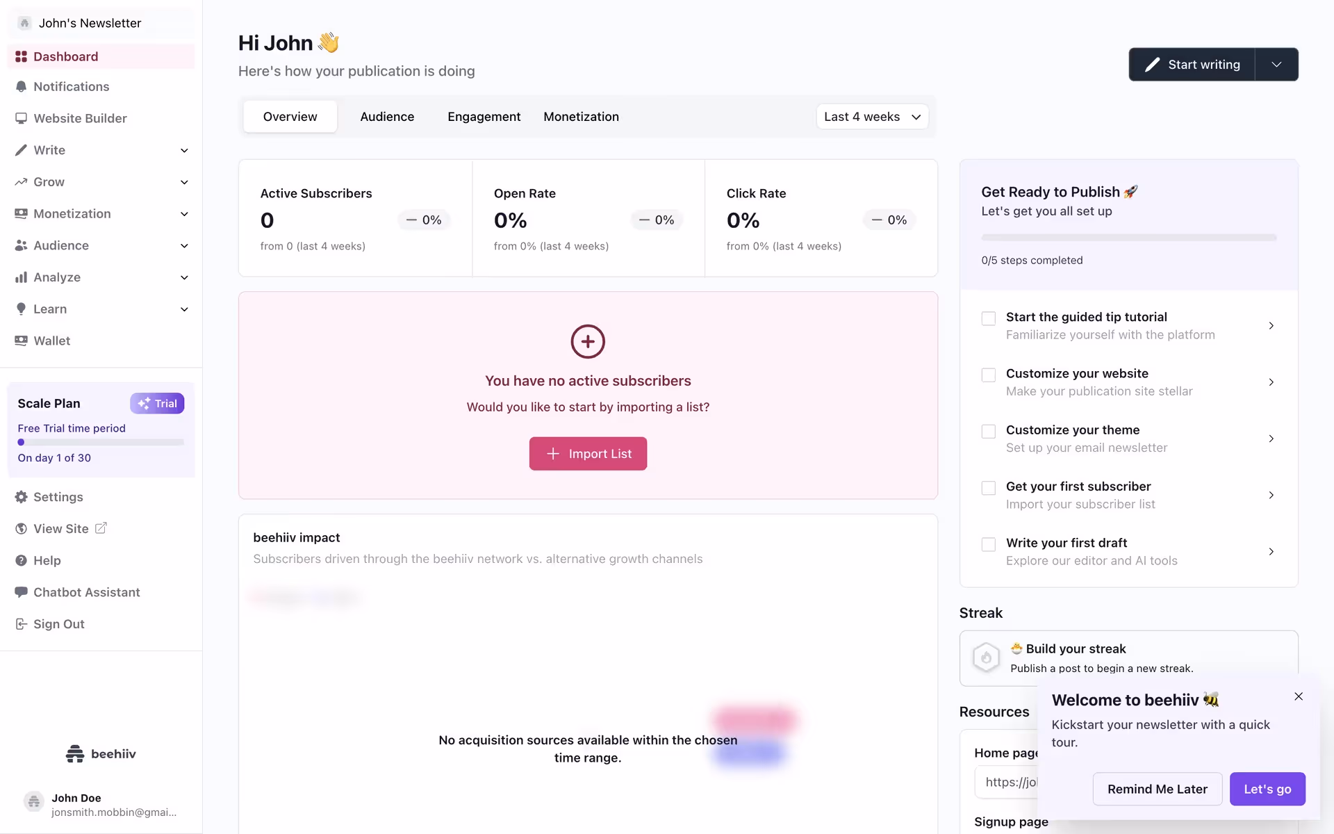
While not a dominant color across the web, you can spot similar purples in the branding of modern tech companies like Jitter, beehiiv, and Mimo. Its selective use suggests a brand that is creative, confident, and a little bit different from the crowd.
You can use the tools below to explore curated palettes, test color contrast for accessibility, and preview Medium Purple in real UI components of top brands.
Using Medium Purple color codes
Using Medium Purple effectively starts with its code, #7E4BDE. This specific shade has a strong presence, so applying it requires a clear intention for the visual message you want to send, whether it’s for a digital interface or a physical product.
While #7E4BDE is standard for web development, your project might require different color models. For digital displays, you can translate it to RGB (Red, Green, Blue) values. If you're designing for print, you'll need its CMYK (Cyan, Magenta, Yellow, Key) equivalent for color accuracy on paper. Other formats like HSL (Hue, Saturation, Lightness) offer a more intuitive way to make adjustments.
To help you get started, we've converted #7E4BDE into a range of popular formats. You can find and copy the exact codes you need for your project in the section that follows.
Analogous
For Medium Purple, its analogous colors are neighbors on the color wheel, creating a palette that feels both harmonious and exceptionally calm.
Complementary
Colors opposite Medium Purple on the color wheel are its complements. This pairing creates a strong, high-contrast relationship, making both hues appear more vivid.
Split Complementary
A split complementary scheme provides high contrast with more nuance. For Medium Purple, this involves pairing it with the two colors adjacent to its direct complement.
Triadic
Triadic color schemes use three hues equally spaced on the color wheel. With Medium Purple, this creates a vibrant, high-contrast, and balanced palette.
Tetradic
A tetradic scheme uses two pairs of complementary colors, forming a rectangle on the color wheel to create a balanced, four-color palette with Medium Purple.
Square
A square color scheme pairs Medium Purple with three other colors, all evenly spaced on the color wheel for a bold, contrasting effect.
Text Color
Background Color
Your Catchy Large Text Goes Here
Shades
Adding black to Medium Purple produces shades, which can ground your design with added weight.
Tints
Tints of Medium Purple are created by adding white, resulting in softer, lighter variations.
Tones
Tones of Medium Purple are created by adding gray, resulting in softer, more subdued variations.
Hues
Hues are variations of Medium Purple, differing in intensity or temperature to create distinct moods.


Never run out of inspiration again.
Use Mobbin for free as long as you like or get full access with any of our paid plans.


