Grayish
Meet Grayish (#CFCAC7), a sophisticated neutral that subtly departs from true gray. Its defining characteristic is a delicate warmth, giving it an organic, earthy quality that feels both modern and timeless, making it a compelling choice for nuanced digital palettes.
What color is Grayish?
Grayish is a soft, warm gray that sits at the intersection of beige and off-white.
Its character comes from a faint, rosy undertone, which gives the color a gentle complexity beyond that of a simple neutral gray.
What is the meaning of the color Grayish (#CFCAC7)?
Grayish embodies balance and neutrality, a sophisticated middle ground between extremes. It often symbolizes intellect, compromise, and a quiet, understated strength.
This color evokes a sense of calm and composure, creating a stable and reserved atmosphere that feels both timeless and dependable.
How should I use Grayish in my UI design?
Grayish (#CFCAC7) shines as a sophisticated background or accent, offering a softer alternative to stark white or cool gray. For a high-contrast, modern feel, pair it with deep charcoals or vibrant jewel tones. Alternatively, combine it with other warm neutrals and earthy colors to build a serene, monochromatic interface that feels grounded and organic.
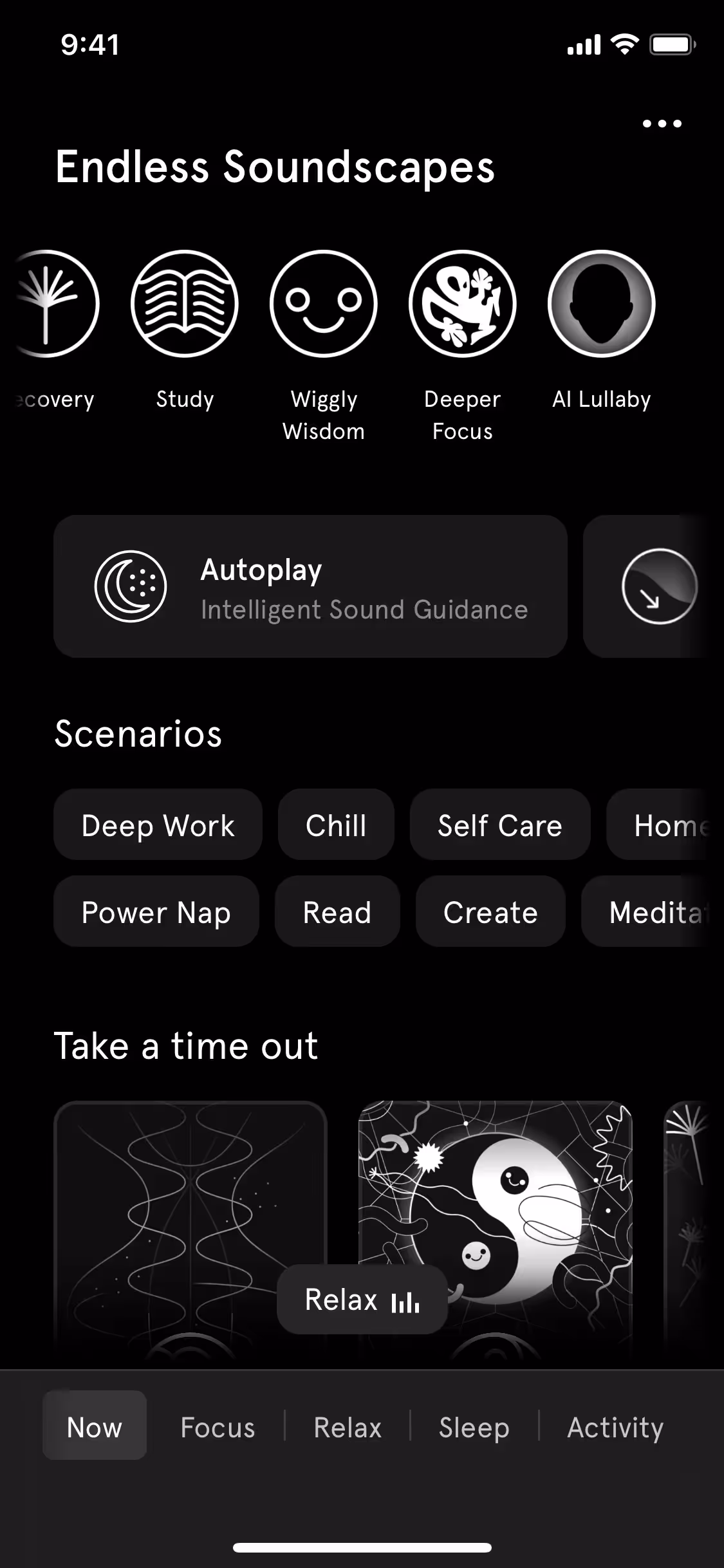
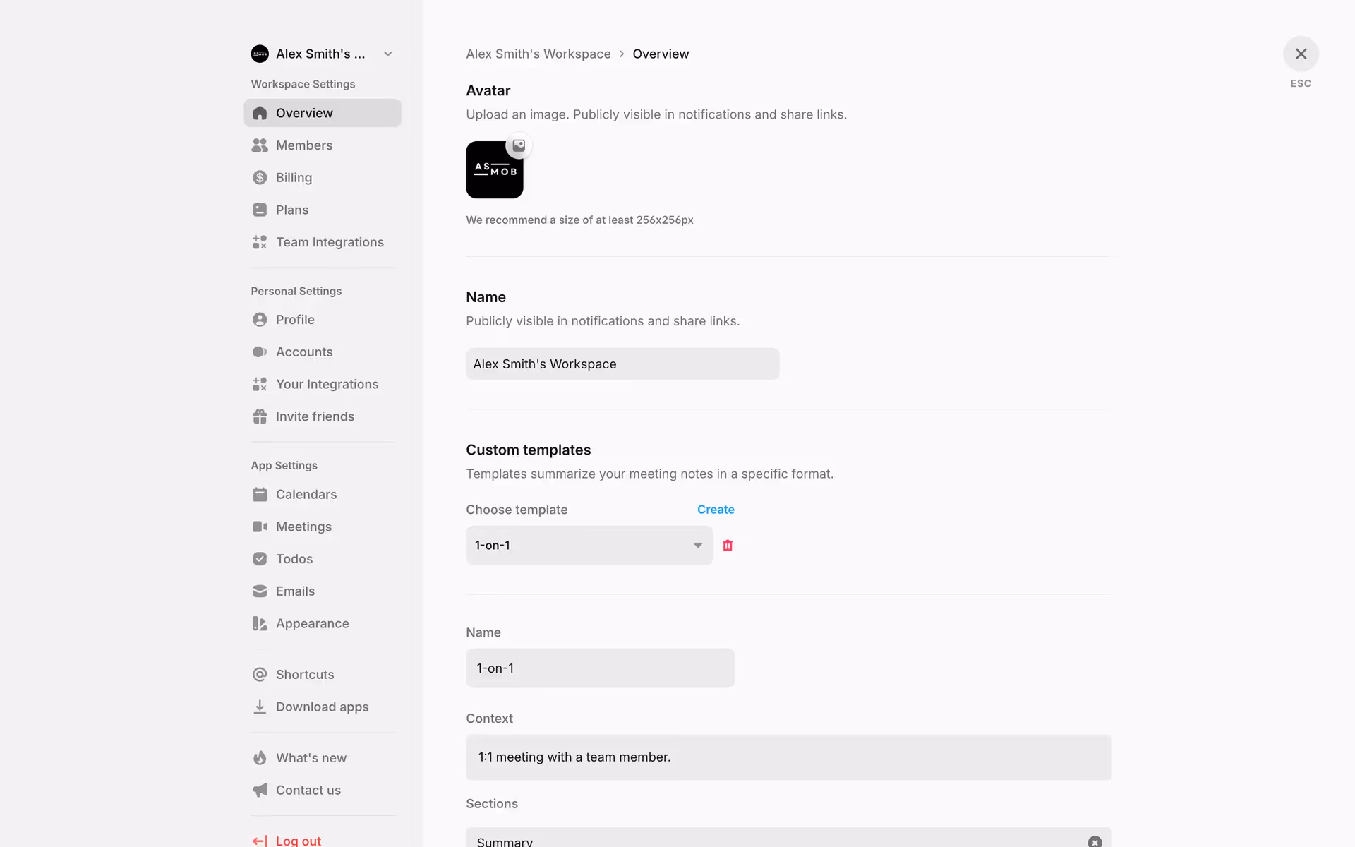
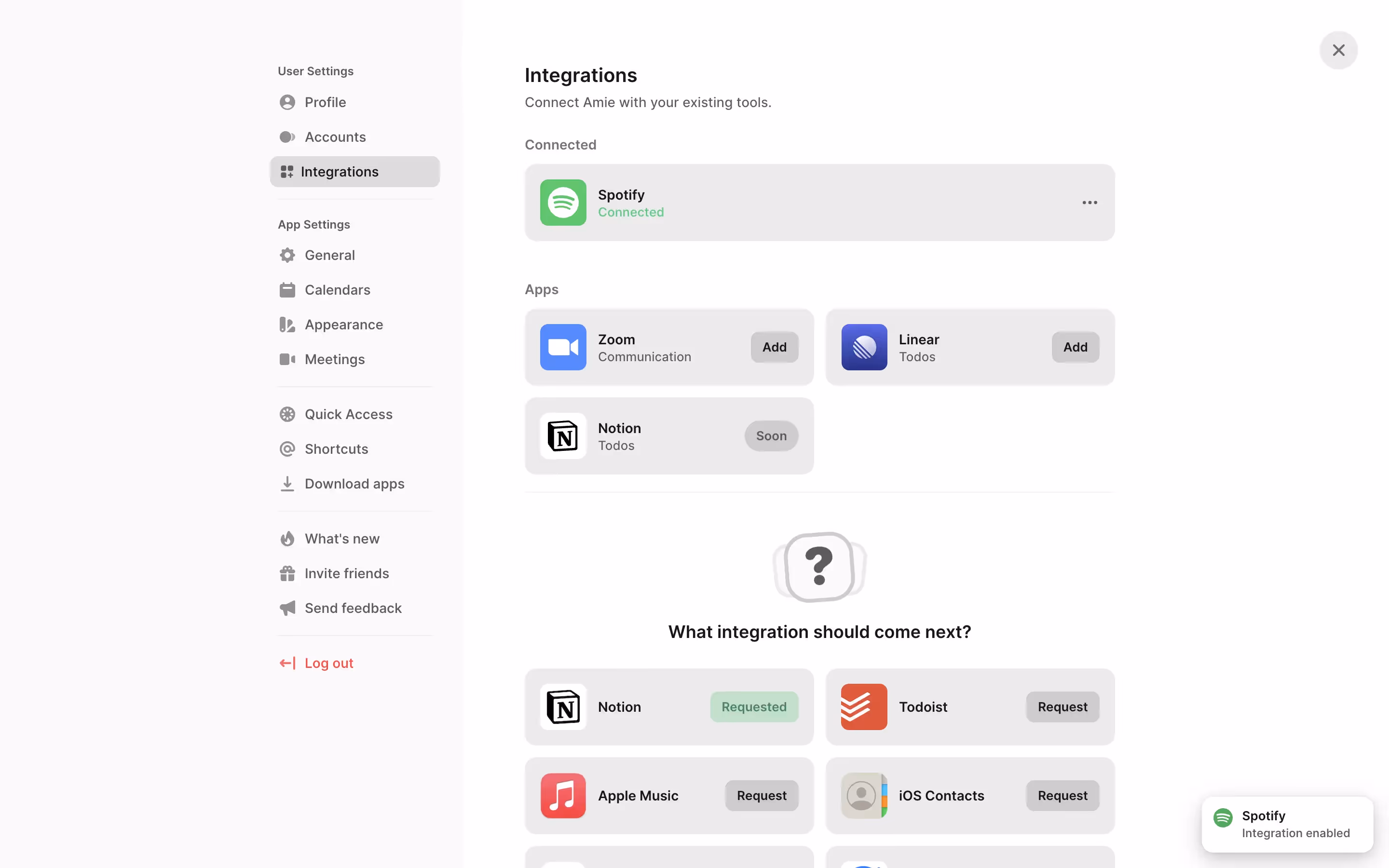
While not a dominant color across the web, its thoughtful application can be seen in brands like Amie, Endel, and Peloton. They use similar off-white and light gray shades to establish a premium, focused, and calm user experience. This selective use suggests a move toward more nuanced and comfortable digital environments.
To see how Grayish performs in your own projects, use the tools below. You can explore curated palettes, test color contrast for accessibility, and preview #CFCAC7 in real UI components from top brands.
Using Grayish color codes
To use Grayish in your projects, you'll need its color code. While #CFCAC7 is the standard hexadecimal format for digital work, different design contexts require different representations.
For instance, RGB values are essential for screen-based designs, while CMYK is the standard for anything destined for print. Other models like HSL provide a more intuitive way to make adjustments, defining a color by its hue, saturation, and lightness.
We've converted #CFCAC7 into a range of popular formats below. Find the one you need and copy it directly into your design tool or codebase.
Analogous
An analogous palette uses colors adjacent to Grayish on the color wheel. This combination produces a particularly harmonious and calming effect in design.
Complementary
Complementary colors are direct opposites on the color wheel. Paired with Grayish, they create a striking, high-contrast effect that makes both hues stand out.
Split Complementary
A split complementary scheme pairs Grayish (#CFCAC7) with the two colors adjacent to its complement, creating a high-contrast yet harmonious visual effect.
Triadic
Triadic color schemes use three hues equally spaced on the color wheel. With Grayish as the base, this creates a vibrant, high-contrast palette.
Tetradic
A tetradic scheme uses four colors in a rectangular formation on the color wheel, giving Grayish two pairs of complementary partners for a vibrant palette.
Square
A square color scheme uses four colors equidistant on the color wheel, forming a vibrant palette with strong contrast, all balanced around the neutral Grayish.
Text Color
Background Color
Your Catchy Large Text Goes Here
Shades
Shades of Grayish are created by adding black, giving the color more depth and weight.
Tints
Tints are lighter versions of Grayish, created by adding white for a softer look.
Tones
Adding gray to Grayish creates tones, resulting in softer, more muted versions of the color.
Hues
Hues are variations of Grayish that differ in intensity or temperature, creating distinct moods.


Never run out of inspiration again.
Use Mobbin for free as long as you like or get full access with any of our paid plans.