
Gray
Meet Gray (#808080), the quintessential neutral. Perfectly balanced between black and white, its striking quality is its ability to support vibrant hues or stand alone with quiet confidence. This foundational color is a staple for creating sophisticated and clean digital interfaces.
What color is Gray?
Gray is a perfectly neutral, achromatic color, sitting at the midpoint between pure black and stark white. It's defined by its absence of strong chromatic content, making it a foundational element in any palette.
Despite its neutrality, Gray possesses a surprising depth through its undertones. It can lean cool with hints of blue or green, or feel warmer with subtle infusions of brown or pink, giving each variation a distinct character and temperature.
What is the meaning of the color Gray in design?
Often perceived as the color of compromise, Gray embodies neutrality and balance. It's a color that stands back, creating a sense of calm and composure without the strong emotional pull of more saturated hues.
Symbolically, Gray can represent sophistication, intellect, and solid foundations. However, it can also evoke feelings of detachment or indecision, a quiet backdrop that can be either stabilizing or somber depending on its application.
How can I effectively use Gray in UI design?
In UI design, Gray is a foundational neutral that excels at creating visual hierarchy. Use lighter shades of Gray for backgrounds to reduce eye strain and make primary content stand out. For a sophisticated look, pair it with a single vibrant accent color for buttons and interactive elements. This creates a clean interface where users know exactly where to focus.
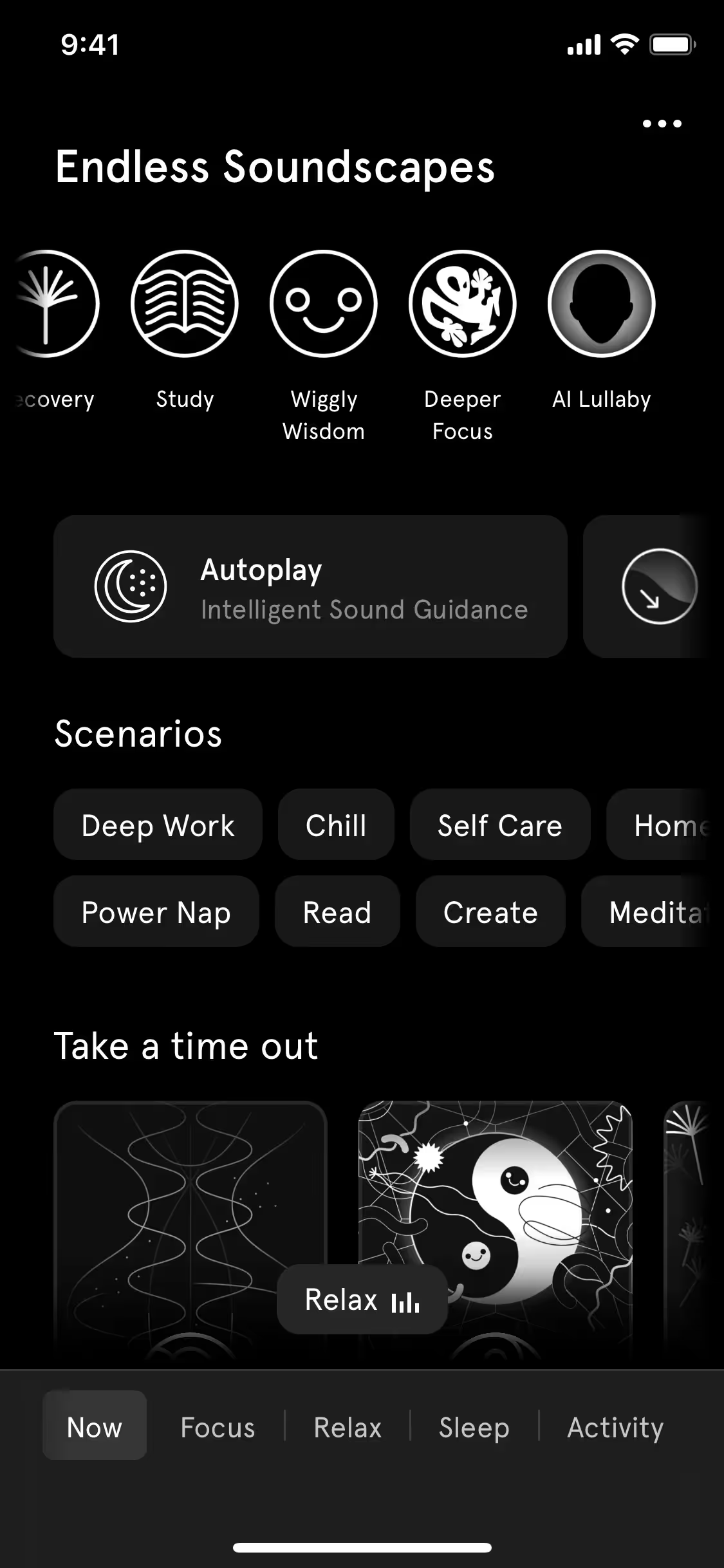
While few brands build their entire identity around Gray, many, like Endel, use it to craft a specific mood. Its infrequent use as a primary color presents a unique opening for brands wanting to project stability and sophistication. It's a color that supports the main event rather than stealing the show.
To see how #808080 works in practice, use the tools below. You can explore curated palettes, test color contrast for accessibility, and preview Gray in real UI components from top brands.
How do I use Gray color codes?
The most direct way to specify Gray is with its hex code, #808080. As a pure, neutral mid-tone, it serves as an excellent starting point for creating lighter tints or darker shades for your project.
While HEX is standard for web development, you’ll often need to translate #808080 into other color models. For screen-based work, you’ll use RGB (Red, Green, Blue), an additive model for digital displays. For print materials, you’ll convert to CMYK (Cyan, Magenta, Yellow, Key/Black), a subtractive model for inks. Other systems like HSL, LAB, LCH, and XYZ offer different ways to define and manipulate color based on human perception and technical requirements.
To simplify your workflow, we have converted Gray (#808080) into a variety of formats. You can find and copy the exact codes you need for your tool or medium in the section below.
Analogous
For Gray, analogous colors are those found directly beside it on the color wheel. This pairing results in a cohesive and calming palette.
Complementary
Complementary colors are opposites on the color wheel. When paired with a neutral base like Gray, they produce a striking, high-contrast visual effect.
Split Complementary
A split complementary scheme for Gray uses the two colors adjacent to its direct complement, offering a vibrant yet balanced high-contrast palette.
Triadic
A triadic color scheme for Gray involves two additional colors, creating a vibrant, high-contrast palette with hues equally spaced on the color wheel.
Tetradic
A tetradic scheme for Gray uses two pairs of complementary colors, forming a rectangle on the color wheel for a vibrant, balanced palette.
Square
The square color scheme pairs Gray with three other equidistant colors on the wheel, offering a vibrant palette with strong, balanced visual contrast.
Text Color
Background Color
Your Catchy Large Text Goes Here
Shades
Adding black to Gray creates darker shades, introducing a sense of depth and weight.
Tints
Tints are created by adding white to Gray, resulting in lighter, softer variations.
Tones
Adding Gray to any hue creates a tone, producing a softer, less saturated color.
Hues
Hues are variations of Gray that differ in temperature, subtly shifting its mood and feel.

Never run out of inspiration again.
Use Mobbin for free as long as you like or get full access with any of our paid plans.


