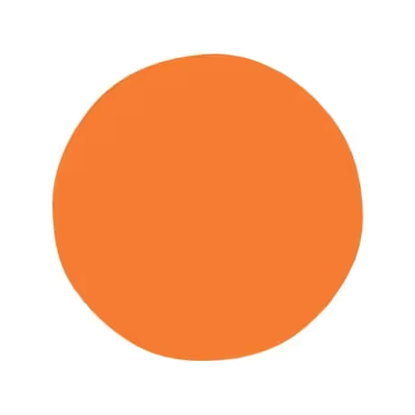
Daylight
Meet Daylight (#FEDFCB), a soft, luminous hue that brings a gentle warmth to any palette. This pale, peachy tint is notable for its high brightness, giving it an airy quality that feels both fresh and sophisticated without overwhelming the eye.
What color is Daylight?
Daylight is a soft, warm off-white defined by its distinct peachy-pink undertones.
This subtle tint gives the color a gentle warmth, separating it from stark, neutral whites and evoking the first light of dawn.
What is the meaning of the color Daylight (#FEDFCB) in design?
Daylight embodies the gentle warmth of a new morning, suggesting optimism and a sense of serene beginnings.
Psychologically, this soft hue fosters feelings of comfort and clarity, creating an atmosphere of approachable softness.
How should I use Daylight in my UI design?
In UI design, Daylight (#FEDFCB) works beautifully as a warm, approachable background or as a soft accent color. For strong visual hierarchy and accessibility, pair it with dark, cool tones like deep navy or charcoal gray. For a more analogous scheme, consider combining it with earthy browns and muted terracotta.
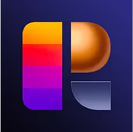
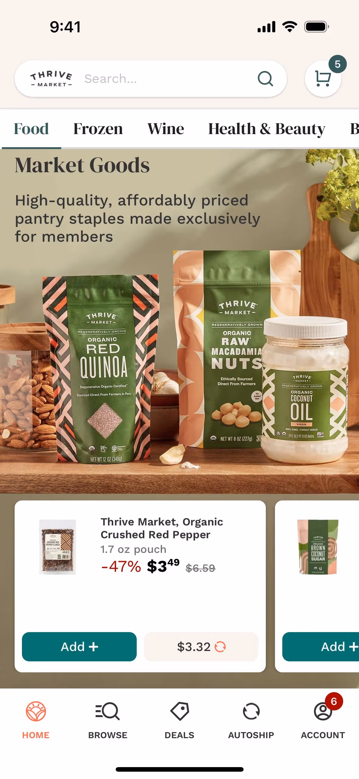
A few brands, such as Thrive Market and SideChef, use similar peachy hues to project a natural and welcoming personality. The relative rarity of this color in digital products means it can help a design feel distinct and fresh.
Use the tools below to explore curated palettes, test color contrast for accessibility, and preview Daylight in real UI components from top brands.
How do I use the Daylight color codes?
The most direct way to apply Daylight in your digital projects is by using its hex code, #FEDFCB. This six-digit code is a web-standard representation of the color that works across browsers and design software.
Depending on your medium, you may need to convert #FEDFCB. For screen-based designs, the RGB values specify the exact mix of red, green, and blue light required. If your work is headed for print, you'll use the CMYK values, which dictate the proportions of cyan, magenta, yellow, and black ink.
To make your workflow easier, we've converted #FEDFCB into a range of popular formats below. Simply copy the code you need and paste it into your design tools.
Analogous
Analogous color schemes use colors next to Daylight (#FEDFCB) on the color wheel, creating a harmonious and serene visual experience for users.
Complementary
As opposites on the color wheel, complementary colors create a vibrant effect. Paired with Daylight, they produce a high-contrast, energetic combination.
Split Complementary
A split complementary palette provides high contrast with less tension. It pairs Daylight with the two colors that sit next to its direct complement.
Triadic
A triadic combination pairs Daylight with two other colors from equidistant points on the color wheel, resulting in a bold yet balanced harmony.
Tetradic
A tetradic scheme pairs Daylight (#FEDFCB) with three other colors, forming two complementary sets for a balanced yet dynamic visual composition.
Square
A square scheme selects four colors equidistant on the color wheel. Using Daylight as an anchor, this method yields a balanced and high-contrast palette.
Text Color
Background Color
Your Catchy Large Text Goes Here
Shades
Shades are darker versions of Daylight, created by adding black to give depth and weight.
Tints
Tints are lighter versions of Daylight, created by adding white to achieve a softer look.
Tones
Tones are muted versions of Daylight, created by adding gray to soften the saturation.
Hues
Hues are variations of Daylight, creating warmer, cooler, or more intense versions of the base color.


Never run out of inspiration again.
Use Mobbin for free as long as you like or get full access with any of our paid plans.