
Dark Pastel Blue
Meet Dark Pastel Blue (#779ECB), a color that balances softness with a surprising depth. Its muted, grayish undertone gives it a sophisticated character, making it a unique choice for interfaces that require a calm yet confident hue without being overly bright or somber.
What color is Dark Pastel Blue?
Dark Pastel Blue (#779ECB) is a cool, muted shade of blue defined by its noticeable gray undertone. This desaturation lends it a soft, pastel quality, while its value keeps it from being overly light, creating a sophisticated, gentle appearance.
Positioned in the blue hue family, it has a moderate lightness and low saturation. These properties give the color a stable and composed character, setting it apart from the vibrancy of a pure, primary blue.
What is the meaning of Dark Pastel Blue (#779ECB)?
Dark Pastel Blue evokes a sense of calm and stability. In color psychology, it represents tranquility and trustworthiness, offering a gentle reassurance without being overpowering.
Symbolically, the color suggests sincerity and quiet confidence. It carries a thoughtful, introspective quality, reminiscent of a peaceful dusk or a calm sea.
How to use Dark Pastel Blue in UI design?
Dark Pastel Blue works well as either a primary color for a serene backdrop or as a subtle accent. For a clean, professional feel, pair #779ECB with neutrals like off-white and light gray. To create a more lively composition, introduce a soft coral or warm yellow as a complementary color, always minding contrast for text readability.
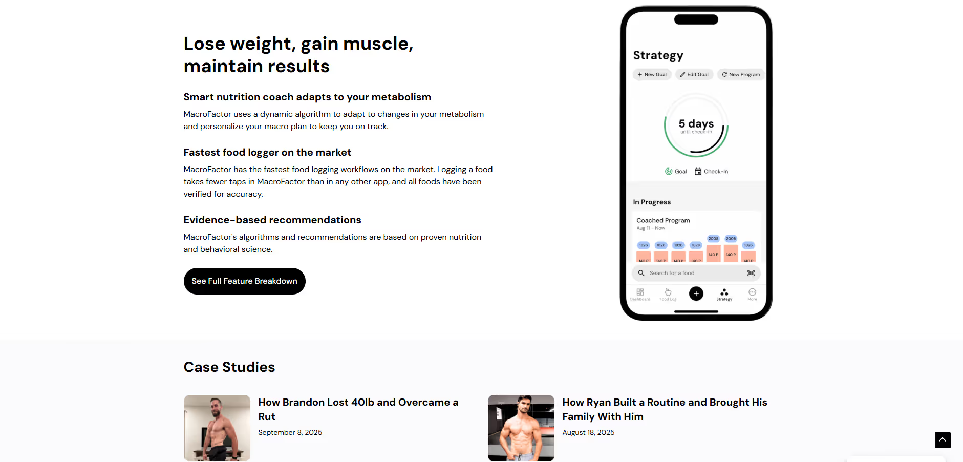
Few major brands use a color similar to Dark Pastel Blue, which can be a significant advantage. Its rarity offers a chance to build a distinctive visual identity that stands apart. The health app MacroFactor, for example, uses a similar blue to project a sense of calm and trustworthiness.
Use the tools below to explore curated palettes, test color contrast for accessibility, and preview Dark Pastel Blue in real UI components of top brands.
How do I use the Dark Pastel Blue color codes?
Using Dark Pastel Blue in a project begins with its hex code, #779ECB, which is standard for CSS and HTML. The main consideration is matching the color code format to your design medium, since a hex code for a website won't translate directly to a print project.
Different color codes are required for different applications. RGB (Red, Green, Blue) is the standard for digital screens, defining colors as a mix of light. For anything printed, you'll need CMYK (Cyan, Magenta, Yellow, Key/Black) values, which correspond to ink percentages. Other models like HSL (Hue, Saturation, Lightness) offer a more intuitive method for color manipulation.
To simplify your workflow, we have converted #779ECB to a range of popular formats. You can find and copy the exact code you need for your tool or project in the section below.
Analogous
Analogous colors are neighbors on the color wheel. For Dark Pastel Blue, these adjacent hues create a harmonious and visually soothing palette.
Complementary
Opposites on the color wheel, complementary colors create a striking visual contrast when paired with a base like Dark Pastel Blue.
Split Complementary
A split complementary scheme for Dark Pastel Blue provides strong visual contrast with less tension by using the two colors neighboring its opposite.
Triadic
Triadic color schemes use three colors equidistant on the color wheel, offering a high-contrast yet harmonious palette for Dark Pastel Blue.
Tetradic
A tetradic scheme for Dark Pastel Blue uses two sets of complementary colors, creating a vibrant four-color palette from a rectangular color wheel selection.
Square
A square color scheme places four colors evenly on the color wheel. With Dark Pastel Blue, this creates a vibrant, high-contrast palette.
Text Color
Background Color
Your Catchy Large Text Goes Here
Shades
Shades of Dark Pastel Blue are created by adding black, giving the color more depth.
Tints
Tints of Dark Pastel Blue are created by adding white, resulting in lighter, softer variations.
Tones
Tones of Dark Pastel Blue are created by adding gray, resulting in softer, desaturated variations.
Hues
Hues are variations of Dark Pastel Blue, differing in intensity or temperature to create distinct moods.

Never run out of inspiration again.
Use Mobbin for free as long as you like or get full access with any of our paid plans.


