
Crayola Pastel Blue
Meet Crayola Pastel Blue (#80CEE1), a color that captures the clarity of a bright sky with a soft, digital finish. Its unique position between cyan and a gentler blue gives it a luminous quality, making it a notable choice for modern interfaces without being overpowering.
What color is Crayola Pastel Blue?
Crayola Pastel Blue is a gentle, airy shade that sits comfortably between blue and cyan.
Its distinct green undertones give it a cool, refreshing quality, reminiscent of pale tropical waters.
What meaning does the color Crayola Pastel Blue (#80CEE1) carry in design?
Crayola Pastel Blue evokes a sense of tranquility and clarity, reminiscent of a calm sky or gentle sea. Its soft, airy quality can inspire feelings of peace and spaciousness, making it a color of quiet confidence and open communication.
Symbolically, #80CEE1 carries a touch of nostalgia and youthful creativity, tied to its Crayola origins. It represents sincerity and reliability, offering a gentle approach to building trust and fostering a serene user experience.
How can I use Crayola Pastel Blue (#80CEE1) in UI design?
In UI design, Crayola Pastel Blue (#80CEE1) creates a serene and spacious feel, making it an excellent choice for backgrounds or large content areas. For strong visual hierarchy and readability, pair it with deep navies or charcoals for text. To build a more dynamic palette, introduce a complementary warm tone like a soft coral or muted orange for accents and calls-to-action.
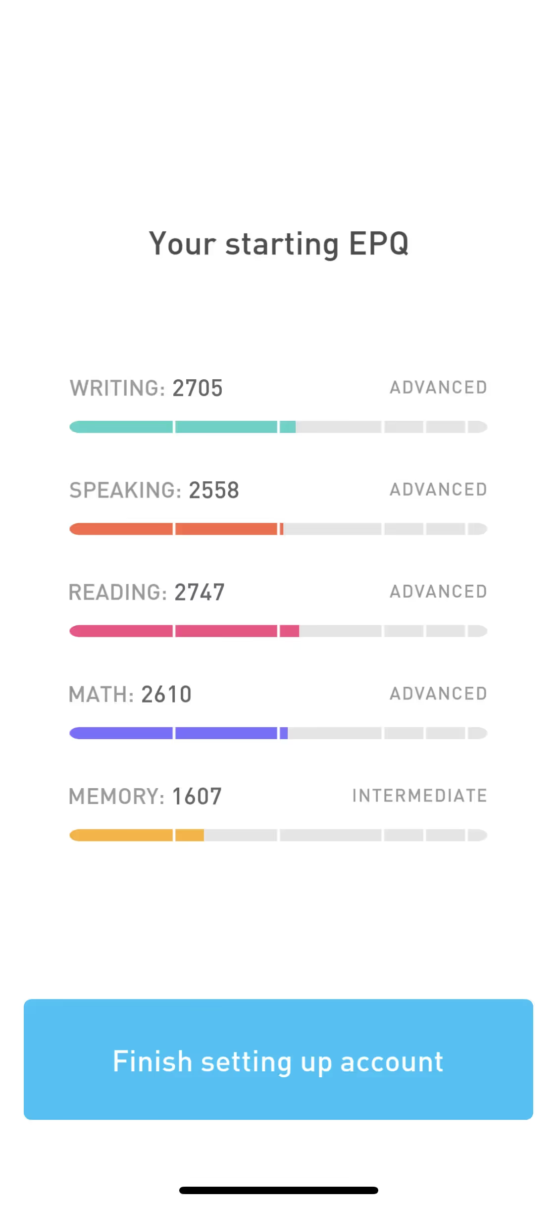
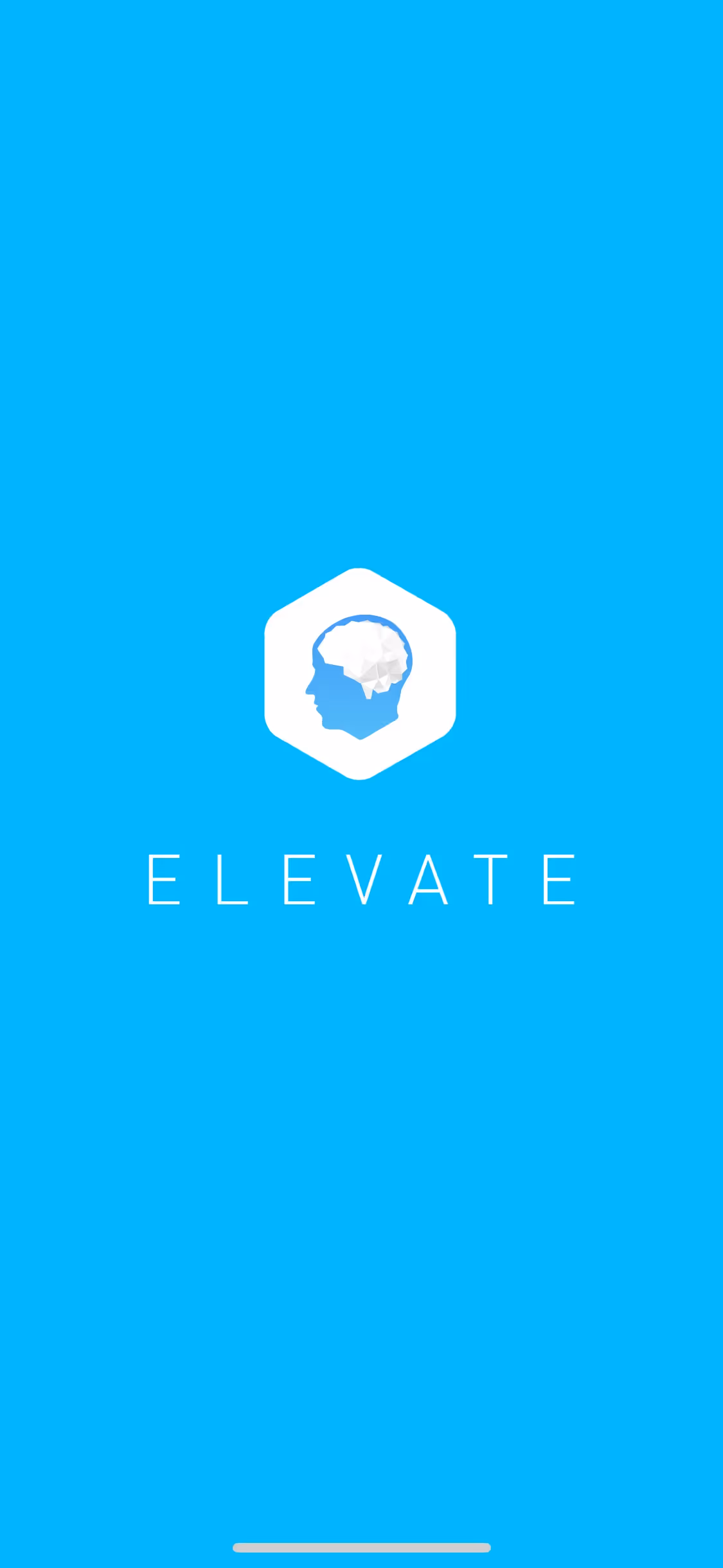
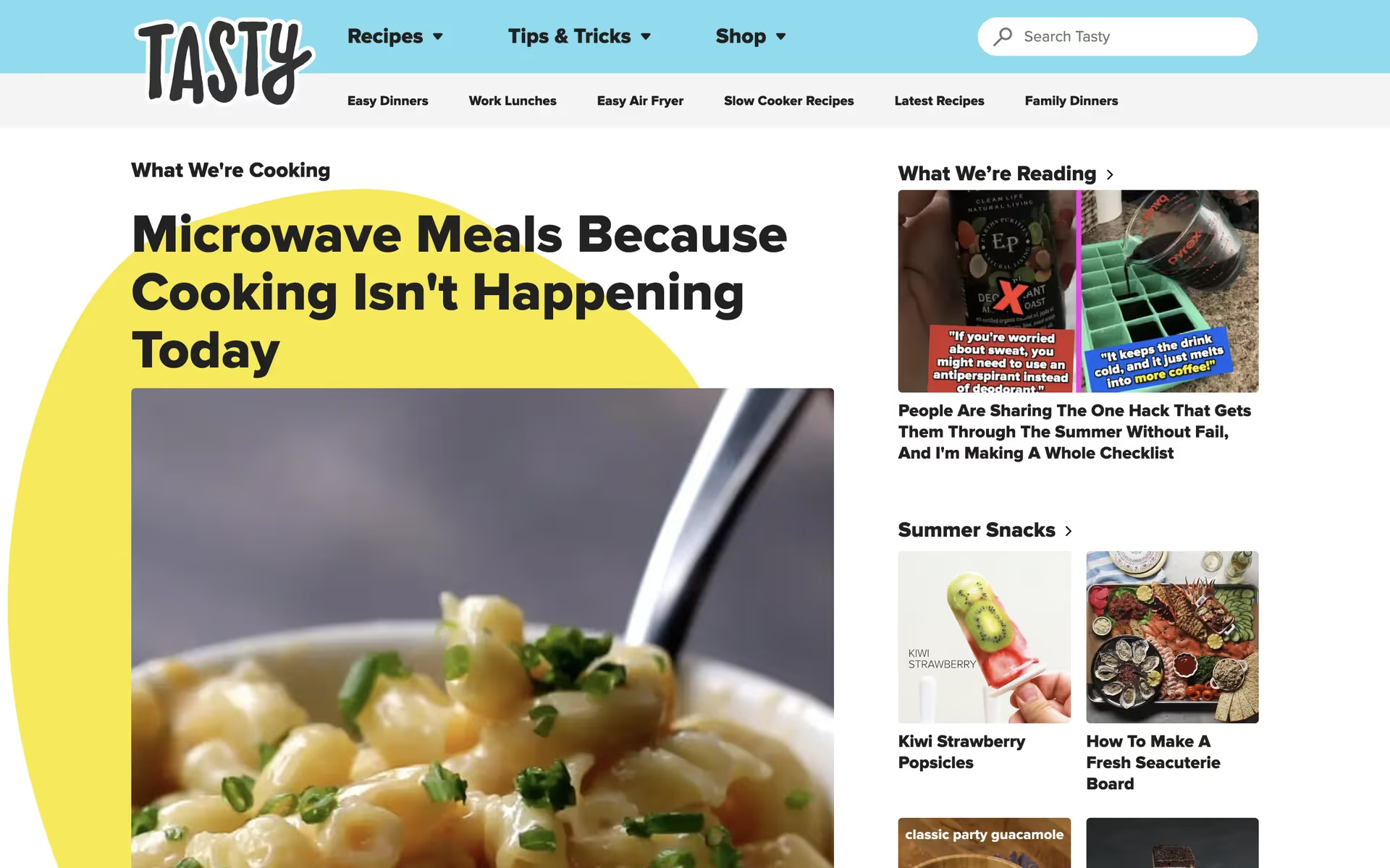
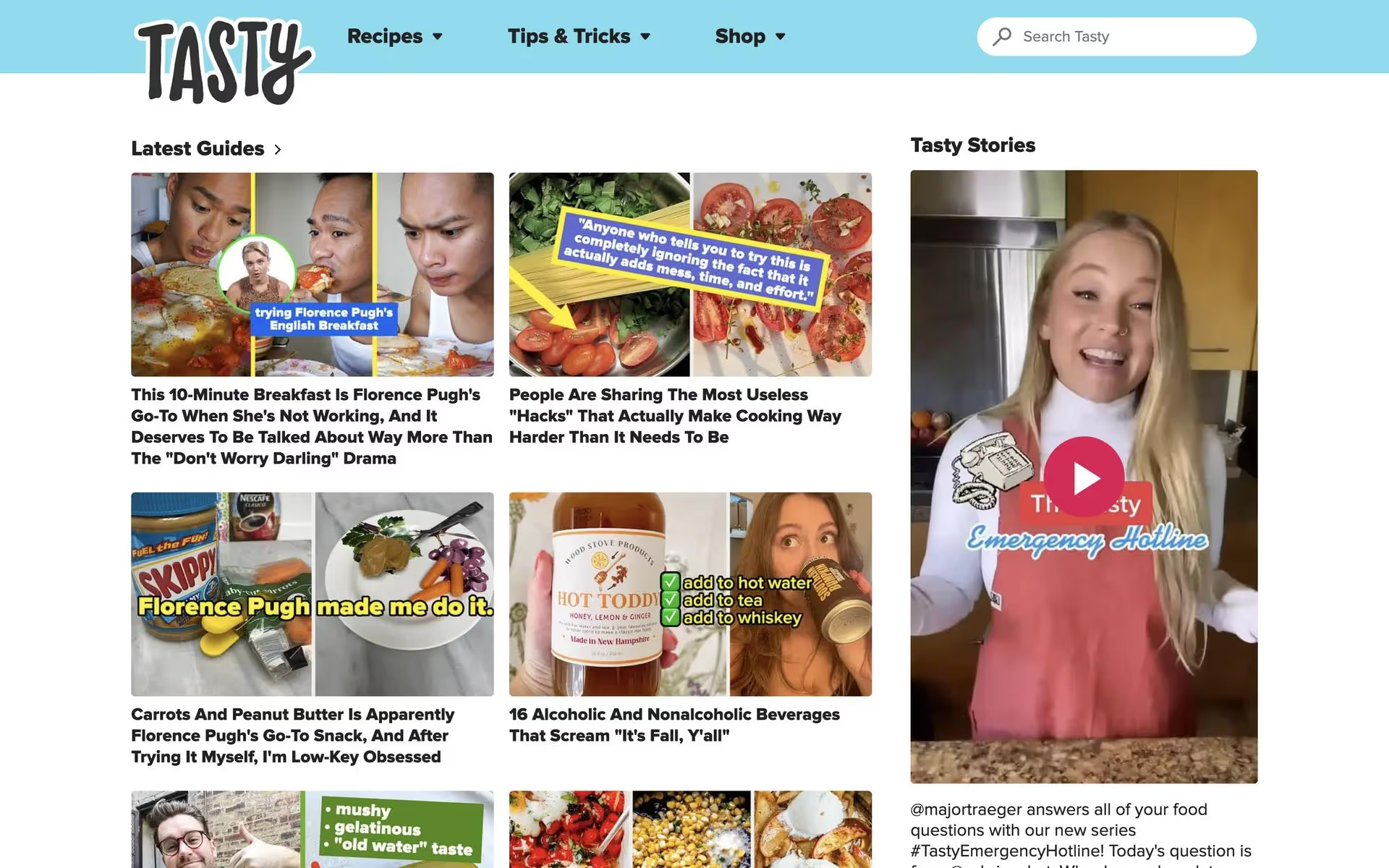
While not a dominant color across the web, shades similar to Crayola Pastel Blue are used effectively by brands like Tasty, Elevate, and Life360. They apply its approachable quality to build trust and create a friendly user interface, showing its potential in health, lifestyle, and food-related applications.
Use the tools below to explore curated palettes, test color contrast for accessibility, and preview Crayola Pastel Blue in real UI components from leading apps.
Using Crayola Pastel Blue color codes
To use Crayola Pastel Blue in your digital projects, the most direct method is with its hex code, #80CEE1. However, different applications and mediums often require specific color code formats, so you may need to convert it.
For instance, RGB values are standard for screen-based design, while CMYK is essential for print work. Other models like HSL (Hue, Saturation, Lightness) offer a more intuitive way to make adjustments. Each format represents the same color but is optimized for a particular use case.
We've translated #80CEE1 into a variety of popular color models for you. Simply find the format you need below and copy the code for your project.
Analogous
By selecting colors adjacent to Crayola Pastel Blue on the color wheel, an analogous palette creates a unified and calming visual experience.
Complementary
Directly opposite Crayola Pastel Blue on the color wheel are its complementary colors. Use them together for a striking, high-contrast visual combination.
Split Complementary
A split complementary scheme for Crayola Pastel Blue uses the two colors neighboring its opposite, creating a high-contrast look with less tension than a direct complement.
Triadic
A triadic color scheme pairs Crayola Pastel Blue with two other hues evenly spaced on the color wheel, creating a vibrant and balanced palette.
Tetradic
A tetradic scheme for Crayola Pastel Blue involves two pairs of complementary colors, forming a rectangle on the color wheel for a rich, balanced palette.
Square
Formed by four evenly spaced hues on the color wheel, a square scheme offers rich contrast and variety, with Crayola Pastel Blue as a base.
Text Color
Background Color
Your Catchy Large Text Goes Here
Shades
Adding black to Crayola Pastel Blue creates its shades, which introduce a sense of depth and gravity.
Tints
Tints of Crayola Pastel Blue are created by adding white, resulting in lighter, softer variations.
Tones
Tones are created by mixing Crayola Pastel Blue with gray, resulting in a less saturated color.
Hues
Hues are variations of Crayola Pastel Blue, differing in intensity and creating distinct moods.


Never run out of inspiration again.
Use Mobbin for free as long as you like or get full access with any of our paid plans.


