
Cornflower
Meet Cornflower, #9ACEEB. This light, airy blue strikes a unique balance between softness and digital clarity. Its gentle, almost pastel quality is sharpened by a crisp undertone, making it a distinctive choice for modern user interfaces that need a touch of serene brightness.
What color is Cornflower?
Cornflower is a pale, gentle shade of blue, reminiscent of the flower it is named after. It sits on the cooler side of the spectrum, presenting a soft and serene visual quality.
This particular shade, #9ACEEB, carries subtle gray undertones, which mute its intensity and give it a sophisticated, almost dusty appearance compared to a more vibrant sky blue.
What is the meaning of the color Cornflower (#9ACEEB)?
Named for the wild Centaurea cyanus flower, Cornflower historically symbolizes delicacy, unity, and devotion. The soft blue hue often brings feelings of calm and tender nostalgia, suggesting a gentle and hopeful outlook.
In design, Cornflower (#9ACEEB) communicates trustworthiness and reliability without the sternness of a darker navy. Its light quality suggests openness and inspires a feeling of quiet optimism and clarity for the user.
How can I use Cornflower (#9ACEEB) in my UI design?
When applying Cornflower (#9ACEEB) in your designs, consider the 60-30-10 rule. Use it as a dominant color for a serene feel, or as a secondary or accent shade. For strong contrast and readability, pair it with deep navies or charcoal grays. To create a more organic and balanced palette, combine it with warm, earthy tones like sand or terracotta.
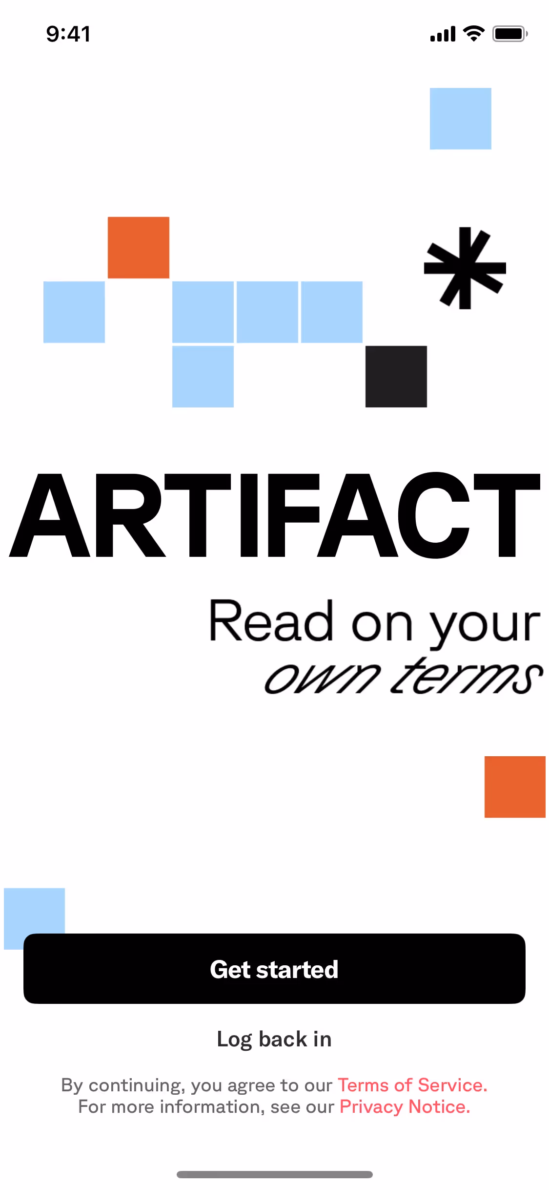
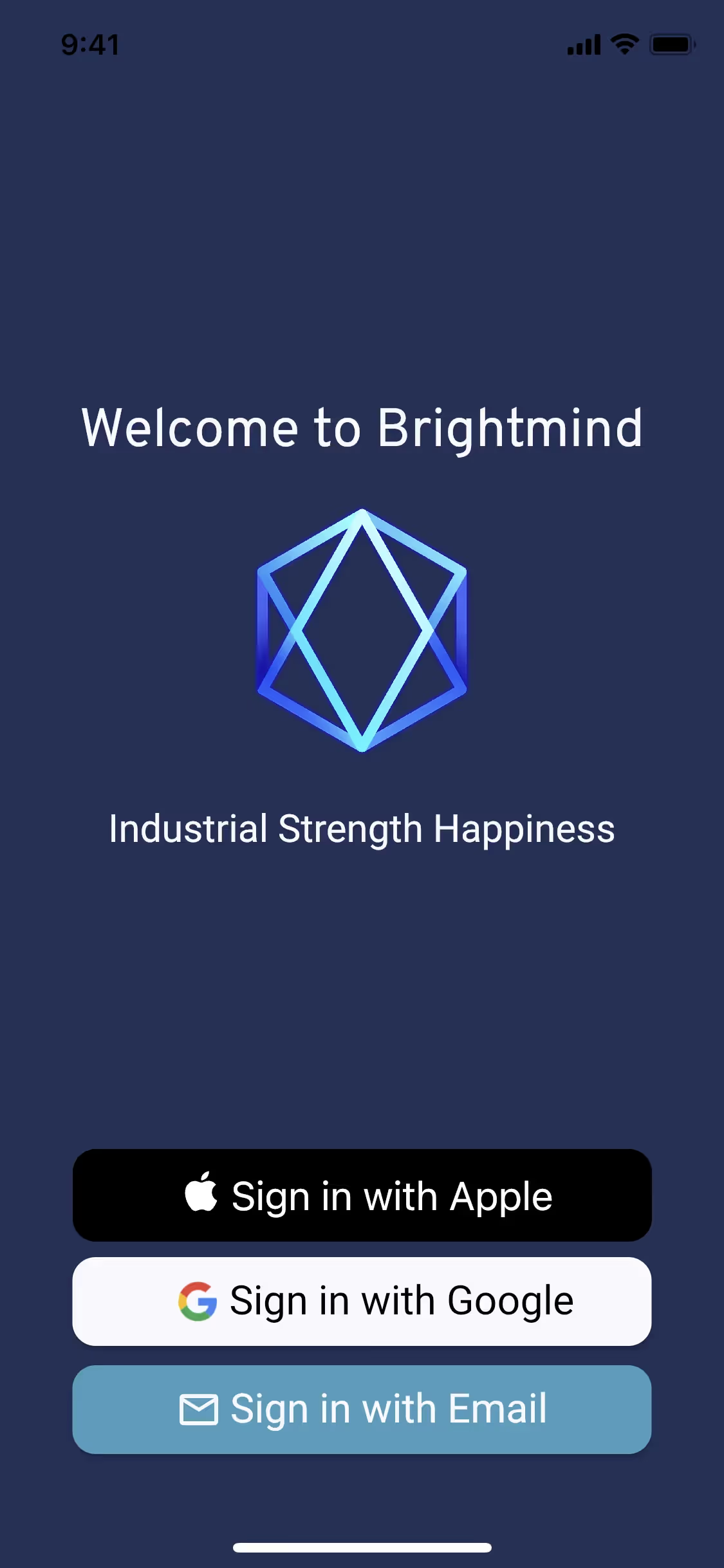
Few major brands have adopted a shade quite like Cornflower, which is precisely its strength. Its relative scarcity in the market offers a chance to build a distinct visual identity. While not widespread, similar light blues appear in apps like Brightmind and Artifact, where they support an atmosphere of clarity and calm.
Put theory into practice with the tools below. You can explore curated palettes, test your color combinations for accessibility, and preview how Cornflower appears in real UI components from top brands.
Using Cornflower color codes
Using the Cornflower color typically starts with its hex code, #9ACEEB, a web standard. But for projects that go beyond the screen, you'll need to work with other color models to maintain consistency, especially between digital and print materials.
Each color model serves a specific purpose. RGB (Red, Green, Blue) is an additive model for digital displays, while CMYK (Cyan, Magenta, Yellow, Key/Black) is a subtractive model for physical printing. Systems like HSL (Hue, Saturation, Lightness) also provide a more intuitive way to manipulate color for screen-based design.
To simplify your process, we have already converted #9ACEEB into a range of common formats. Feel free to copy the exact codes you need for your project from the list below.
Analogous
Analogous colors sit next to each other on the color wheel. With Cornflower, they produce a gentle, low-contrast combination that feels both composed and pleasing.
Complementary
Complementary colors sit directly opposite each other on the color wheel. For Cornflower, this pairing creates a striking, high-contrast visual effect.
Split Complementary
The split complementary scheme for Cornflower takes the two colors on either side of its opposite, creating a high-contrast look with less tension.
Triadic
A triadic scheme pairs Cornflower with two other colors from equidistant points on the color wheel, resulting in a vibrant, high-contrast visual effect.
Tetradic
Tetradic palettes pair Cornflower with three other colors, forming two complementary sets for a vibrant and well-balanced combination of hues.
Square
A square color scheme uses four colors evenly spaced on the color wheel. With Cornflower as the base, this creates a vibrant, high-contrast palette.
Text Color
Background Color
Your Catchy Large Text Goes Here
Shades
Adding black to Cornflower produces darker shades, which can introduce depth and visual weight.
Tints
Tints lighten Cornflower by mixing in white, which introduces a gentle and airy quality.
Tones
Tones are created by adding gray to Cornflower, resulting in softer, more muted variations.
Hues
Hues are variations of Cornflower that differ in intensity or temperature, creating distinct moods.


Never run out of inspiration again.
Use Mobbin for free as long as you like or get full access with any of our paid plans.


