
Chartreuse Yellow
Meet Chartreuse Yellow, #C7FF00. This electric hue commands attention with an intense, almost fluorescent glow that feels both synthetic and natural. It’s a color that refuses to be ignored, radiating a sharp vibrancy that makes it a memorable addition to any palette.
What color is Chartreuse Yellow?
Chartreuse Yellow is a vivid, electric hue that sits precisely halfway between yellow and green on the color wheel. It's a warm color, dominated by yellow, but it carries a distinct cool, zesty undertone from its green component.
This high-saturation color is a tertiary shade, born from mixing yellow and green. Its brightness is what gives it that almost-neon, luminous quality, making it appear to glow.
What meaning does Chartreuse Yellow convey in design?
Named after the French liqueur, Chartreuse Yellow carries a sense of vivacity and zest. It often symbolizes youth, nature, and new beginnings, radiating an energetic and enthusiastic spirit.
Psychologically, this high-visibility hue commands attention, sparking feelings of excitement and spontaneity. Its intensity can also signal a warning, making it a color of both approach and caution.
How can I best apply Chartreuse Yellow in UI design?
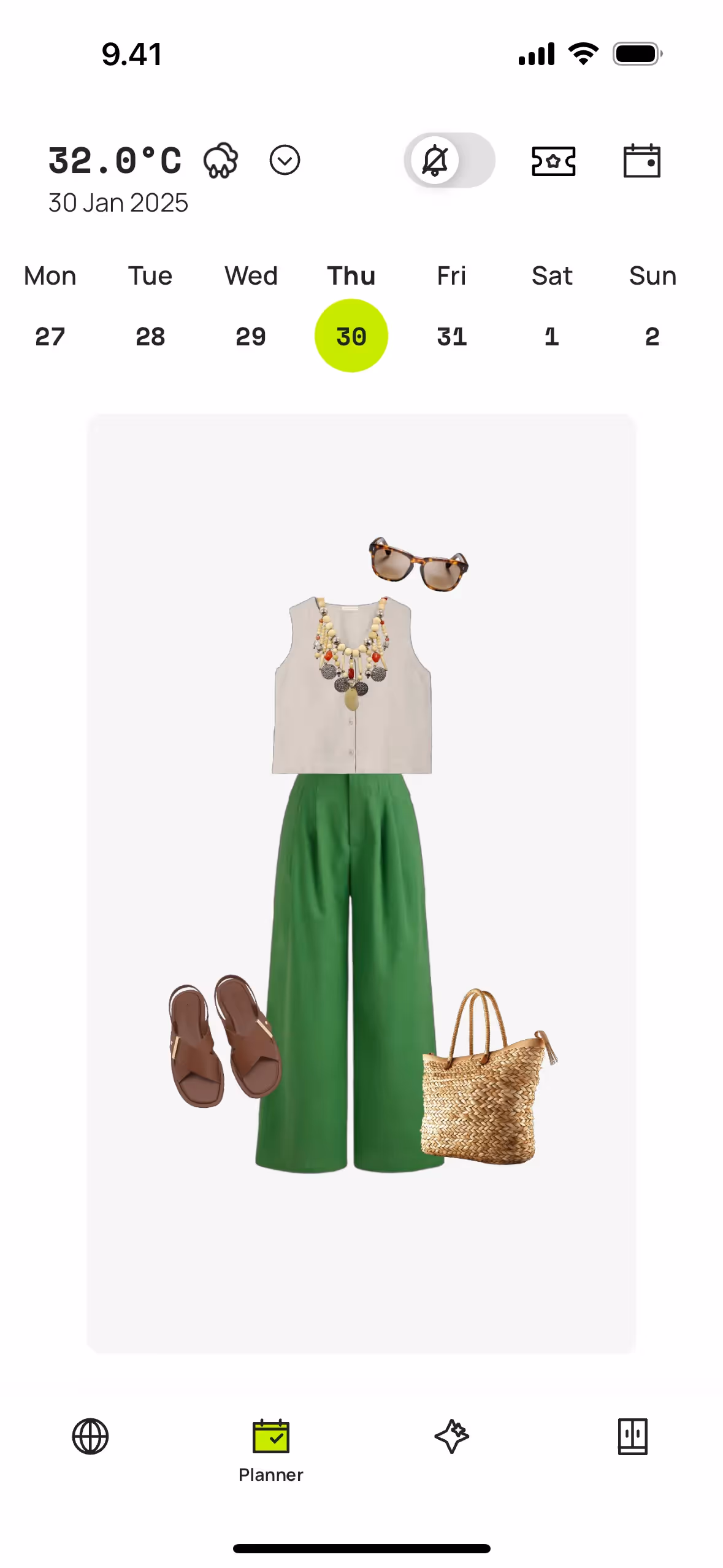
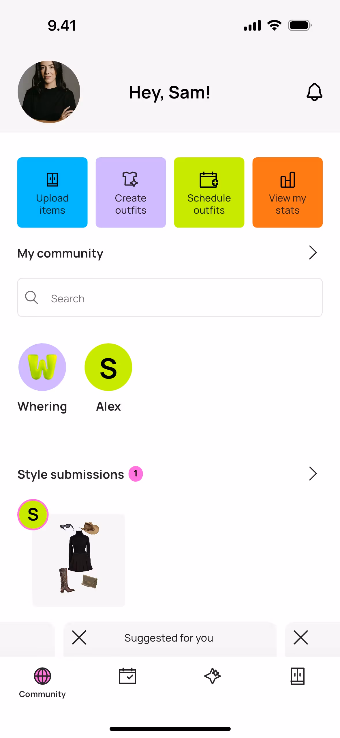
Chartreuse Yellow, with its intense vibrancy, is most effective when used sparingly as an accent. It creates a striking effect against dark, moody backgrounds or can be balanced with soft neutrals for a cleaner feel. Consider the 60-30-10 principle, assigning this bold color to the smallest, most impactful 10% of your design—think buttons, icons, or key interactive states.
While not a dominant color in the corporate world, brands like Whering, Grammarly, and KOHO have successfully incorporated similar electric greens to project a fresh and forward-thinking identity. Using a color like Chartreuse Yellow can be a powerful differentiator, signaling confidence and a departure from more traditional brand palettes.
To see how #C7FF00 performs in practice, use the tools below. You can explore curated palettes, check its contrast ratios for accessibility, and even preview Chartreuse Yellow applied to UI components from well-known apps.
Using Chartreuse Yellow color codes
When working with Chartreuse Yellow, the hex code #C7FF00 is your starting point for digital projects. Given its intensity, it works exceptionally well for accents, highlights, or interactive elements that need to grab attention without overpowering the entire design.
Your hex code can be translated into other color models depending on your medium. For screen-based work, you'll use RGB (Red, Green, Blue), which defines color by mixing light. For physical print materials, you'll need CMYK (Cyan, Magenta, Yellow, Key/Black) values that correspond to ink percentages. Other models like HSL (Hue, Saturation, Lightness) provide a more intuitive method for creating tints and shades.
To get you started, we've converted #C7FF00 to a range of popular formats below that you can copy directly into your design tool.
Analogous
For Chartreuse Yellow, analogous colors are those found directly beside it on the color wheel, resulting in a cohesive and tranquil visual experience.
Complementary
Complementary colors sit directly opposite each other on the color wheel. Paired with Chartreuse Yellow, they create a striking, high-contrast visual effect.
Split Complementary
A split complementary palette takes Chartreuse Yellow and pairs it with the two colors that sit on either side of its direct complement.
Triadic
Triadic palettes are built from three hues equidistant on the color wheel. For Chartreuse Yellow, this results in a bold and harmonious combination.
Tetradic
A tetradic scheme for Chartreuse Yellow uses two pairs of complementary colors, forming a rectangle on the color wheel for a vibrant, balanced palette.
Square
A square color scheme uses four colors equidistant on the color wheel. With Chartreuse Yellow, this creates a vibrant, high-contrast palette.
Text Color
Background Color
Your Catchy Large Text Goes Here
Shades
Shades are darker versions of Chartreuse Yellow, created by adding black for depth and weight.
Tints
By adding white to Chartreuse Yellow, you create tints, which produce a softer, airier effect.
Tones
Tones are softer versions of Chartreuse Yellow, made by mixing in gray for a desaturated effect.
Hues
Hues are variations of Chartreuse Yellow, differing in intensity and temperature to create distinct moods.


Never run out of inspiration again.
Use Mobbin for free as long as you like or get full access with any of our paid plans.


