
Burnt Orange
Burnt Orange (#CC4200) is a study in grounded vibrancy. This shade balances the energy of orange with a deep, toasted quality, creating a hue that is both striking and substantial without being overwhelming. It's a color with presence.
What color is Burnt Orange?
Burnt Orange is a warm, medium-dark shade of orange, distinguished by its strong brown or reddish undertones.
It’s a sophisticated, earthy color that feels less saturated than a pure orange, sitting comfortably between a bright tangerine and a deep terracotta.
What is the meaning of the color Burnt Orange (#CC4200)?
Burnt Orange evokes a sense of warmth, comfort, and earthy stability. It is often associated with the coziness of autumn, suggesting change, nostalgia, and a touch of rustic charm.
Psychologically, it's a confident and sociable color that can stimulate conversation and creativity. It carries a feeling of passion and adventure, but with a more grounded and approachable energy than brighter oranges.
How can I make Burnt Orange work in my UI design?
To make Burnt Orange work in your design, consider its high energy. It excels as an accent color for calls-to-action, icons, or highlights, drawing immediate attention. For a balanced palette, pair it with cool neutrals like charcoal gray or deep navy blue; this contrast makes the #CC4200 pop without overwhelming the user. For a more adventurous, analogous scheme, try pairing it with earthy reds and muted yellows.
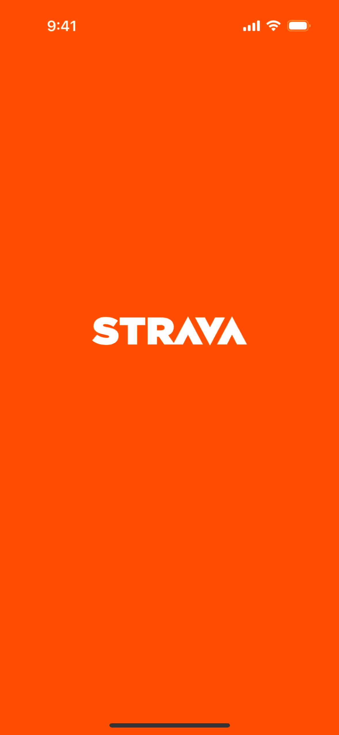
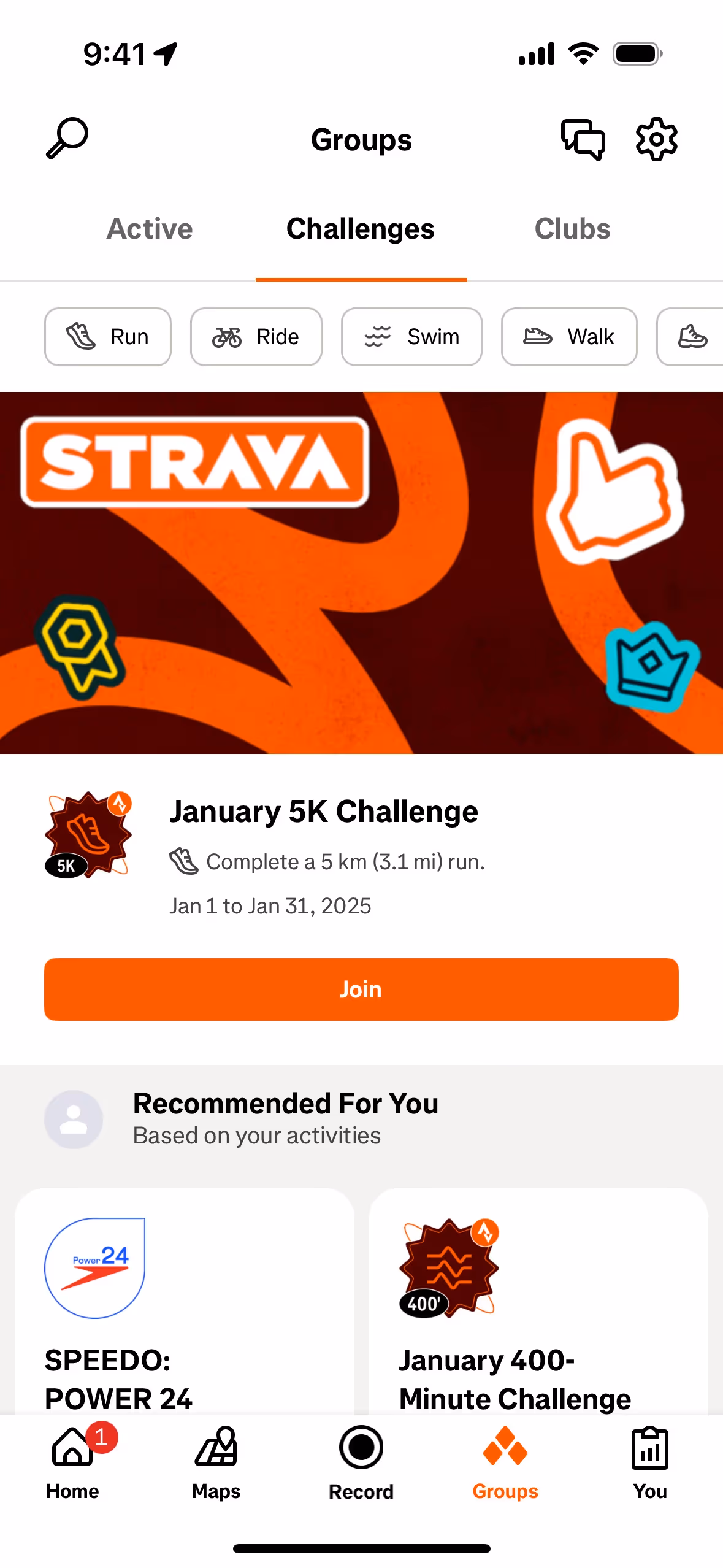
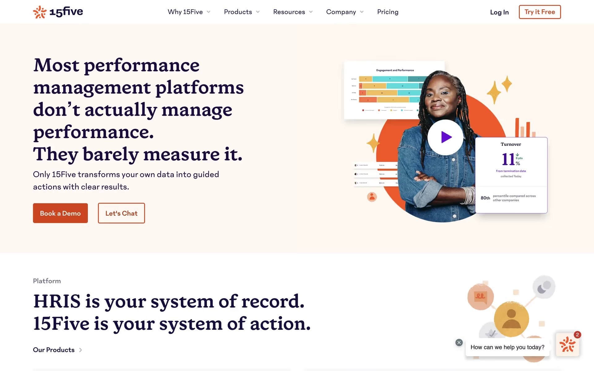
While not a dominant color in the tech world, some brands like Strava and 15Five have successfully incorporated similar warm, earthy oranges. Its relative rarity presents a clear opportunity for a brand to build a distinct visual identity that feels both grounded and energetic, standing apart from the sea of blues and greens.
To see these principles in action, use the tools below. You can explore curated palettes, test your color combinations for accessibility, and preview how Burnt Orange looks in the actual UI components of leading apps.
Using Burnt Orange color codes?
Using Burnt Orange in your projects starts with its hex code, #CC4200. This code is a direct instruction for any digital screen to display the specific shade you want, making it the most common format for web-based work.
While hex is standard for the web, you'll often need to translate #CC4200 into other color models. For instance, RGB (Red, Green, Blue) values are fundamental for digital displays, defining a color by the intensity of its light components. For print work, you'll need the CMYK (Cyan, Magenta, Yellow, Key/Black) values, which correspond to ink percentages.
To make things easy, we've converted #CC4200 into a range of popular formats. You can find and copy the exact values you need for your project below.
Analogous
Analogous colors are neighbors on the color wheel. For Burnt Orange, these adjacent hues create a harmonious and visually soothing palette.
Complementary
Complementary colors sit opposite each other on the color wheel. When paired with Burnt Orange, they create a striking, high-contrast visual effect.
Split Complementary
A split complementary scheme for Burnt Orange uses the two colors adjacent to its direct opposite, offering a vibrant yet balanced and harmonious palette.
Triadic
Triadic schemes pair Burnt Orange with two other colors, all equally spaced on the color wheel, for a vibrant and contrasting effect.
Tetradic
A tetradic color scheme for Burnt Orange involves four colors. It pairs the base with its complement, plus another complementary pair for a vibrant palette.
Square
A square color scheme pairs Burnt Orange with three other colors, all evenly spaced on the color wheel for a vibrant, high-contrast palette.
Text Color
Background Color
Your Catchy Large Text Goes Here
Shades
Adding black to Burnt Orange creates shades, which introduce a sense of depth and gravity.
Tints
Tints are lighter versions of Burnt Orange, created by adding white to soften the hue.
Tones
Tones are created by adding gray to Burnt Orange, producing softer, less saturated versions.
Hues
Hues are variations of Burnt Orange that differ in intensity or temperature, affecting its mood.


Never run out of inspiration again.
Use Mobbin for free as long as you like or get full access with any of our paid plans.


