
Bright Pink
Bright Pink (#FF007A) is a color that makes an immediate statement. Its pure hue and intense saturation give it an unapologetic boldness that commands attention, sitting at the vibrant intersection of magenta and red.
What color is Bright Pink?
Bright Pink is a vibrant, highly saturated shade that commands attention. It's a warm color with a distinct blue undertone, placing it somewhere between a classic magenta and a deep rose.
This intense hue has an almost electric quality, thanks to its high brightness and lack of black or gray impurities, resulting in a pure, striking appearance.
What is the meaning of the color Bright Pink (#FF007A)?
Bright Pink, or #FF007A, is a color bursting with energy and confidence. It evokes feelings of playfulness, passion, and excitement, making a bold and unapologetic statement wherever it appears.
Historically linked to pop art and avant-garde fashion, it symbolizes a modern, assertive spirit. It's often used to represent fun, creativity, and a touch of rebellion against the norm.
How to use Bright Pink in UI design?
Bright Pink (#FF007A) is a high-energy color that works best as an accent to draw attention to key elements like buttons, notifications, or links. For a sharp, modern feel, pair it with a monochromatic base of black, white, and grays. To create a more dynamic palette, consider setting it against deep blues or teals, which provides a striking contrast while maintaining visual harmony.
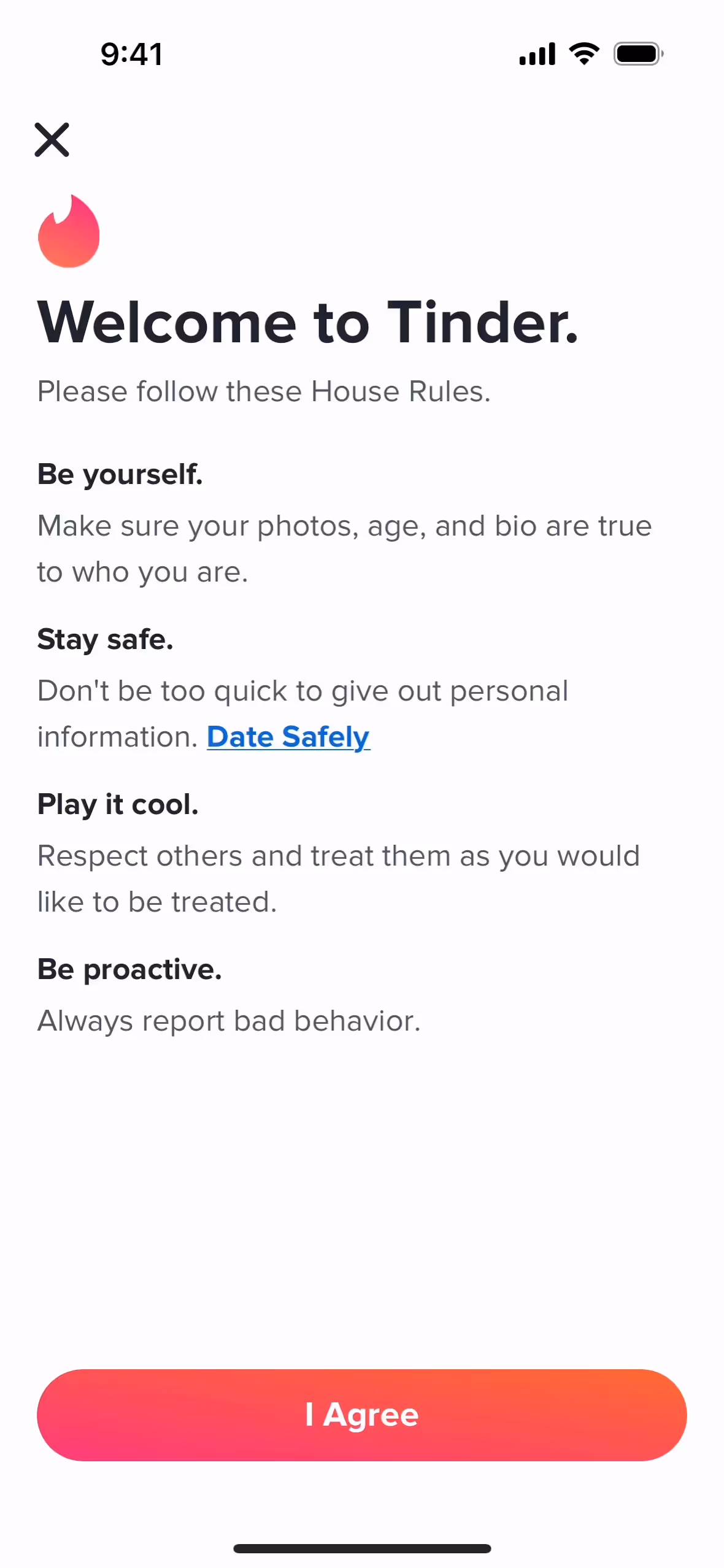
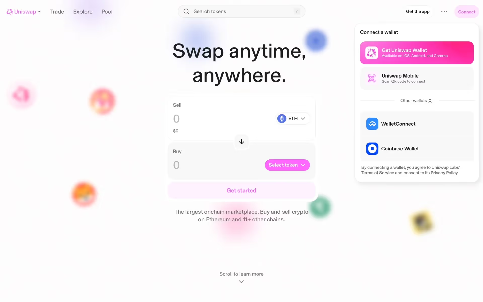
While not a color you see every day in brand identities, its selective use can make a product memorable. Companies like Uniswap, Tinder, and Cameo have successfully incorporated similar vibrant pinks into their interfaces. This relative rarity means choosing Bright Pink can be a powerful differentiator, signaling confidence and a forward-thinking approach.
To see how Bright Pink performs in practice, use the tools below. You can explore curated palettes, check the color's contrast ratios for accessibility, and preview it on UI components from well-known apps.
How do I use Bright Pink color codes?
Using Bright Pink (#FF007A) effectively is about intention. Its intensity makes it a powerful choice for drawing attention, so a little can go a long way for accents and calls-to-action. If you're aiming for a more audacious and energetic design, using it as a primary color can make a memorable statement.
To apply Bright Pink across different projects, you'll need to translate its HEX code into other formats. For digital work on screens, you'll use its RGB (Red, Green, Blue) values. For anything destined for print, you'll need the CMYK (Cyan, Magenta, Yellow, Key/Black) equivalent. Other models like HSL (Hue, Saturation, Lightness) give you a more intuitive way to make adjustments.
We've converted #FF007A into a range of popular color code formats below. Simply find the one you need and copy it directly into your design tool.
Analogous
Analogous colors sit next to each other on the color wheel. With Bright Pink, this combination produces a serene and cohesive visual experience.
Complementary
Complementary colors are opposites on the color wheel. Paired with Bright Pink, these hues create a high-contrast, visually stimulating effect perfect for drawing attention.
Split Complementary
The split complementary palette for Bright Pink uses the two colors on either side of its direct complement, creating high contrast with less tension.
Triadic
Triadic color schemes use three colors equally spaced on the color wheel. With Bright Pink as the base, this creates a vibrant, high-contrast palette.
Tetradic
Tetradic palettes create bold combinations by pairing Bright Pink with a second set of complementary colors, forming a rectangle on the color wheel.
Square
A square scheme pairs Bright Pink with three other colors, all equidistant on the color wheel, resulting in a dynamic and highly contrasting combination.
Text Color
Background Color
Your Catchy Large Text Goes Here
Shades
Shades of Bright Pink are created by adding black, resulting in darker, weightier tones.
Tints
Tints are lighter versions of Bright Pink, created by adding white for a softer feel.
Tones
Tones are muted versions of Bright Pink, created by adding gray to soften its saturation.
Hues
Hues are variations of Bright Pink, differing in intensity or temperature to create distinct moods.


Never run out of inspiration again.
Use Mobbin for free as long as you like or get full access with any of our paid plans.


