
Bright Gray
Introducing Bright Gray (#EBEBEB), a whisper-light neutral that stands as a sophisticated alternative to stark white. Its defining characteristic is its subtle warmth and near-white appearance, offering a clean canvas that feels softer and more contemporary for any interface.
What color is Bright Gray?
Bright Gray is a high-value, achromatic gray. Its neutrality means it lacks any discernible hue or undertone, presenting as a pure, soft shade that sits just off-white.
The color #EBEBEB is perfectly balanced in temperature. Think of it as a foundational neutral—a clean slate without the starkness of pure white or the moodiness of a darker gray.
What is the meaning of the color Bright Gray?
Bright Gray suggests a quiet sophistication and timeless elegance. As a color of balance and neutrality, it provides a stable foundation without the somber weight of its darker relatives.
Symbolically, it points to professionalism and clarity. It’s a staple in modern, minimalist aesthetics, often connected to technology and functional design.
How can I effectively use Bright Gray in my UI design?
In practice, Bright Gray (#EBEBEB) works exceptionally well as a primary background color, creating a softer, more spacious feel than pure white. To maintain legibility and establish a clear visual hierarchy, pair it with high-contrast elements. Deep charcoals or pure black for typography and key interactive components are essential for readability and guiding the user’s attention.
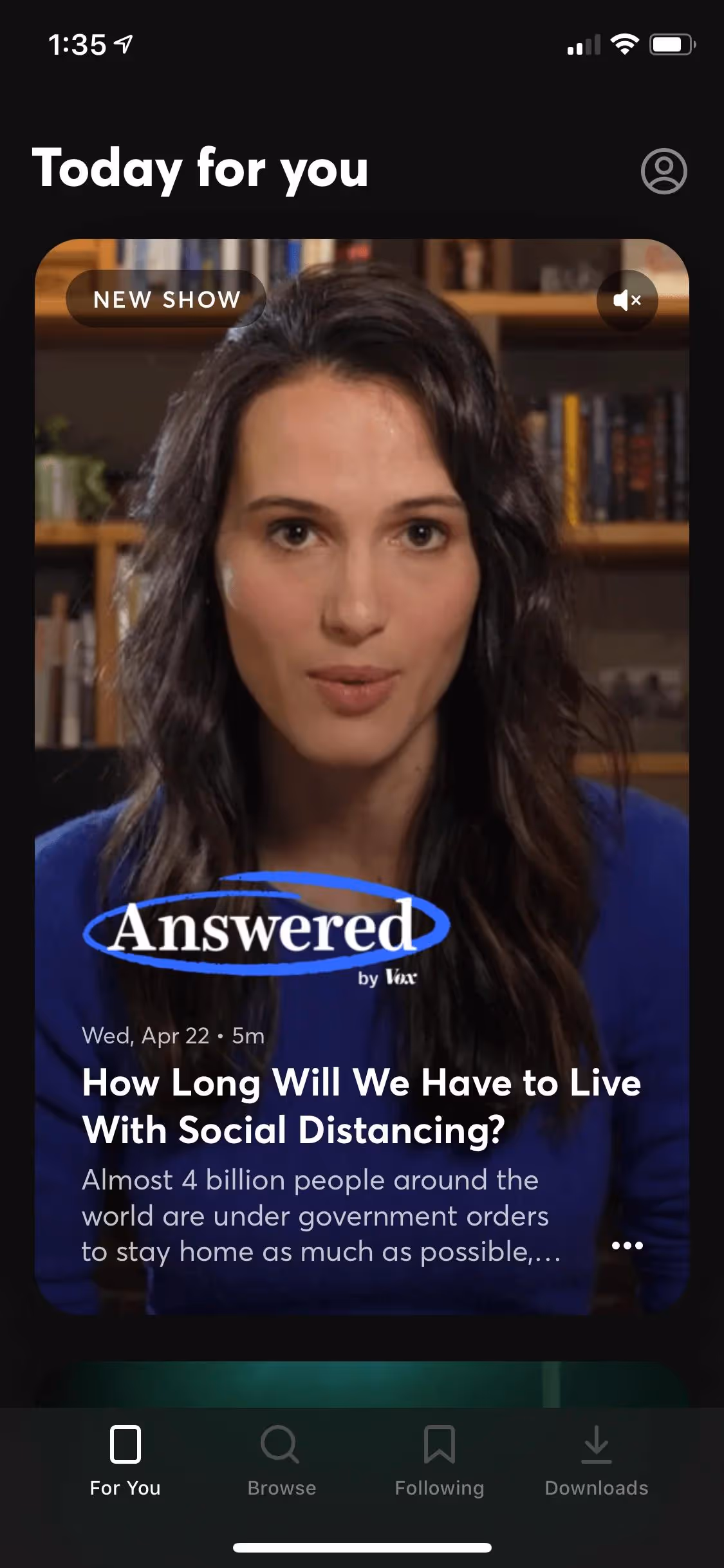
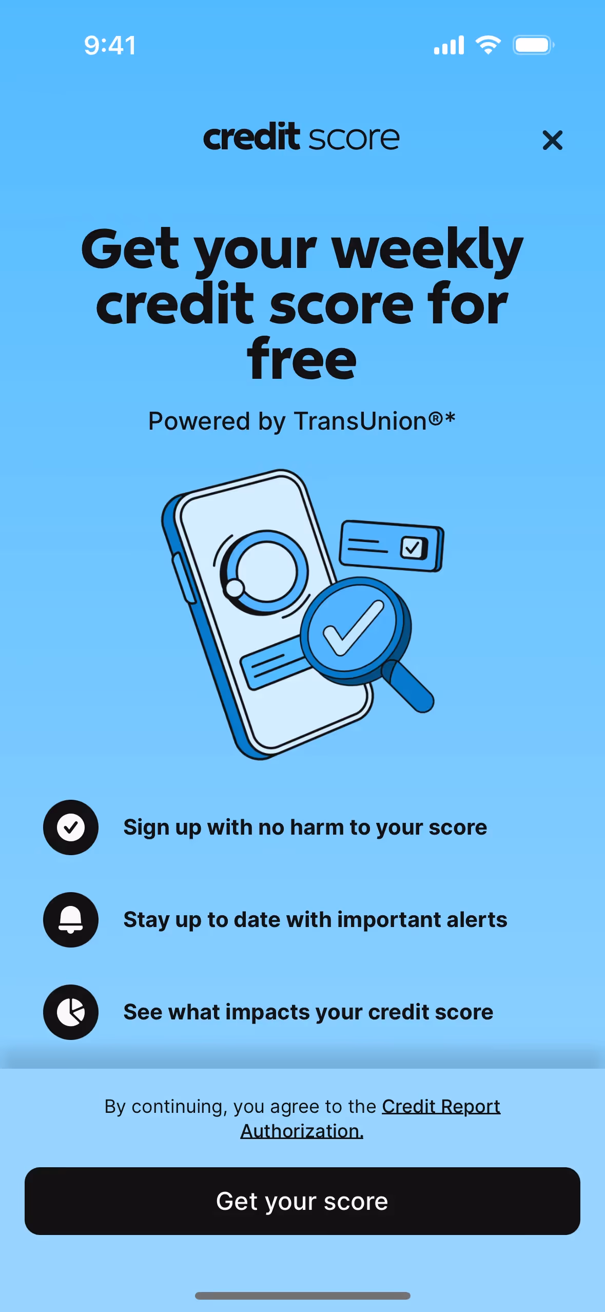
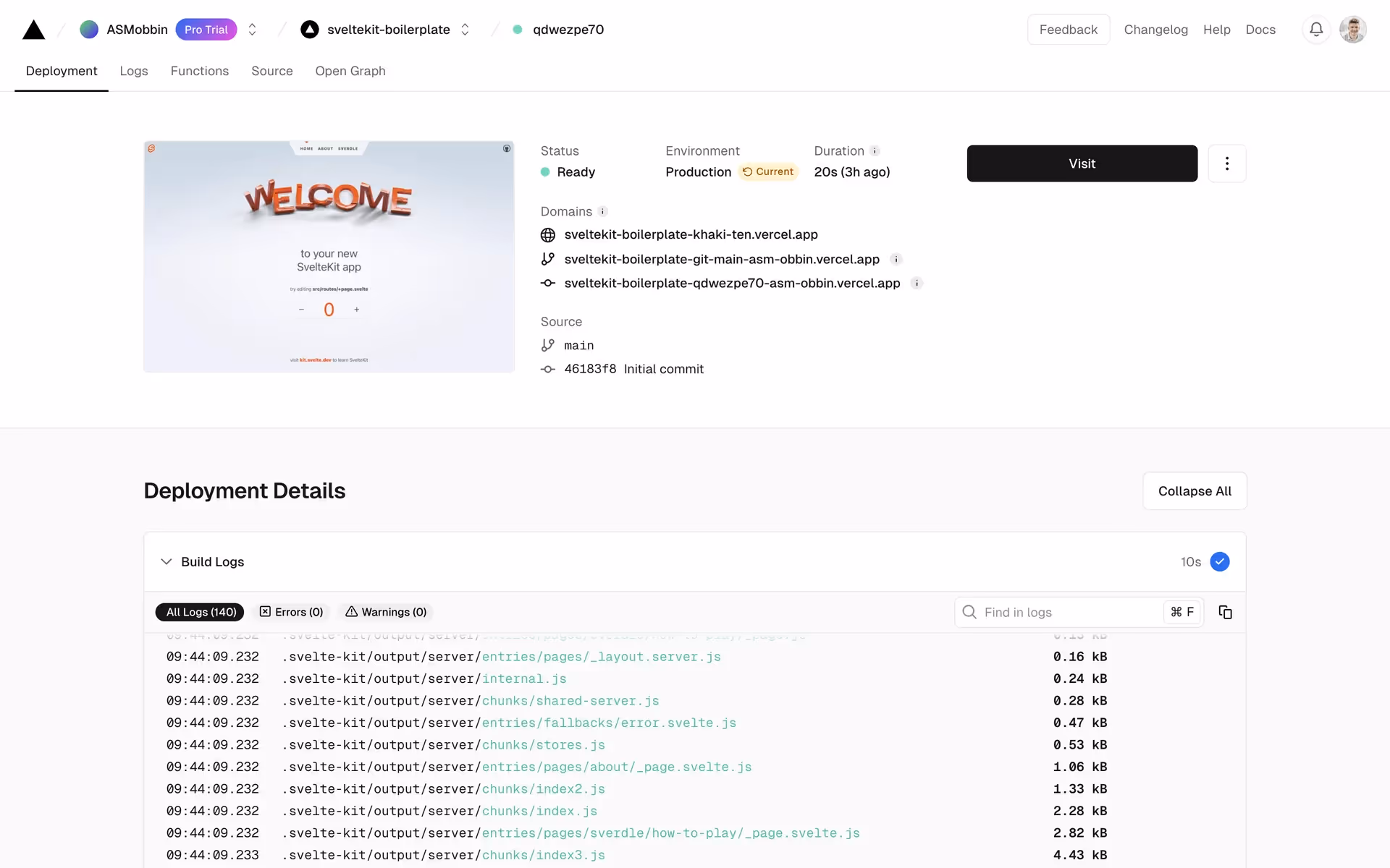
Because of its neutrality, Bright Gray allows vibrant accent colors to stand out without overwhelming the design. This approach is common in the clean, focused interfaces of brands like Vercel, Claude, Kajabi, Apple, Quibi, and One, which use similar light foundations to project a modern and sophisticated appearance.
You can use the tools below to explore curated palettes, test color contrast for accessibility, and preview Bright Gray in real UI components of top brands.
Using Bright Gray color codes
Bright Gray, with its hex code #EBEBEB, is a versatile near-white that can soften an interface without the starkness of pure white. It works well as a subtle background or for low-emphasis UI components, providing a gentle foundation for your design.
While #EBEBEB is standard for web development, you'll often need to convert it for different applications. The RGB value is essential for digital displays, defining the mix of red, green, and blue light. For print projects, you'll use its CMYK equivalent, which specifies the ink combination. Other models like HSL (Hue, Saturation, Lightness) offer a more intuitive way to make adjustments.
To help you get started, we've converted the #EBEBEB hex code into a range of popular color models. You can find and copy the exact values you need for your project below.
Analogous
Analogous colors sit next to each other on the color wheel. Paired with Bright Gray, they produce a cohesive and tranquil composition.
Complementary
Complementary colors sit opposite each other on the color wheel, creating a vibrant effect. Bright Gray acts as a perfect neutral to ground them.
Split Complementary
A split complementary palette for Bright Gray creates high contrast with less tension, using the two colors on either side of its complement.
Triadic
Triadic schemes pair Bright Gray with two other colors, all equidistant on the color wheel, for a balanced yet visually striking combination.
Tetradic
A tetradic palette uses four colors, including Bright Gray, arranged into two complementary pairs that form a rectangle on the color wheel.
Square
A square color scheme pairs Bright Gray with three other colors, all equidistant on the color wheel, creating a vibrant and high-contrast palette.
Text Color
Background Color
Your Catchy Large Text Goes Here
Shades
Adding black to Bright Gray creates its shades, which are darker and add visual weight.
Tints
Tints are lighter versions of Bright Gray, created by adding white for a softer effect.
Tones
Tones are created by adding gray to Bright Gray, which softens its saturation.
Hues
Hues are variations of Bright Gray, differing in intensity or temperature to create distinct moods.


Never run out of inspiration again.
Use Mobbin for free as long as you like or get full access with any of our paid plans.


